VIS-SIG Blog
Wonderful Wednesday January 2026 (70)
Fatty liver disease subgroups - revisited Presenting the data explorer to look at distributions, trends and subgroups

Wonderful Wednesday December 2025 (69)
Seasonal plots in the light of the gestalt principles.
Wonderful Wednesday November 2025 (68)
Improving a plot - a scroll story.
Wonderful Wednesday October 2025 (67)
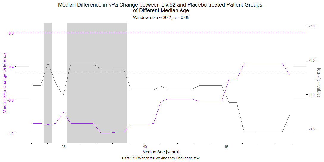
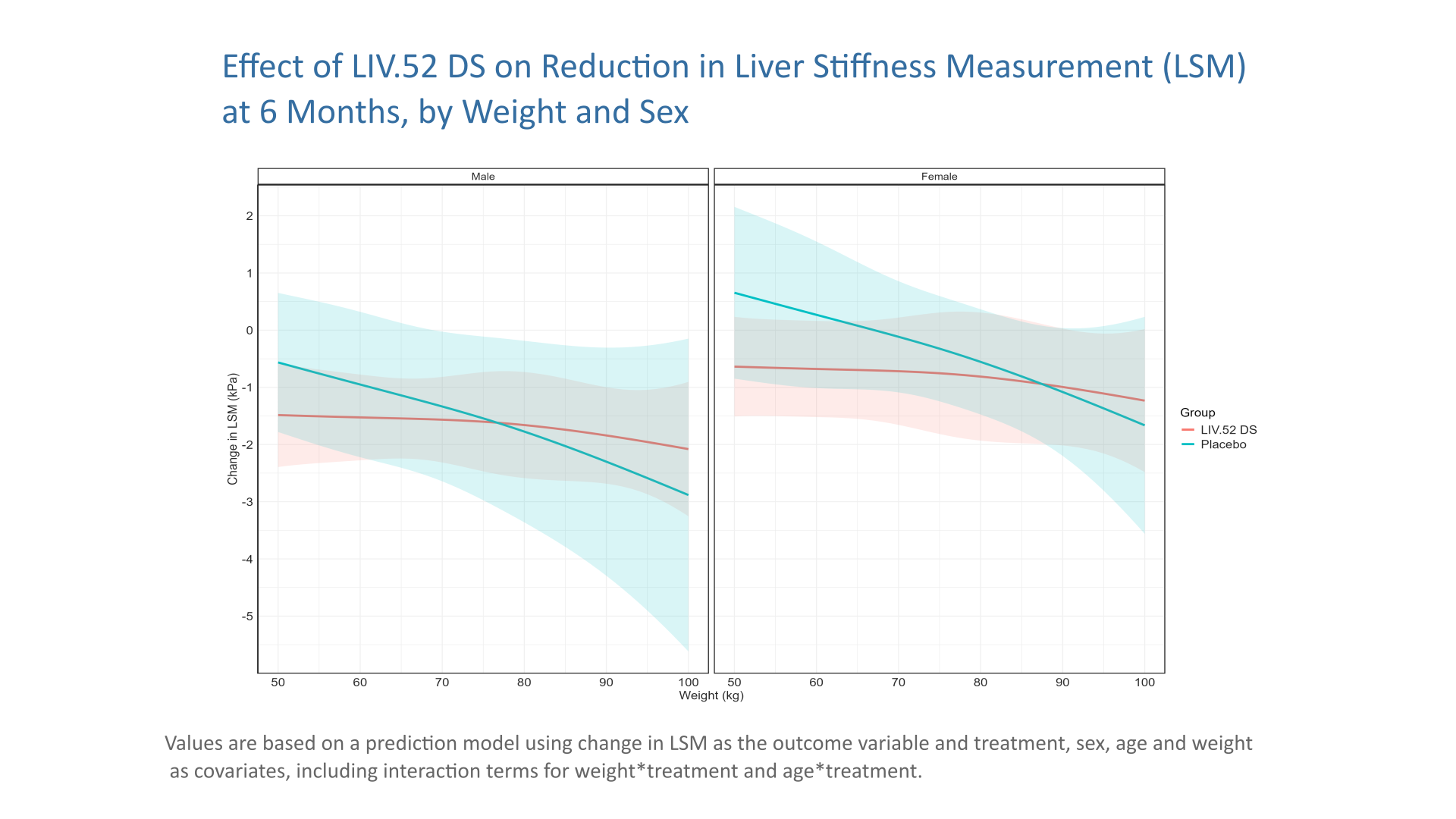
Extension of the September challange to observe subgroup effects in treatment of MAFLD (simulated data).
Wonderful Wednesday September 2025 (66)
In a recent publication of a clinical trial a pair of figures has been attached, that invites a discussion on graphic design principles.
Wonderful Wednesday August 2025 (65)
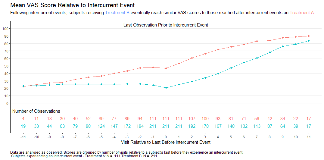
In clinical trials, intercurrent events are post-baseline occurrences that affect the interpretation or existence of outcome data. Visualisations help understand the possible impact of these events on the interpretation of the study results.
Wonderful Wednesday July 2025 (64)
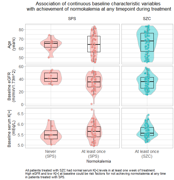
Building on the topic from june the focus is on visualising patient-level data (generated with AI)
Wonderful Wednesday June 2025 (63)
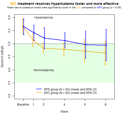
All about improving an existing plot from a recent publication on a hyperkalemia trial.
Wonderful Wednesday May 2025 (62)
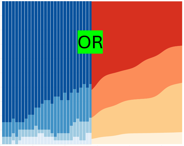
As the current therapy of the Macrophage Activation Syndrome has significant side effects, dose reduction is key. Here are visualisations to effectively demonstrate the dose reduction over time, both on the individual level and in summary.
Wonderful Wednesday April 2025 (61)
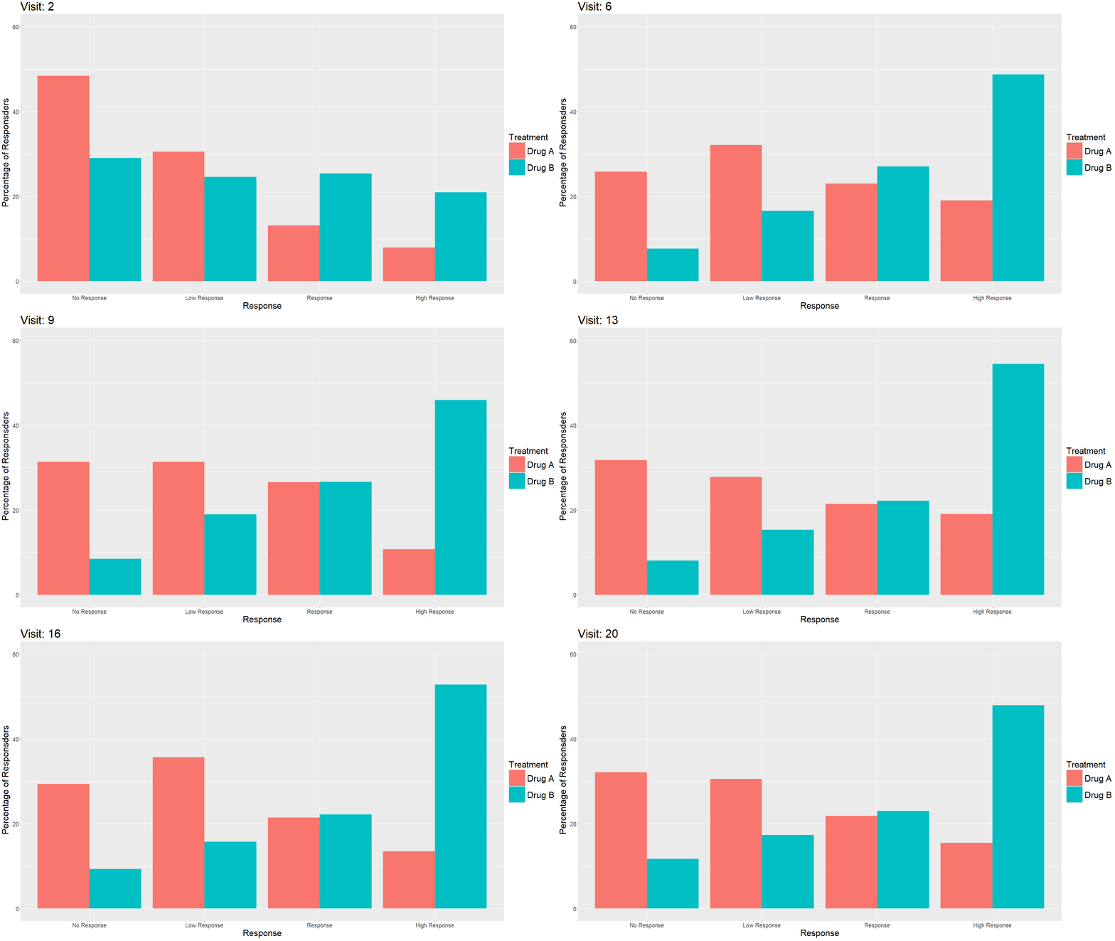
Measuring treatment response is vital for the assessment of the efficacy of a drug. Visualisations can help to show response gain and maintenance or loss over time.
Wonderful Wednesday March 2025 (60)
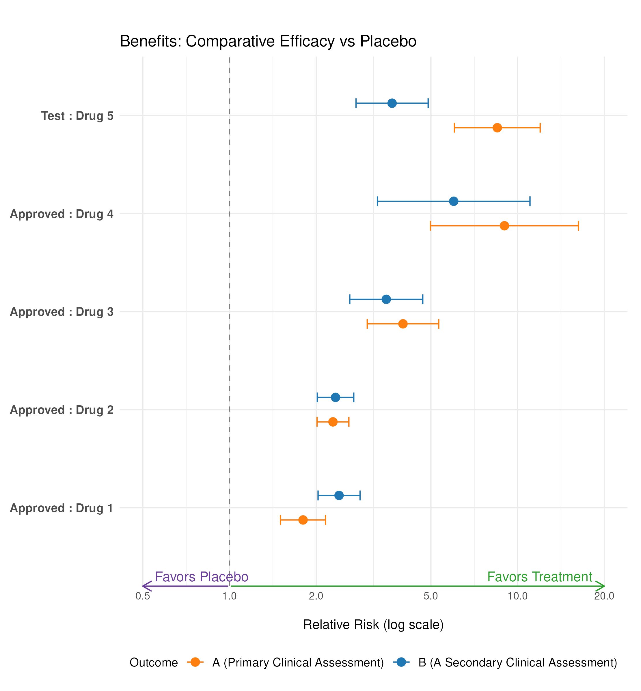
The assessment of benefit and risk is in the centre of evaluating treatments.
Wonderful Wednesdays February 2025 (59)
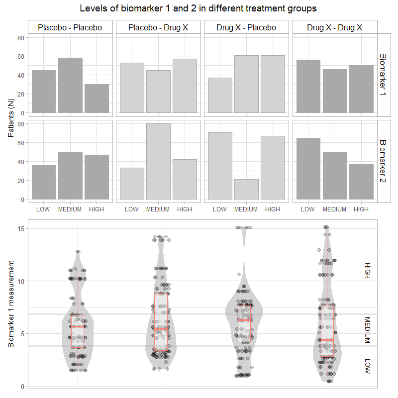
It is a real challenge to display adverse event data. There are a lot of different aspects to concentrate on. How this can be approached?
Wonderful Wednesdays December 2024
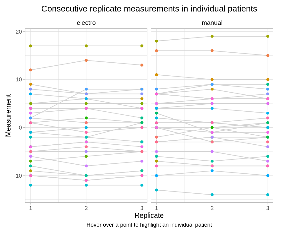
Use Visualizations to answer the following questions: Inter-goniometer: do the two goniometers agree? Intra-goniometer: do the goniometers measure consistently the knee joint angle across the three repeated measurements?
Wonderful Wednesdays November 2024
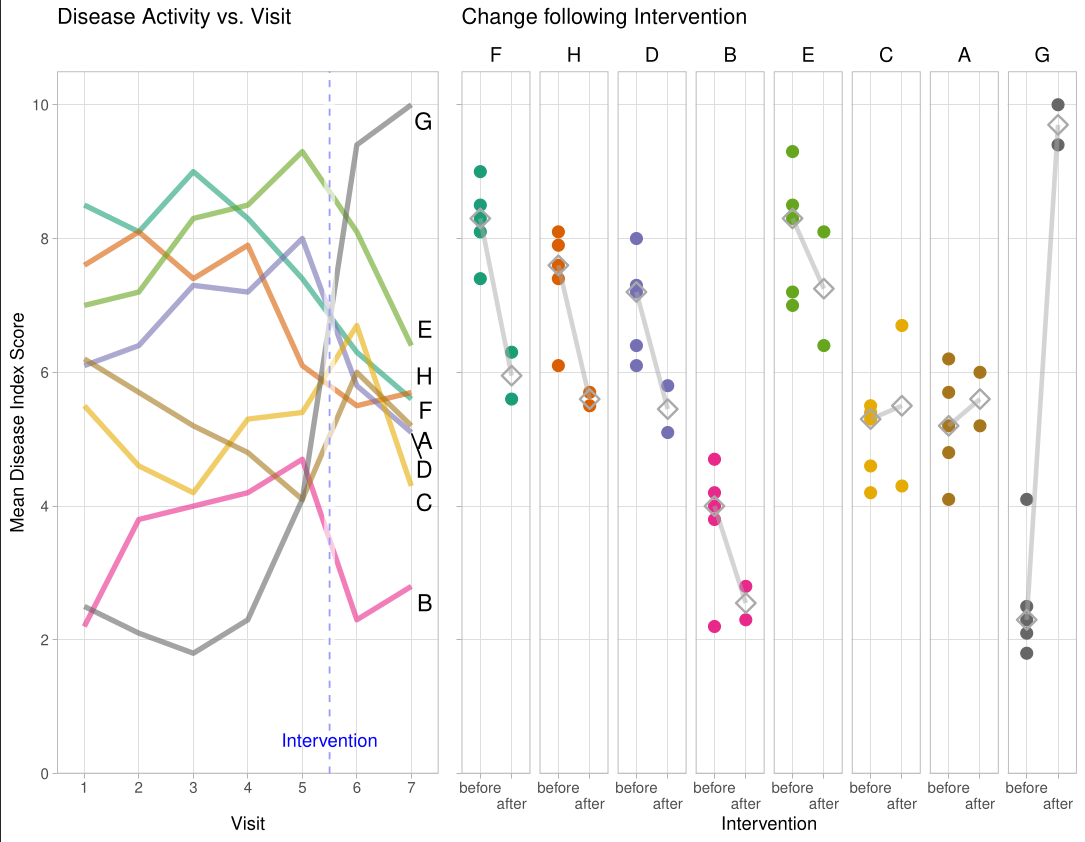
The challenge was about improving a bad chart.
Wonderful Wednesdays October 2024
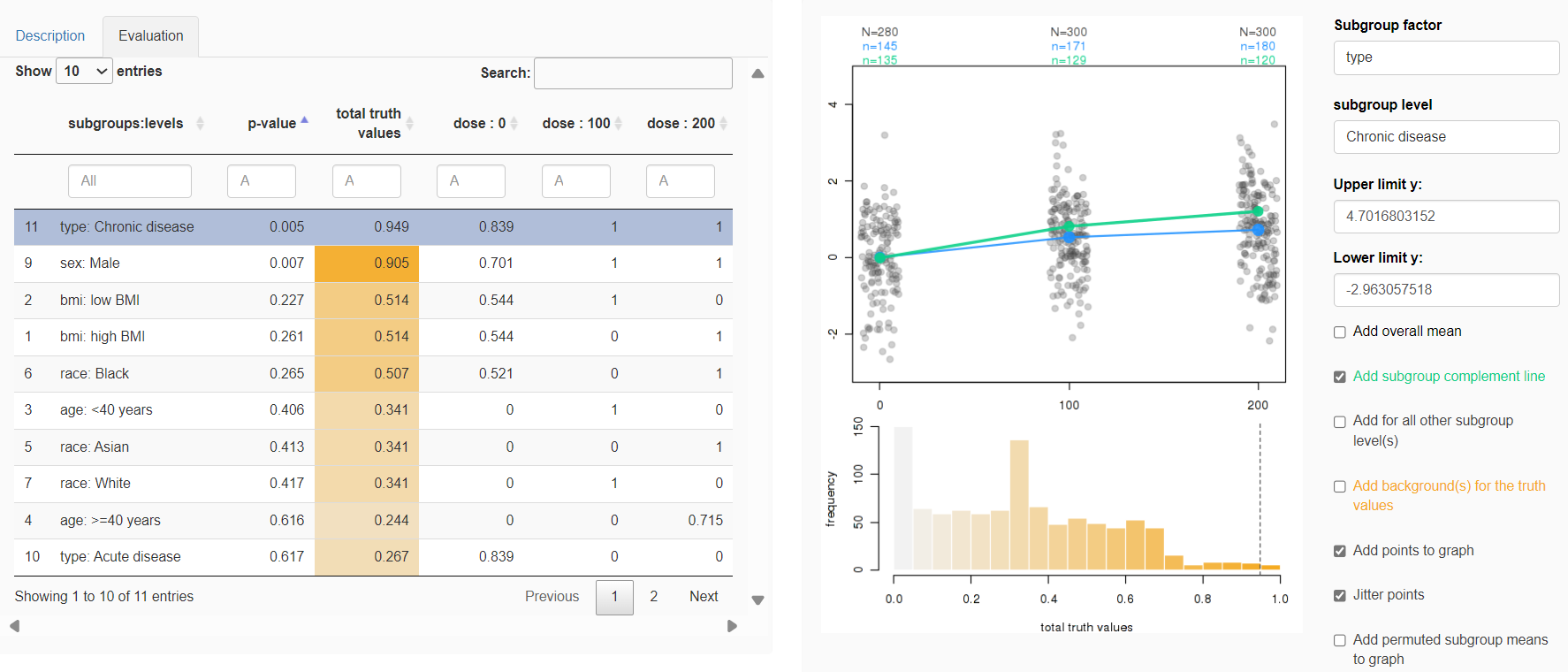
Why personalized dosing? „Again and again, it has been shown that certain patients benefit more from individual drugs, while others suffer more heavily from side effects… …and still they are usually treated with a standard dose." Free translation of a quote from Prof. Dr. Dr. Gerd Geisslinger, Executive Director, Fraunhofer Institute for Translational Medicine and Pharmacology, Frankfurt
Wonderful Wednesdays September 2024
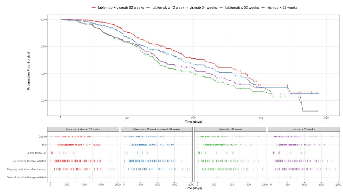
Visualise the pattern of events (disease progression, death, etc) on a summary data level or on a patient level data. Highlight differences between treatments or subgroups.
Wonderful Wednesdays August 2024
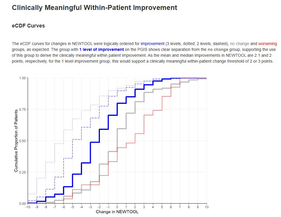
When a new patient-reported outcome (PRO) is developed, there is interest in deriving the following, to support interpretation of data collected using the new tool: Minimal Clinically Important Difference (MCID) / Responder Definition (RD), Meaningful Between-Group Difference, Meaningful Score Categories. These are usually derived by using an existing, validated measure as the ‘gold standard’ to quantify e.g. disease status.
Wonderful Wednesdays July 2024
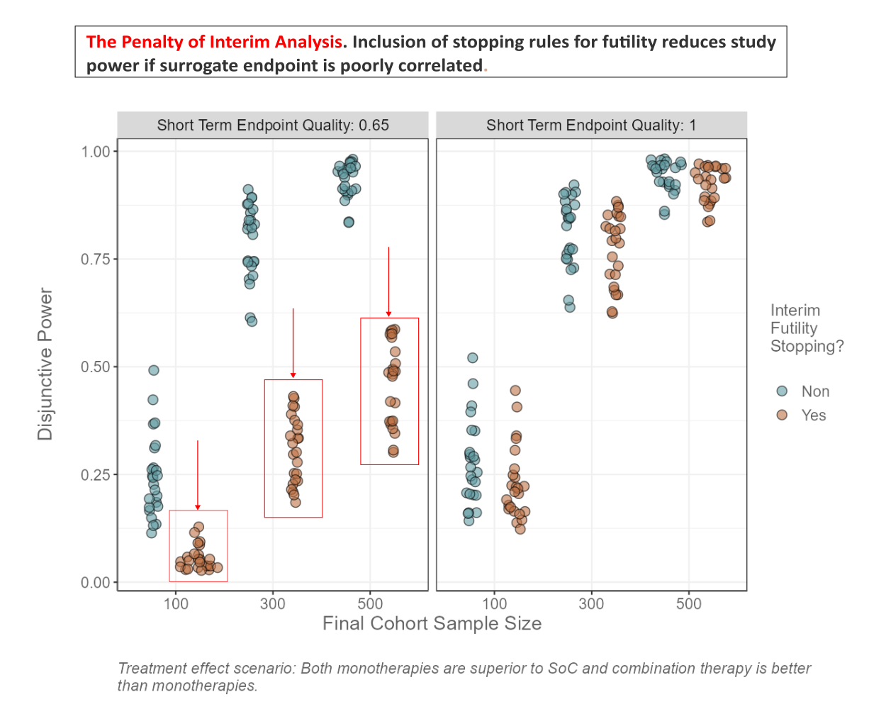
The data set is based on a platform trial design. How can we investigate the effectiveness of early stopping for futility? What is the relationship between the quality of the surrogate endpoint and the average number of patients enrolled? Is there an interaction with futility stopping and treatment effect scenario? How do FWER and FWER_BA differ from each other with respect to treatment effect scenario and maximum number of cohorts? Can you find other interesting patterns in the data?
Wonderful Wednesdays June 2024
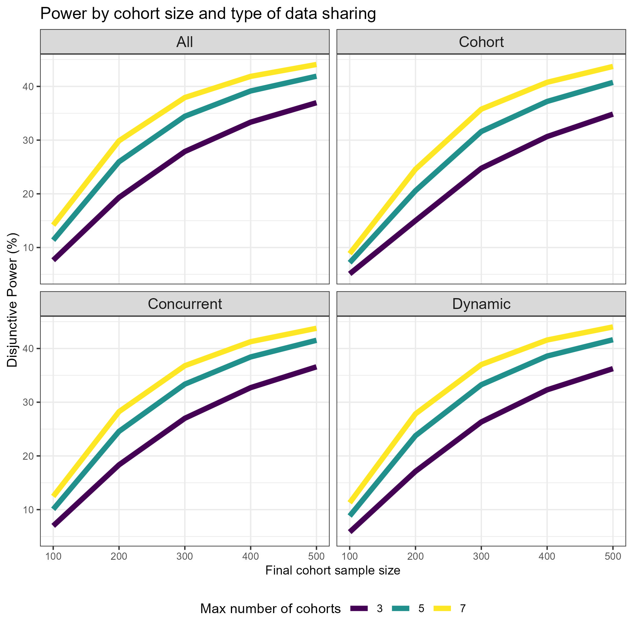
The data set is based on a platform trial design. How can we best show the effect of sample size on the power/type 1 error? Does sample size affect PTP and Disj_Power in the same way? How about in interaction with the type of data sharing? What is the relationship between number of cohorts, cohort inclusion rate and power? How can we investigate the effectiveness of early stopping for futility? What is the relationship between the quality of the surrogate endpoint and the average number of patients enrolled? Is there an interaction with futility stopping and treatment effect scenario? How do FWER and FWER_BA differ from each other with respect to treatment effect scenario and maximum number of cohorts? Can you find other interesting patterns in the data?
Wonderful Wednesdays May 2024
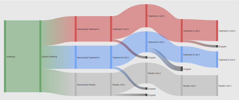
In almost every study there is a flow chart to present the patient's path through the trial. What could the next level of study flow charts look like? Sandard study flow charts are basically organised lookup tables. A true visualisation can do much more. For example colour coding or indenting boxes can help organising. Also additional information can be embedded. This can easily done in R. For patient disposition Sankey diagrams can be extremely useful. This is even more powerful if used interactively. People charts even go without explanation.
Wonderful Wednesdays April 2024
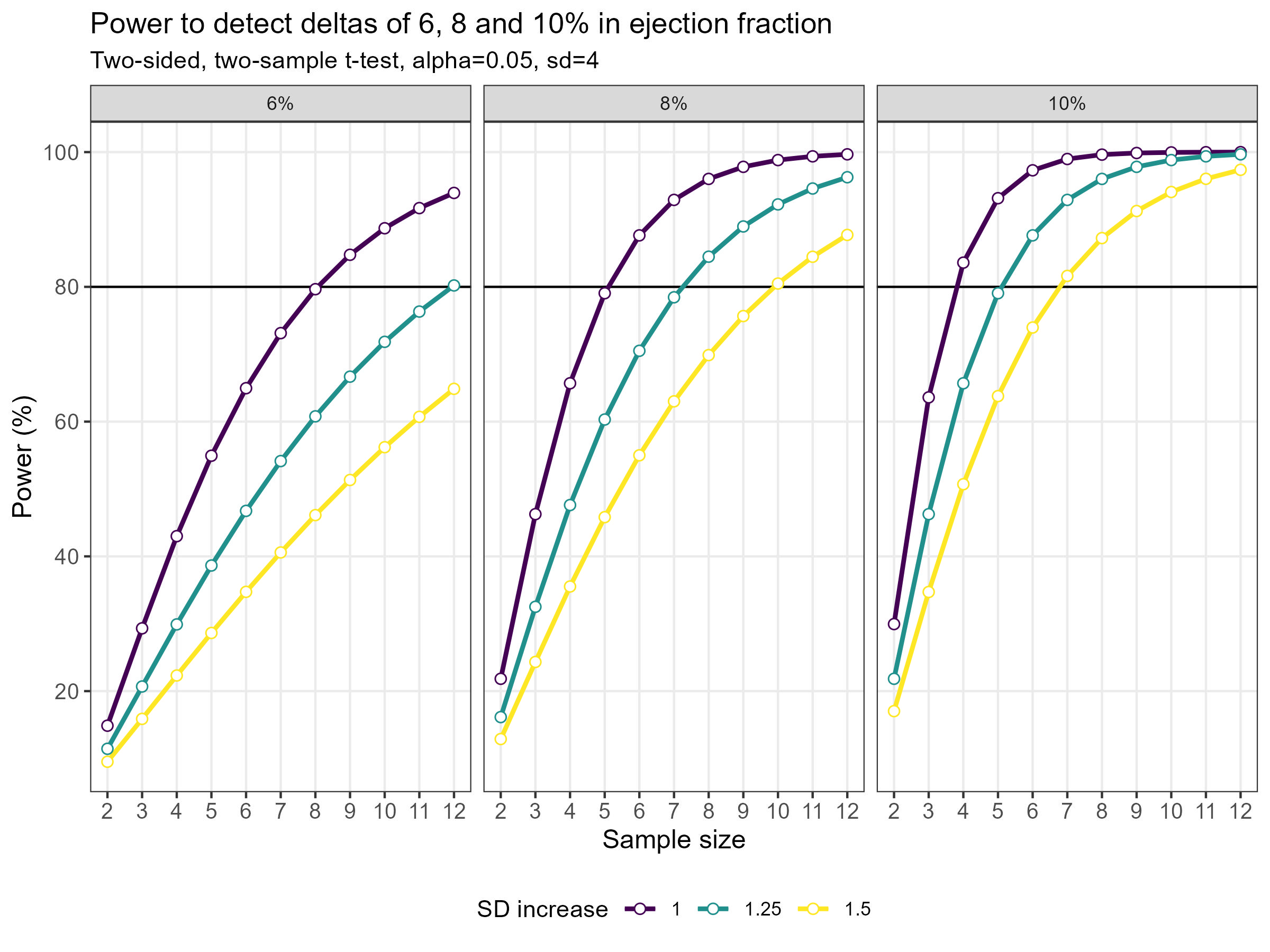
As statisticians, we often have to deal with power or sample size calculations. It can be very beneficial to visualise the impact that different factors have on the sample size or power. Produce data visualisation(s) or share tools that help your audience understand how power and sample size calculations work and what impacts the actual results of these calculations.
Wonderful Wednesdays March 2024
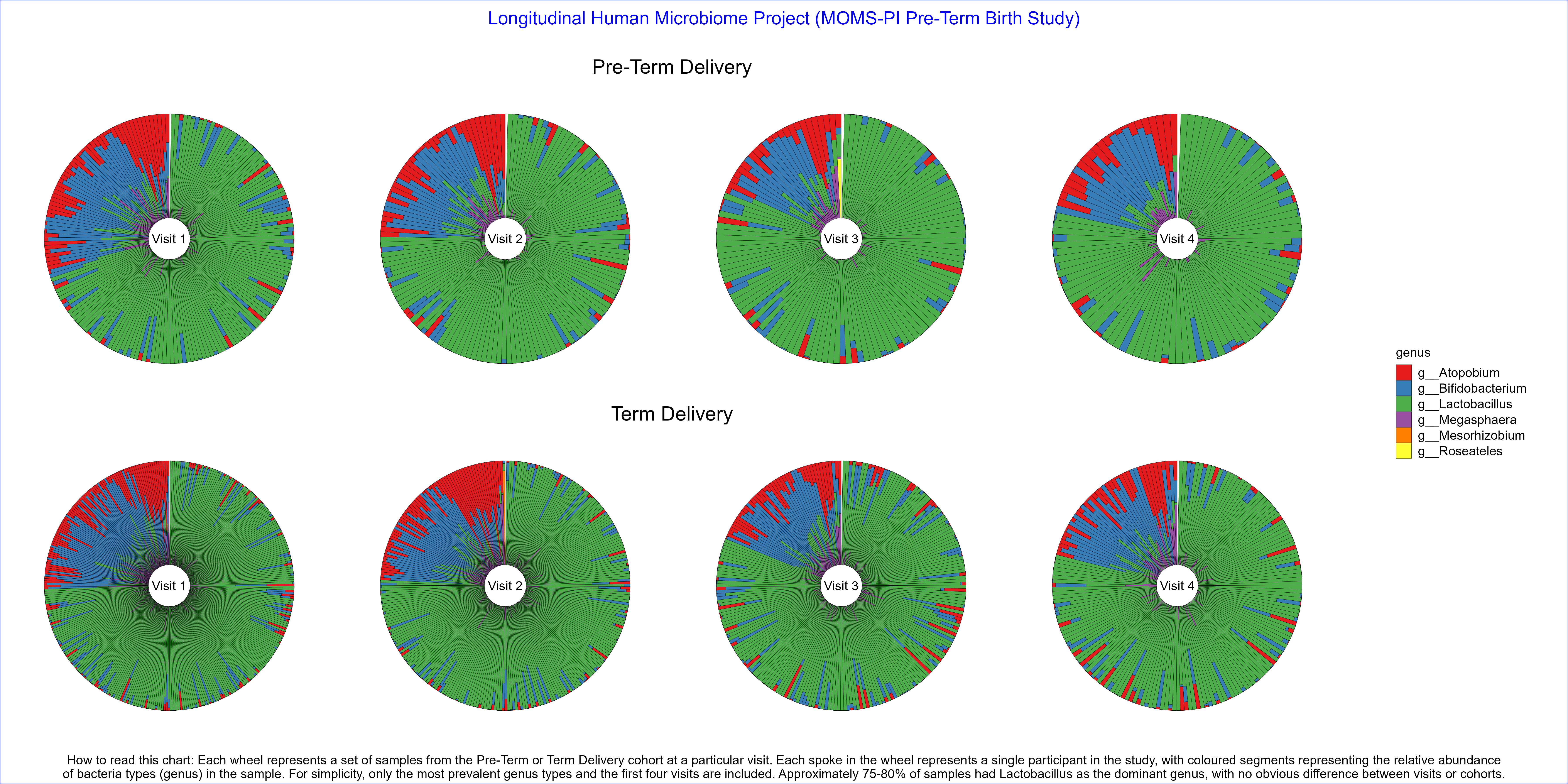
Produce data visualisation(s) providing insights into how microbiome profiles change over time and what the differences are in microbiome profiles between Pre-Term Birth and Term Birth.
Wonderful Wednesdays February 2024
Find a plot in a healthcare related publication and improve the visual presentation with only the data available from the publication.
Wonderful Wednesdays January 2024
Best of 2023
Wonderful Wednesdays December 2023
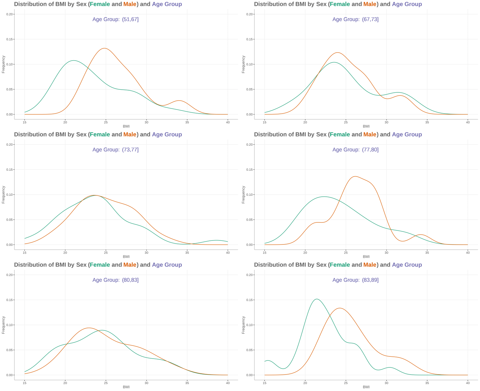
Demographic data display: The challenge is based on CDISC data. It is a standard ADSL data set for subject level data (demographics and baseline).
Wonderful Wednesdays November 2023
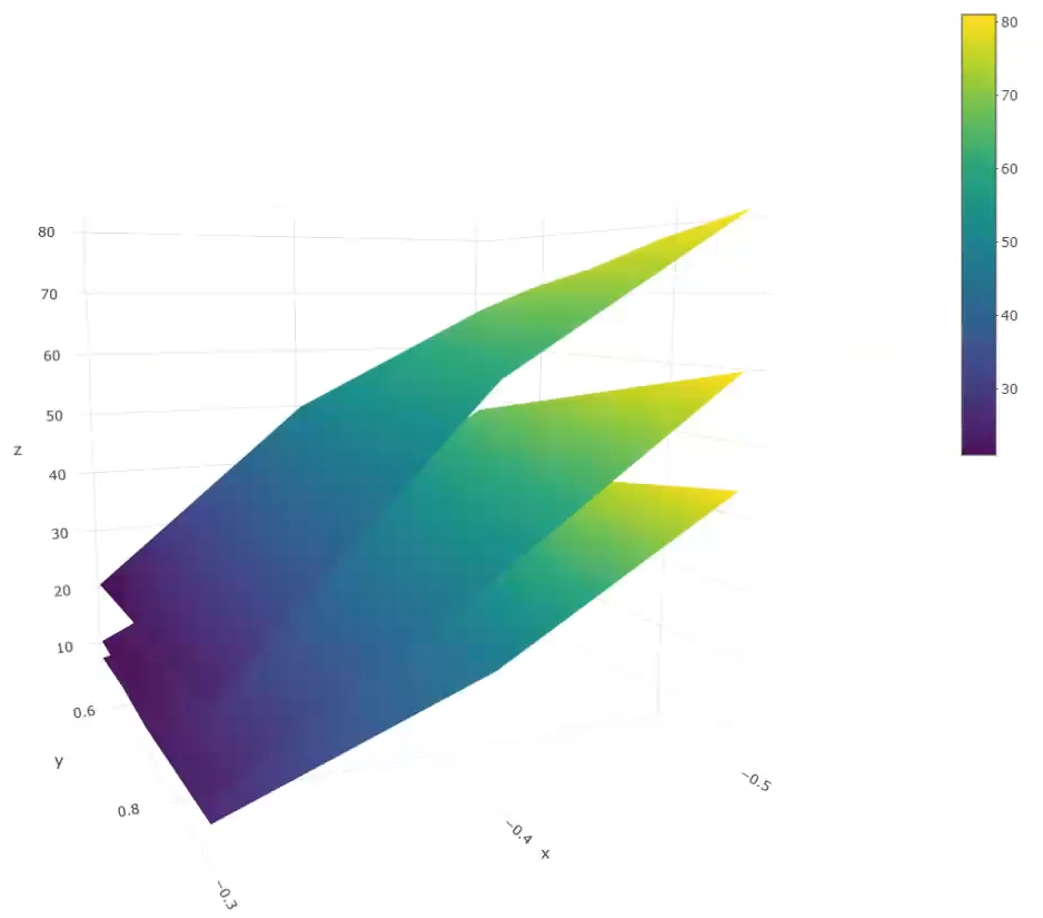
Gatekeeping Procedure: Results are provided from a simulation of a phase III study in schizophrenia patients, investigating efficacy at 3 dose levels (Low, Medium, High) versus placebo. The study includes a primary endpoint and two key secondary endpoints. The study includes a total of 9 hypotheses, and multiplicity adjustments are required to control for type I error.
Wonderful Wednesdays October 2023
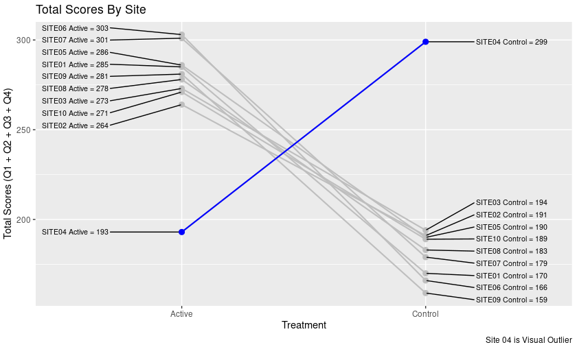
Leverage visual analytics to identify data issues.
Wonderful Wednesdays September 2023
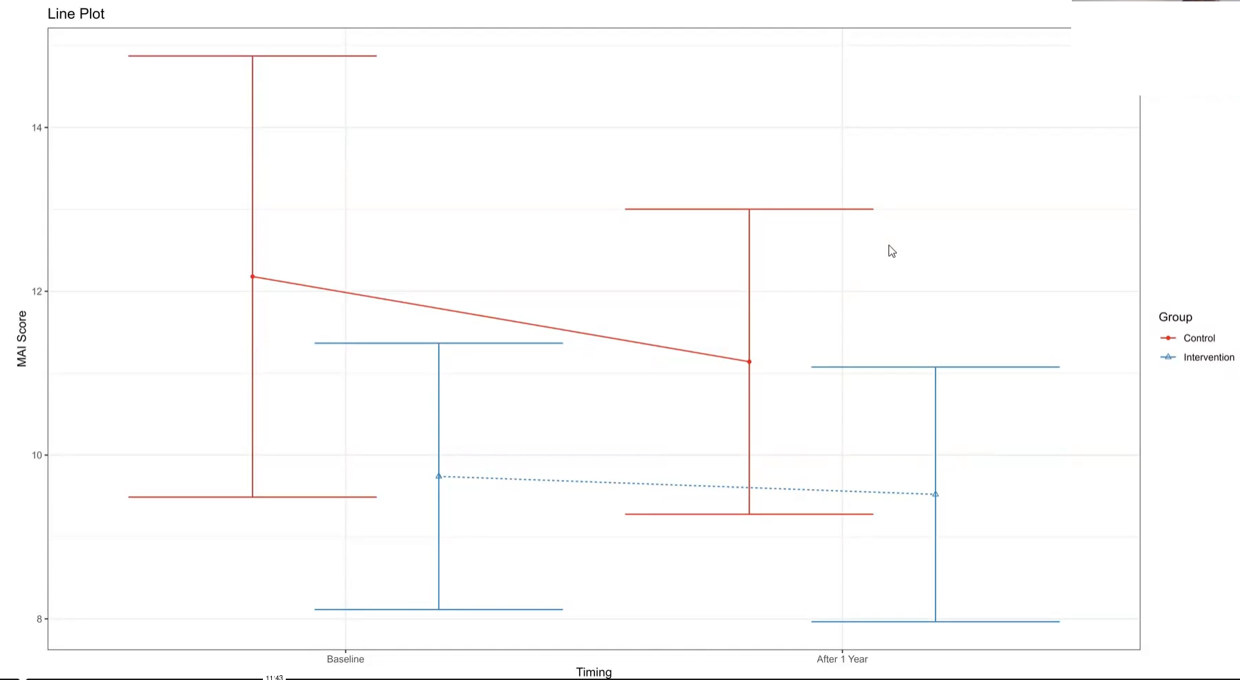
The PRIMUM study aimed to improve medication appropriateness in elderly patients with multimorbidity. A complex intervention involving general practitioners (GPs) and their healthcare assistants (HCA) was developed and compared to usual care. Check for a treatment effect on the MAI score after the intervention. Visualize the effect of adjusting the treatment effect for the MAI score at baseline.
Wonderful Wednesdays August 2023
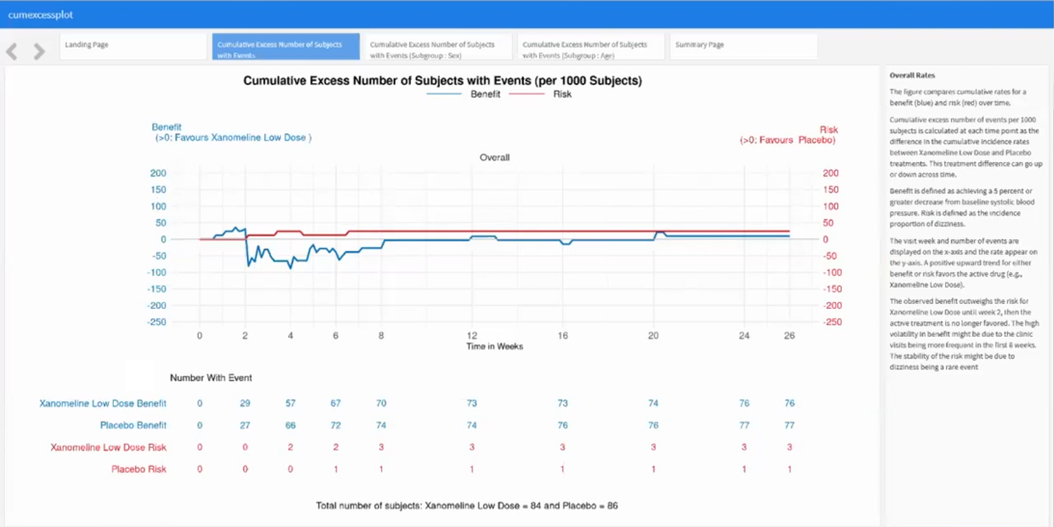
Benefit-Risk Assessment: For a drug to be approved for marketing, regulatory authorities must determine that the drug is effective and that its expected benefits outweigh its potential risks to patients. An Alzheimer’s Disease drug might have a positive benefit-risk profile for lowering blood pressure. To generate a hypothesis, an exploratory benefit-risk assessment will be conducted.

Wonderful Wednesdays July 2023
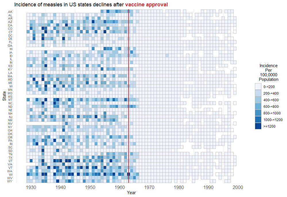
US Disease Incidence
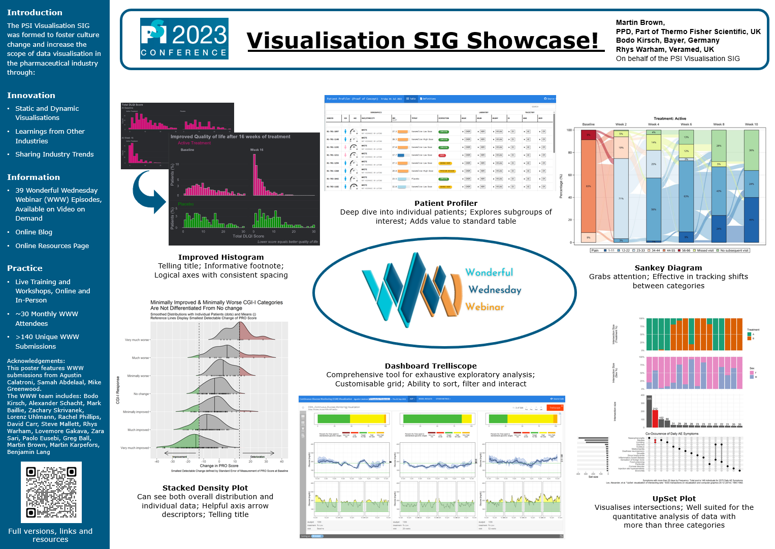
Visualisation SIG Showcase
This is an entry accompanying the poster at the PSI conference 2023.
Wonderful Wednesdays May 2023
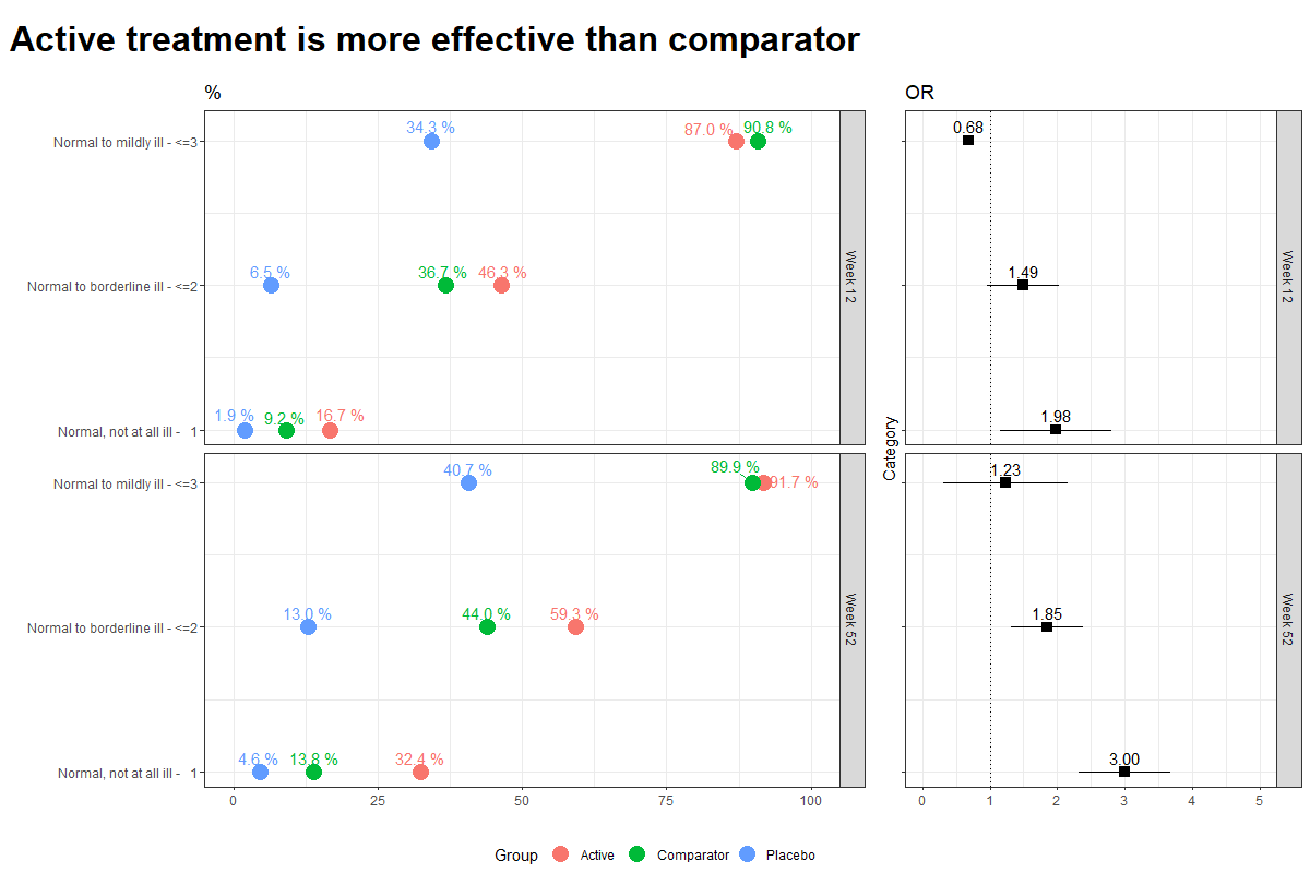
Data visualisations to present Clinical Global Impression Data and to provide comparisons between the different groups (e.g. based on response differences or odds ratios for the different response categories).
Wonderful Wednesdays April 2023
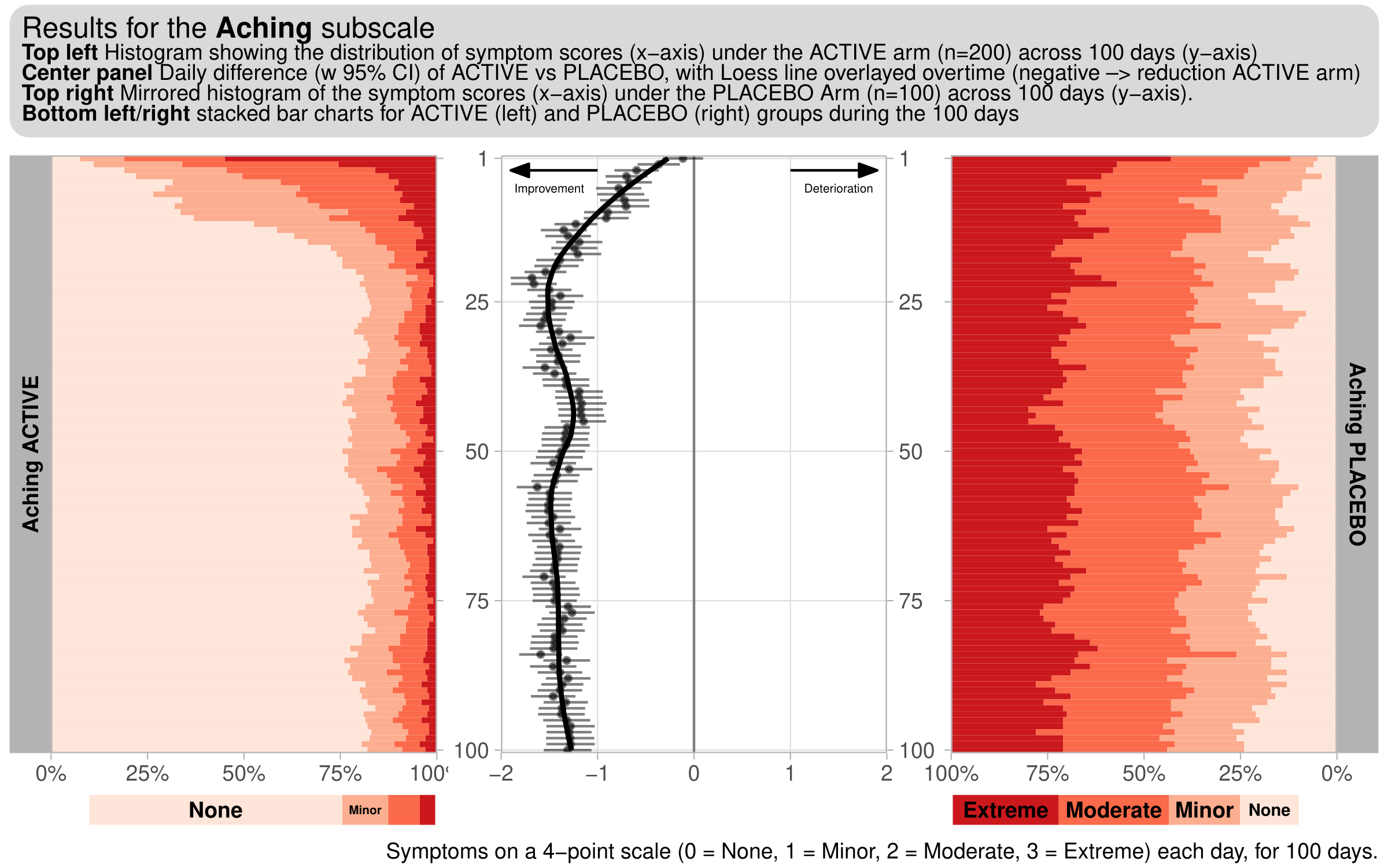
This month’s challenge will be to visualise diary data, whereby patients complete a diary (grading a number of symptoms), each day. For this challenge, we consider a hypothetical diary, consisting of 6 symptoms (Exhaustion, Aching, Tenderness, Depression, Loneliness, Anxiety). 300 subjects (200 active, 100 placebo), grade each of these symptoms on a 4-point scale (0 = None, 1 = Minor, 2 = Moderate, 3 = Extreme) each day, for 100 days.
Wonderful Wednesdays March 2023
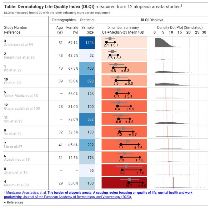
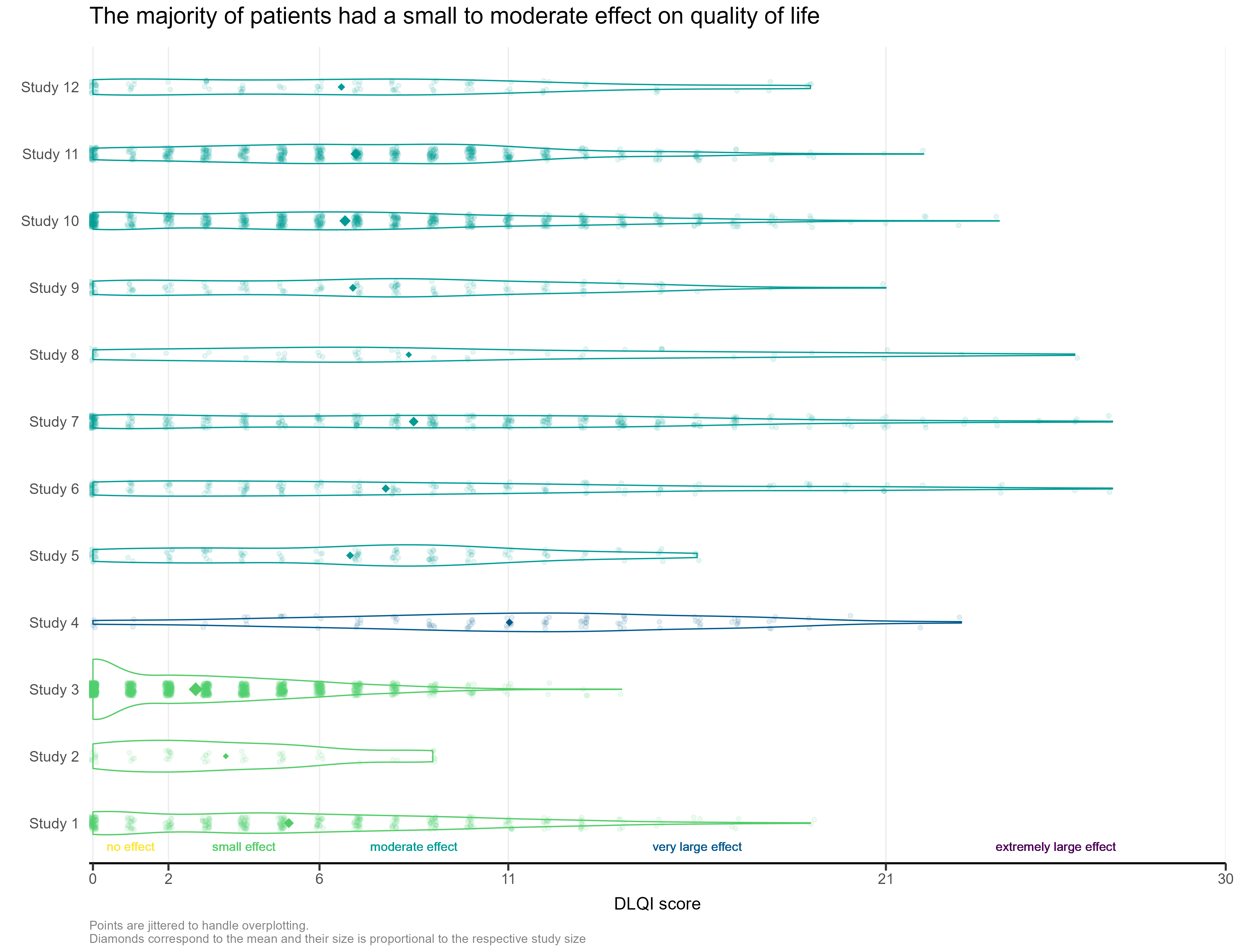
This month’s challenge was to improve a published visualisation. The visualisation displayed the mean (and SD) Dermatology Life Quality Index (DLQI) score for 12 studies on alopecia areata. The publication had visualised these using ‘dynamite plots’, a type of visualisation which has received criticism in the past.
Wonderful Wednesdays December 2022
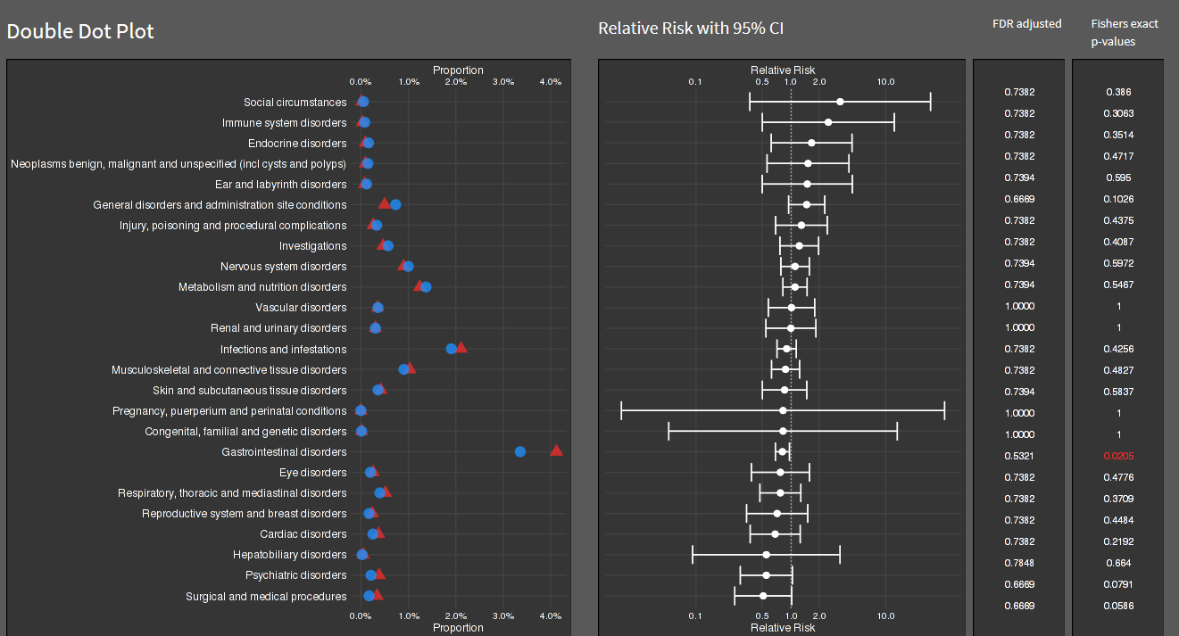
The data is an excerpt of the official VAERS data created by US Food and Drug Administration (FDA) and Centers for Disease Control and Prevention (CDC) that may be associated with vaccines.
Wonderful Wednesdays November 2022
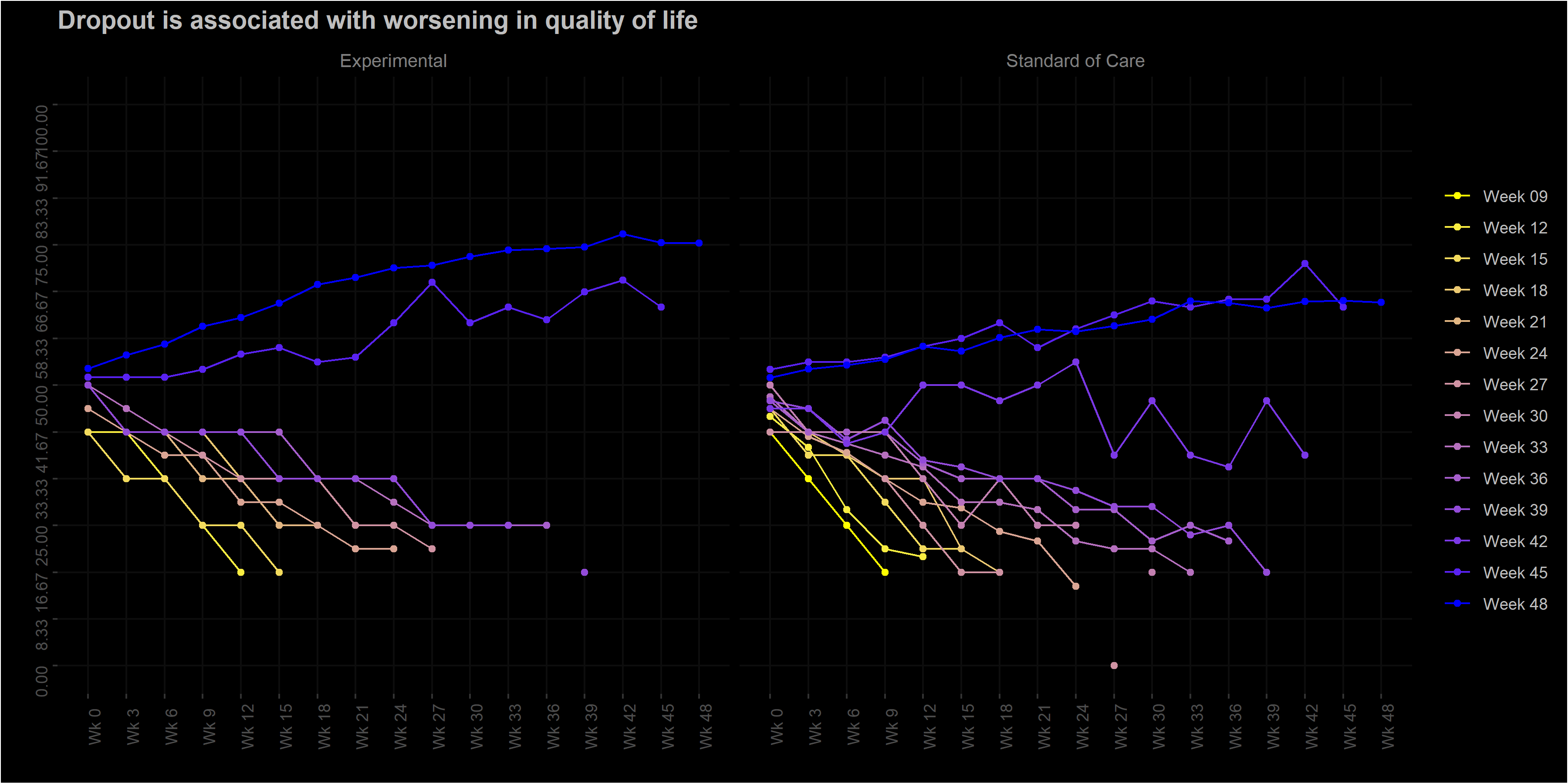
The EORTC QLQ-C30 is a 30-item questionnaire that has been designed for use in a wide range of cancer patient populations and is a reliable and valid measure of the quality of life in cancer patients. It includes a number of different scales, but this challenge is focussed on the global health and quality of life scale (QL).
Wonderful Wednesdays October 2022
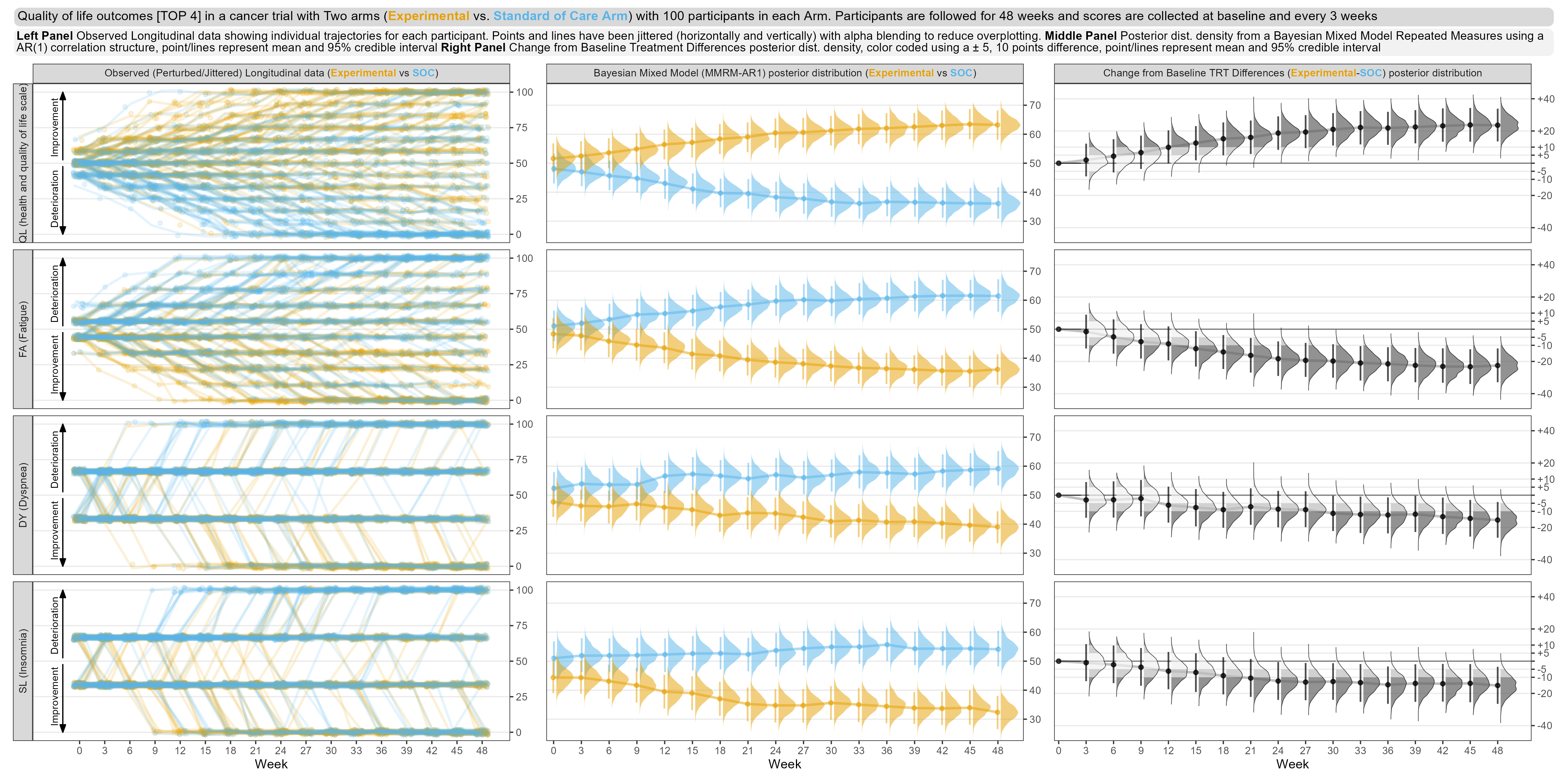
The EORTC QLQ-C30 is a 30-item questionnaire that has been designed for use in a wide range of cancer patient populations and is a reliable and valid measure of the quality of life in cancer patients (Aaronson et al., 1993).
Wonderful Wednesdays September 2022
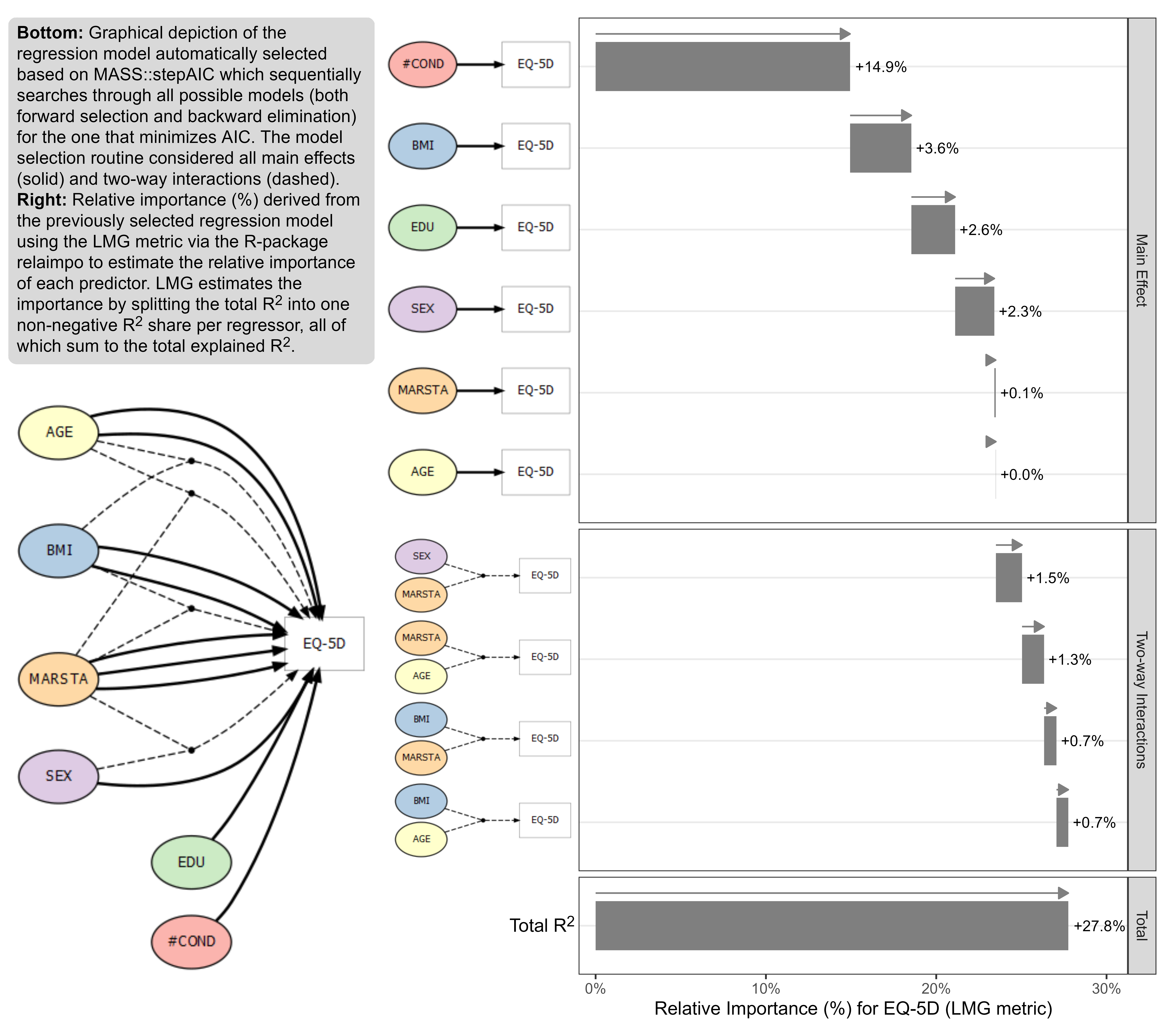
The data is based on a study to assess the health status in patients with coronary heart diseases (see Ose et al., 2012). The research question was: what factors are associated with health status in usual primary care? The original data included 2,656 patients with 14 (patient and practice) characteristics (with clustered data structure). The outcome was EQ-5D VAS scale (Health related quality of life; range: [0; 1]). The data set for this challenge is a sub-sample of patients and variables and it is simulated data.
Wonderful Wednesdays August 2022
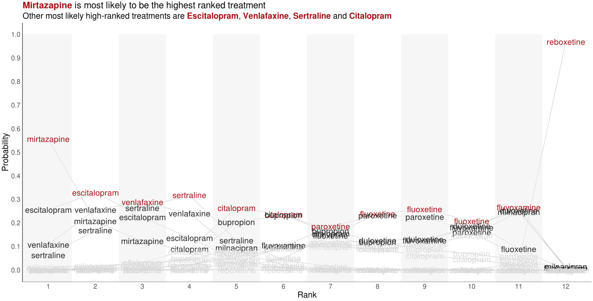
Visualise the relative performance of the treatments based on ranking data. You may want to consider other metrics which can be derived from the ranking data and used to compare treatments.
Wonderful Wednesdays July 2022
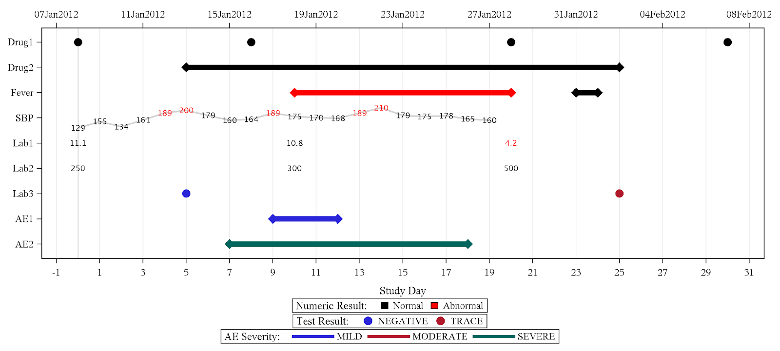
Detailed patient level data is meant to be an informed representation of the patient and what happened to the patient during the course of the study. These visualisations can help to get a quick overview on demographic information as well as exposure, concomitant medications, adverse events and laboratory data.
Wonderful Wednesdays June 2022
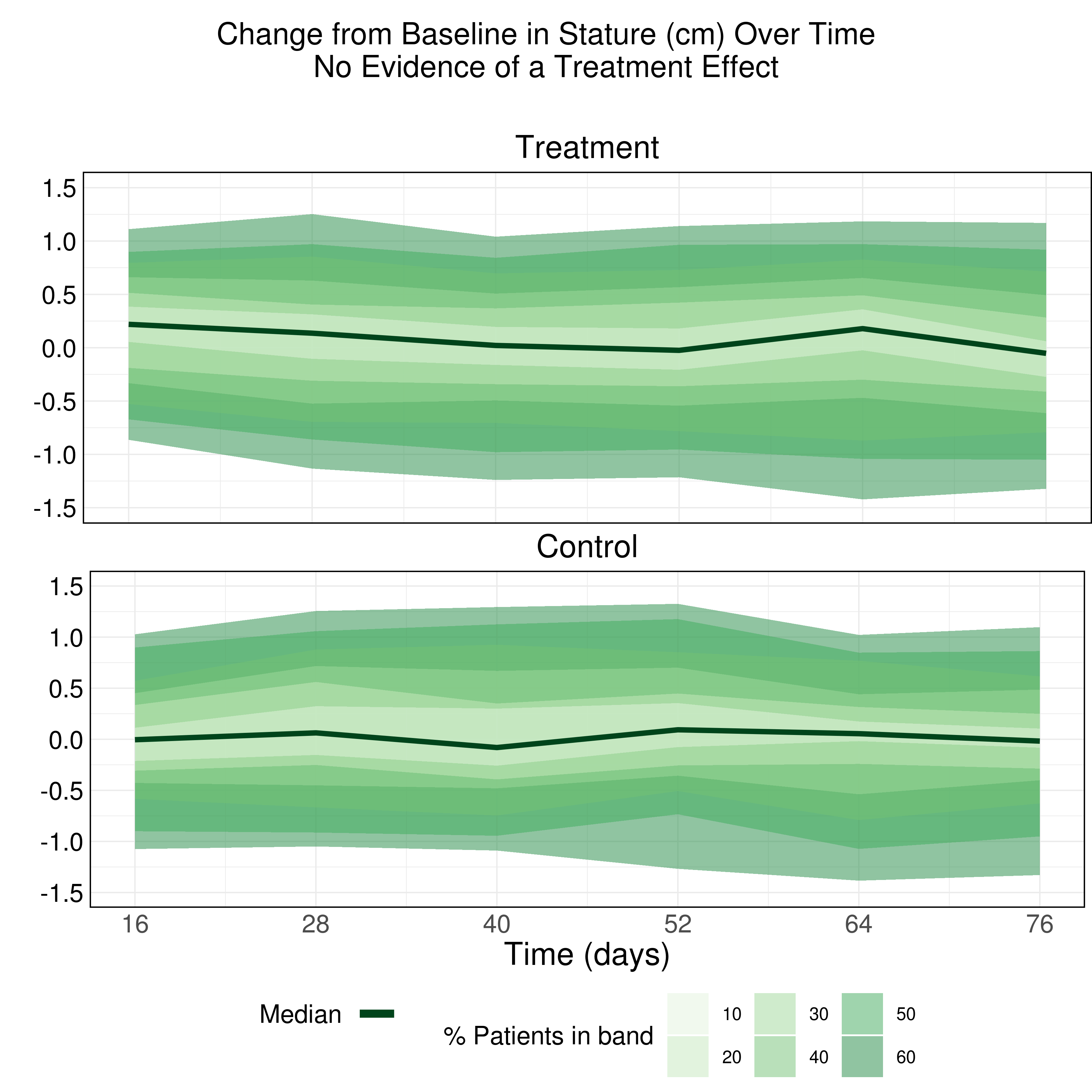
The purpose of this data visualization is to assess if there is an adverse impact on the growth of these children due to taking the drug (exploratory). Explanatory examples are welcome too (once you know the answer).
Wonderful Wednesdays May 2022
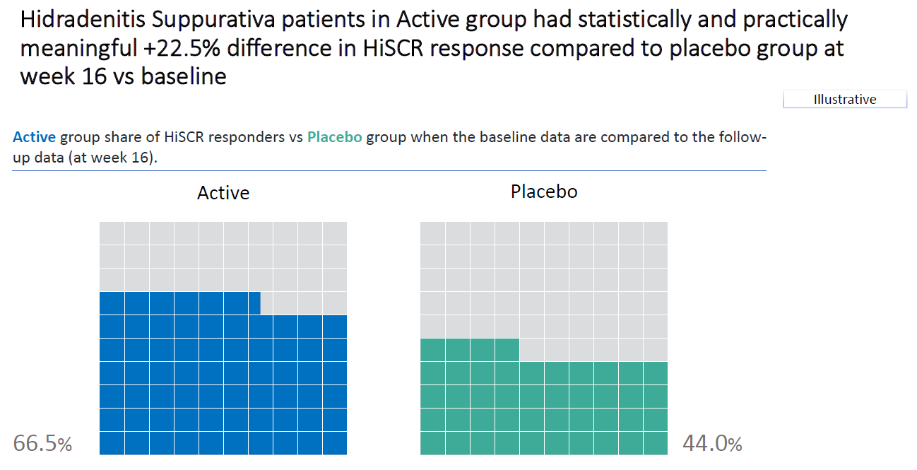
The challenge is to visualize the impact of changing the definition of HiSCR response on the results. The idea is to change, for example, the first condition and assume that a decrease of 25% or 75% is needed to reach HiSCR response. The second and third condition can be changed separately, or a mix of changes to two or all conditions can be applied. How does this impact the results?
Wonderful Wednesdays April 2022
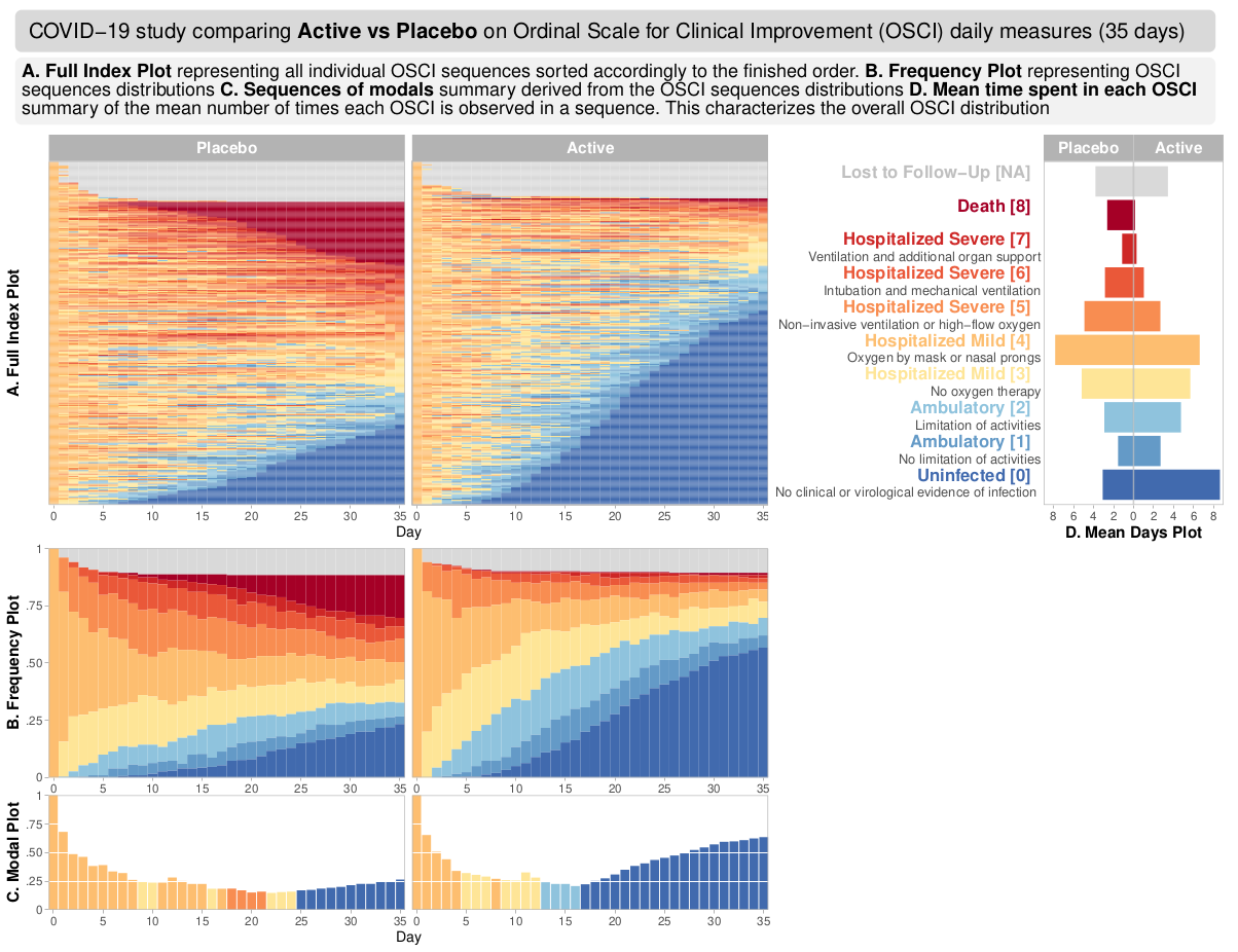
The data reflects a phase III study - active vs placebo and the endpoint was Ordinal Scale for Improvement (OSCI). All patients started at OSCI=4 and daily measures over 35 days were performed. The challenge was to describe the treatment effect specifically taking into account the number and timing of patients who died, left the hospital or fully recovered.
Wonderful Wednesdays February 2022
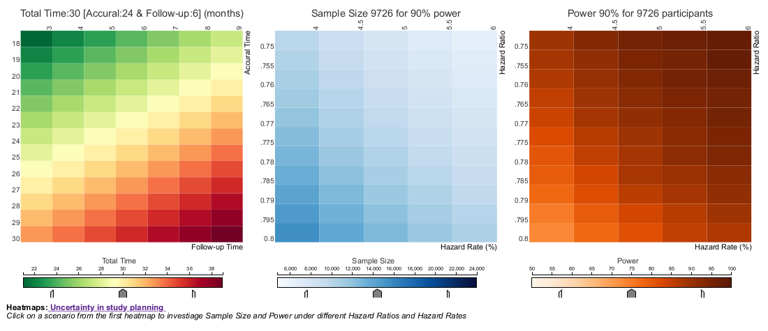
The current example is focusing on uncertainty in study planning. In this Wonderful Wednesday Webinar, we assume that a phase III cardiovascular superiority study is planned and we will discuss how uncertainty can be displayed with regard to total study duration if the assumptions are not exactly met.
Wonderful Wednesdays December 2021
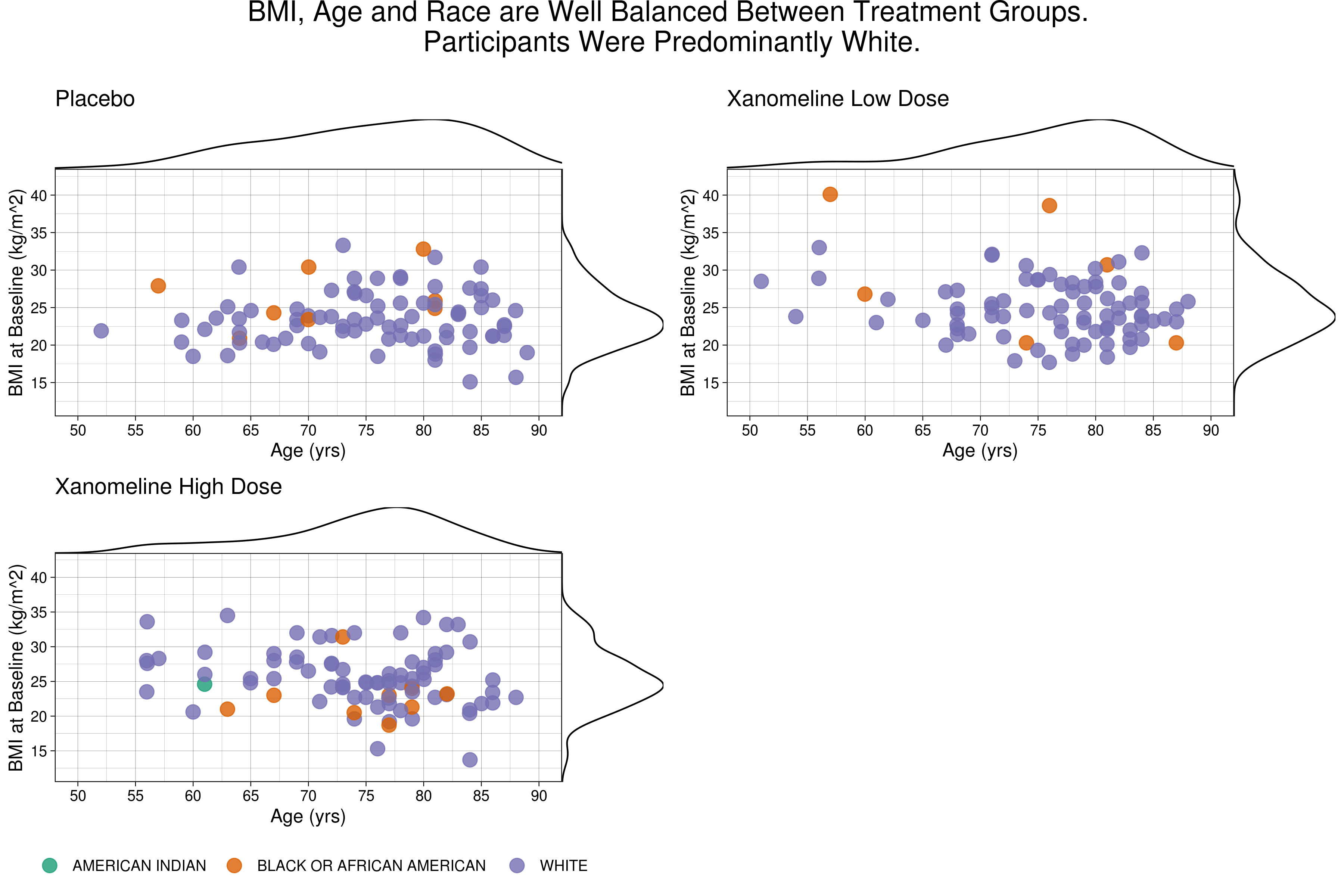
The challenge was to give a comprehensive visual overview of demographic data and baseline charactaristics.
Wonderful Wednesdays November 2021
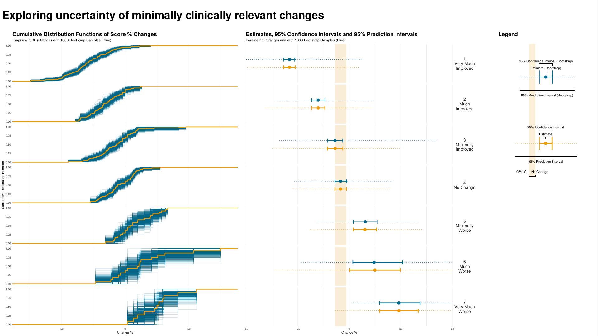
Understanding clinically meaningful differences is important to get a feeling for how relevant changes are on e.g. a patient reported outcome. These are often done by understanding how changes from baseline relate to the overall impression of the physician measured by the CGI-I.
Wonderful Wednesdays October 2021
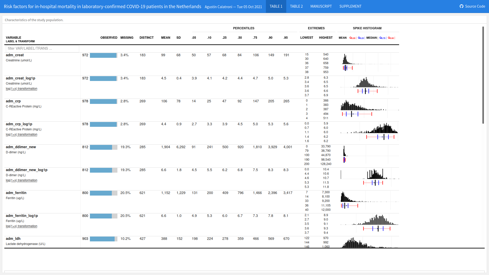
The goal was to find a way to visualize the impact of different risk factors (comorbidities and symptoms at admission to hospital) on the risk of death considering the competing risk of recovery.
PSI Scientific Meeting
PSI Scientific Meeting: Generating Insights through Modern Applications of Data Visualisation. Find more information and sign up here: https://psiweb.org/events/event-item/2021/09/17/default-calendar/psi-scientific-meeting-generating-insights-through-modern-applications-of-data-visualisation
Wonderful Wednesdays September 2021
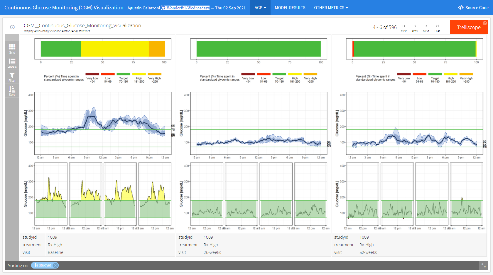
The goal of the challenge is to produce explanatory graphics - Visually demonstrate that there is a dose response in glycemic control for Rx (the higher the dose the lower the variability) and that the Rx med and Rx high demonstrate better glycemic control that SOC and these attributes are sustained.
Wonderful Wednesdays August 2021
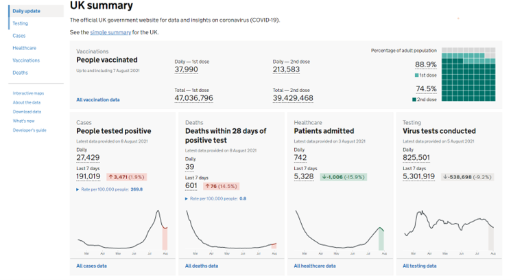
For this edition of the Wonderful Wednesdays, the audience was asked to send examples of visualizations representing coronavirus data. The webinar was a showcase og the different types of visualizations, such as area graphs, forest plots, streamgraphs, or network analysis.
Wonderful Wednesdays July 2021
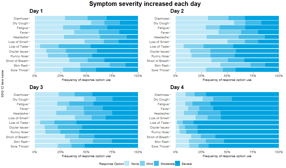
Patient Reported Outcomes (PROs) are often used within clinical trials. Prior to use as an endpoint, it is important to establish measurement properties of the instrument in the population of interest. This is conducted on blinded data, with no knowledge of the treatment allocation of each patient. Instead, anchor measures are used and compared to the score that is being evaluated. These anchor measures are usually simple questions that are designed to link conceptually to the overall target of evaluation or can be previously validated measures that assess similar concepts.
Wonderful Wednesdays June 2021
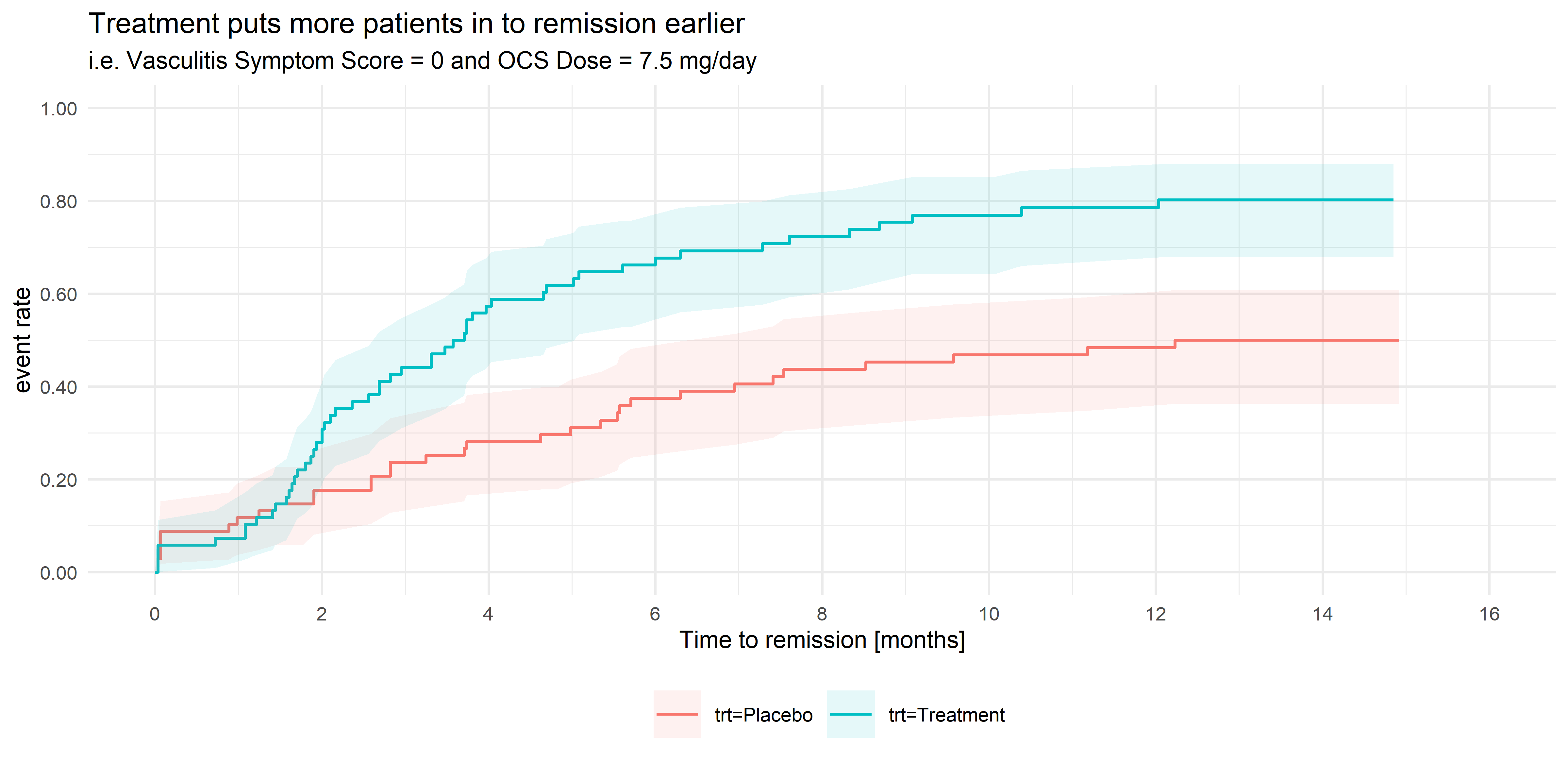
Vasculitis is an inflammation of the blood vessels, in many cases caused by the body’s immune system attacking healthy blood vessels, causing them to become swollen and narrow. The symptoms associated with vasculitis are varied, and include asthma, allergic rhinitis (cold-like symptoms), fever, joint pain, tiredness, loss of appetite and weight loss. In serious cases, if left untreated, severe vasculitis can lead to organ failure and death. Vasculitis is treated primarily with oral corticosteroid (OCS) treatment. However long-term usage of OCS therapy at high doses is associated with a number of side-effects which worsen over time, and steroid-dependency is often a concern, so steroid doses need to be reduced if possible. However, some patients have a propensity to relapse, in which the patient experiences an acute flare-up of symptoms, usually requiring immediate treatment with high dose OCS treatment. Patients are considered to be in remission if the symptom score is zero concurrently with the OCS dose being ≤ 7.5 mg/day.
Wonderful Wednesdays May 2021
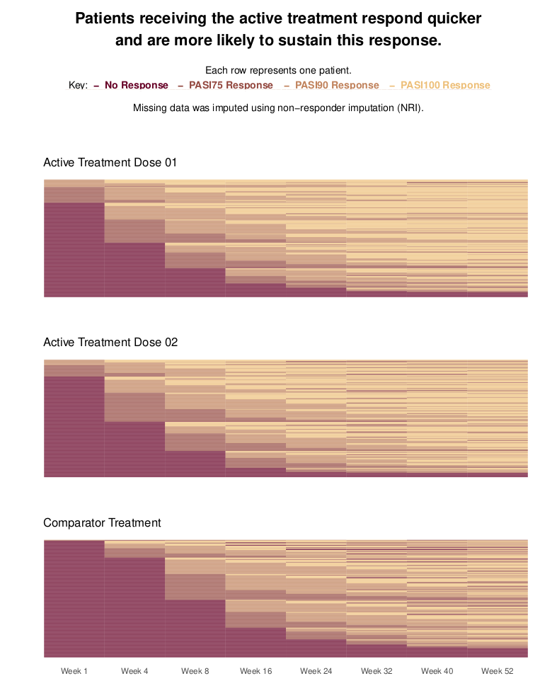
Psoriasis is a chronic, inflammatory skin disease. For such diseases, it is of interest to not only compare treatments in terms of patients achieving a response, but also in terms of patients sustaining this response once it is achieved. This is the focus of this month’s challenge: produce a visualization to compare treatments with regards to patients sustaining a response. The synthetic data contains PASI (Psoriasis Area and Severity Index) scores for three treatment groups: two receive an active treatment in different doses; the third receives a comparator. The three arms are balanced, with 300 patients in each. The data contains PASI scores at Baseline and eight follow-up visits, spread over the course of a year. PASI scores can range from 0 to 72, with higher scores indicating a worse condition state. The criteriafor response can be chosen, but typical thresholds include a 75%, 90% or 100% reduction in PASI scores relative to Baseline (PASI75/PASI90/PASI100). More than one threshold could also be considered in the same visualization.
Wonderful Wednesdays April 2021
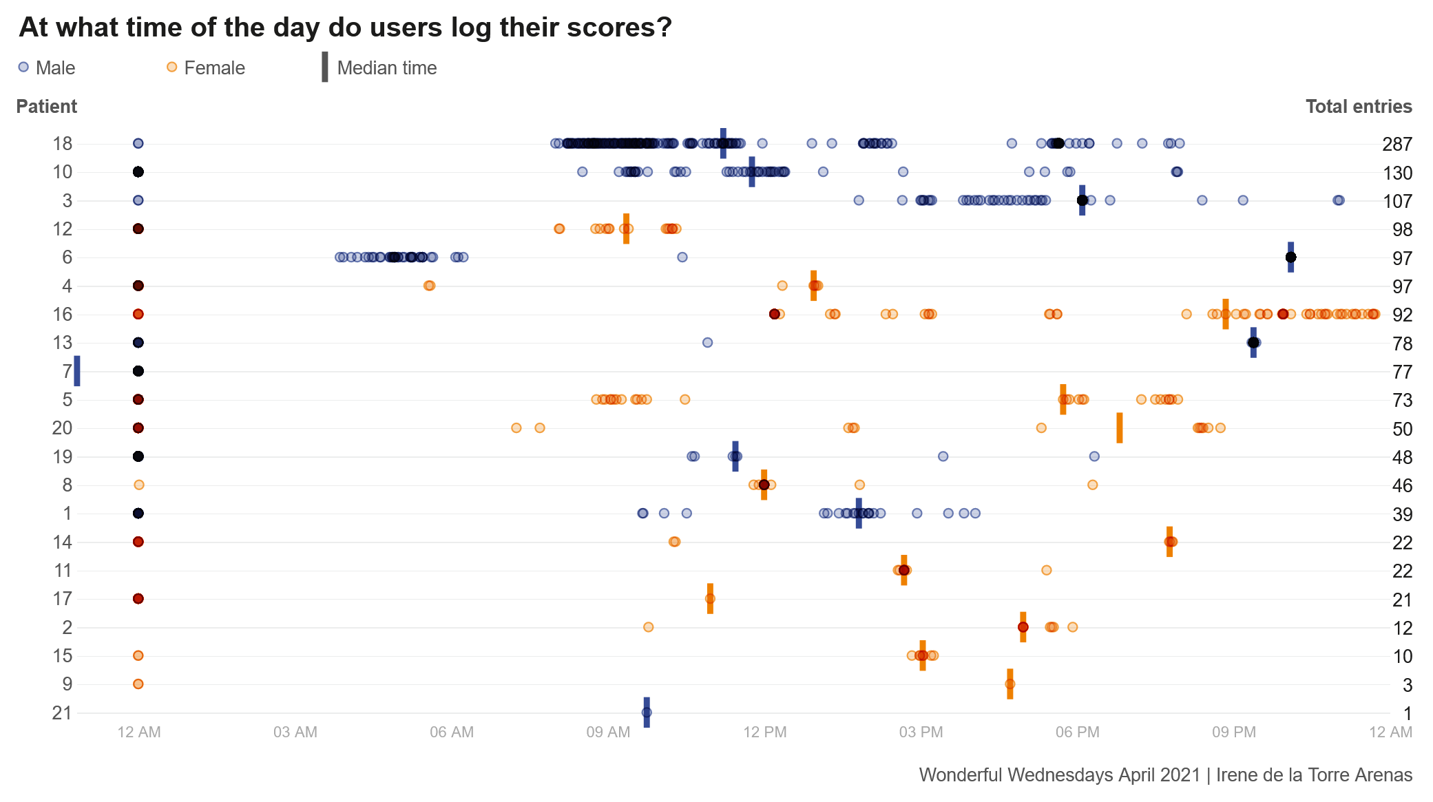
COPD is a disease that effects adults typically aged 40 years or older. It is a chronic condition that effects the lungs of a patient. The intervention in this study was an self-management app that aimed to improve inhaler use and exercise capacity in individuals with COPD. Users of the intervention could access different videos to educate themselves around different topics to better understand COPD and what steps help improve their condition, such as exercise or smoking cessation. Users could also report other detail such as their medication use, their CAT score and even a daily symptom score on how they are feeling that day. All this information could be shared with their doctor who can then monitor and manage patients to ensure they get the right treatment for them.
Wonderful Wednesdays March 2021
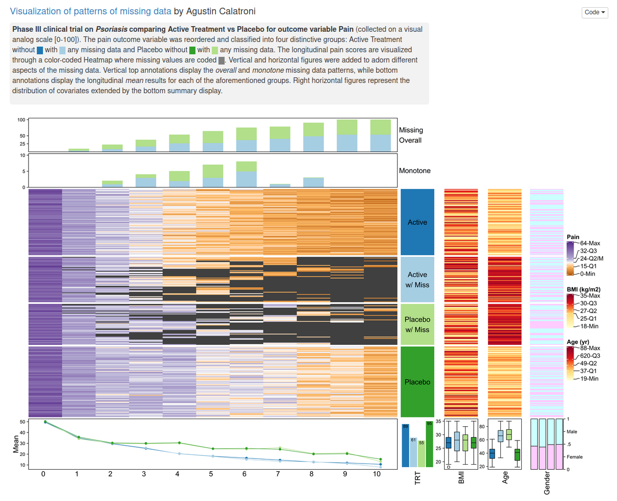
The current example data set is focusing on missing data. Missing data are present in almost any (clinical) data set. Ways to visualize different patterns of missing values is the topic of this webinar / blog entry.
Wonderful Wednesdays February 2021
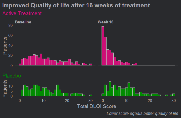
The DLQI is the most frequently used method for evaluating quality of life for patients with different skin conditions. There are 10 questions, covering the following topics: symptoms, embarrassment, shopping and home care, clothes, social and leisure, sport, work or study, close relationships, sex, treatment. Each question refers to the impact of the skin disease over the previous week and is scored from 0 to 3, giving a possible score range from 0 (meaning no impact of skin disease on quality of life) to 30 (meaning maximum impact on quality of life). This month's challenge was to use an effective visualisation to show the effect of treatment on DLQI scores across time points, possibly also reflecting the DLQI's multidimensional nature.
Wonderful Wednesdays January 2021
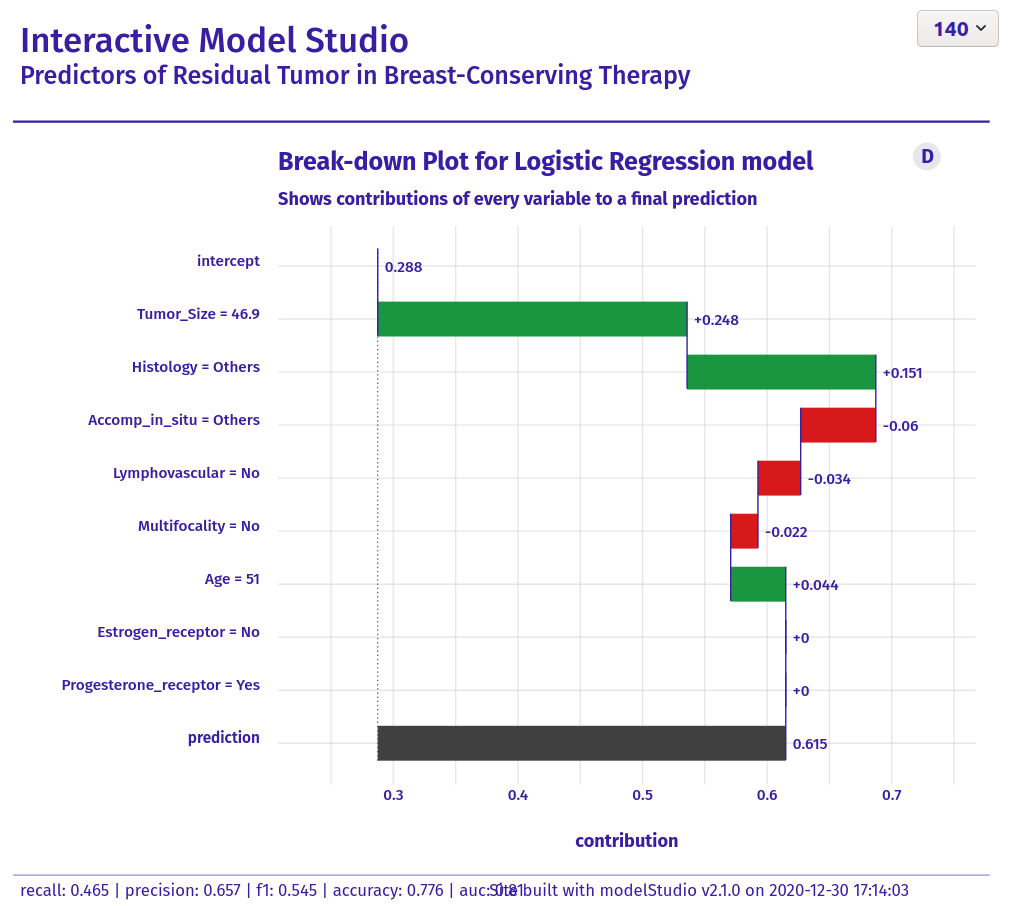
The data set is about a retrospecitve study on finding "Predictors of Residual Tumor in Breast-Conserving Therapy". There are 500 subjects included. The outcome variable is reexcision and it describes, if there has been a reexcision necessary after the (initial) surgery. In a first step, a prediction model for reexcission needed to be set up. The goal of this exercise was to visualize the results. The audience was intended to be a "non-technical" one.
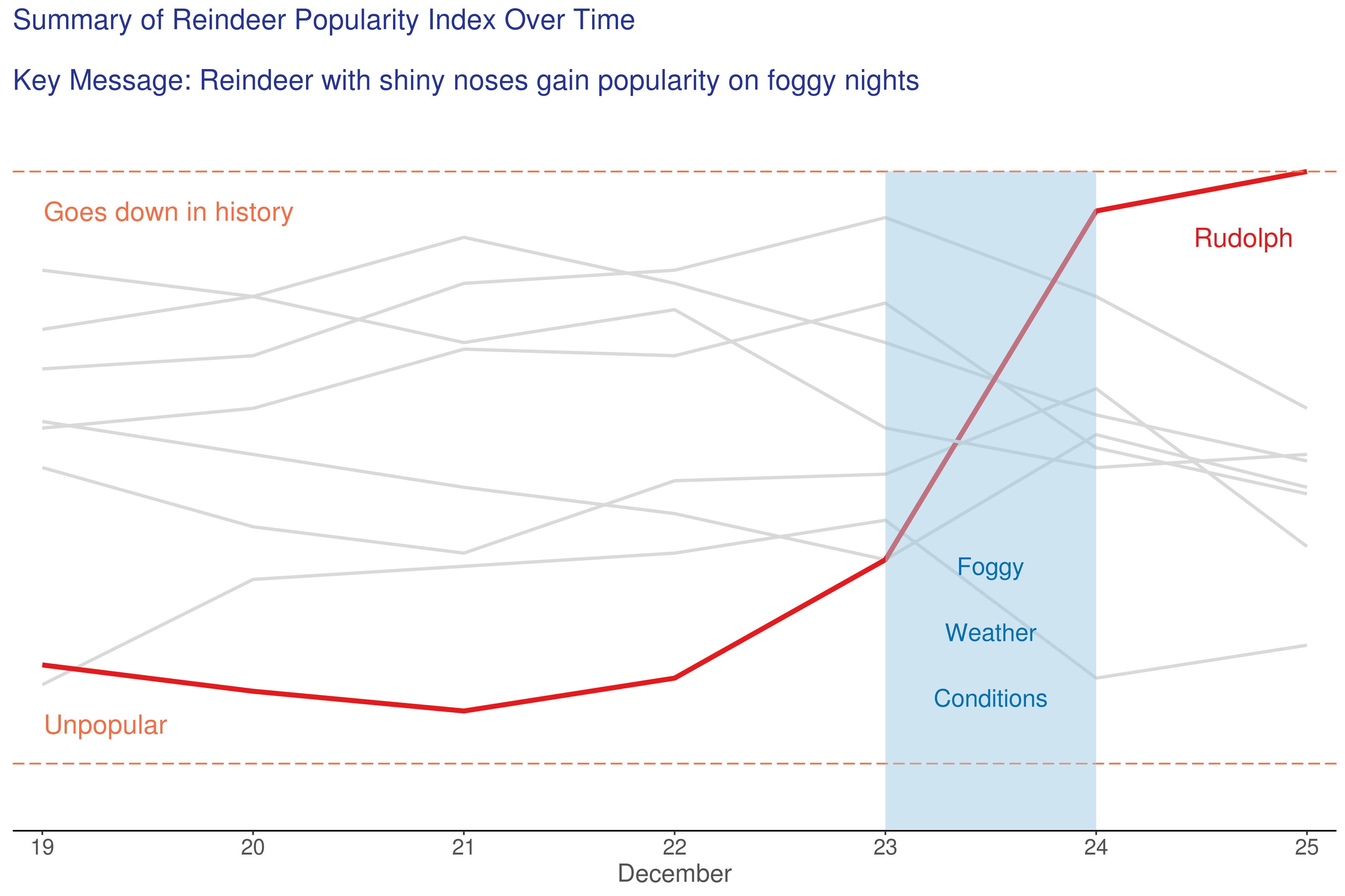
Festive Reindeer Plots
In this entry, we do a little festive fun. We hope you will enjoy it!
Wonderful Wednesdays December 2020
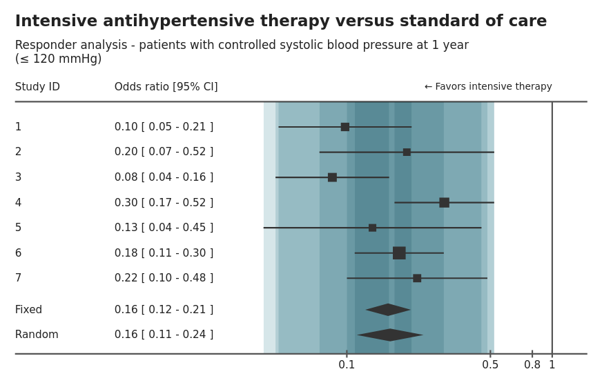
Mark Baillie guides us through the submissions for the meta-analysis data set. The purpose of the challenge was to explore how data visualisation can be deployed to find insights when faced with big data. Big data in the pharma setting typically means wide data i.e. more variables than observations. We went through a number of interesting submissions from a shiny application of a forest plot, an interactive application to explore relationships between variables, an application that provides a workflow for developing a prognostic model, through to exploratory plots using small multiple ridge and scatter plots. A lesson from the challenge is to always visualise your data to avoid surprises.
Wonderful Wednesdays November 2020
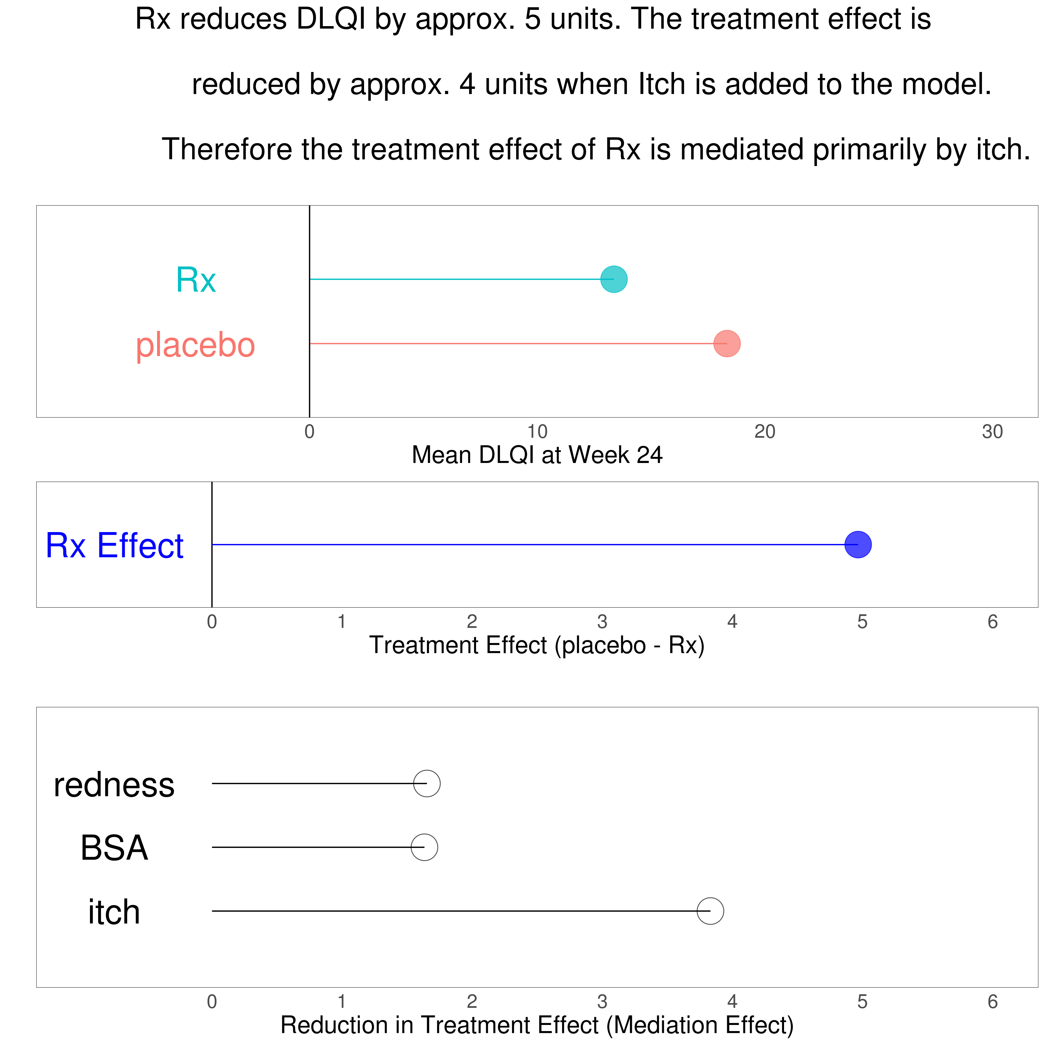
Zachary Skrivanek guides through a number of data visualisations explaining a mediated treatment effect on patient reported quality of life. In addition the problem of missing data should be handled within the graphical representation. A Lollipop plot and a bar chart were presented as well as multiplot solutions using correlation plots or a combination of scatter plots, modelling plots and distribution plots. A point of discussion was the usability of a parallel coordinates plot. Another proposal used a Bayesian model displaying the results in an impressive grable – a combination of graphic and table. The last approach used an innovative way of storytelling with data called scrollytelling.
Wonderful Wednesdays October 2020
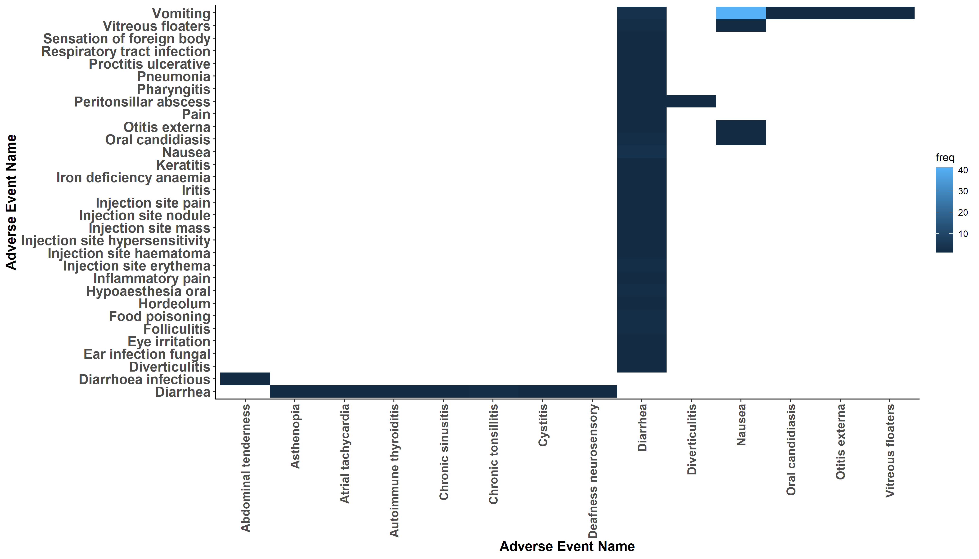
Abi Williams presented data visualisations on co-occurrence of adverse events. How to display events that occur at the same time in the same patient and highlight differences of treatment or gender? A variety of very different approaches was discussed. The first visualisation was a heatmap for the frequency of co-occurrences. A Lollipop plot combined the frequency with the overlap time. Then a Shiny App made interactive exploration of up to 4 co-occurring events possible. The presentation of an UpSet plot brought up a discussion on the advantages over the vinn diagram. The shiny app AdEPro was referred to as an useful exploration tool for adverse event in general. Another tool for exploring the co-occurrence in particular was the force directed network graph. The final approach was embedded in a PowerBI Dashboard.
Wonderful Wednesdays September 2020
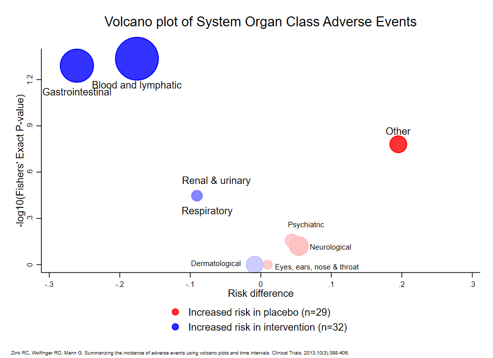
How to display safety data? This month's challenge has shown there are very different ways to visualize adverse event data. Although the example data set was from a two-arm study and relatively simple, the display of type of AE, frequency, timing, severity and seriousness is not easily combined in one plot.
Wonderful Wednesdays August 2020
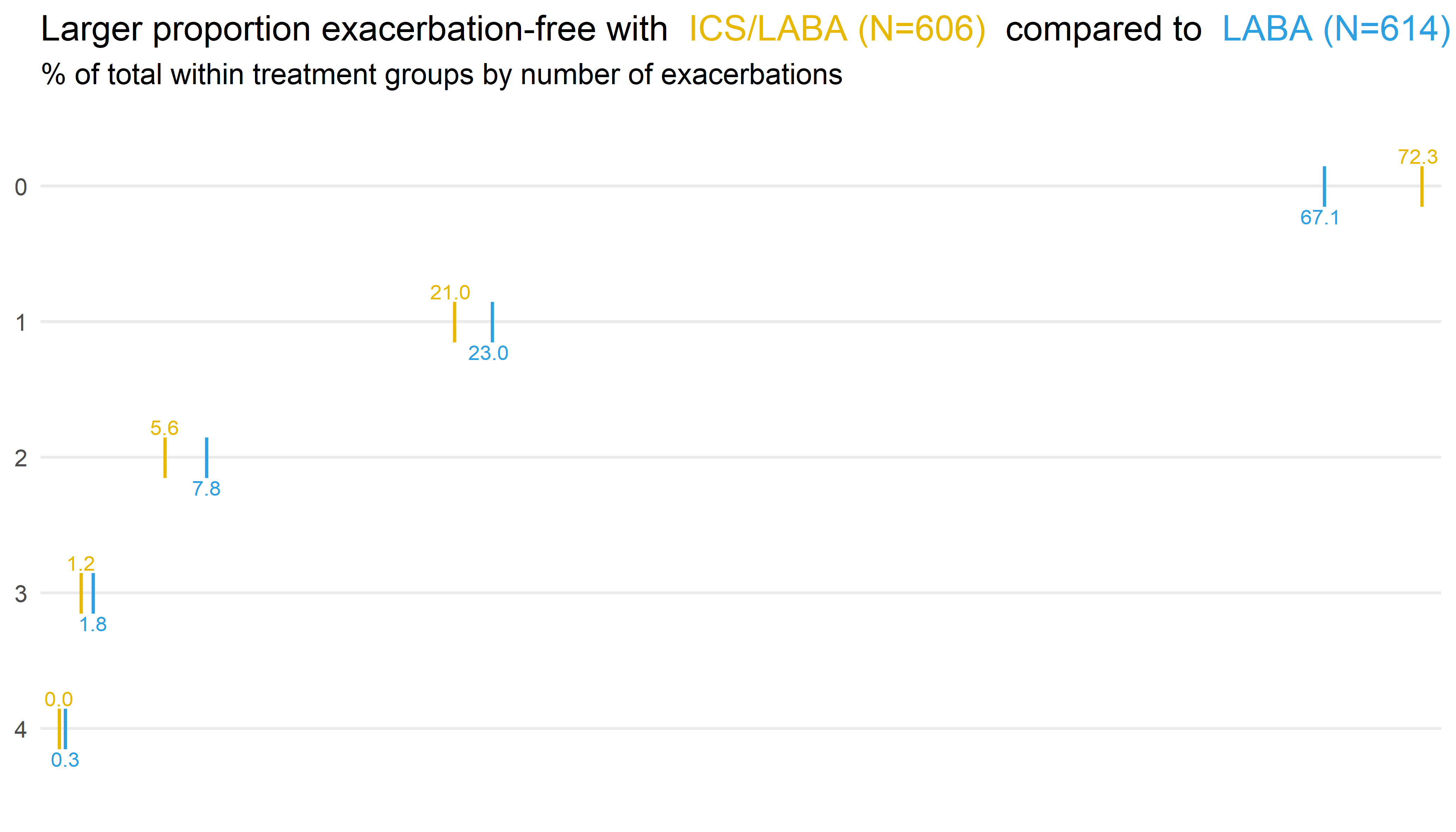
In this month’s webinar, we discussed an exacerbation example data set. The data is based on the RISE study for patients with moderate COPD. The primary endpoint is the number of exacerbations during a six month treatment period. Event data – but patients can (and do) have multiple exacerbations. Statistical analysis used a Negative Binomial model. The dataset also included other variables which (may) effect the exacerbation rate: % Predicted Normal of Forced Expiratory Volume in 1 second (FEV1), Exacerbations in previous year, and Region / Gender. The challenge was to produce a data visualisation incorporating the information on the number of exacerbations observed. The discussed visualisations included a straightforward and clear presentation of the number of exacerbations, a Power BI app, longitudinal plots, and a display of patient-level outcomes.
Wonderful Wednesdays July 2020
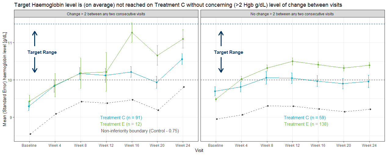
This month's challenge was to summarise changes in haemoglobin (Hgb) concentration over time in patients with anaemia associated with Chronic Kidney Disease (CKD). An experimental medicine was compared with a control group, but in addition to demonstrating efficacy, there was a special interest in visualising intra-individual variability, as large changes in Hgb are a potential safety concern. The visualisations presented ranged from grouped line plots over time, Sankey-diagrams and line plots with quantile bands for summary views and a lasagna plot for the display of individual data. Some general hints were given on how to define suitable color palettes for graphs depending on the type of data. Presented by Steve Mallett.
Wonderful Wednesdays June 2020
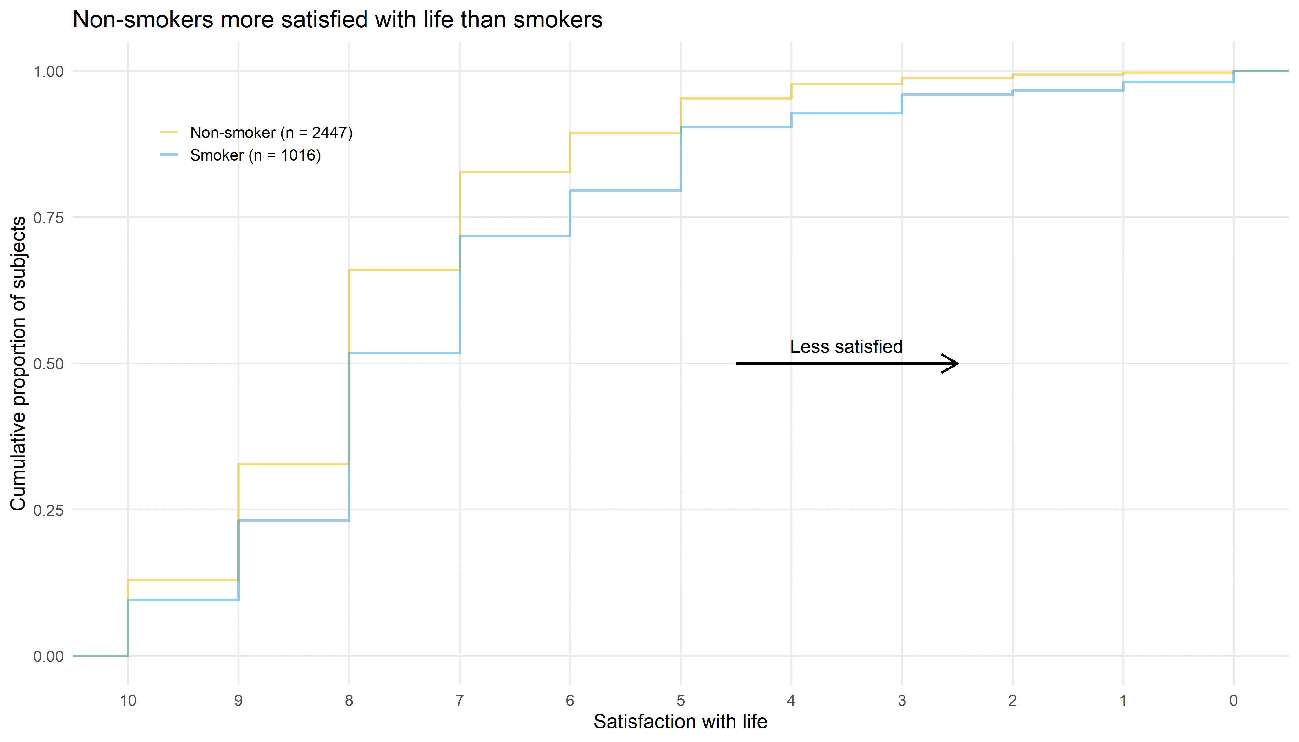
This month the discussion is about visualizations of the satisfaction data using cumulative distribution functions, a tree plot, staggered bar plots, a power BI dashboard and two interactive funnel plots using plotly and RShiny. These examples nicely demonstrate that different displays support different purposes. Some visualizations are telling a story about the data and others help to explore the data. Presented by Bodo Kirsch.
Wonderful Wednesday April 2020
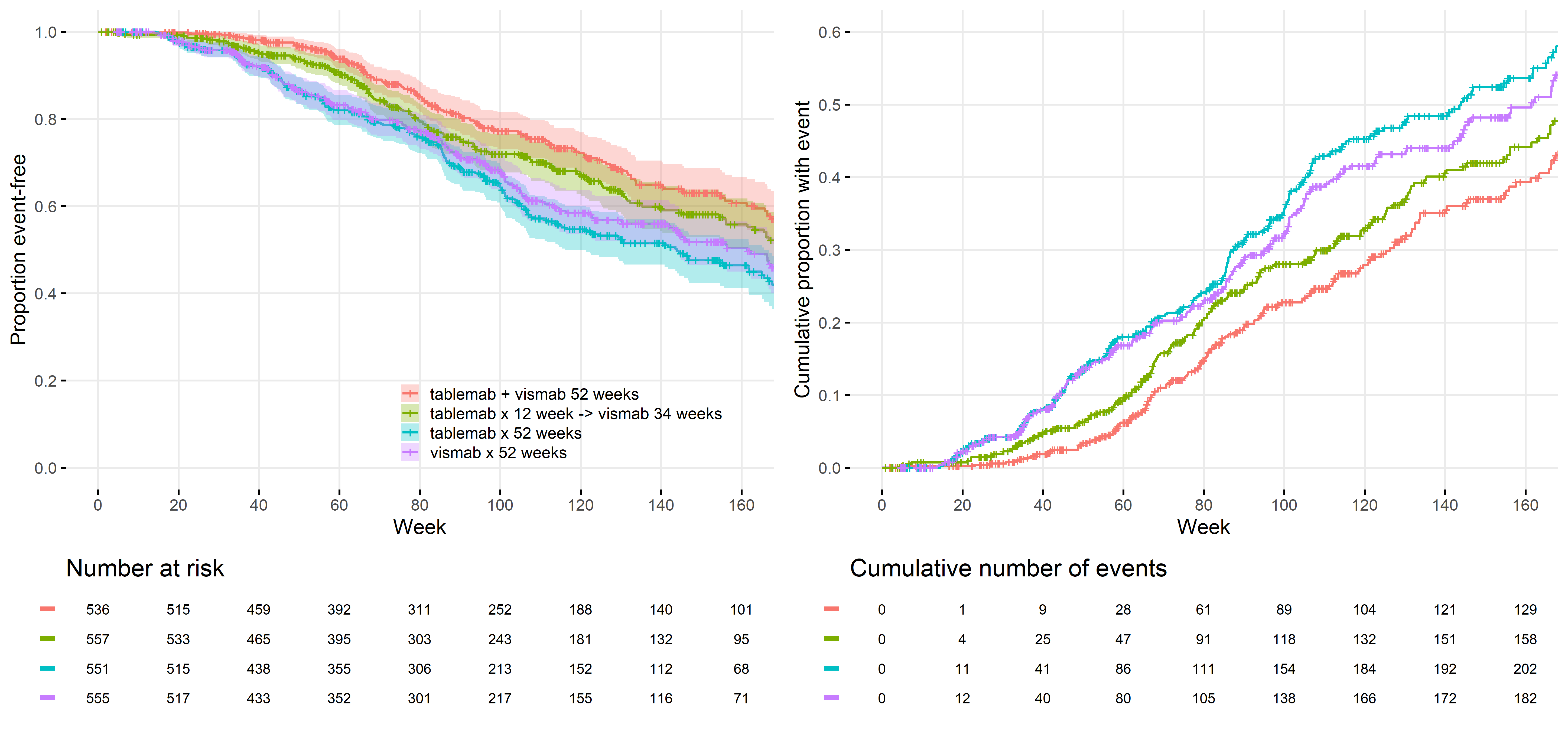
In this webinar we discuss the first submissions looking at some great ways to visualise a categorical response variable over time. We talk about what the SIG members like about each plot and give some pointers on areas we think could be improved. More specifically, we talk about: the value of a title with conclusions, the use of colour, the benefits of animation to display time, ways to declutter your graph and examples of clean design, enclosure to highlight important parts of the data, the benefits of the sankey diagram, how different charts help to answer different questions, and many more aspects of great visualizations.

Wonderful Wednesdays March 2020
The VIS SIG is happy to introduce a new initiative called “Wonderful Wednesdays”. This initiative will provide the participants to not only learn theoretically about visualisation principles but also apply them to relevant examples from the field of healthcare and the development of new therapies. This webinar kicks off the webinar series by giving an introduction into principles of visualization and an overview of the process. The first dataset is also introduced.
Wonderful Wednesdays Overview
This provides a short overview of our Wonderful Wednesdays Webinars.