This is a snapshot from a two-year clinical trial assessing the impact of a drug on growth measurements (stature, weight and BMI) in children as part of a regulatory commitment for a marketed drug. There is a placebo comparator arm that converts to active drug at 6 months and additional rescue medication is allowed.
The challenge is to use visualizations to assess if there is an adverse impact on children’s growth due to taking a drug. To do so, participants had to display effects on development over time. Although the topic led to more exploratory visualizations, the organizers also encouraged participants to develop explanatory graphs.
Example 1. Change from baseline over time
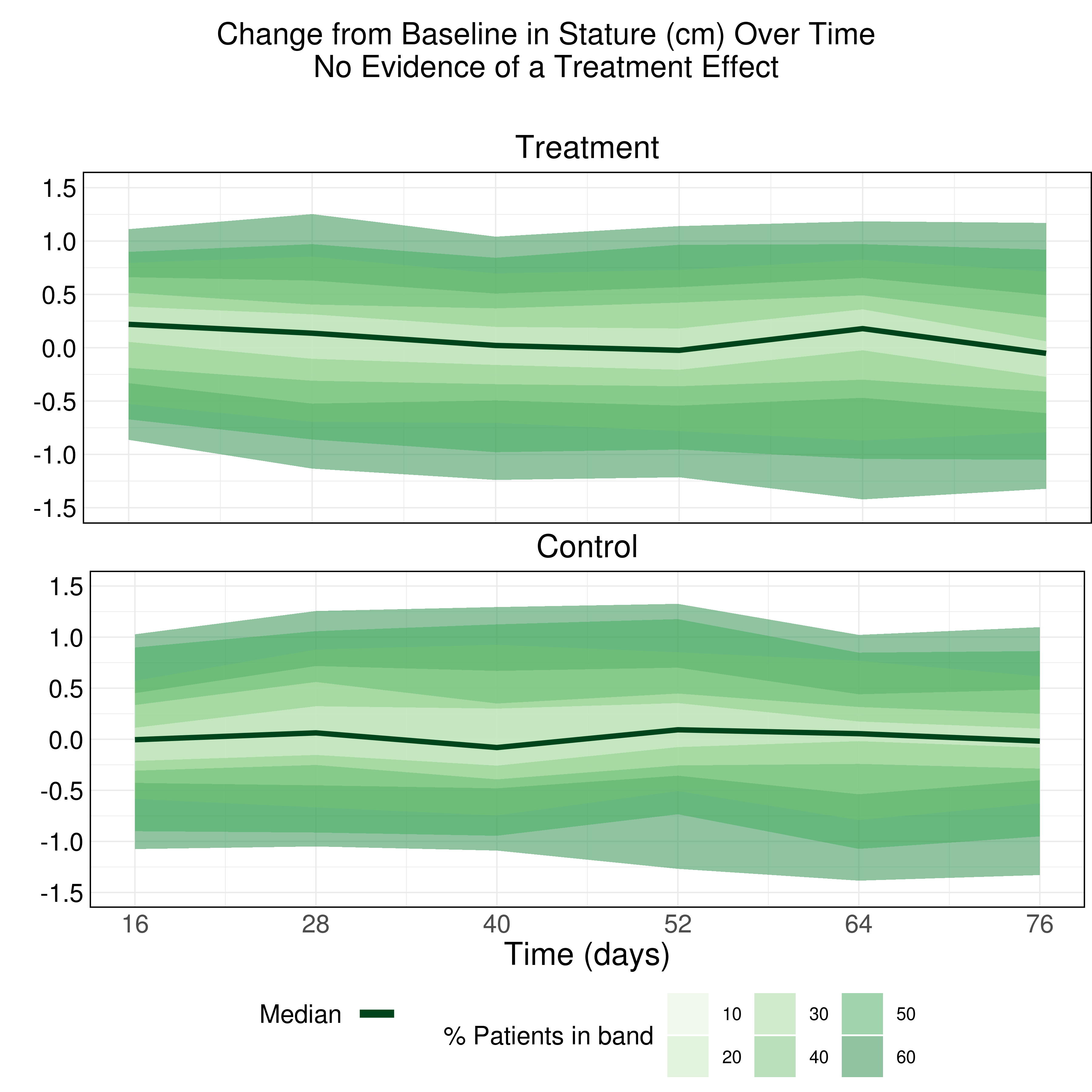
The first entry encoded the change from baseline in stature’s distribution with color. The area graph used contours and shades of green to highlight the percentages of patients that had a specific shift from baseline over time.
The panelists liked the descriptive title. They also made a few suggestions to improve the chart:
- Removing the opacity of the areas: the overlap of the shades made the bands hard to read.
- Using colors that highlight the highest percentages instead of the lowest ones.
- Labeling de bands to better identify groupings.
Example 2. Animated Z-Score
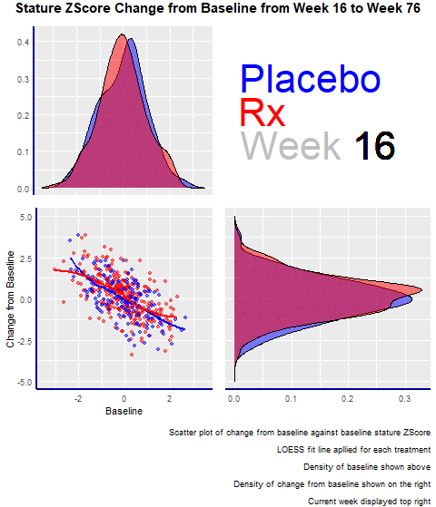
The second entry was an animated scatterplot and density plot: an exploratory visualization that showed the data over time and let viewers draw their conclusions.
The graph had four panels:
- The top left panel showed the baseline distribution for the two groups
- The bottom right one displayed the change from the baseline distribution.
- The bottom left had a scatterplot showing the change from baseline and baseline for the two groups.
- The panel enjoyed the animations and highlighted its minimalistic design, where there are no duplicated elements, such as axis titles. A design change that would have made the entry even better would have been to increase the contrast between the dots and the trend lines in the scatterplot.
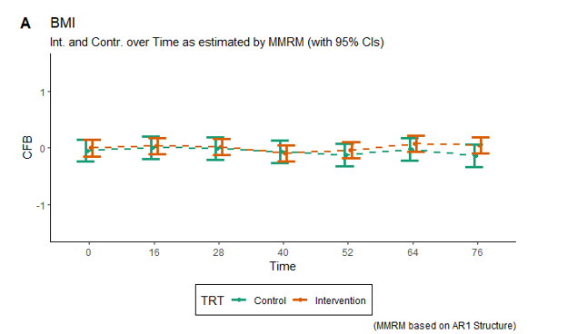
Example 3. BMI - error bars
The third entry is a dot plot with whiskers showing confidence intervals and trendlines connecting treatment values. The visualization displayed a lot of data and how the treatments deviated.
The panelists made a few suggestions on how to improve the graph:
- The first step would be to consider which elements need to pick the audience’s attention first and structure the visual hierarchy around them.
- Following that idea, those shapes -in this case, the dots- need to be the first thing they see.
- Everything else, the trendlines or the CIs (Confidence intervals), can be knocked back and made just supportive elements -by simplifying them or making them lighter-.
Another point that was mentioned was to make the textual elements more descriptive. Having the abbreviations meaning, or writing down the unit of the time axis, would have helped viewers understand the chart.
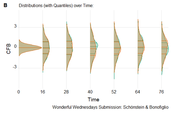
Example 4. Density plots
The fourth entry showed distributions over time. In this challenge, the expectation was that most of the changes from baseline should be 0, which is what this visualization highlights.
It’s an especially useful graph that lets you see the distributions over time. It helps you see differences and find extreme values. It also includes the quartiles that facilitate making comparisons between the two groups.
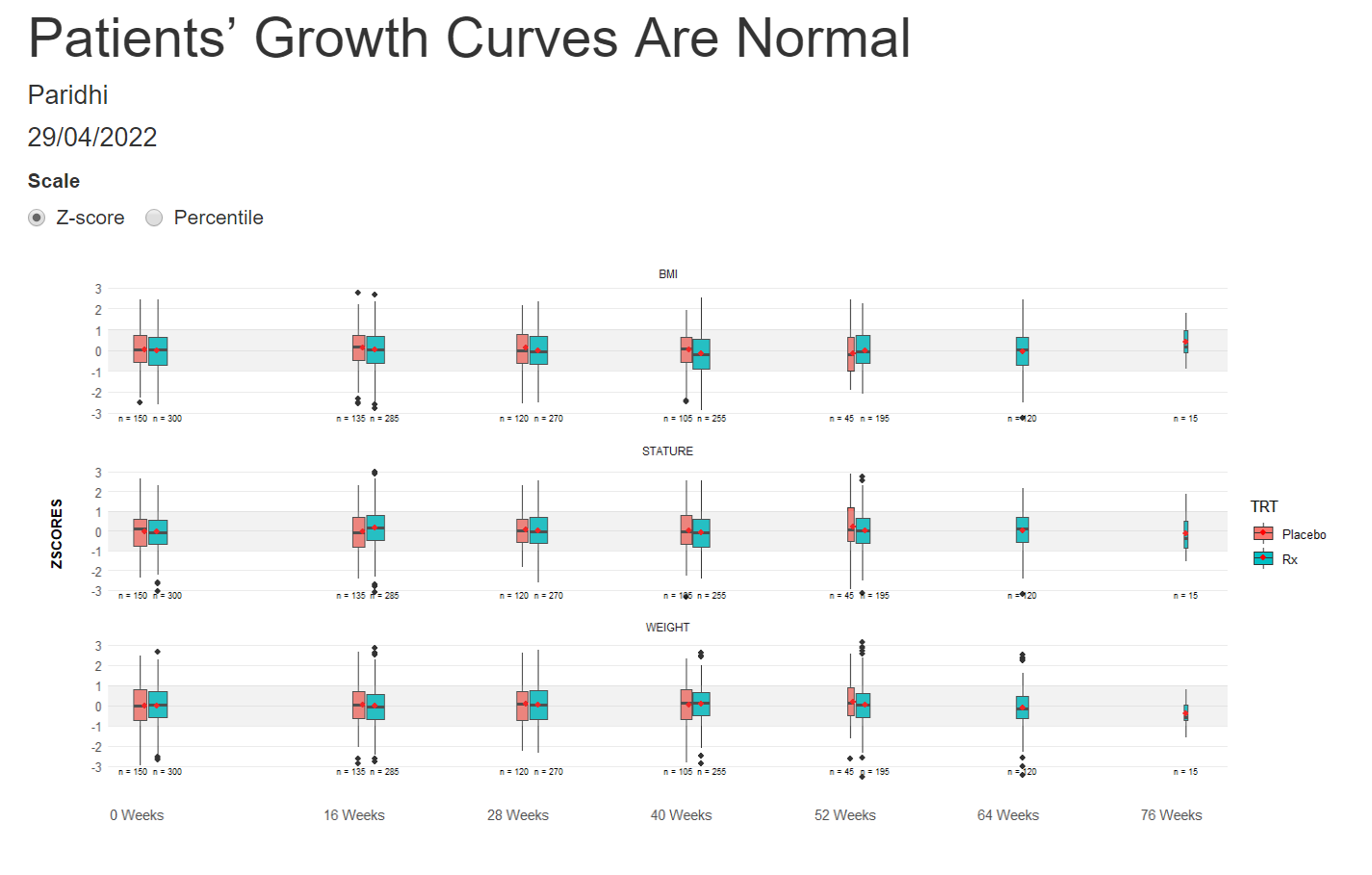
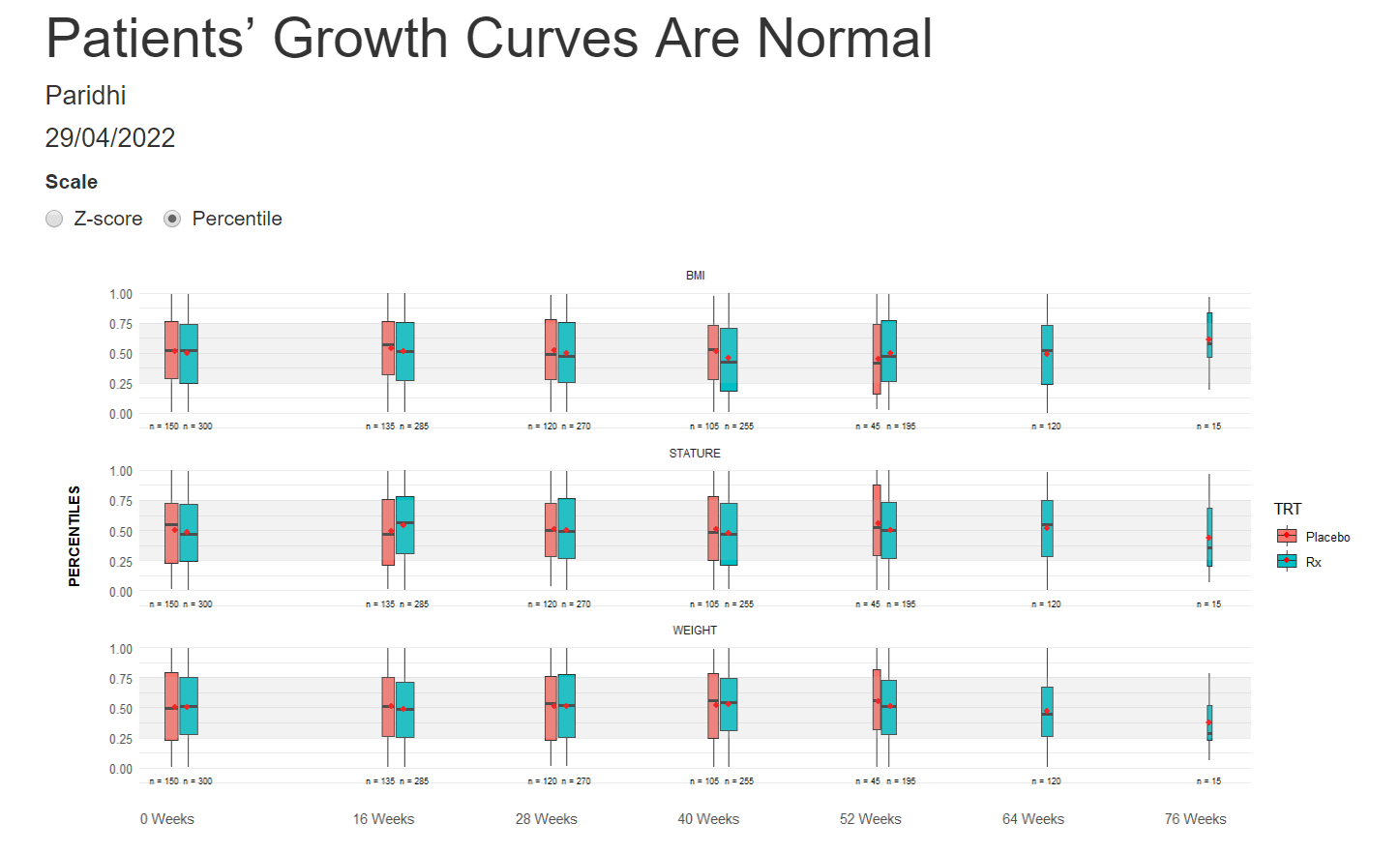
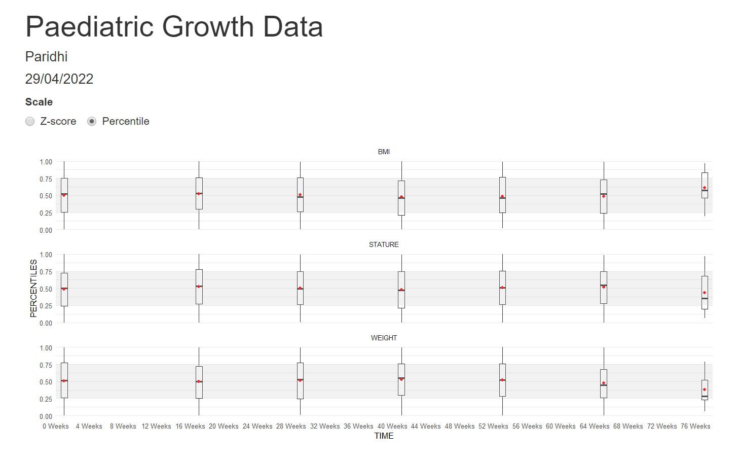
Example 5. Box plots

high resolution image 1
high resolution image 2
high resolution image 3
high resolution image 4
The last visualization is box plots over time. A shaded area highlights the band [1, -1], which should fit around 50% of the data. The width of the box plots is also proportional to the number of participants in each treatment group. The X-Axis is also relative to the time points.
The panel liked all the little additions to make the box plots more understandable and representative. They would have liked more separation between the treatment groups to help make comparisons between them.
Code
Example 1. Change from baseline over time
library(haven)
library(dplyr)
library(tidyr)
library(ggplot2)
library(grid)
library(gridExtra)
library(readxl)
library(cowplot)

hgb1 <- read_excel("/.../growth.xlsx") %>%
  filter(MEASURE == "STATURE" & TRT == "Rx" & TIME != 0)

quant1 <- hgb1 %>% group_by(TIME) %>%
  do(quant = quantile(.$CFB, probs = seq(0.2,0.8,.05)), probs = seq(0.2,0.8,.05)) %>%
  unnest(cols=c(quant, probs)) %>%
  mutate(delta = 2*round(abs(.5-probs)*100)) %>%
  group_by(TIME, delta) %>%
  summarize(quantmin = min(quant), quantmax= max(quant)) %>%
  filter(delta > 0)

# Derive median Hgb

hgb_med1 <- hgb1 %>%
  group_by(TIME) %>%
  summarise(hgb.median = median(CFB))

# Produce plot for group E

plot01 <- ggplot() +
  geom_ribbon(data = quant1, aes(x = TIME, ymin = quantmin, ymax = quantmax,
                                    group = reorder(delta, -delta), fill = factor(delta)),
              alpha = .5) +
  geom_line(data = hgb_med1, aes(x = TIME, y = hgb.median, color = "#00441b"), size = 2 ) +
  scale_x_continuous("Time (days)",
                     breaks=c(16, 28, 40, 52, 64, 76),
                     limits=c(16, 76)) +
  scale_y_continuous(" ",
                     breaks=c(-1.5, -1.0, -0.5, 0, 0.5, 1.0, 1.5),
                     limits=c(-1.5, 1.5),
                     ) +
  scale_fill_manual("% Patients in band", values=c("#e5f5e0","#c7e9c0", "#a1d99b", "#74c476", "#41ab5d", "#238b45", "#006d2c")) +
  scale_color_identity(name = " ",
                       guide=legend,
                       labels = " ") +
  theme_minimal() +
  theme(legend.position="none",
        axis.title.x=element_blank(),
        axis.text.x=element_blank(),
        axis.ticks.x=element_blank(),
        axis.text.y.left =  element_text(color = 'black'),
        plot.title = element_text(hjust = 0.5, size = 25),
        text = element_text(size = 15),
        axis.text = element_text(size = 20),
        axis.title = element_text(size = 25),
        panel.border = element_rect(colour = "black", fill=NA, size=1),
        plot.margin=unit(c(1,0,0,0),"cm")) +
  ggtitle(label = "Treatment")

hgb2 <- read_excel("/.../growth.xlsx") %>%
  filter(MEASURE == "STATURE" & TRT == "Placebo"  & TIME != 0)


quant2 <- hgb2 %>% group_by(TIME) %>%
  do(quant = quantile(.$CFB, probs = seq(0.2,0.8,.05)), probs = seq(0.2,0.8,.05)) %>%
  unnest(cols=c(quant, probs)) %>%
  mutate(delta = 2*round(abs(.5-probs)*100)) %>%
  group_by(TIME, delta) %>%
  summarize(quantmin = min(quant), quantmax= max(quant)) %>%
  filter(delta > 0)

hgb_med2 <- hgb2 %>%
  group_by(TIME) %>%
  summarise(hgb.median = median(CFB))

plot02 <- ggplot() +
  geom_ribbon(data = quant2, aes(x = TIME, ymin = quantmin, ymax = quantmax,
                                    group = reorder(delta, -delta), fill = factor(delta)),
              alpha = .5) +
  geom_line(data = hgb_med2, aes(x = TIME, y = hgb.median, color = "#00441b"), size = 2) +
  geom_segment(x=17, y=1, xend=75, yend=1, color="black") +
  scale_x_continuous("Time (days)",
                     breaks=c(16, 28, 40, 52, 64, 76),
                     limits=c(16, 76)) +
  scale_y_continuous(" ",
                     breaks=c(-1.5, -1.0, -0.5, 0, 0.5, 1.0, 1.5),
                     limits=c(-1.5, 1.5),
  ) +
  scale_fill_manual("% Patients in band", values=c("#e5f5e0","#c7e9c0", "#a1d99b", "#74c476", "#41ab5d", "#238b45", "#006d2c")) +
  scale_color_identity(name = "Median",
                       guide=legend,
                       labels = " ") +
  labs(fill = "Hgb (% patients in band)") +
  theme_minimal() +
  theme(legend.position="bottom",
        plot.title = element_text(hjust = 0.5, size = 25),
        text = element_text(size = 15),
        axis.text = element_text(size = 20),
        axis.title = element_text(size = 25),
        axis.text.y.left =  element_text(color = 'black'),
        legend.text=element_text(size=14),
        legend.title=element_text(size=20),
        legend.key.size = unit(1.2, "cm"),
        panel.border = element_rect(colour = "black", fill=NA, size=1)) +
  guides(colour = guide_legend(override.aes = list(size=3))) +
  ggtitle(label = "Control")

p <- grid.arrange(arrangeGrob(plot01, ncol=1, nrow=1),
                  arrangeGrob(plot02, ncol=1, nrow=1),
                  heights = c(1,1.32))

title <- ggdraw() + draw_label("Change from Baseline in Stature (cm) Over Time\nNo Evidence of a Treatment Effect", size = 24)

p2 <- plot_grid(title, p, ncol=1, rel_heights = c(1, 10))

gsave("/.../growth.png", p2, width=12, height=12, dpi=300)
Example 2.
No code has been submitted.
Example 3.
No code has been submitted.
Example 4.
No code has been submitted.
Example 5.
The rmd file for the graphs 1 and 3 can be found here.
The rmd file for the graphs 2 and 4 can be found here.