This month’s challenge involved a classic survival dataset example. You can download the dataset here. This simulated example dataset was based on a phase III clinical trial in breast cancer, you can read more about this study here. To summarise, this was a four-arm study, where participants were randomised to receive either one of two monotherapies or one of two combination therapies for 1 year with 4 years post treatment follow-up. The primary outcome was progression free survival and we wanted you to explore different ways of visualising this time-to-event outcome. The dataset contained information that allowed you to explore subgroups, patterns of events and individual patient profiles. More information on the dataset is available here.
We received a variety of submissions in this round including both static and interactive plots and we would like to thank everyone for their contributions. In the webinar members of the VIS SIG discussed the merits of each and picked out key elements they felt would make the ‘ultimate plot’. We summarise the discussions for each submission below.
Example 1

link to code
high-resolution image
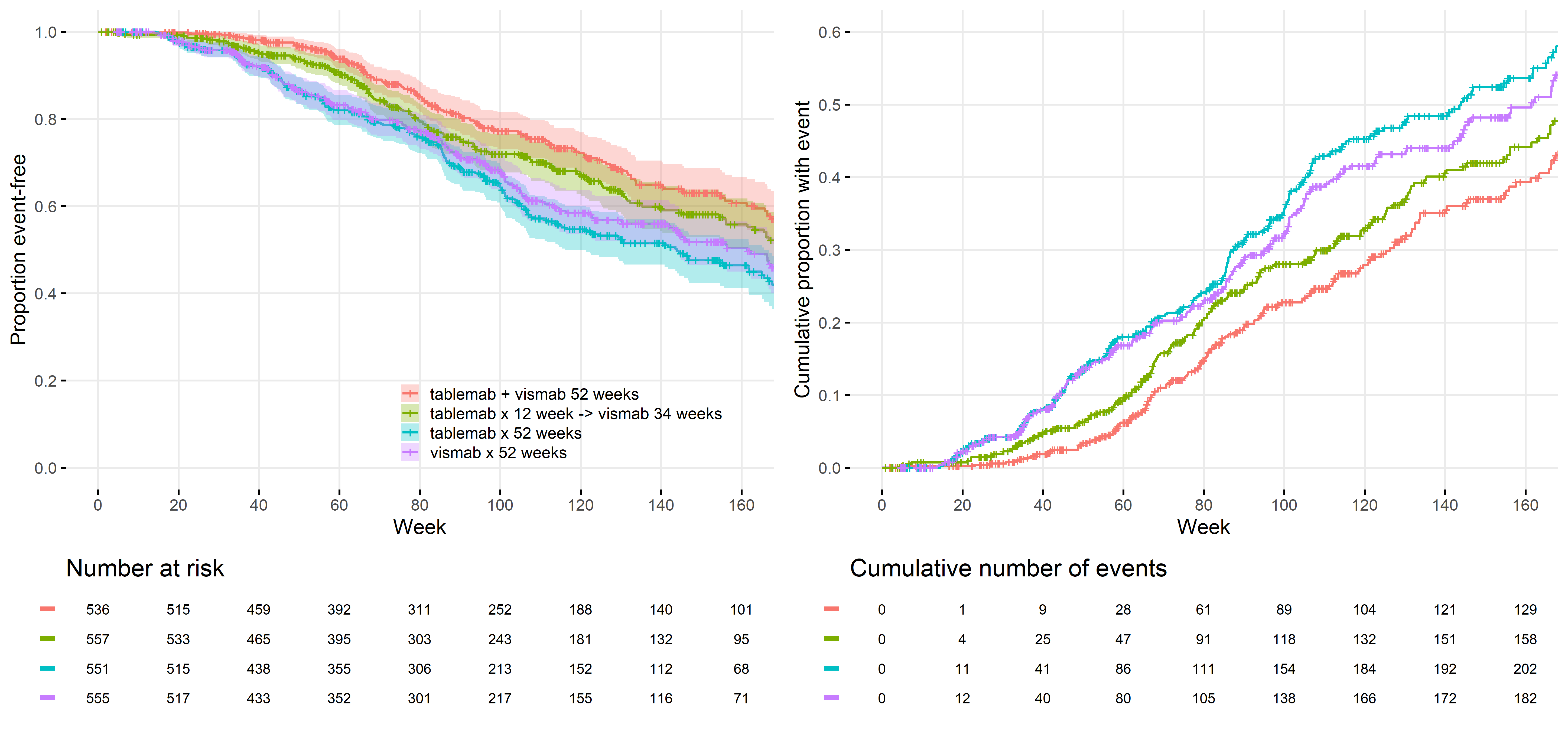
On the left this plot displays the proportion of participants that are event free over time by treatment arm and on the right we can see the cumulative number of events over time by treatment arm. Inclusion of both of these figures into one image gives a view of the data which we don’t often see. Inclusion of uncertainty is also not often seen in Kaplan-Meier plots (but has been advocated in this recent publication from Morris et al.) but is extremely useful and the clutter from the overlap of the confidence bands is perhaps less problematic with inclusion of the cumulative plot on the right. The team liked the inclusion of the tables of numbers at risk and the cumulative number of events at the bottom of each plot, this is important information, and we felt this approach didn’t overload or create a cluttered image. We thought there was a nice use of colour.
Whilst there is clear labelling of the axis and the inclusion of a common legend ensures clarity this image would benefit from inclusion of some extra details to allow it to stand-alone, for example it would benefit from inclusion of a title. In terms of creating a clearer image we also felt that the dashes to indicate censoring in the image on the left could be omitted given the information on numbers at risk are available at the bottom of the plot.
This is a nice example of an exploratory type plot that statisticians can use to understand the data but if the aim is to communicate a message to stakeholders then we would suggest presenting less information in a simpler graphic.
Example 2

link to code
high-resolution image
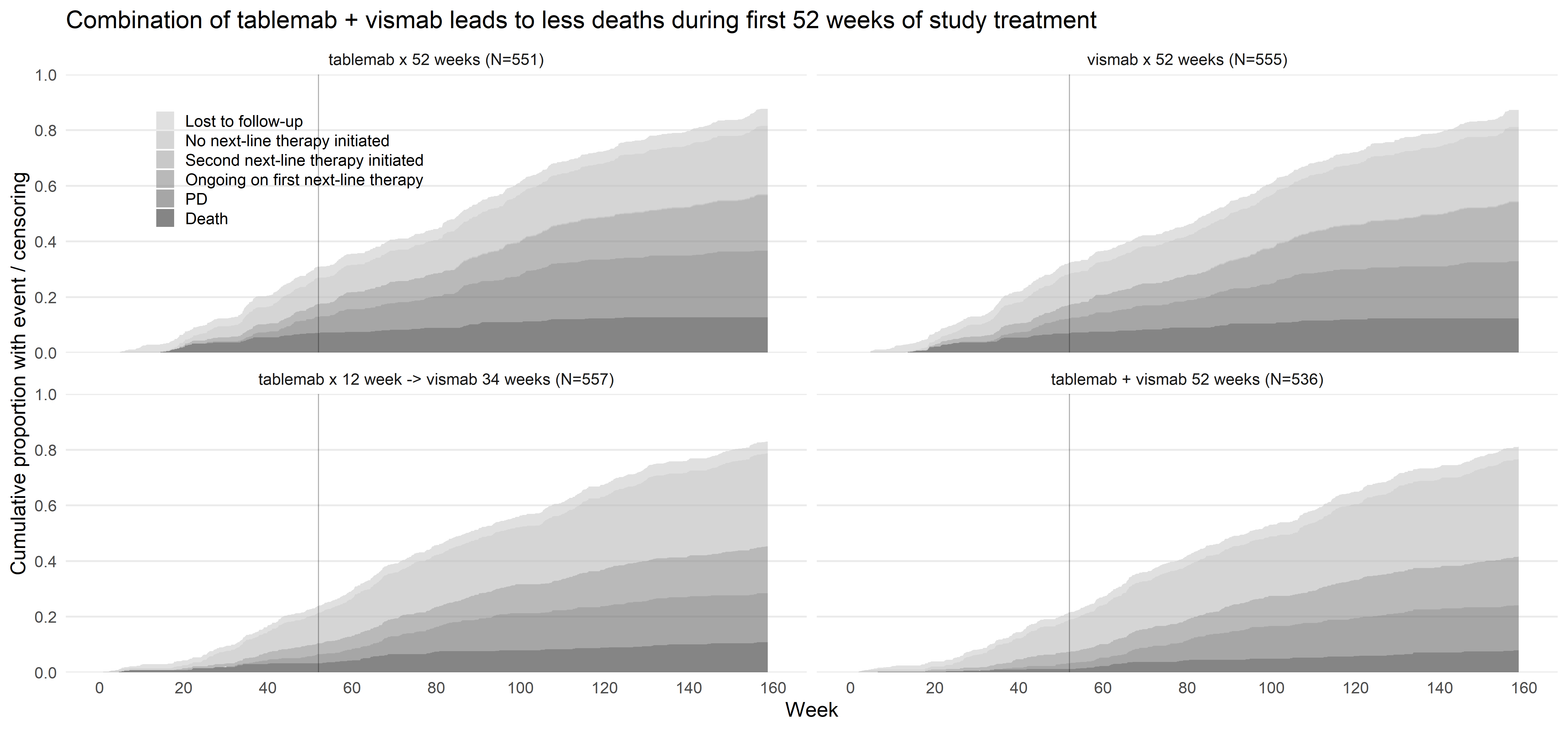
This presentation of the data displays the cumulative proportion of participants experiencing an event. It includes a separate plot for each treatment arm and the inclusion of subtitles ensures clarity. This plot is being used to tell a story, which the title guides us towards. Inclusion of a reference line at an important time point is helpful to guide the audience’s attention. Labelling the x and y-axis only once prevents clutter and in combination with the inclusion of the reference lines makes this a clear presentation of the data. This demonstrates an effective use of graduation of saturation and clear annotation.
The team noted that there are six colours of grey in the legend but that it was difficult to pick out all six groups in the image. This was because one of the groups is very small. However, it’s tricky to pick out which group this is so we caution potential users to be mindful of this in their own plots.
This is an original, well thought through presentation of survival data which we commend and think would work well where the is a natural ordering of the groups.
Example 3

link to code
high-resolution image
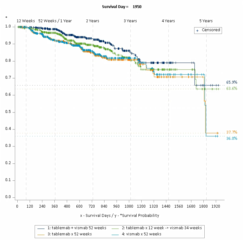
This is a very nice, interactive visual presentation of a growing or developing Kaplan-Meier plot link. This image included some really nice design points that update as the image progresses that can help to tell a story. These included:
- The percentages on right y-axis changing as the video plays,
- The inclusion of an additional x-axis at the top of the plot that is populated as it progresses,
- The developing reference lines that follow the data as the plot progresses.
The team felt that this interactive approach could help understanding and interpretation amongst those not so familiar with Kaplan-Meier plots. It’s a potentially useful way to force the viewer to take the entire time period into consideration and not just the final time point when there is often the most uncertainty.
With some additional information on the right y-axis such as estimates of treatment effects this could be a really powerful design choice. A minor point was that it would be nice to include treatment labels with the numbers on the right y-axis so the audience do not have to keep referring back to the legend as the image progresses.
Example 4

link to code
high-resolution image
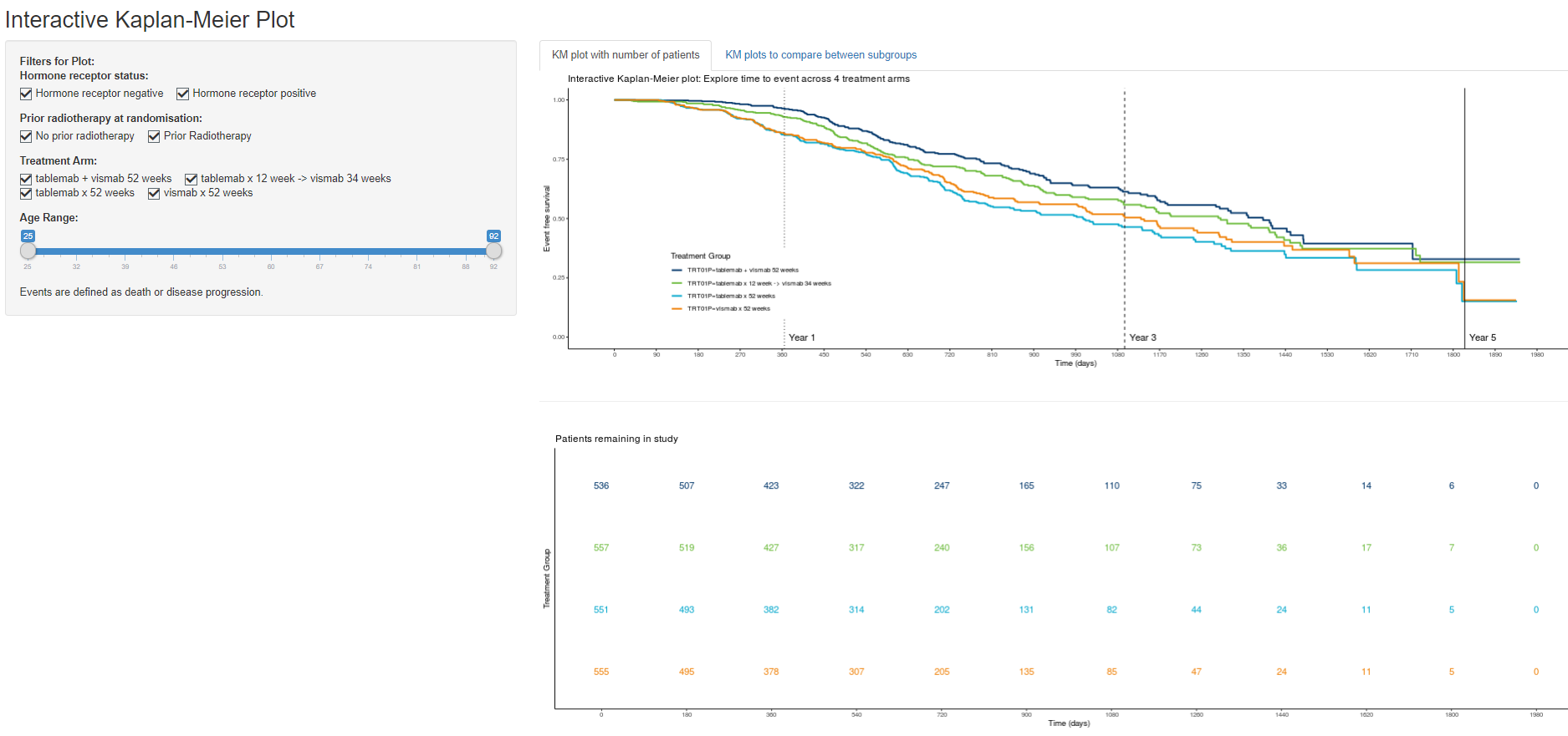
This is a very flexible tool to display Kaplan-Meier plots that explores the subgroup element of the challenge link. It allows the user to change what is presented e.g. displaying information on different treatment groups, different subgroups, or restricting information presented by the age range of participants. Including the legend within the plot and use of grid lines both help audiences to interpret this image.
This is a nice way to present the data for exploratory purposes. It would be nice to include sample sizes and confidence intervals within this tool to represent the uncertainty and minimise the risk of making incorrect conclusions.
Example 5

link to code
link to html file
high-resolution image
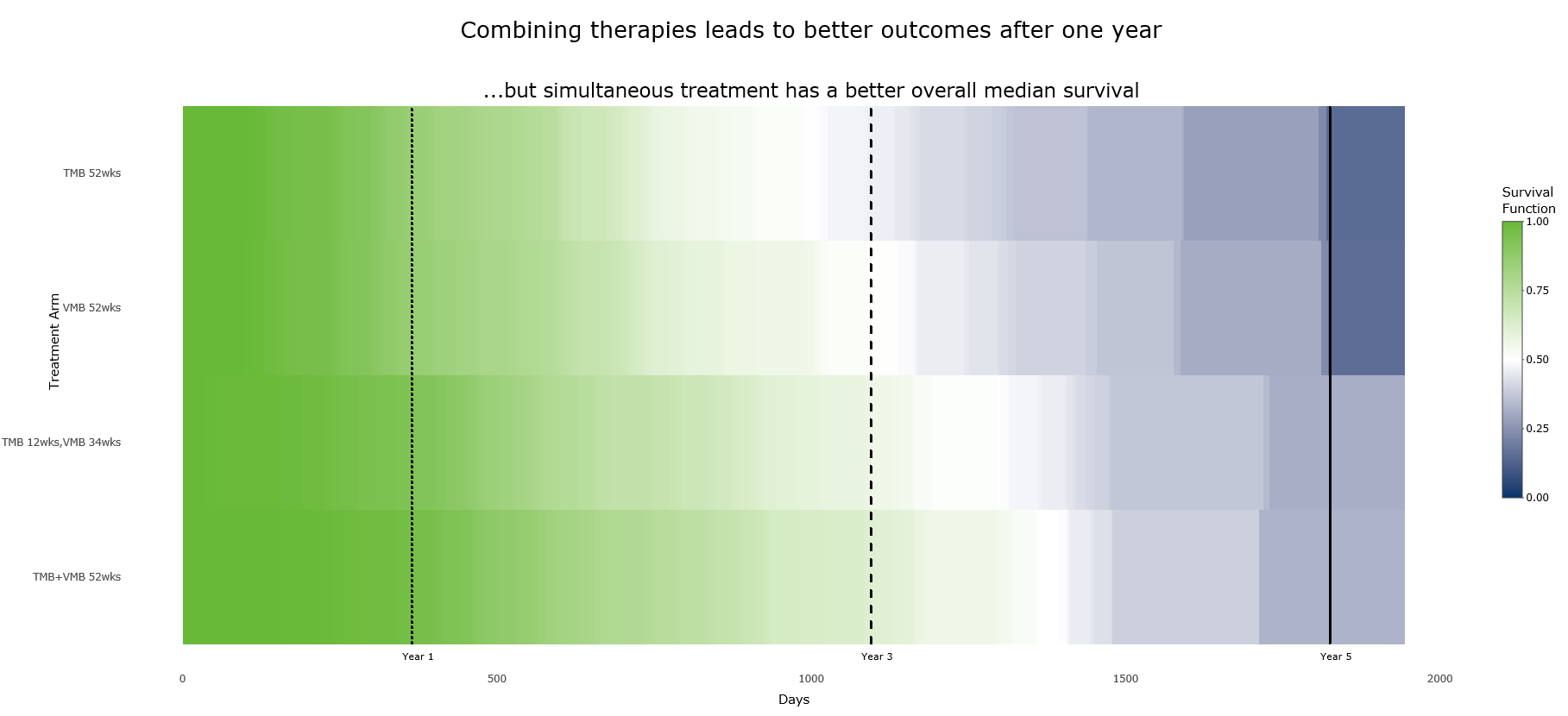
The use of a heat map to present survival data is a new idea to the group. At first some of us found it difficult to understand but with some thought it definitely becomes clearer. Given the novelty of this plot it probably needs more information to explain what is going on but could be very useful to help deliver a message to audiences. Inclusion of a clear message in the title and the ordering of the data in a way that the image portrays this really helps i.e. the white stripe representing the median helps show differences between treatment arms.
As well as a ‘big picture’ message from the changes in colour there is also an interactive element to this plot allowing more detailed information to be provided, as the user hovers over different points on the plot information on the survival function at that time point is displayed. Similarly hovering over the reference lines displays further information.
Example 6

link to code
high-resolution image
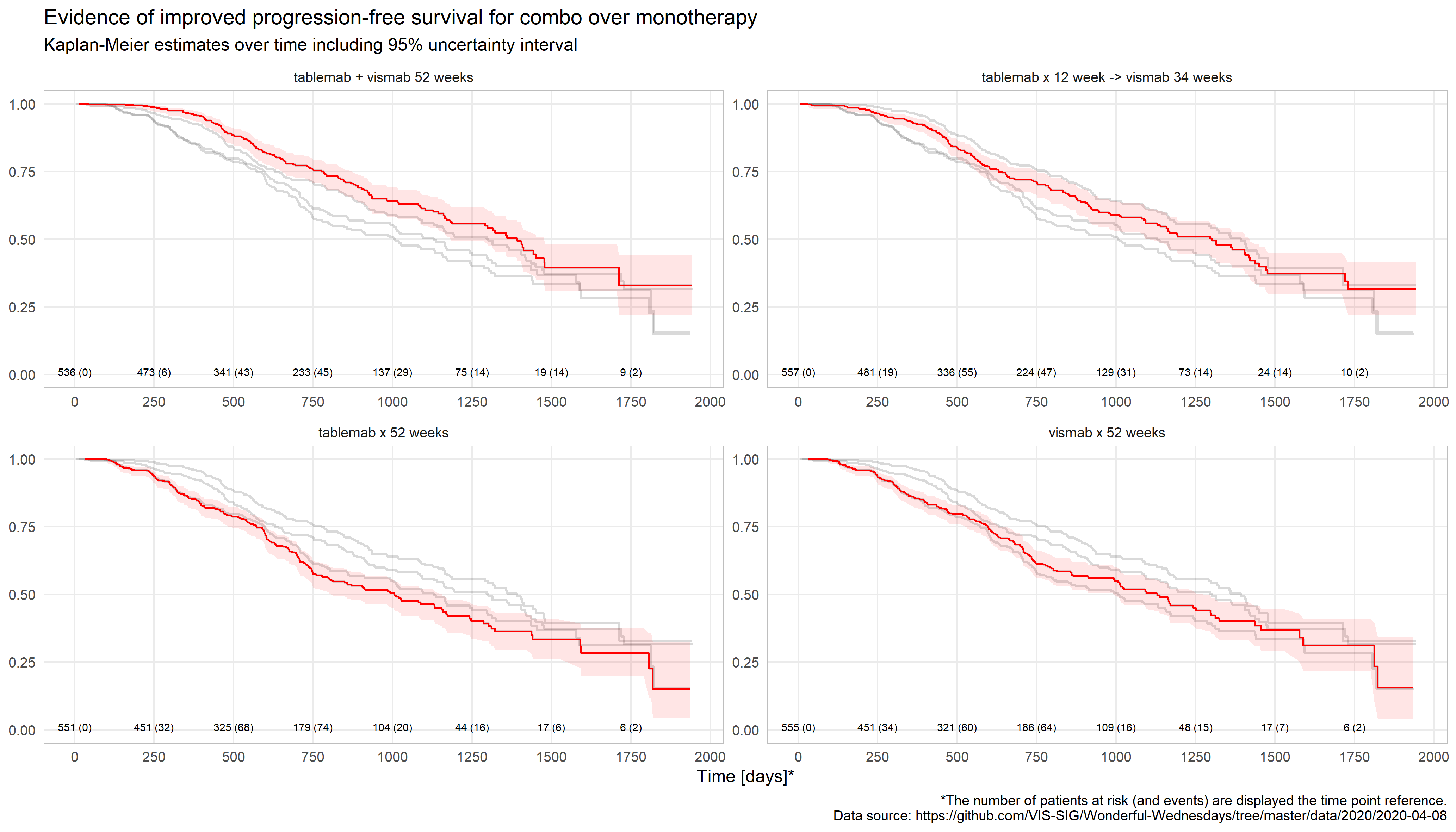
This image displays a Kaplan-Meier plot for each treatment arm with accompanying confidence bands with inclusion of other treatment arms in grey for comparison. This is simple, clear plot exhibiting use of good data visualisation principles. We liked the clear message in the title, inclusion of numbers at risk for each plot rather than in a table and the use of grid lines. The team felt that this plot would be good for communicating a message.
Minor adjustments we recommend are: including a more prominent grid line at 52 weeks, including a legend clearly explaining what the red line and reference bands are and changing the scale from days to weeks or months.
Code
Example 1 (R)
### Purpose: create TTE KM plots

### Load packages
library(readr)
library(survival)
library(survminer)
library(stringr)

### Load data
setwd('C:/Users/XXXXXXXXXXXXX')
ADTTE <- read_delim('2020-04-08-psi-vissig-adtte.csv', delim=';')

### AVAL is given in days; transform into weeks
ADTTE$AVAL_wk = ADTTE$AVAL / 7

### Create survival curves
surv_curve <- survfit(Surv(AVAL_wk, CNSR == 0) ~ TRT01P, data = ADTTE)

### Adjust treatment group labels in surv_curve
names(surv_curve$strata) <- str_remove(names(surv_curve$strata), "TRT01P=")

### Theme for plots
theme_table <- theme_minimal(base_size = 18) %+replace%
  theme(panel.grid.major.x = element_blank(), panel.grid.minor.x = element_blank(),  # remove vertical gridlines
        panel.grid.major.y = element_blank(),  # remove horizontal gridlines
        axis.title.y = element_blank(), axis.title.x = element_blank(),  # remove axis titles
        axis.text.x = element_blank(), axis.ticks.x = element_blank())  # remove x-axis text and ticks

theme_gg <- theme_minimal(base_size = 18) %+replace%
  theme(panel.grid.minor.y = element_blank(), panel.grid.minor.x = element_blank(),  # remove minor gridlines
        legend.title = element_blank())  # remove legend title

### Plot
plots <- list()
# Proportion event-free
plots[[1]] <- ggsurvplot(fit = surv_curve,  # survfit object
                         data = ADTTE,  # data used to fit survival curves.
                         break.y.by = 0.2,  # y-axis breaks
                         risk.table = T,  # show risk table.
                         conf.int = T,  # show confidence intervals
                         xlim = c(0, 160),  # present narrower X axis
                         break.time.by = 20,  # x-axis breaks
                         ggtheme = theme_gg,  # use theme defined above
                         risk.table.y.text = F, # show bars instead of names in text annotations in legend of risk table
                         xlab = "Week",
                         ylab = "Proportion event-free",
                         legend = c(0.7, 0.15),  # legend position
                         tables.theme = theme_table)  # use them defined above for risk table

# Cumulative proportion with event
plots[[2]] <- ggsurvplot(fit = surv_curve,
                         data = ADTTE,
                         fun = "event",  # show event probability instead of survival probability
                         ylim = c(0, 0.6),  # do not include full scale (0-1) to allow to better discriminate between treatments
                         break.y.by = 0.1,
                         cumevents = T,  # show cumulative number of events
                         conf.int = F,
                         xlim = c(0, 160),
                         break.time.by = 20,
                         ggtheme = theme_gg,
                         cumevents.y.text = FALSE,
                         xlab = "Week",
                         ylab = "Cumulative proportion with event",
                         legend = "none",
                         tables.theme = theme_table)

# Save plot
ggsave(filename = "2020-04-08-markusv_km.png",
       plot = arrange_ggsurvplots(plots, print = T, ncol = 2, nrow = 1),
       width = 19.3, height = 9, units = "in")
Example 2 (R)
### Purpose: create TTE area plot

### Load packages
library(readr)
library(dplyr)
library(ggplot2)
library(zoo)

### Load data
setwd('C:/Users/XXXXXXX')
ADTTE <- read_delim('2020-04-08-psi-vissig-adtte.csv', delim=';')

### AVAL is given in days; transform into weeks
ADTTE$AVAL_wk = ADTTE$AVAL / 7

### Derive number of subjects per treatment group
ADTTE_ntrt <- ADTTE %>% group_by(TRT01PN, TRT01P) %>% mutate(N=n())

### Derive cumulative number (percentage) of subjects with event / censoring
ADTTE_cum <- ADTTE_ntrt %>% group_by(TRT01PN, TRT01P, N, EVNTDESC, AVAL_wk) %>%
  summarise(n = n()) %>% mutate(n = cumsum(n), pct = n / N)

### Create grid to ensure all groups have a value at each timepoint (necessary for geom_area())
grid <- with(ADTTE_cum, expand.grid(TRT01PN = unique(TRT01PN), EVNTDESC = unique(EVNTDESC),
                                    AVAL_wk = unique(AVAL_wk)))
ADTTE_grid <- merge(grid, ADTTE_cum, by = c("TRT01PN", "EVNTDESC", "AVAL_wk"), all = T)

### Fill in NA values with last non-NA value and remove leading NA rows
ADTTE_locf <- ADTTE_grid %>% group_by(TRT01PN, EVNTDESC) %>% do(na.locf(.))

### Control order (show events at bottom and censoring above)
ADTTE_locf$EVNTDESC <- factor(ADTTE_locf$EVNTDESC, levels = c("Lost to follow-up", "No next-line therapy initiated",
                                                              "Second next-line therapy initiated",
                                                              "Ongoing on first next-line therapy", "PD", "Death"))

### Add N to treatment label and order by TRT01PN
ADTTE_locf$TRT01P_label <- with(ADTTE_locf, paste0(TRT01P, " (N=", N, ")"))
ADTTE_locf$TRT01P_label <- reorder(ADTTE_locf$TRT01P_label, ADTTE_locf$TRT01PN)

### Stacked area chart
ggplot(data = ADTTE_locf, aes(x = AVAL_wk, y = pct, fill = EVNTDESC)) +
  geom_area(alpha = 0.6) +
  facet_wrap(TRT01P_label ~ .) +
  scale_x_continuous(limits = c(0, 160), breaks = seq(0, 160, by = 20), name = "Week") +
  scale_y_continuous(limits = c(0, 1), breaks = seq(0, 1, by = 0.2),
                     name = "Cumulative proportion with event / censoring", expand = c(0, 0)) +
  geom_vline(xintercept = 52, alpha = 0.3) +
  theme_minimal(base_size = 18) +
  scale_fill_grey(start = 0.8, end = 0.2) +
  theme(legend.position = c(0.15, 0.85), legend.title = element_blank(),  # remove legend title and set legend position
        panel.grid.major.x = element_blank(), panel.grid.minor.x = element_blank(),  # remove vertical gridlines
        panel.grid.minor.y = element_blank()) +  # remove horizontal minor gridlines
  ggtitle("Combination of tablemab + vismab leads to less deaths during first 52 weeks of study treatment")

ggsave(filename = "2020-04-08-markusv_area.png", width = 19.3, height = 9, units = "in")
Example 3 (SAS)
filename urlFile url 'https://raw.githubusercontent.com/VIS-SIG/Wonderful-Wednesdays/master/data/2020/2020-04-08/2020-04-08-psi-vissig-adtte.csv';
*--------------------------------
Import Procedure
---------------------------------;


data ADTTE
    (label='Time-to-Event'
     compress=yes
);

infile urlFile
  delimiter = ','
  missover
  dsd
  lrecl=32767
  firstobs=2;
attrib
    STUDYID length=$20 format=$20. informat=$20. label='the study identifier'
    SUBJID length=8 format=8. informat=8. label='subject identifier'
    USUBJID length=$40 format=$40. informat=$40. label='unique subject iddentifier'
    AGE length=8 format=8. informat=8. label='age at randomisation (years)'
    STR01 length=$8 format=$8. informat=8. label='Hormone receptor status at randomisation'
    STR01N length=3 format=3. informat=3. label='Hormone receptor positive (Numeric)'
    STR01L length=$30 format=$30. informat=$30. label='Hormone receptor positive (Long format)'
    STR02 length=$30 format=$30. informat=$30. label='Prior Radiotherapy at randomisation'
    STR02N length=3 format=3. informat=3. label='Prior Radiotherapy at randomisation (Numeric)'
    STR02L length=$40 format=$40. informat=$40. label='Prior Radiotherapy at randomisation (Long format)'
    TRT01P length=$40 format=$40. informat=$40. label='Planned treatment assigned at randomisation'
    TRT01PN length=8 format=8. informat=8. label='Planned treatment assigned at randomisation (Numeric)'
    PARAM length=$40 format=$40. informat=40. label='Analysis parameter - Progression free survival'
    PARAMCD length=$10 format=$10. informat=$10. label='Analysis parameter code'
    AVAL length=8 format=8. informat=8. label='Analysis value (time to event [days])'
    CNSR length=3 format=3. informat=3. label='Censoring (0 = Event, 1 = censored)'
    EVNTDESC length= $34 format=$34. informat=$34. label='Event description'
    CNSDTDSC length=$33 format=$33. informat=$34. label='Censoring description'
    DCTREAS length=$25 format=$25. informat=34. label='Discontinuation from study reason'
;
input
  STUDYID SUBJID USUBJID AGE STR01 STR01N STR01L
  STR02 STR02N STR02L   TRT01P TRT01PN PARAM PARAMCD
  AVAL CNSR EVNTDESC CNSDTDSC DCTREAS;
run;


data TIME_TO_EVENT
( keep =  Patient Age_at_Start Age_Group Age_at_End Survival_Days Survival_Weeks
          Full_Years Hormone_Receptor_Status Prior_Radiotherapy
        Treatment_No Treatment Censoring Death Discontinuation Discontinuation_Reason
);

attrib
    Patient length=8
    Age_at_Start length=8
    Age_Group length=$5
    Age_at_End length=8
    Survival_Days length=8 label='Survival Days'
    Full_Years length=8
    Hormone_Receptor_Status length=$8
    Prior_Radiotherapy length=$1
    Treatment_No length=8
    Treatment length=$40
    Censoring length=8
    Death length=8
    Discontinuation length=$1
    Discontinuation_Reason length=$25
;
set RECD.ADTTE;

    Patient = SUBJID;
    Age_at_Start = AGE;
    Survival_Days = AVAL;
    Survival_Weeks = int(Survival_Days/7);
    Full_Years = int(Survival_Days/365.25);
    Age_at_End = Age_at_Start + Full_Years;
    Hormone_Receptor_Status = STR01;
    Prior_Radiotherapy = ifc(STR02N=1,'Y','N');
    Treatment_No = TRT01PN;
    Treatment = TRT01P;
    Censoring = CNSR;
    Death = ifc(EVNTDESC = 'Death',1,0);
    Discontinuation = ifc(DCTREAS = 'NA','N','Y');
    Discontinuation_Reason = propcase(DCTREAS);

    if Discontinuation = 'N' then Discontinuation_Reason = 'Not applicable';

    if Age_at_Start <= 50 then Age_Group = '25-50';
    else if 51 <= Age_at_Start <= 60 then Age_Group = '51-60' ;
    else if 61 <= Age_at_Start <= 70 then Age_Group = '61-70' ;
    else if 71 <= Age_at_Start <= 80 then Age_Group = '71-80' ;
    else  Age_Group = '81+' ;
run;


ods _all_ close;
ods graphics on;

ods output Survivalplot=SurvivalPlotData;
proc lifetest data=TIME_TO_EVENT plots=survival(atrisk=0 to 2000 by 10);
    time Survival_Days * Death(0);
    strata Treatment/ test=logrank adjust=sidak;
run;


proc sql;
create table time
as
select distinct time
from SurvivalPlotData;
quit;


data time;
set time end=eof;
i=_n_;
if eof then call symput('n',_n_);
run;


%macro km;
%do i=1 %to &n+10;

proc sql noprint;
select max(Time) into: Time
from Time
where i <= &i.;
quit;

data SPD;
set SurvivalPlotData (where=(Time le &Time.));
run;

proc sql;
create table Survival_Pct
as
select      StratumNum,
            min(Survival) as Survival,
            compress(put(min(Survival),percent8.1)) as Survival_txt
from        SPD
where       Survival not=.
group by    StratumNum;
quit;

data _null_;
set Survival_Pct;
if StratumNum = 1 then do;
    call symput('Trt_val_1',Survival);
    call symputx('Trt_txt_1',Survival_txt);
end;
if StratumNum = 2 then do;
    call symput('Trt_val_2',Survival);
    call symputx('Trt_txt_2',Survival_txt);
end;
if StratumNum = 3 then do;
    call symput('Trt_val_3',Survival);
    call symputx('Trt_txt_3',Survival_txt);
end;
if StratumNum = 4 then do;
    call symput('Trt_val_4',Survival);
    call symputx('Trt_txt_4',Survival_txt);
end;
run;

title j=center font=calibri height=10pt "Survival Day = &Time";
proc sgplot data=SPD noborder nowall;
 styleattrs datacontrastcolors=(CX003469 CX69b937 CXef7d04 CX00a6cb);
 step x=time y=survival / group=stratum name='s';
  scatter x=time y=censored / markerattrs=(symbol=plus) name='c';
  scatter x=time y=censored / markerattrs=(symbol=plus) GROUP=stratum;

  keylegend 'c' / location=inside position=topright valueattrs = (family=calibri size=10pt);
  keylegend 's' / linelength=20 valueattrs = (family=calibri size=10pt);
  xaxis
    values = (0 to 2000 by 30)
    valueattrs = (family=calibri size=10pt)
    labelattrs = (family=calibri size=10pt)
    label = 'x - Survival Days / y - *Survival Probability'
  ;
  yaxis
    valueattrs = (family=calibri size=10pt)
    labelattrs = (family=calibri size=10pt)
    values = (0 to 1 by 0.1)
    labelpos = top
    label='*'
  ;

%if &Time. ge 84 %then %do;
refline 84 / axis=x
    lineattrs=(pattern=dash color=lightgrey) label='12 Weeks' labelattrs=(family=calibri size=10pt);
%end;

%if &Time. ge 365 %then %do;
refline 365 / axis=x
    lineattrs=(pattern=dash color=lightgrey) label='52 Weeks / 1 Year' labelattrs=(family=calibri size=10pt);
%end;

%if &Time. ge 730 %then %do;
refline 730 / axis=x
    lineattrs=(pattern=dash color=lightgrey) label='2 Years' labelattrs=(family=calibri size=10pt);
%end;

%if &Time. ge 1095 %then %do;
refline 1095 / axis=x
    lineattrs=(pattern=dash color=lightgrey) label='3 Years' labelattrs=(family=calibri size=10pt)  ;
%end;

%if &Time. ge 1461 %then %do;
refline 1461 / axis=x
    lineattrs=(pattern=dash color=lightgrey) label='4 Years' labelattrs=(family=calibri size=10pt)  ;
%end;

%if &Time. ge 1826 %then %do;
refline 1826 / axis=x
    lineattrs=(pattern=dash color=lightgrey) label='5 Years' labelattrs=(family=calibri size=10pt)  ;
%end;

refline &Trt_val_1. / axis=y
    lineattrs=(pattern=thindot color=CX003469) label="&Trt_txt_1" labelattrs=(family=calibri size=10pt color=CX003469);

refline &Trt_val_2. / axis=y
    lineattrs=(pattern=thindot color=CX69b937) label="&Trt_txt_2" labelattrs=(family=calibri size=10pt color=CX69b937);

refline &Trt_val_3. / axis=y
    lineattrs=(pattern=thindot color=CXef7d04) label="&Trt_txt_3" labelattrs=(family=calibri size=10pt color=CXef7d04);

refline &Trt_val_4. / axis=y
    lineattrs=(pattern=thindot color=CX00a6cb) label="&Trt_txt_4" labelattrs=(family=calibri size=10pt color=CX00a6cb);
run;

title;


%end;
%mend;

/* Create the combined graph. */


options papersize=a4 printerpath=gif animation=start animduration=0.05 animloop=no noanimoverlay nodate nonumber spool;
ods printer file="c:\temp\KM_Treatment.gif";

ods graphics / width=10in height=10in  scale=on imagefmt=GIF;
%km;

options printerpath=gif animation=stop;
ods printer close;Example 4 (R and readme.txt)
## PSI_April_KM_v1_0

## load in packages
library(shiny)
library(shinyWidgets)
library(tidyverse)
library(shinycssloaders)
library(broom)
library(survival)
library(survminer)
library(plotly)


tick <- icon("check")

Orange <- "#EF7F04"
Green <- "#68B937"
Blue <- "#00A6CB"
Grey <- "#4E5053"
Darkblue <- "#003569"
Yellow <- "#FFBB2D"

ADTTE <- read_csv('2020-04-08-psi-vissig-adtte_v2.csv')

ADTTE$EVNTDESC <- as.factor(ADTTE$EVNTDESC)
ADTTE$STR01L <- as.factor(ADTTE$STR01L)
ADTTE$STR02L <- as.factor(ADTTE$STR02L)
ADTTE$TRT01P <- as.factor(ADTTE$TRT01P)
ADTTE$AGE <- as.integer(ADTTE$AGE)

ADTTE2 <- ADTTE
# Define UI for app that draws a bar chart in ggplot ----

# Use a fluid Bootstrap layout
ui <- fluidPage(

  # Give the page a title
  titlePanel("Interactive Kaplan-Meier Plot"),

  # Generate a row with a sidebar
  sidebarLayout(

    # Define the sidebar with inputs for each plot separately
    sidebarPanel(
      ## Conditional panels- only see first set of filters on first tab
      conditionalPanel(condition = "input.tabset == 'withn'",
                       strong("Filters for Plot:"),
                       prettyCheckboxGroup("Strat1", "Hormone receptor status:",
                                           choices=levels(ADTTE$STR01L),
                                           selected = levels(ADTTE$STR01L),
                                           inline = TRUE, icon = tick),
                       prettyCheckboxGroup("Strat2", "Prior radiotherapy at randomisation:",
                                           choices= levels(ADTTE$STR02L),
                                           selected = levels(ADTTE$STR02L),
                                           inline = TRUE, icon = tick),
                       prettyCheckboxGroup("Trt", "Treatment Arm:",
                                           choices= levels(ADTTE$TRT01P),
                                           selected = levels(ADTTE$TRT01P),
                                           inline = TRUE, icon = tick),
                       sliderInput("ptAGE", "Age Range:",
                                   min = min(ADTTE$AGE), max = max(ADTTE$AGE),
                                   value = c("min","max"))),

      ## Conditional panels- only see second set of filters on second tab
      conditionalPanel(
        condition = "input.tabset == 'QuantComp'",
        strong("Filters for Plot A:"),
        prettyCheckboxGroup("Strat1a", "Hormone receptor status:",
                            choices=levels(ADTTE$STR01L),
                            selected = levels(ADTTE$STR01L),
                            inline = TRUE, icon = tick),
        prettyCheckboxGroup("Strat2a", "Prior radiotherapy at randomisation:",
                            choices= levels(ADTTE$STR02L),
                            selected = levels(ADTTE$STR02L),
                            inline = TRUE, icon = tick),
        prettyCheckboxGroup("Trta", "Treatment Arm:",
                            choices= levels(ADTTE$TRT01P),
                            selected = levels(ADTTE$TRT01P),
                            inline = TRUE, icon = tick),
        sliderInput("ptAGEa", "Age Range:",
                    min = min(ADTTE$AGE), max = max(ADTTE$AGE),
                    value = c("min","max")),
        br(),
        hr(),
        br(),

        strong("Filters for Plot B:"),
        prettyCheckboxGroup("Strat1b", "Hormone receptor status:",
                            choices=levels(ADTTE$STR01L),
                            selected = levels(ADTTE2$STR01L),
                            inline = TRUE, icon = tick),
        prettyCheckboxGroup("Strat2b", "Prior radiotherapy at randomisation:",
                            choices= levels(ADTTE$STR02L),
                            selected = levels(ADTTE$STR02L),
                            inline = TRUE, icon = tick),
        prettyCheckboxGroup("Trtb", "Treatment Arm:",
                            choices= levels(ADTTE$TRT01P),
                            selected = levels(ADTTE$TRT01P),
                            inline = TRUE, icon = tick),
        sliderInput("ptAGEb", "Age Range:",
                    min = min(ADTTE$AGE), max = max(ADTTE$AGE),
                    value = c("min","max")),

      ),
      "Events are defined as death or disease progression."
    ),


    # Create a spot for the plot
    mainPanel(
      ## Creates two separate panels- one for KM plot and number of patients, one for two KM plots to allow comparisons
      tabsetPanel(type = "tabs",
                  id = "tabset",
                  tabPanel("KM plot with number of patients", plotOutput("PlotA"), br(), hr(), br(), plotOutput("PlotB"), value = "withn"),


                  tabPanel("KM plots to compare between subgroups", plotOutput("PlotC"), br(), hr(), br(), plotOutput("PlotD"), value = "QuantComp")


      )

    )
  )

)


# Define a server for the Shiny app


server <- function(input, output) {

  # Create four separate plots based on inputs

  ## Fit model and plot KM curve for first tab
  output$PlotA <- renderPlot({

    #Filter and Subset Data

    plotdata <- ADTTE %>% filter(STR01L %in% input$Strat1, STR02L %in% input$Strat2,
                                 TRT01P %in% input$Trt)
    plotdata2 <- subset(plotdata,
                        AGE  >= input$ptAGE[1] & AGE <= input$ptAGE[2])


    fita <- survfit(Surv(AVAL, CNSR == 0) ~ TRT01P, data = plotdata2)
    plot <-        ggsurvplot(fita,
                              risk.table = TRUE,
                              data = plotdata2,
                              # size = 0.0001,
                              censor.shape = "",
                              palette = c("TRT01P=tablemab + vismab 52 weeks" = Darkblue,"TRT01P=tablemab x 12 week -> vismab 34 weeks" = Green,
                                          "TRT01P=tablemab x 52 weeks" = Blue, "TRT01P=vismab x 52 weeks" = Orange),
                              # risk.table = 'nrisk_cumcensor',
                              # tables.theme = theme_cleantable(),
                              # risk.table.col = "strata",
                              # # cumevents = TRUE,
                              title = "Interactive Kaplan-Meier plot: Explore time to event across 4 treatment arms",
                              xlab = "Time (days)",
                              ylab = "Event free survival",
                              legend = c(.18,.25),
                              legend.title = "Treatment Group",

                              # legend.labs = c("Control", "Treatment"),
                              break.x.by = 90,
                              xlim = c(0, 1980),
                              ggtheme = theme_classic())
    plot$plot + ggplot2::geom_vline(xintercept=365, linetype='dotted', col = "black") +
      ggplot2::geom_vline(xintercept=1095, linetype='dashed', col = "black") +
      ggplot2::geom_vline(xintercept=1825, linetype='solid', col = "black") +
      ggplot2::annotate(geom = "text", x = 375, y = 0, label = "Year 1", hjust = "left", size = 4.5) +
      ggplot2::annotate(geom = "text", x = 1105, y = 0, label = "Year 3", hjust = "left", size = 4.5) +
      ggplot2::annotate(geom = "text", x = 1835, y = 0, label = "Year 5", hjust = "left", size = 4.5)

  })

  ## Filter data and pull out number of patients for n's at bottom of first tab
  output$PlotB <- renderPlot({
    plotdata <- ADTTE %>% filter(STR01L %in% input$Strat1, STR02L %in% input$Strat2,
                                 TRT01P %in% input$Trt)
    plotdata2 <- subset(plotdata,
                        AGE  >= input$ptAGE[1] & AGE <= input$ptAGE[2])


    fita <- survfit(Surv(AVAL, CNSR == 0) ~ TRT01P, data = plotdata2)
    plot2 <-        ggsurvplot(fita,
                               data = plotdata2,
                               # size = 0.0001,
                               censor.shape = "",
                               palette = c("TRT01P=tablemab + vismab 52 weeks" = Darkblue,"TRT01P=tablemab x 12 week -> vismab 34 weeks" = Green,
                                           "TRT01P=tablemab x 52 weeks" = Blue, "TRT01P=vismab x 52 weeks" = Orange),
                               # risk.table = 'nrisk_cumcensor',
                               # tables.theme = theme_cleantable(),
                               # risk.table.col = "strata",
                               # # cumevents = TRUE,
                               #title = "Interactive Kaplan-Meier plot: Explore time to event across 4 treatment arms",
                               title = "Interactive Kaplan-Meier plot: Explore time to event across 4 treatment arms",
                               xlab = "Time (days)",
                               ylab = "Event free survival",
                               legend = c(.18,.25),
                               legend.title = "Treatment Group",
                               break.x.by = 180,
                               xlim = c(0, 1980),
                               ggtheme = theme_classic(),
                               risk.table = TRUE,
                               risk.table.col = "strata",
                               risk.table.title="Patients remaining in study"
    )
    plot2$table + theme(
      axis.text.y = element_blank(),
      axis.ticks.y = element_blank(),
      legend.position = "none"
    )

  })
## Filter data and create KM plot for top of second tab
  output$PlotC <- renderPlot({

    #Filter and Subset Data

    plotdatc <- ADTTE %>% filter(STR01L %in% input$Strat1a, STR02L %in% input$Strat2a,
                                 TRT01P %in% input$Trta)
    plotdata2c <- subset(plotdatc,
                         AGE  >= input$ptAGEa[1] & AGE <= input$ptAGEa[2])


    fitc <- survfit(Surv(AVAL, CNSR == 0) ~ TRT01P, data = plotdata2c)
    plotb <-        ggsurvplot(fitc,
                               risk.table = TRUE,
                               data = plotdata2c,
                               # size = 0.0001,
                               censor.shape = "",
                               censor = FALSE,
                               palette = c("TRT01P=tablemab + vismab 52 weeks" = Darkblue,"TRT01P=tablemab x 12 week -> vismab 34 weeks" = Green,
                                           "TRT01P=tablemab x 52 weeks" = Blue, "TRT01P=vismab x 52 weeks" = Orange),
                               # risk.table = 'nrisk_cumcensor',
                               # tables.theme = theme_cleantable(),
                               # risk.table.col = "strata",
                               # # cumevents = TRUE,
                               title = "Plot A:",
                               xlab = "Time (days)",
                               ylab = "Event free survival",
                               legend = c(.18,.25),
                               legend.title = "Treatment Group",

                               # legend.labs = c("Control", "Treatment"),
                               break.x.by = 90,
                               xlim = c(0, 1980),
                               ggtheme = theme_classic())
    plotb$plot + ggplot2::geom_vline(xintercept=365, linetype='dotted', col = "black") +
      ggplot2::geom_vline(xintercept=1095, linetype='dashed', col = "black") +
      ggplot2::geom_vline(xintercept=1825, linetype='solid', col = "black") +
      ggplot2::annotate(geom = "text", x = 375, y = 0, label = "Year 1", hjust = "left", size = 4.5) +
      ggplot2::annotate(geom = "text", x = 1105, y = 0, label = "Year 3", hjust = "left", size = 4.5) +
      ggplot2::annotate(geom = "text", x = 1835, y = 0, label = "Year 5", hjust = "left", size = 4.5)

  })


## Filter data and create KM plot for bottom of second tab
  output$PlotD <- renderPlot({

    #Filter and Subset Data

    plotdatad <- ADTTE %>% filter(STR01L %in% input$Strat1b, STR02L %in% input$Strat2b,
                                  TRT01P %in% input$Trtb)
    plotdata2d <- subset(plotdatad,
                         AGE  >= input$ptAGEb[1] & AGE <= input$ptAGEb[2])


    fitd <- survfit(Surv(AVAL, CNSR == 0) ~ TRT01P, data = plotdata2d)
    plotd <-        ggsurvplot(fitd,
                               risk.table = TRUE,
                               data = plotdata2d,
                               censor = FALSE,
                               # size = 0.0001,
                               censor.shape = FALSE,
                               palette = c("TRT01P=tablemab + vismab 52 weeks" = Darkblue,"TRT01P=tablemab x 12 week -> vismab 34 weeks" = Green,
                                           "TRT01P=tablemab x 52 weeks" = Blue, "TRT01P=vismab x 52 weeks" = Orange),
                               # risk.table = 'nrisk_cumcensor',
                               # tables.theme = theme_cleantable(),
                               # risk.table.col = "strata",
                               # # cumevents = TRUE,
                               title = "Plot B:",
                               xlab = "Time (days)",
                               ylab = "Event free survival",
                               legend = c(.18,.25),
                               legend.title = "Treatment Group",
                               # legend.labs = c("Control", "Treatment"),
                               break.x.by = 90,
                               xlim = c(0, 1980),
                               ggtheme = theme_classic())
    plotd$plot +  ggplot2::geom_vline(xintercept=365, linetype='dotted', col = "black") +
      ggplot2::geom_vline(xintercept=1095, linetype='dashed', col = "black") +
      ggplot2::geom_vline(xintercept=1825, linetype='solid', col = "black") +
      ggplot2::annotate(geom = "text", x = 375, y = 0, label = "Year 1", hjust = "left", size = 4.5) +
      ggplot2::annotate(geom = "text", x = 1105, y = 0, label = "Year 3", hjust = "left", size = 4.5) +
      ggplot2::annotate(geom = "text", x = 1835, y = 0, label = "Year 5", hjust = "left", size = 4.5)


  })
}


# Create Shiny app ----
shinyApp(ui = ui, server = server)
Interactive Kaplan Meier

- Overall, this app produces a standard Kaplan Meier curve and associated data table
- The app contains two tabs:
    - "KM Plot with number of patients"
    - This tab displays a standard plot and data table. The options in the left hand bar allow for updates to the chart in real time.
    - the data table is colour coded to match the legend in the chart
    - Labels not presented on the Y-axis so that the chart and the table align
    - "KM Plots to compare between subgroups"
    - two plots are displayed vertically
    - use options on the left hand panel to compare information between different scenarios
    - future improvements include:
        - Displaying N at start of treatment on the chart for the selected scenarios
        - adding a "hover" to indicate the N remaining at each timepoint for the selected scenarios

Online file
Opens as a webpage/hosted shiny app from shortcut or link- https://avpco.shinyapps.io/PSI_April_KM_v1_0

R file
1. Click "run app" (with data saved as 2020-04-08-psi-vissig-adtte_v2.csv in the same folder/working directory)

Video file
Video demonstration of the Rshiny appExample 5 (R and readme.txt)
## Heatmap for PSI Wonderful Wednesday - April

## Load required packages ====

library(tidyverse)
library(plotly)
library(survival)

## Read in data and assign colours ====

Orange <- "#EF7F04"
Green <- "#68B937"
Blue <- "#00A6CB"
Grey <- "#4E5053"
Darkblue <- "#003569"
Yellow <- "#FFBB2D"

## Assumes data saved in same working directory
ADTTE <- read_csv('2020-04-08-psi-vissig-adtte_v2.csv')

## change variable types as necessary
ADTTE$STR01L <- as.factor(ADTTE$STR01L)
ADTTE$STR02L <- as.factor(ADTTE$STR02L)
ADTTE$TRT01P <- as.factor(ADTTE$TRT01P)
ADTTE$DCTREAS <- as.factor(ADTTE$DCTREAS)
ADTTE$EVNTDESC <- as.factor(ADTTE$EVNTDESC)


## Fit survival model and reformat ====
fita <- survfit(Surv(AVAL, CNSR == 0) ~ TRT01P, data = ADTTE)

## Pull out survival function data
surv <- as.data.frame(fita$surv)

## Add treatment to survival data
treatment <- c(rep("TMB+VMB 52wks", times = 433),
               rep("TMB 12wks,VMB 34wks", times = 454),
               rep("TMB 52wks", times = 427),
               rep("VMB 52wks", times = 445))

## Combine survival function data, treatment arm and time
surv_time <- surv %>%
  add_column(Days=fita$time) %>%
  add_column(Treatment_Arm=treatment) %>%
  rename(survival=`fita$surv`) %>%
  arrange(Days)

## create shell with all possible days in

shell <- tibble(Days = rep(1:1944, times = 4),
                Treatment_Arm = c(rep("TMB+VMB 52wks", times = 1944),
                                  rep("TMB 12wks,VMB 34wks", times = 1944),
                                  rep("TMB 52wks", times = 1944),
                                  rep("VMB 52wks", times = 1944)))

## merge on from surv time for when we have a survival value
## Add 1 for first day at each (nobody's dead yet)
## Copy survival function values down into empty rows to replicate KM curve horizontal line

full_surv <- shell %>%
  left_join(surv_time) %>%
  mutate(survival = if_else(Days == 1, 1, survival)) %>% ## add 1 for first day as all alive
  group_by(Treatment_Arm) %>%  ## make sure we don't copy from one trt to the next
  arrange(Days, .by_group = TRUE) %>%  ## make sure in correct analysis day order
  fill(survival) %>%  ## fills in empty survival function values
  ungroup()

testdf <- full_surv %>%
  pivot_wider(id_cols = Days, names_from = Treatment_Arm, values_from = survival)

Flag <-  case_when(
  testdf$`TMB 12wks,VMB 34wks`> testdf$`TMB 52wks` &
    testdf$`TMB 12wks,VMB 34wks`> testdf$`TMB+VMB 52wks` &
    testdf$`TMB 12wks,VMB 34wks`> testdf$`VMB 52wks` ~ 3,

  testdf$`TMB 52wks`> testdf$`TMB 12wks,VMB 34wks` &
    testdf$`TMB 52wks`> testdf$`TMB+VMB 52wks` &
    testdf$`TMB 52wks`> testdf$`VMB 52wks` ~ 1,

  testdf$`TMB+VMB 52wks`> testdf$`TMB 12wks,VMB 34wks` &
    testdf$`TMB+VMB 52wks`> testdf$`TMB 52wks` &
    testdf$`TMB+VMB 52wks`> testdf$`VMB 52wks` ~ 4,

  testdf$`VMB 52wks`> testdf$`TMB 12wks,VMB 34wks` &
    testdf$`VMB 52wks`> testdf$`TMB 52wks` &
    testdf$`VMB 52wks`> testdf$`TMB+VMB 52wks` ~ 2
)


## Creating text labels for hover functionality ====
## Add in text for labels, adding extra blank space for alignment
full_surv2 <- full_surv %>%
  mutate(text1 = paste(Treatment_Arm, round(survival, digits = 4), sep = ": ")) %>%
  mutate(text2 = if_else(condition = Treatment_Arm == "TMB 12wks,VMB 34wks", paste(Treatment_Arm, round(survival, digits = 4), sep = ":"),
                         false = if_else(condition = Treatment_Arm == "TMB+VMB 52wks", paste(Treatment_Arm, round(survival, digits = 4), sep = ":          "),
                                         false = if_else(Treatment_Arm == "VMB 52wks", paste(Treatment_Arm, round(survival, digits = 4), sep = ":                   "),
                                                         false = paste(Treatment_Arm, round(survival, digits = 4), sep = ":                   ")))))


## Remove survival values (now in text2) and reformat data to wide format
full_surv3 <- full_surv2 %>%
  select(-survival) %>%
  pivot_wider(id_cols = Days, names_from = Treatment_Arm, values_from = text2)

full_surv3$Flag <- Flag

full_surv3 <- full_surv3 %>%
  mutate(Flag = replace_na(Flag, 99))

## Merge formatted labels (full_surv3) back to data with survival values (so all labels for each observation)
## Combines label with /n separator to ensure each on different line
## Makes the value that is hovered over bold

full_surv4 <- full_surv2 %>%
  left_join(full_surv3) %>%
  mutate(text2 = paste(`TMB 52wks`,`VMB 52wks`,`TMB 12wks,VMB 34wks`,  `TMB+VMB 52wks`, sep = "\n")) %>%
  mutate(boldtrt = paste("<b>", if_else(Flag ==1, `TMB 52wks`,
                                        false = if_else(Flag==2, `VMB 52wks`,
                                                        false = if_else(Flag==3, `TMB 12wks,VMB 34wks`,
                                                                        false = if_else(Flag==4,`TMB+VMB 52wks`,
                                                                                        false = "")))),"</b>", sep = "")) %>%
  mutate(text3 = if_else(Flag == 1, paste(boldtrt, `VMB 52wks`,`TMB 12wks,VMB 34wks`,  `TMB+VMB 52wks`, sep = "\n"),
                         false = if_else(Flag == 2, paste(`TMB 52wks`,boldtrt,`TMB 12wks,VMB 34wks`,  `TMB+VMB 52wks`, sep = "\n"),
                                         false = if_else(Flag == 3, paste(`TMB 52wks`,`VMB 52wks`,boldtrt,  `TMB+VMB 52wks`, sep = "\n"),
                                                         false = if_else(Flag == 4, paste(`TMB 52wks`, `VMB 52wks`,`TMB 12wks,VMB 34wks`,  boldtrt, sep = "\n"),
                                                                         false = paste(`TMB 52wks`,`VMB 52wks`,`TMB 12wks,VMB 34wks`, `TMB+VMB 52wks`, sep = "\n"))))))

## Reorder factors so that axis will match with label order ====
full_surv4$Treatment_Arm <- as.factor(full_surv4$Treatment_Arm)

full_surv4$Treatment_Arm <- fct_relevel(full_surv4$Treatment_Arm, "TMB+VMB 52wks", "TMB 12wks,VMB 34wks", "VMB 52wks","TMB 52wks")

## Create plot ====

## Create ggplot object
plot <- ggplot(data = full_surv4, aes(x = Days, y = Treatment_Arm, text = text3)) +
  ggplot2::scale_fill_gradient2(
    low = Darkblue,
    high = Green,
    mid = 'white',
    midpoint = 0.5,
    limits = c(0, 1),
    name = "Survival\nFunction") +
  labs(y = "Treatment Arm") +
  theme_minimal() +
  theme(panel.grid.major = element_blank(), panel.grid.minor = element_blank())

## Create static heatmap and add titles
plot <- plot + geom_tile(aes(fill = survival))

plot <-  plot +
  annotate(geom = "text", x = 1000, y = 5.2, label = " ", hjust = "centered", vjust = "top", size=7) +
  annotate(geom = "text", x = 1000, y = 5.05, label = "Combining therapies leads to better outcomes after one year", hjust = "centered", vjust = "top", size=7) +
  annotate(geom = "text", x = 1000, y = 4.6, label = "...but simultaneous treatment has a better overall median survival", hjust = "centered", vjust = "top", size=6) +
  geom_segment(x=365, xend=365, y=0.5, yend=4.5, linetype='dotted', col = "black") +
  geom_segment(x=1095, xend=1095, y=0.5, yend=4.5, linetype='dashed', col = "black") +
  geom_segment(x=1825, xend=1825, y=0.5, yend=4.5, linetype='solid', col = "black") +
  annotate(geom = "text", x = 375, y = 0.4, label = "Year 1", hjust = "left", vjust = "bottom", size = 3) +
  annotate(geom = "text", x = 1105, y = 0.4, label = "Year 3", hjust = "left", vjust = "bottom", size = 3) +
  annotate(geom = "text", x = 1835, y = 0.4, label = "Year 5", hjust = "left", vjust = "bottom", size = 3) +
  annotate(geom = "text", x = 1835, y = 0.3, label = " ", hjust = "left", vjust = "bottom", size = 3)


## Transform to plotly to add hover text

ggplotly(plot, tooltip = c("text3")) %>% layout(hoverlabel = list(align = "left"))
HeatMap-Lan Meier

- The HeatMap-Lan Meier uses survival functions from a Kaplan Mier curve to show the transition in the proportion of events.
- The benefit of the KM information in this format is that it "separates" the curves while supplying the same information. Overlaps which obsure data are now not an issue
- The "proportion" with events is not as intuitive using a colour coded heat map. As such we have included a hover function.
    - Placing the mouse over any element of the chart will show the survival function for all treatment arms.
    - The treatment arm and associated survival function in _BOLD_ represent the most favourable condition at the selected timepoint.

HTML File
Opens heat map as a webpage

R file
1. Save dataset (as 2020-04-08-psi-vissig-adtte_v2.csv) in same folder/working directory as code

2. Install associated packages

3. Run the R codeExample 5 (R)
library(tidyverse)
library(broom)
library(survival)
library(here)

# load data
ADTTE <- read_csv(here("data", '2020-04-08-psi-vissig-adtte.csv'))


# Set up meta data for the report
#-------------------------------------------------
title <- "Evidence of improved progression-free survival for combo over monotherapy"
subtitle <- "Kaplan-Meier estimates over time including 95% uncertainty interval"
source <- "*The number of patients at risk (and events) are displayed the time point reference.
Data source: https://github.com/VIS-SIG/Wonderful-Wednesdays/tree/master/data/2020/2020-04-08"
y_axis <- "Progression free survival"
x_axis <- "Time [days]*"


############################################
## Survival model for KM and risk set
############################################

fit <- survfit(Surv(AVAL, CNSR == 0) ~ TRT01P, data = ADTTE, conf.type = 'log-log' )
sumfit <- summary(fit, times = c(0, 250, 500, 750, 1000, 1250, 1500, 1750, 2000))


# tidy KM curve by treatment for plotting
#-------------------------------------------
km <-
  survfit(Surv(AVAL, CNSR == 0) ~ TRT01P,
          data = ADTTE,
          conf.type = 'log-log')  %>%
  broom::tidy(fit) %>%
  dplyr::mutate(group = stringr::str_remove(strata, "TRT01P=")) %>%
  dplyr::mutate(group = factor(
    group,
    levels = c(
      "tablemab + vismab 52 weeks",
      "tablemab x 12 week -> vismab 34 weeks",
      "vismab x 52 weeks",
      "tablemab x 52 weeks"
    )
  ))

# tidy KM curve by treatment for small multiples
# this is a second data set to pass in for plotting
# ghost lines of each treatment
#-------------------------------------------
km_sm <- km %>%
  mutate(group2 = group)


# Calculate risk set for annotations
#------------------------------------------
risk_data <-
  tibble(
    time =  sumfit$time,
    group = sumfit$strata,
    n.risk =   sumfit$n.risk,
    n.events = sumfit$n.event
  ) %>%
  dplyr::mutate(
    group = stringr::str_remove(group, "TRT01P="),
    label = paste0(n.risk, " (", n.events, ")"),
    y_pos = 0.01
  )


############################################
## Create the plot
############################################

plot <-
  km %>% ggplot(aes(x = time, y = estimate, group = group)) +
  ## draw the ghost lines of each treatment by facet. Force the group facet to null
  geom_step(
    data = transform(td2, group = NULL),
    aes(time, estimate, group = group2),
    size = 0.75,
    color = "#000000",
    alpha = 0.15
  ) +

  ## draw km lines
  geom_ribbon(aes(ymin = conf.low, ymax = conf.high), alpha = 0.1, fill = "red") +
  geom_step(color = "red") +

  ## draw risk set
  geom_text(data = risk_data, mapping = aes(x = time, y = y_pos, label = label, group = group, fill = NULL), size = 2.5) +

  ## asthetics of the plot
  scale_x_continuous(breaks = c(0, 250, 500, 750, 1000, 1250, 1500, 1750, 2000)) +
  scale_y_continuous(breaks = c(0, 0.25, 0.50, 0.75, 1), limits = c(0, 1)) +

  ## annotations
  labs(title = title,
       subtitle = subtitle,
       caption = source) +
  xlab(x_axis) +
  ylab(y_axis) +

  # set up basic theme
  theme_minimal(base_size = 12) +
  theme(
    panel.grid.minor = element_blank(),
    axis.title.y = element_blank(),
    legend.position = "none"
  ) +

  # Set the entire chart region to a light gray color
  theme(panel.background = element_rect(fill = color_background, color = color_background)) +
  theme(plot.background = element_rect(fill = color_background, color = color_background)) +
  theme(panel.border = element_rect(color = "grey", fill = NA, size = 0.35)) +
  facet_wrap(~ group, scales = 'free', ncol = 2)

# Save plot to file
#-----------------------------------------
ggsave(
  file = here("figs", "ww-km-plot.png"),
  width = 35, height = 20, units = "cm")