Missing data
Missing data are present in almost any (clinical) data set. For this simulated data set, we assume a clinical phase III trial on Psoriasis. An active treatment arm is compared to a placebo arm. The main interest lies in the comparison of these two arms. (The comparison may be adjusted for age, gender, and BMI). The outcome variable is Pain which was collected on a visual analogue scale (range: 0-100). Greater values mean worse pain. Next to the original values, a dichotomized version of pain is calculated and included in the data set: Pain reduction from baseline of at least 30. Data were collected at baseline and at ten follow-up time points.
Example 1. Simple Heatmap
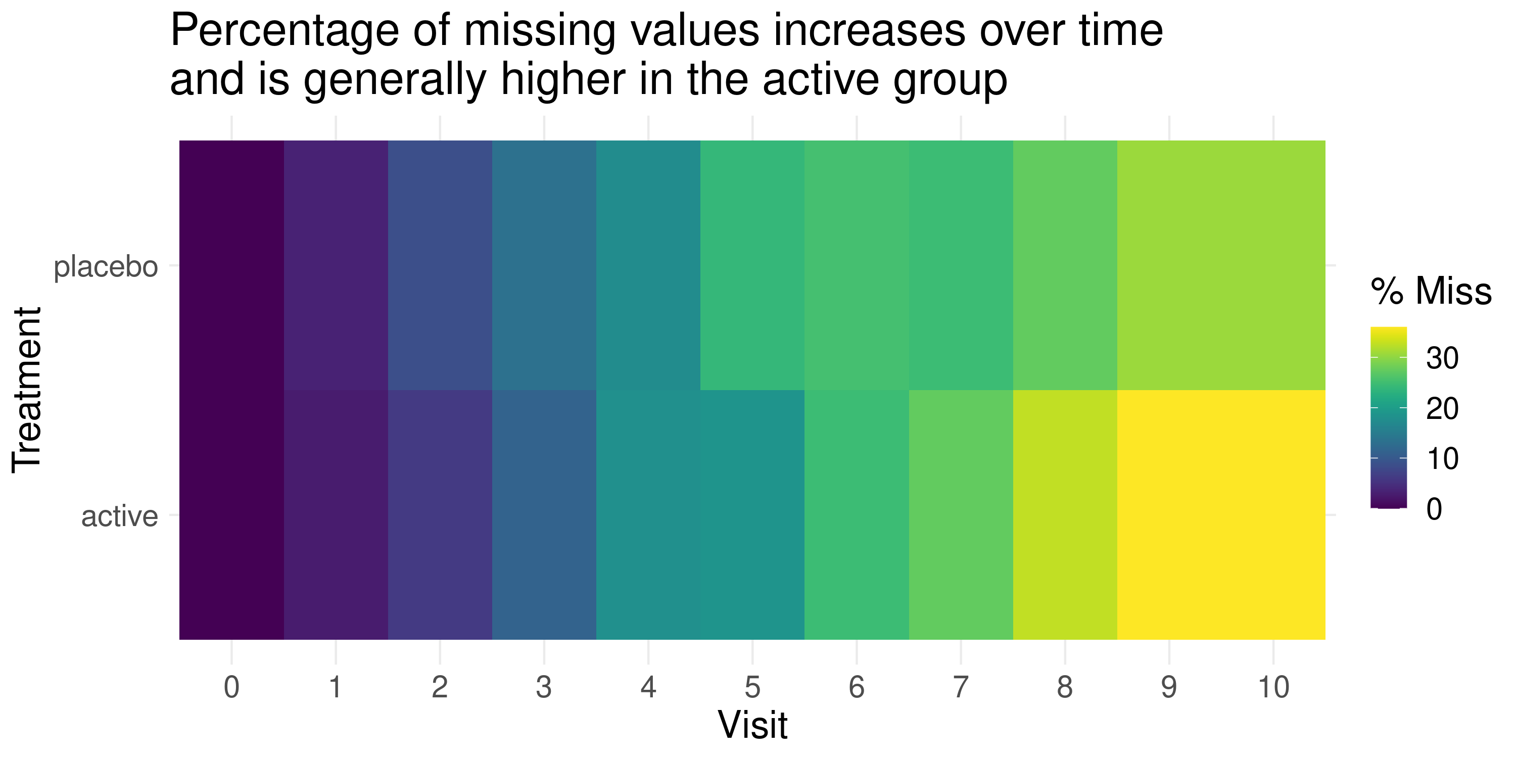
This graph is focussing on the missingness of the data, with proportions of missing data coded to different hues (colours). Missingness is shown by treatment group and visit, and is quite impactful with a clear message in the title.
An improved design might be to represent different degrees of missingness by colour value (lightness or darkness), as in general it is not so easy to interpret numeric data represented by different colours. Alternatively the missingness values could be added within the cells. The colour palette used here was colour-blind safe (which can be tested by downloading Oracle Color software).
It was questioned whether the graph needed to be a heatmap in this case, and whether a line plot might have been sufficient, possibly using colour in another way e.g. treatment. A further improvement might have been to also incorporate the pain score. In general, the “data to ink ratio” is rather low, and this design of graph may be more effective for a dataset with more variables, e.g. large number of treatments, or in a machine learning application.
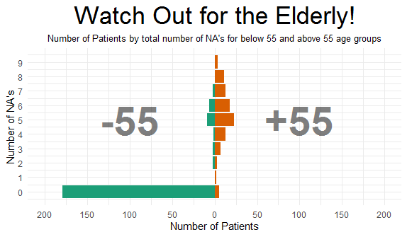
Example 2. Mirrored Histogram
This graph certainly has a clear message! The graph has pooled treatment groups and visits, and is focussing on the relationship between missingness and age group. In terms of patients with complete data (zero missing data), there is clearly a large difference between age groups.
It is not clear why 55 years was used as the threshold value, as this was not specified in the problem description, and there does not seem to be an obvious rationale (e.g. median value). Also, the labelling of the subgroups could have been be improved to show “<55 years” and “>=55 years”. Use of “NA” should also be avoided, as the meaning would not be clear to most audiences, and some panellist thought that a simpler design with fewer gridlines would be a little more effective.
There was a difference of opinion regarding whether to include the “0” category. The large number of patients in the <55 group distorts the horizontal axis range and creates a lot of white space in the graph overall. However others thought that this was the essential message of the graph. Finally, when showing relative frequency, one should consider using percentages rather than number of subjects.
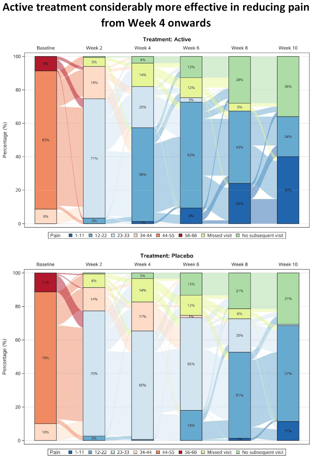
Example 3. Sankey Diagram
The pdf file can be found here.
This was the first plot presented that included the actual pain scores, which have been categorised and summarised over time separately for the two treatment groups. Categorisation allows missing data categories to also be included alongside the efficacy data, with separate categories for single missing visits and monotone missing values (dropouts). A Sankey Diagram is effective in showing shifts between categories at the individual patient level, and in this case a subset of visits has been included to allow the flows to be seen more easily (although this has also created some issues with interpreting the “no subsequent visit” category).
As well as showing overall trends, the graph provides insights into the pain scores that preceded withdrawal from the study. The results are showing a rapid improvement in both treatment groups at the start of the study, possibly due to regression to the mean resulting from study inclusion criteria selecting a cohort of patients with relatively high baseline pain score.
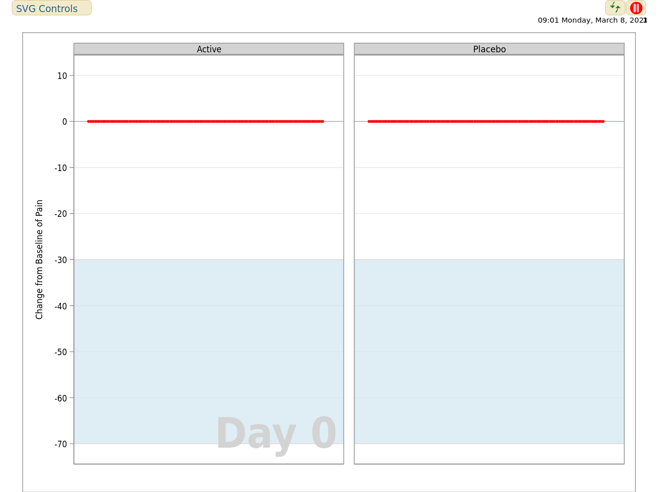
Example 4. Animated Scatter Plot
The first animated visualization can be found here.
The second animated visualization can be found here.
This plot shows an animated representation of pain score in each treatment group, and requires little explanation to the viewer. The plot is effective in showing obvious trends in the data, in this case with patients in the active treatment group showing improved efficacy, particularly after week 24. Also, data were only observed at discrete visits, with data between visits having been derived using linear interpolation.
The graph could have been improved by representing missingness in the data, for example including imputed data in a different colour. The graph would also benefit from an effective title. Some other possible variations were discussed, including a moving boxplot, or showing the proportions of patients above a set of pain thresholds over time, to more effectively quantify differences between treatment groups. Another idea discussed was for the individual patient trajectories to be shown (i.e. Spaghetti plot), superimposed onto the animation.
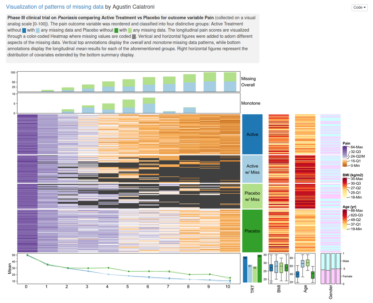
Example 5. Complex Heatmap
The app can be found here
This graph provides a rich source of information that would be suitable as an exploratory plot, e.g. atdatabase freeze, to gain a deep understanding of the data. There are several components to this graph.The body of the graph is a lasagna plot, showing individual patient data with colour-coded pain scores. The graph is divided into different panels according to treatment group and whether or not patients had some missing data. This design allows obvious differences between the treatment groups to be discerned easily, i.e. that patients in the active treatment group generally showed lower pain scores after visit 4 but with more missing data. In general, lasagne plots (and other graphsshowing individual patient level data) can benefit from sorting. A further design improvement might have been to include the legend closer to the body of the plot. The stacked barchart at the top shows the proportion of patients with missing data, monotone and overall, although the overall message wasn’t clear to some of the panellists. It would be useful to somehow provide more insight into relationship between pain and missingness, e.g. to summarise outcomes that preceded missing data.The line plot at the bottom summarise mean pain score for each of the four groups, and suggests that the missingness pattern is MCAR, as pairs of lines for each treatment group are largely superimposable.The graph included marginal lasagne plots and boxplots, showing the distribution of age and BMI in the different groups. The boxplot confirmed the relationship between age and missingness seen in the mirrored histogram, although it was questioned whether the additional lasagne plots added value to the graph.
Example 6. Scrollytelling

The scrollitelling website can be found here.
Scrollytelling is a relatively new graphical format, that allows the viewer to scroll through a series of graphs, with a text panel providing a changing commentary on the interpretation of the data. The panellists really appreciated the originality of this format, which provides the ability to present and discuss several different aspects of the data.
Firstly, a stacked barchart shows the proportion of missing data by visit (not including treatment group). This graph was quite effective, although it was thought that including time on vertical axis is not optimal, and it’d also be useful to include the numbers in the bars. Also the title is highlighting “missing data”, but the left part of the bars is showing non-missing data, which is a little counter-intuitive.
Scrolling on to the Upset plot, and the graph presents vertical barcharts showing the prevalence of different patterns of missing data. For simplicity, the graph only includes a subset of categories (visit 6 onwards). The graph is effective in telling a clear story that if visit 6 is missed, then subsequent visits are likely to be missing. However the horizontal bars are not so easy to interpret.
Next up was a lasagna plot, which in this case is sorted. Adding colour-coding for pain score, and including treatment group would have improved the interpretation in terms of efficacy.
A series of boxplots are provided next, showing the relationship between missingness and covariates(BMI and Age), which clearly shows the higher degree of missingness seen in older patients. However there was some confusion in terms of interpreting the overall horizontal and vertical axes, which would have benefited from clearer labelling.
Finally, the mean pain scores in the treatment groups are summarised in line plots, which shows the overall trend in terms of efficacy, although may have been easier to interpret if the treatment groupshad been superimposed.
Code
Example 1. Simple Heatmap
# Heatmap:
##########

# Load required packages:
require(naniar)
require(ggplot2)

# Load data set:
dat <- read.csv("missing_data.csv")

# Focus only on continuous pain variables:
dat <- dat[, c(1:11, 25)]

# Reshape data into long format and do some data preparation steps:
dat.long <- reshape(dat, varying = 1:11, direction = "long", sep = ".")
dat.long <- dat.long[, -4]
dat.long$time <- factor(dat.long$time)


dat.long.pbo <- dat.long[which(dat.long$trt == "pbo"), ]
dat.long.act <- dat.long[which(dat.long$trt == "act"), ]

names(dat.long.act)[3] <- "active"

dat.long.pbo <- dat.long.pbo[, -1]
dat.long.act <- dat.long.act[, -1]

dat.long.combined <- dat.long.act
dat.long.combined$placebo <- dat.long.pbo$pain

# Create heatmap:
gg_miss_fct(x = dat.long.combined, fct = time) +
  ggtitle("Percentage of missing values increases over time
and is generally higher in the active group") +
  xlab("Visit") + ylab("Treatment") +
  theme(axis.text.x = element_text(angle = 0, hjust = 0.5),
        text = element_text(size = 18))
ggsave("heatmap.png", height = 5, width = 10)
Example 2. Mirrored Histogram
The Rmd file can be found here
Example 3. Sankey Diagram
The sas file can be found here.
Example 4. Animated Scatter Plot
The sas file for the first visualization can be found here
The sas file for the second visualization can be found here
Example 5. Complex Heatmap
The Rmd file can be found here
Example 6. Scrollytelling
There is no code available (yet).