Event data - COPD example data
Chronic Obstructive Pulmonary Disease (COPD) is a respiratory disease characterised by difficulty breathing and has increased mortality. An exacerbation can be life-threatening if not treated promptly. Data is based on the RISE study for patients with moderate COPD.
The primary endpoint is the number of exacerbations during a six month treatment period. Event data - but patients can (and do) have multiple exacerbations. Statistical analysis used a Negative Binomial model. here.
Example 1. Dotplot
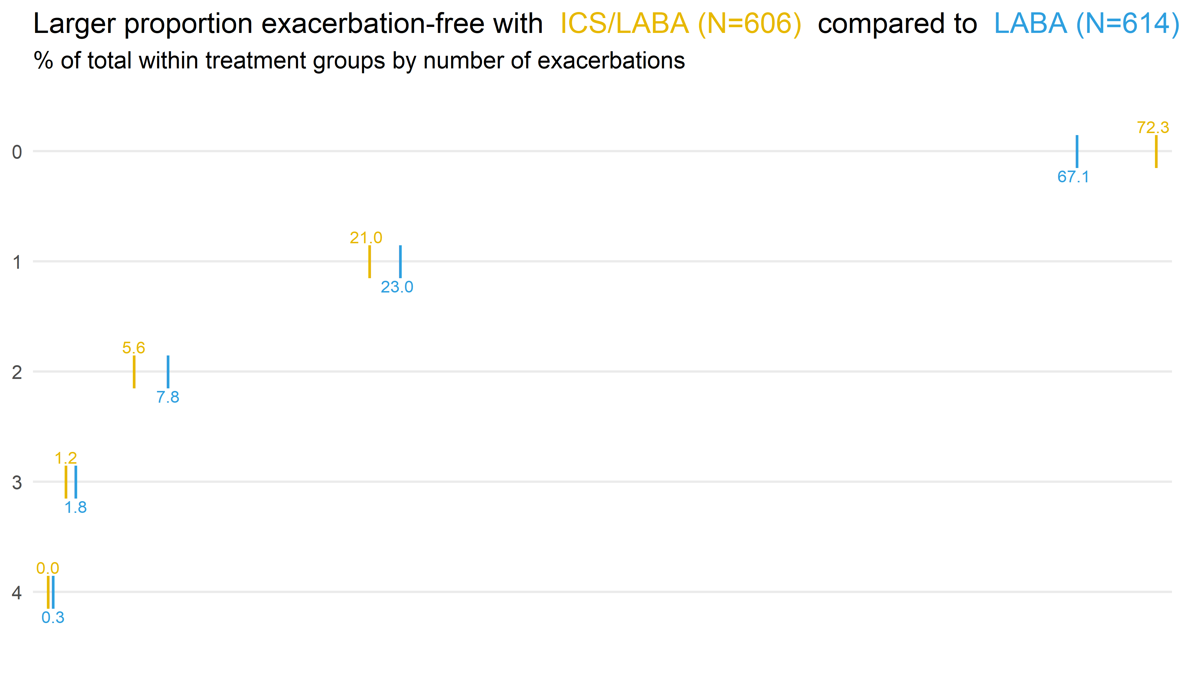
This is a very clean and clear presentation of the primary endpoint. It is actually a barchart but displayed horizontally. Each group is represented by a different color which makes it very easy to see the differences between the two groups in regards to the primary endpoint. The ICS/LABA group leads to higher values in the category of 0 counts, whereas the LABA group leads to higher percentages in all other categories. Thus, the message becomes very clear and it is easy to communicate the results using this visualization.
Overall, this is a very good visualisation. The use of color is done in a very sensible way. The colors are already used which makes a lot of sense as well. Furthermore, it is a minimalistic design and, therefore, it focus on the relevant aspects while dropping any clutter (minimizing the ink-to-data ratio). There are more helpful details considered in the visualisation: The bars are labeled directly at each bar and the percentage of ICS/LABA are always above the bar while the percentage of LABA is always below.
An altarnative way would have been a waterfall plot. This would emphasize a little more the (change of) differences between the groups over the categories. Another option would have been to add lines between the “bars” in each category to emphasize the difference between the groups. These lines would be color coded to stress the “direction” of the difference.
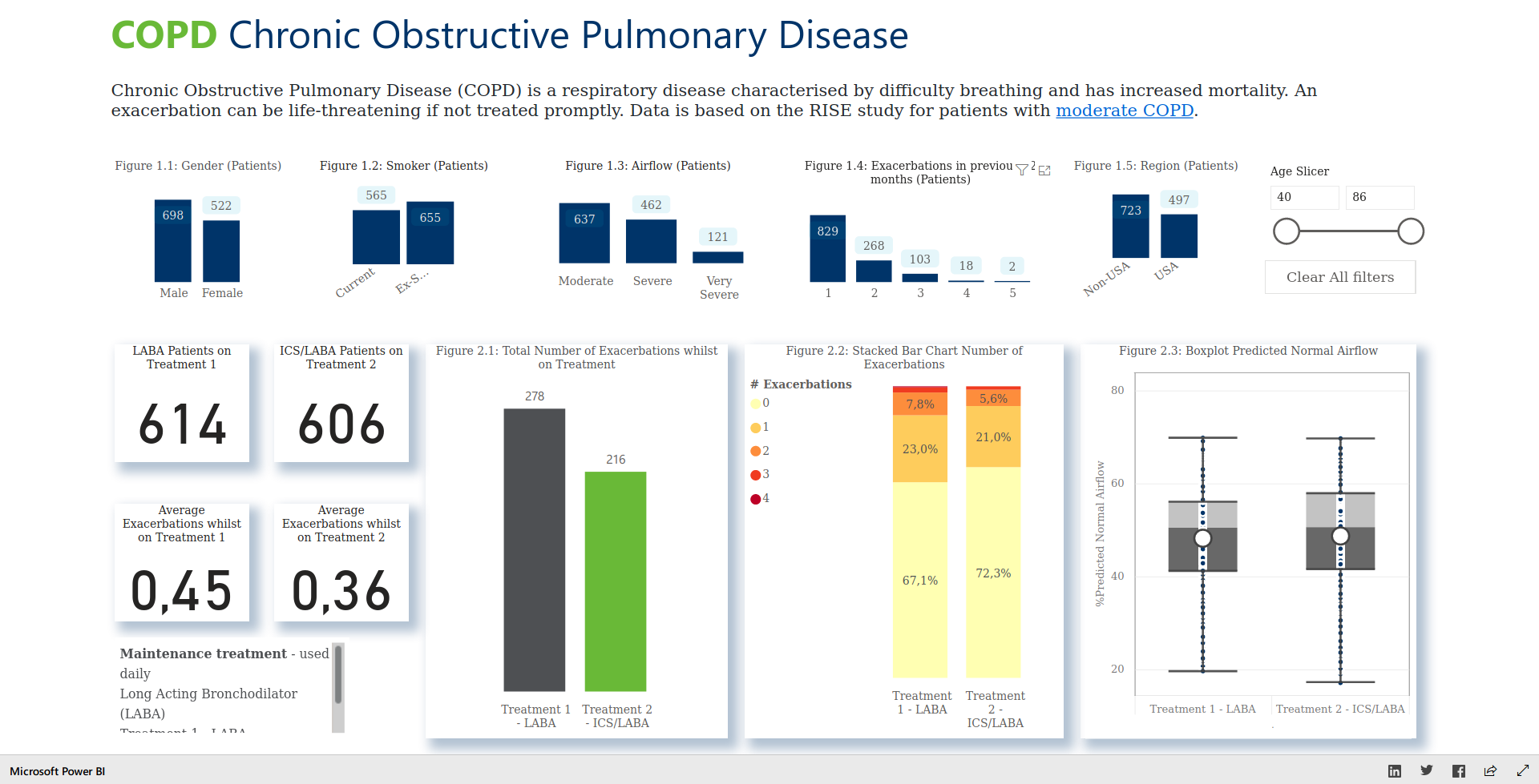
Example 2. Power BI app
The app can be found here.
This app provides you with a quick overview over several variables at the same time. It provides you with a lot of contextual information that helps you address the question you want to answer. It also has a nice feature: You can just click on a category of one variable and all other plots and numbers will get updated. This can be even done in combination among different variables. It also offers you a “Clear All filters” button which is often missing in other applications.
Since it is interactive, it is really useful and a nice tool to explore the data. Furthermore, it is nicely organized and it includes several titles and explanations which makes it easy to see what is being displayed. On the top, you have all baseline variables, and on the bottome you see the outcomes. The latter ones are organized in boxed which appear to pop out which is a nice idea to put some emphasis on these variables. Also, the key numbers are being higlighted on the left hand side.
Something that could be improved on would be the use of coloring. It is not entirely clear what they represent and it also seems to change over different plots. The coloring in Figure 2.1 is actually great, because it makes you focus on the treatment of interest. However, this coloring scheme is not kept consisent over all visualisations, for example in Figure 2.2. At the same time, you could argue that it is more important there to be able to compare the categories between the two groups and, therefore, they have to be represented in the same color. A last idea for improvement would be add some random noise (horizontally) to the dots in the boxplots to make it easier to see each single observation. Furthemore, in Figure 2.1, the average number instead of the total number could have been displayed. Also, it is not entirely clear why there are numbers on the bottom left instead of additional visualisations.
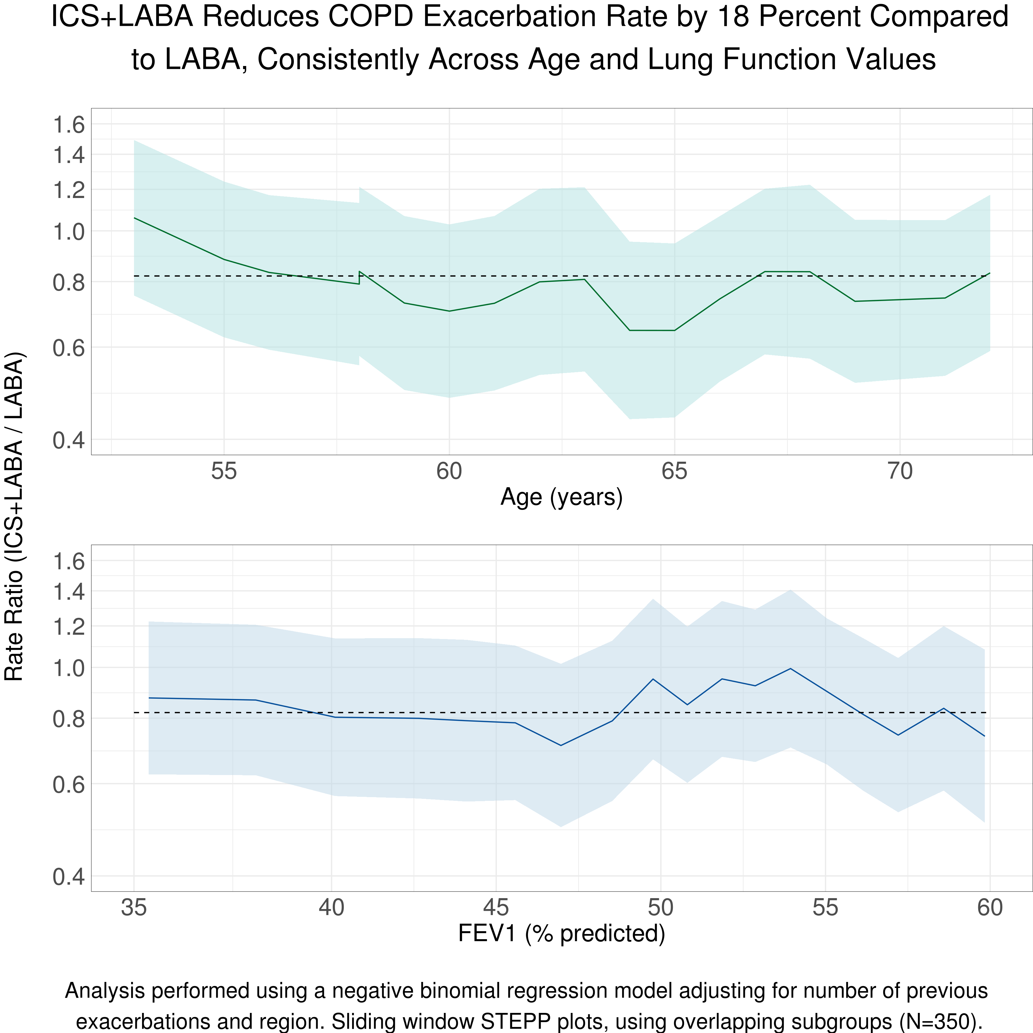
Example 3. Line plot
Here, we are not only focusing on a single endpoint, but we also consider some covariate information. The title helps you to understand right away what this visualisation is showing you. It presents the rate ratio over different age and FEV1 values.
Overall, this is a great visualisation. The design is minimalistic and chosen wisely. The coloring makes it clear that different aspects are being displayed. Also, the reference lines are really helpful. Another important point is the logarithmic scale on the x-axis which is keeps the confidence intervals / bands symmetric.
An aspect that gets not entirely clear is the defintion of the confidence bands. One could argue that we would expect the bands to get wider at both ends. Here the width seems to be absolutely constant. The reason for this is most likely the fact that we only look at overlapping subgroups which is explained in the footnote below the plot. Another point is the interpretation of the rate ratio in the title as a reduction which we could argue about. Furthermore, due to the logarithmic scale on the y axis, it might be a bit challenging to effectively make use of the horizontal grid lines which are not pointing at a specific value on the y axis.
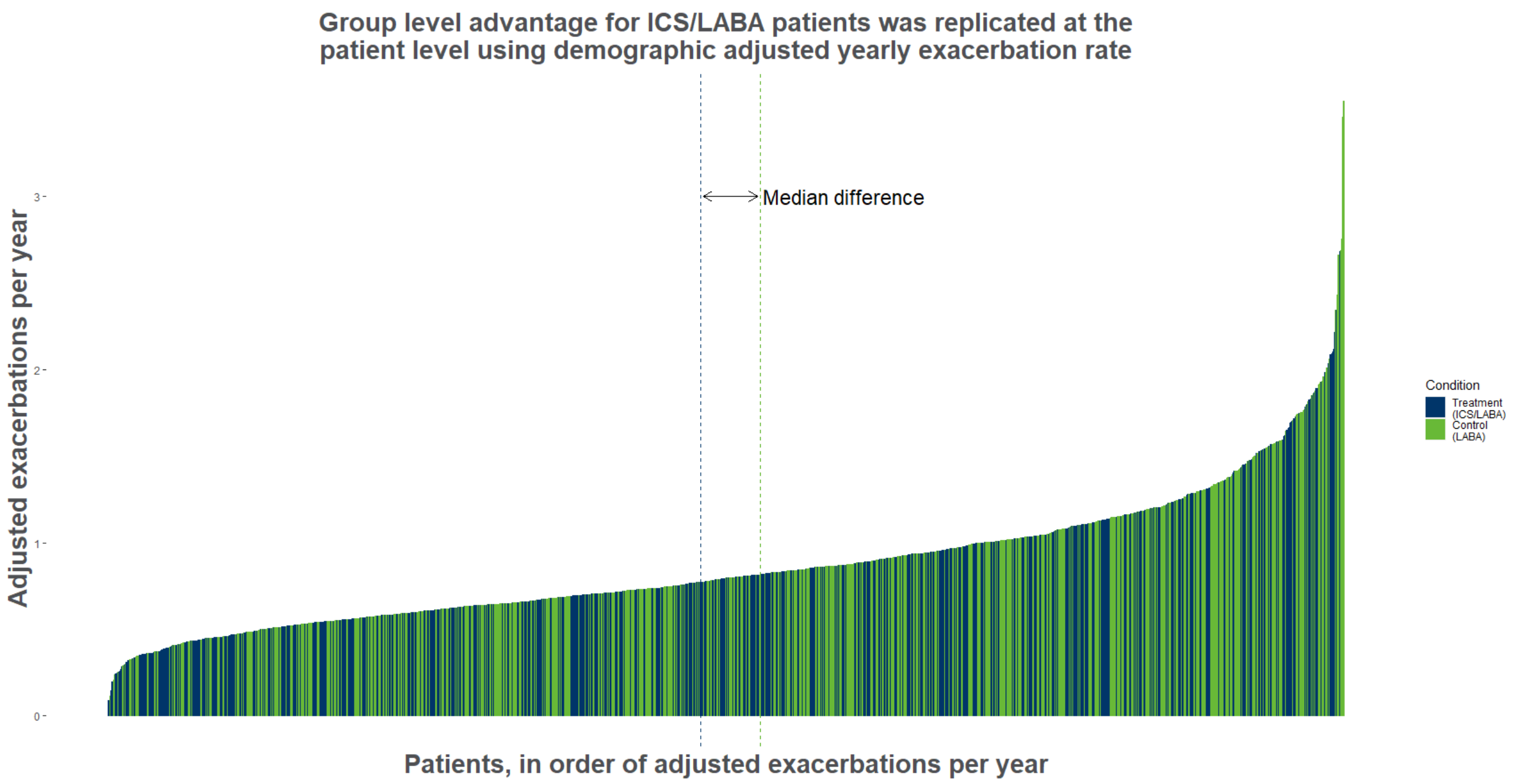
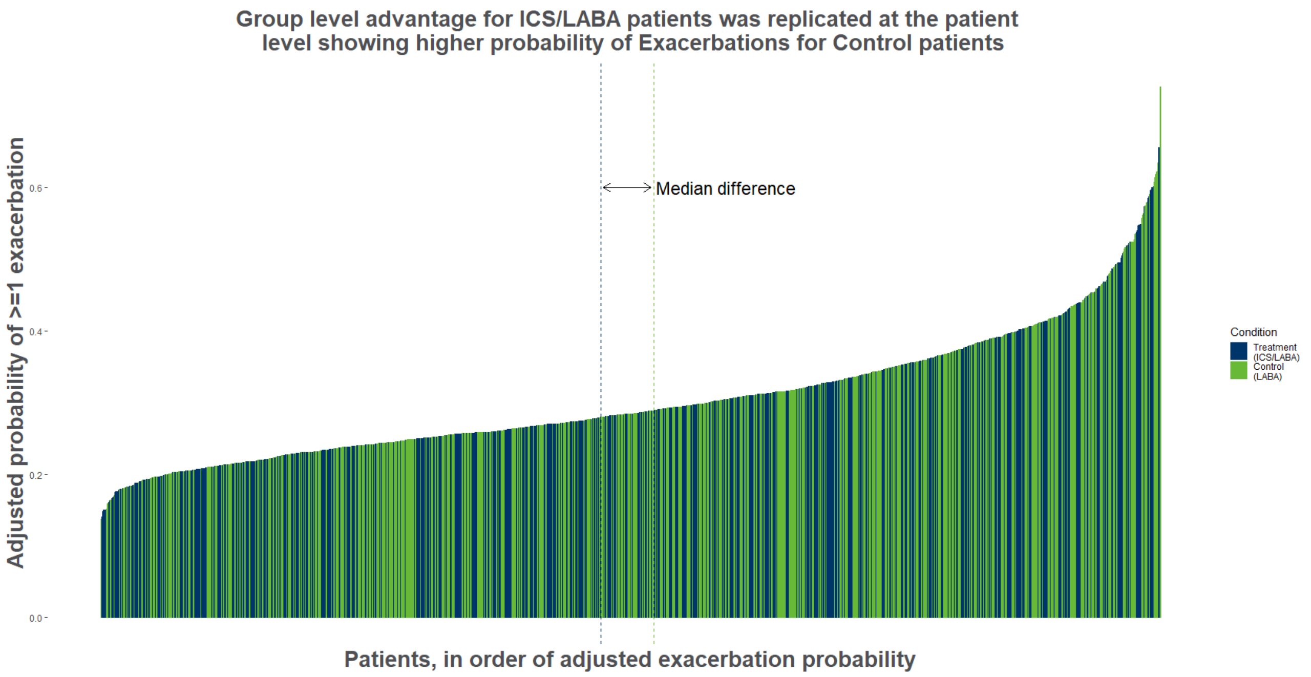
Example 4. Individual data
 high-resolution image
high-resolution image
In these two plots, the individual observations are being displayed which provides you with very detailed information. In addition, the overall effect is shown as median difference.
An advantage of this visualisation is that it shows you that despite of an existing treatment effect, we get reminded that there are indeed some patients who do not seem to benefit from the treatment.
At the same time, it might be a little bit challenging to get the message out of this visualisation right away. Withouth the lines showing the treatment effect, it might be really hard to see any effect at all. So, this plot might be specifically useful, if you have a big treatment effect - and then it has got huge potential in it. Also, the coloring is chosen wisely and the visualisation looks very clean overall.
An alternative way would have been to show the cumulative distribution functions for both groups and then emphasize the difference, for example, by coloring the space in between the two lines (representing the distribution functions). Another option could be Q-Q plots.
Code
Example 1. Dotplot (R)
### Load packages
library(here)
library(tidyverse)
library(ggtext)

### Load data
data <- data.frame(read_delim(here("2020-07-08-COPD-PSI-data.csv"), delim=','))
data$ANTHONISEN <- fct_rev(factor(data$ANTHONISEN)) # reverse factor for plotting

### Get percentage for number of exacerbations by treatment group
freq <- data %>% group_by(RAND_TRT, ANTHONISEN, .drop = F) %>% summarise(n = n()) %>% mutate(freq = 100 * n / sum(n))
freq$freq_label <- format(round(freq$freq, 1), nsmall = 1)

### Add N's to treatment group labels
N <- data %>% group_by(RAND_TRT) %>% summarize(N = n())

### Create label variable including number of subjects
freq_n <- merge(freq, N, by = "RAND_TRT")
freq_n$RAND_TRT_L <- paste0(freq_n$RAND_TRT, " (N=", freq_n$N, ")")

### Colors
fill <- c("#E7B800", "#2E9FDF")

### Plot
ggplot(freq_n, aes(x = ANTHONISEN, y = freq, color = RAND_TRT)) +
  # Set minimal theme and flip x/y-axes
  theme_minimal(base_size = 20) +
  coord_flip() +
  # Plot points
  geom_point(position = position_dodge(width = 0), shape = 124, size = 10) +
  # Plot annotations (different positions by treatment group)
  geom_text(data = freq[freq$RAND_TRT == "ICS/LABA",], aes(label=freq_label, x=ANTHONISEN, y=freq), hjust=0.6, vjust=-1.5, size = 5) +
  geom_text(data = freq[freq$RAND_TRT == "LABA",], aes(label=freq_label, x=ANTHONISEN, y=freq), hjust=0.6, vjust=2.5, size = 5) +
  # Color treatment group labels in title
  labs(title = paste("Larger proportion exacerbation-free with <span style='color:", fill[1], "'>", unique(freq_n$RAND_TRT_L)[1],
                     "</span> compared to <span style='color:", fill[2], "'>", unique(freq_n$RAND_TRT_L)[2], "</span>"),
       subtitle = "% of total within treatment groups by number of exacerbations") +
  theme(plot.title = element_markdown()) +
  # Set colors and remove legend (in comments: code to color treatment group labels in legend)
  #scale_color_manual(labels = paste("<span style='color:", fill, "'>", unique(freq$RAND_TRT), "</span>"),
  #                   values = fill, name = NULL) +
  #theme(legend.text = element_markdown(size = 12), legend.position = c(0.1, 0.89)) +
  #guides(colour = guide_legend(override.aes=list(size=0))) +
  scale_color_manual(values = fill) +
  theme(legend.position = "none") +
  # Remove clutter
  scale_y_continuous(expand = c(0,1)) +
  theme(axis.title.x = element_blank(), axis.text.x=element_blank(),
        panel.grid.major.x = element_blank(), panel.grid.minor.x = element_blank()) +
  scale_x_discrete(name = NULL) +
  NULL

ggsave(file = here("dotplot.png"), width = 35, height = 20, units = "cm")Example 2. Power BI app
Example 3. Line plot
R:
####################################################################
# Program name: COPD_exacs_STEPP.R
# Purpose: To produce a STEPP plot for COPD exacerbations
#          examining age and FEV1
#         (for Wonderful Wednesdays Aug 2020)
# Written by: Steve Mallett
# Date: 31-Jul-2020
####################################################################

library(haven)
library(ggplot2)
library(grid)
library(gridExtra)

copd_age <- read_sas("/.../plot_ww2020_08.sas7bdat") %>%
  filter(var == "age_n")

plot01 <- ggplot() +
  geom_ribbon(data = copd_age, aes(x = median, ymin = LowerExp, ymax = UpperExp), fill = "#b2e2e2", alpha = .5) +
  geom_line(data = copd_age, aes(x = median, y = ExpEstimate), color = "#006d2c", size = 0.5 ) +
  geom_segment(aes(x=53, xend=72, y=0.82, yend=0.82), linetype = 2, color = "black") +
  scale_x_continuous("Age (years)",
                     # breaks=c(55, 60, 65, 70),
                     # labels=c(55, 60, 65, 70),
                     limits=c(53, 72)) +
  scale_y_log10(" ",
                breaks=c(0.4, 0.6, 0.8, 1.0, 1.2, 1.4, 1.6),
                limits=c(0.4, 1.6)) +
  theme_minimal() +
  theme(legend.position="none",
        text = element_text(size = 15),
        axis.ticks.x = element_blank(),
        axis.ticks.y = element_blank(),
        axis.text.x =  element_text(size = 20),
        axis.text.y =  element_text(size = 20),
        axis.title.x = element_text(size = 20),
        axis.title.y = element_text(size = 20),
        plot.title = element_text(hjust = 0.5, size = 25),
        panel.border = element_rect(colour = "black", fill=NA, size=0.25),
        # panel.grid = element_blank(),
        plot.margin=unit(c(0,0,0,0),"cm")) +
  ggtitle(label = " ")

copd_fev <- read_sas("/shared/175/arenv/arwork/gsk1278863/mid209676/present_2020_01/code/COPD/plot_ww2020_08.sas7bdat") %>%
  filter(var == "fev1_rv")

plot02 <- ggplot() +
  geom_ribbon(data = copd_fev, aes(x = median, ymin = LowerExp, ymax = UpperExp), fill = "#bdd7e7", alpha = .5) +
  geom_line(data = copd_fev, aes(x = median, y = ExpEstimate), color = "#08519c", size = 0.5 ) +
  # geom_hline(yintercept = 0.82, linetype = 2, color = "black", size = 0.5) +
  geom_segment(aes(x=34, xend=60, y=0.82, yend=0.82), linetype = 2, color = "black") +
  scale_x_continuous("FEV1 (% predicted)",
                     breaks=c(34, 40, 45, 50, 55, 60),
                     labels=c(35, 40, 45, 50, 55, 60),
                     limits=c(34, 60)) +
  scale_y_log10(" ",
                breaks=c(0.4, 0.6, 0.8, 1.0, 1.2, 1.4, 1.6),
                limits=c(0.4, 1.6)) +
  theme_minimal() +
  theme(legend.position="none",
        text = element_text(size = 15),
        axis.ticks.x = element_blank(),
        axis.ticks.y = element_blank(),
        axis.text.x =  element_text(size = 20),
        axis.text.y =  element_text(size = 20),
        axis.title.x = element_text(size = 20),
        axis.title.y = element_text(size = 20),
        plot.title = element_text(hjust = 0.5, size = 25),
        panel.border = element_rect(colour = "black", fill=NA, size=0.25),
        # panel.grid = element_blank(),
        plot.margin=unit(c(0,0,0,0),"cm")) +
  ggtitle(label = " ")

g <- grid.arrange(plot01, plot02, ncol =1, nrow = 2,
                  left = textGrob("Rate Ratio (ICS+LABA / LABA)", rot = 90, gp = gpar(fontsize=20)),
                  top = textGrob("ICS+LABA Reduces COPD Exacerbation Rate by 18 Percent Compared\n to LABA, Consistently Across Age and Lung Function Values", gp = gpar(fontsize=25)),
                  bottom = textGrob("\nAnalysis performed using a negative binomial regression model adjusting for number of previous \nexacerbations and region. Sliding window STEPP plots, using overlapping subgroups (N=350).", gp = gpar(fontsize=18)))

ggsave("/.../plot_ww2020_08.png", g, width=12, height=12, dpi=300)
SAS:
libname outdata "H:\arwork\gsk1278863\mid209676\present_2020_01\code\COPD";

PROC IMPORT OUT= WORK.copd
            DATAFILE= "C:\Users\sam31676\OneDrive - GSK\_Non Project\Data Visualisation\PSI data vis SIG\Wonderful Wednesdays\2020 08\ww08.txt"
            DBMS=CSV REPLACE;
     GETNAMES=YES;
     DATAROW=2;
RUN;

data copdx;
  set copd;
  fu_years=study_days_n/365.25;
  logfu=log(fu_years);
run;

* Fit overall model;

proc genmod data=copdx;
  class rand_trt prev_exac region;
  model anthonisen = rand_trt prev_exac region fev1_rv /dist=negbin link=log offset=logfu type3;
  lsmeans rand_trt / diff exp cl om;
run;

* Main macro to create plot data;

%macro create(id=, var=, class=, covars=);
proc sort data=copdx;
  by &var;
run;

options nosymbolgen mprint;
%let r1=50;
%let r2=350;
%let n = 1221;

%macro split;
%global m;
%let i = 0;
%let low = 1;
%let high = %eval(&r2);

%do %until (&high > &n);
  %let i = %eval(&i+1);

  data copd&i;
    set copdx;
    if _n_ >= &low and _n_ <= &high;
    group = &i;
    run;

  %let low = %eval(&low+&r1);
  %let high = %eval(&low+&r2-1);
  %let m = &i;
  %end;

%mend split;
%split;

%macro combine;
data copd_all;
  set
  %do i = 1 %to &m;
    copd&i
    %end;
    ;
run;
%mend combine;
%combine;

proc means data=copd_all noprint;
  by group;
  var &var;
  output out=med(keep=group median) median(&var)=median;
run;

ods output diffs=diffs;

proc genmod data=copd_all;
  by group;
  class &class;
  model anthonisen = &covars/dist=negbin link=log offset=lnstudyday;
  lsmeans rand_trt / diff exp cl om;
run;
quit;

data plot&id;
  merge diffs(keep=group ExpEstimate lowerexp upperexp) med;
  by group;
  var="&var";
run;
%mend create;
%create(id=1, var=fev1_rv, class=%str(rand_trt prev_exac region), covars=%str(rand_trt prev_exac region));
%create(id=2, var=age_n, class=%str(rand_trt prev_exac region), covars=%str(rand_trt prev_exac region));

data outdata.plot_ww2020_08;
  set plot1 plot2;
run;Example 4. Individual data
library(tidyverse)
library(RColorBrewer)
library(readxl)

#Colour scheme
Orange <- "#EF7F04"
Green <- "#68B937"
Blue <- "#00A6CB"
Grey <- "#4E5053"
Darkblue <- "#003569"
Yellow <- "#FFBB2D"
GreyedOut <- "#D3D3D3"

setwd("C:/Users/philip.griffiths/OneDrive - OneWorkplace/Documents/Wonderful Wednesday/Exacerbations")

#Read in a dataset and create a flag value for exacerbations >=1
exacerbations <- read_csv("2020-07-08-COPD-PSI-data.csv")  %>%
  mutate(flag = as.numeric(ifelse(ANTHONISEN >= 1, "1", "0")))

#linear regression to adjust number of exacerbations based on Baseline values
Model <- lm(ANTHONISEN ~ FEV1_RV + PREV_EXAC + AGE_C + GENDER + SMOKER + AIRFLOW, data = exacerbations)

#logistic regression to determine the probability of >=1 exacerbation adjusted for baseline
LogisticModel <- glm(flag ~ FEV1_RV + PREV_EXAC + AGE_C + GENDER + SMOKER + AIRFLOW,data = exacerbations,family = binomial)

#Check out the models. I actually removed region. it was highly sig, but I dont have a theoretical reason for that, and also just loads of US
summary(Model)
summary(LogisticModel)

#Make an "adjusted" exacerbation rate and a probability exacerbation
Adjusted <- predict(Model, data = exacerbations)
Prob <-predict(LogisticModel, type = "response")

#add the ajusted and probability columns to the main dataset. make adjusted exacerbations per year
#Sequence1 is a consecutively ordered variable for the waterfall plot later on
exacerbations_pred <- add_column(exacerbations, adjust=Adjusted) %>%
  add_column(prob=Prob) %>%
  mutate(years=STUDY_DAYS_N/365) %>%
  mutate(ratio=adjust / years) %>%
  arrange(ratio) %>%
  add_column(sequence1 = 1:nrow(exacerbations))

#create two datasets (one for treat and one for control) and test the difference between them
treat <-exacerbations_pred %>%
  filter(RAND_TRT=="ICS/LABA")

control <- exacerbations_pred %>%
  filter(RAND_TRT=="LABA")

wilcox.test(treat$ratio, control$ratio,paired=FALSE)

whichmedian <- function(x) which.min(abs(x - median(x)))

#Median patient on treatment for reference line
TreatMed <- exacerbations_pred %>%
  filter(RAND_TRT=="ICS/LABA") %>%
  slice(whichmedian(ratio))

#Median patient on control for refeence line
ControlMed <- exacerbations_pred %>%
  filter(RAND_TRT=="LABA") %>%
  slice(whichmedian(ratio))

#create plot
p <- exacerbations_pred %>%
  ggplot() +
  geom_col(aes(x=sequence1, y=ratio, fill=RAND_TRT, color=RAND_TRT)) + #column - aes takes seq1 for the x as this is the reordered Ps. Need fill and colour so that the col outlines are the correct colour
  ggtitle("Group level advantage for ICS/LABA patients was replicated at the\npatient level using demographic adjusted yearly exacerbation rate") + #titles etc
  xlab("Patients, in order of adjusted exacerbation probability") +
  xlab("Patients, in order of adjusted exacerbations per year") +
  ylab("Adjusted exacerbations per year") +
  geom_vline(aes(xintercept = sequence1), linetype='dashed', col = Darkblue, TreatMed)  + #reference lines for median treatment response and median control response
  geom_vline(aes(xintercept = sequence1), linetype='dashed', col = Green, ControlMed)  +
  scale_fill_manual(values=c(Darkblue, Green), name = "Condition", labels = c("Treatment\n(ICS/LABA)", "Control\n(LABA)")) + #make sure that the col and legend have the chosen colors. Update legend text
  scale_colour_manual(values=c(Darkblue, Green)) + #make sure the outlines for the cols are also coloured in line with the above
  guides(color = FALSE, size = FALSE) + # remove legend for the col outline
  theme(axis.text.x=element_blank(), # remove the participant numbers
        axis.ticks.x=element_blank()) + # remove x-axis ticks
  theme (plot.title = element_text(family = "sans", color=Grey, face="bold", size=22, hjust=0.5)) + #Edit font
  theme (axis.title = element_text(family = "sans", color=Grey, face="bold", size=22)) + #Edit font
  theme(panel.background = element_blank()) # blank out the background

p + annotate(geom = "text", x = (ControlMed$sequence1 + 3), y = 3, label = "Median difference", hjust = "left", size = 6) + #add text higlighting the median
  annotate(geom = "segment", y = 3, yend = 3, x = (TreatMed$sequence1 + 3), xend = (ControlMed$sequence1 - 3),
           arrow = arrow(length = unit(3, "mm"))) + #this controls the arrow heads
  annotate(geom = "segment", y = 3, yend = 3, x = (ControlMed$sequence1 - 3), xend = (TreatMed$sequence1 + 3),
           arrow = arrow(length = unit(3, "mm")))

#additional manipulation to reorder the dataset based on probability of exacerbation and creaion of a consecutive numbering (sequence2)
exacerbations_pred <- exacerbations_pred %>%
  arrange(prob) %>%
  add_column(sequence2 = 1:nrow(exacerbations))

#create two datasets (one for treat and one for control) and test the difference between them
treat <-exacerbations_pred %>%
  filter(RAND_TRT=="ICS/LABA")

control <- exacerbations_pred %>%
  filter(RAND_TRT=="LABA")

wilcox.test(treat$prob, control$prob,paired=FALSE)

#Median patient on treatment for ref line
TreatMed <- exacerbations_pred %>%
  filter(RAND_TRT=="ICS/LABA") %>%
  slice(whichmedian(prob))

#Median patient on control for ref line
ControlMed <- exacerbations_pred %>%
  filter(RAND_TRT=="LABA") %>%
  slice(whichmedian(prob))

#see above plot for comments
q <- exacerbations_pred %>%
  ggplot() +
  geom_col(aes(x=sequence2, y=prob, fill=RAND_TRT, color=RAND_TRT)) +
  ggtitle("Group level advantage for ICS/LABA patients was replicated at the patient \n level showing higher probability of Exacerbations for Control patients") +
  ylab("Adjusted probability of >=1 exacerbation") +
  xlab("Patients, in order of adjusted exacerbation probability") +
  geom_vline(aes(xintercept = sequence2), linetype='dashed', col = Darkblue, TreatMed)  +
  geom_vline(aes(xintercept = sequence2), linetype='dashed', col = Green, ControlMed)  +
  scale_fill_manual(values=c(Darkblue, Green), name = "Condition", labels = c("Treatment\n(ICS/LABA)", "Control\n(LABA)"))+
  scale_colour_manual(values=c(Darkblue, Green)) +
  guides(color = FALSE, size = FALSE) +
  theme(axis.text.x=element_blank(),
        axis.ticks.x=element_blank()) +
  theme (plot.title = element_text(family = "sans", color=Grey, face="bold", size=22, hjust=0.5)) +
  theme (axis.title = element_text(family = "sans", color=Grey, face="bold", size=22)) +
  theme(panel.background = element_blank())


q + annotate(geom = "text", x = (ControlMed$sequence2 + 3), y = 0.6, label = "Median difference", hjust = "left", size = 6) +
  annotate(geom = "segment", y = 0.6, yend = 0.6, x = (TreatMed$sequence2 + 3), xend = (ControlMed$sequence2 - 3),
           arrow = arrow(length = unit(3, "mm"))) +
  annotate(geom = "segment", y = 0.6, yend = 0.6, x = (ControlMed$sequence2 - 3), xend = (TreatMed$sequence2 + 3),
           arrow = arrow(length = unit(3, "mm")))