Vasculitis Data
This is a study of a new investigational medicine for the treatment of a rare type of vasculitis, with patients randomised to active treatment or placebo, with an on-treatment period of 52 weeks and a subsequent off-treatment follow-up period of up for 8 weeks. An ideal medicine would reduce vasculitis symptoms and/or enable a reduction in OCS dose and/or reduce the risk of relapse. Additional endpoints are defined for total number of days the patient was in remission during the on-treatment period, and a binary endpoint for whether a patients achieved remission within the first 24 weeks and maintained in remission until the end of the on-treatment period. Being a rare disease, there is no established consensus on a single endpoint for demonstrating efficacy.
Example 1. Kaplan-Meier plot
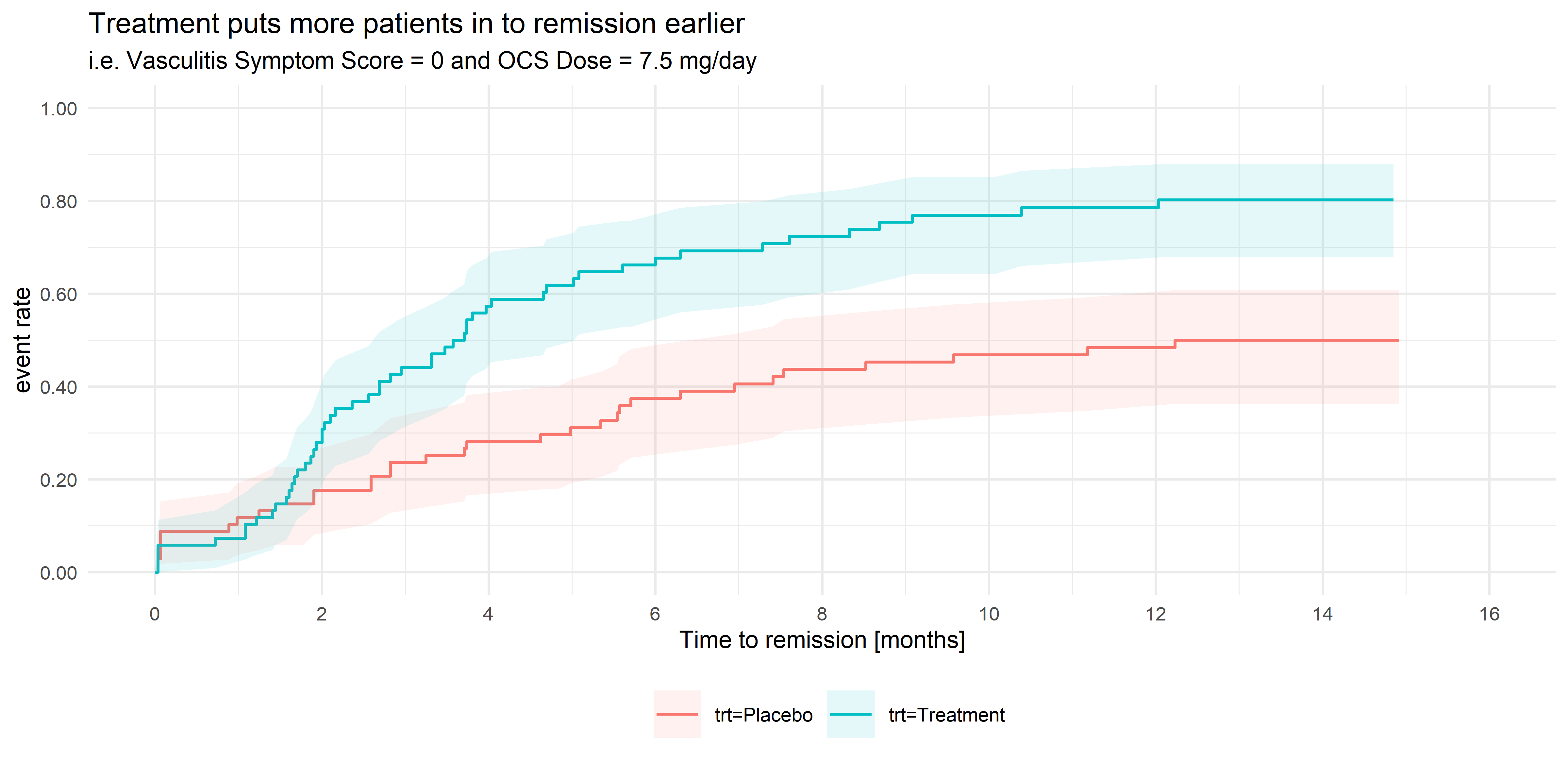
This Kaplan-Meier plot goes straight to the point and provides a picture of the data. Moreover, the chart makes viewers ask about the factor driving the difference between placebo and treatment. In terms of design, some panelists indicated that a way to improve it would have been to include the legend labels close to the lines. That implementation would have helped to highlight the connection between the colors and data.
The informative title produced a bit of a discussion. A panelist asked the audience where is the line between describing the result and having a promotional title. Another member mentioned the importance of knowing the context where the chart will appear. Is it a poster? A Conference? A scientific journal?
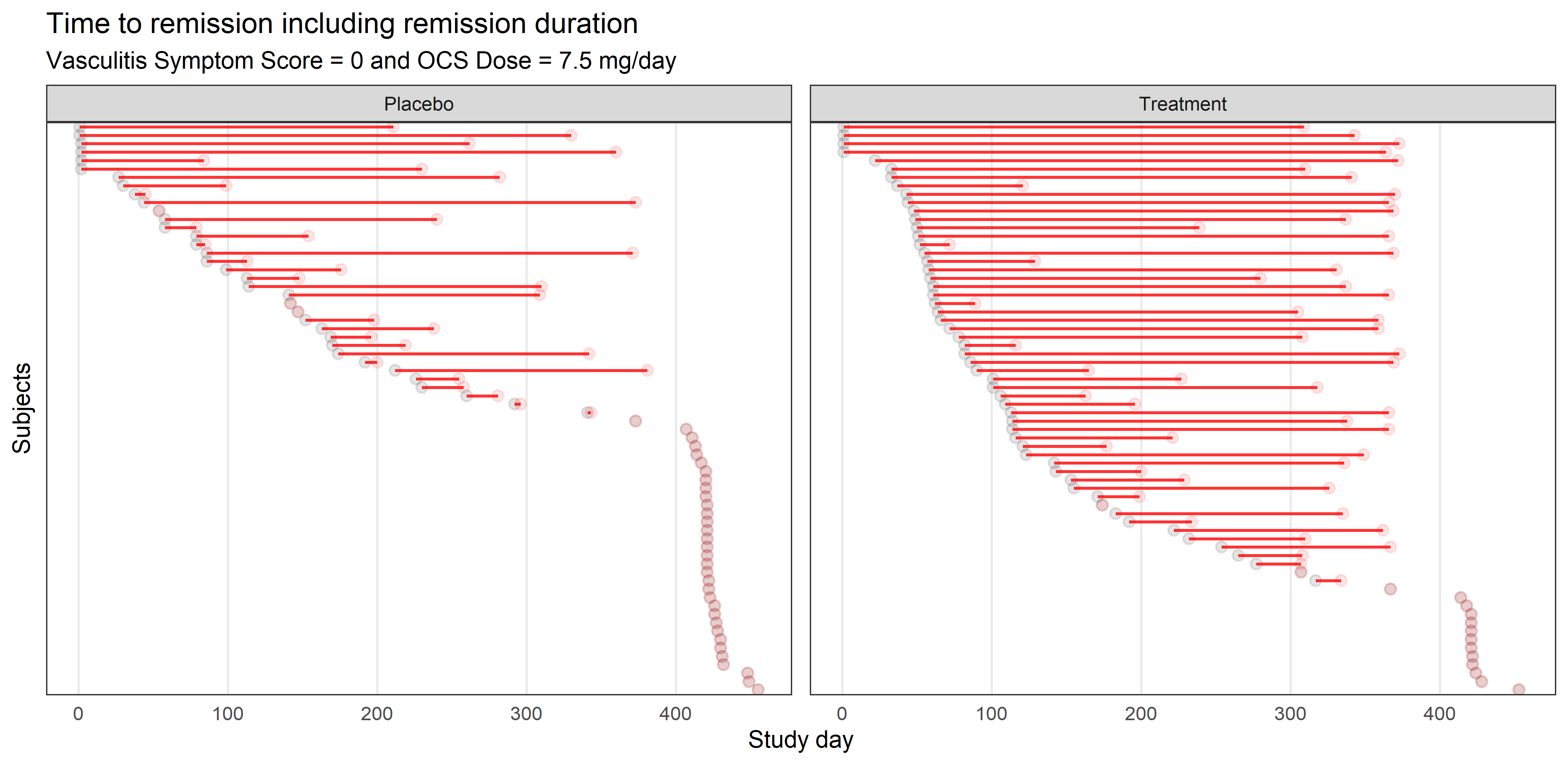
Example 2. Lasagna plot
Similar to a lasagna plot or heatmap, this chart shows timelines of the patients achieving remissions. The sorting is very helpful for identifying when they started their remission, a message also supported by the title. Some panelists wondered how the chart would look like with a different type of sorting, such as the length to achieve remission. Others asked about relapses, which is something that didn’t appear in the plot.
Some of the suggestions mentioned were around legends and annotations. It would have helped to have information about the circles or annotations that clarified the meaning of the dots without lines in the placebo facet. Another recommendation was to change the units of the X-axis to more relevant measurements, such as years or months.
Example 3. Visualisation app
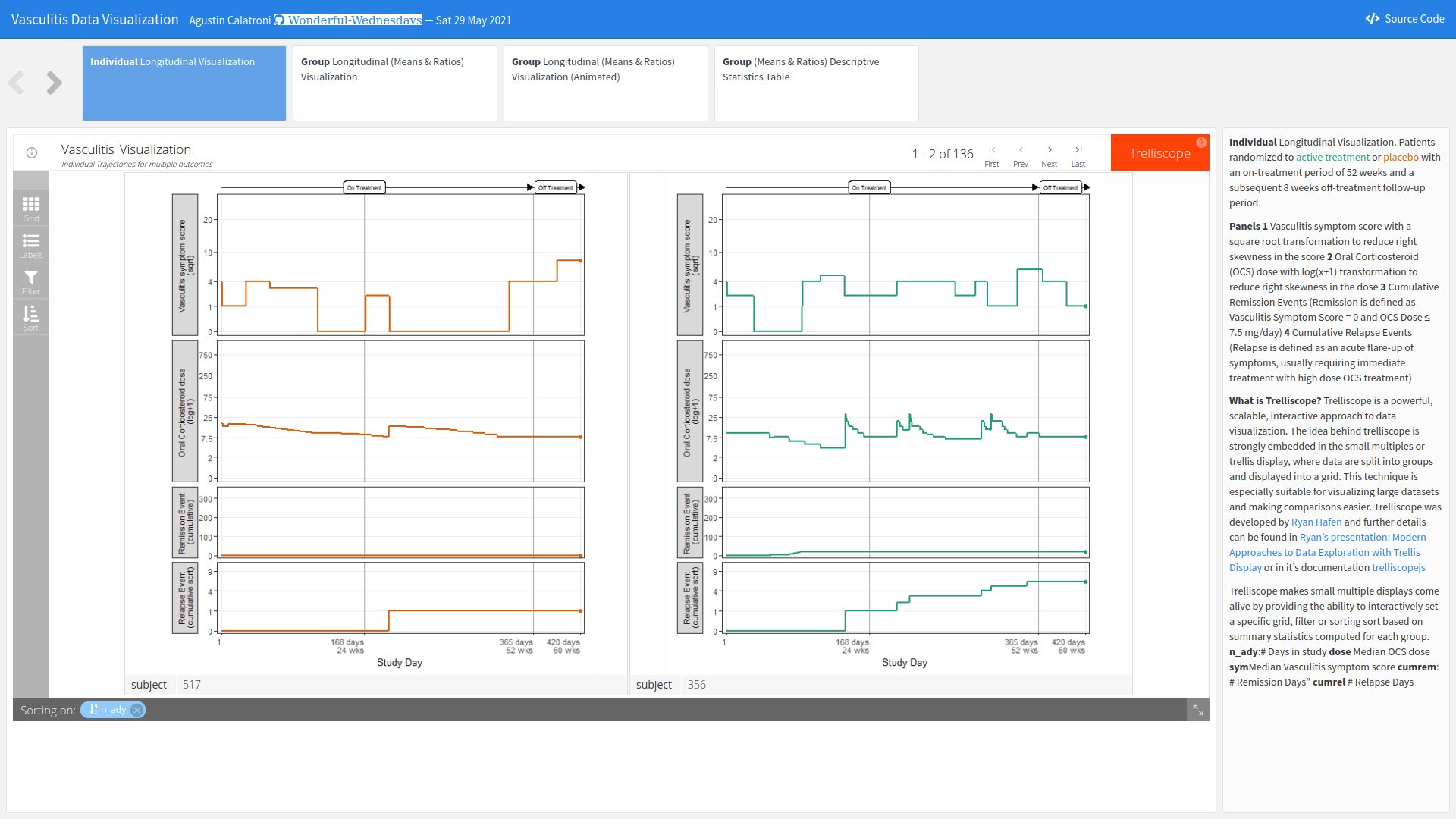
The app can be found here.
In this session, the Webinar had a special guest as part of the panel: Agustin Calatroni, a regular contributor of the Wonderful Wednesdays. The members took the opportunity to ask him about his entry, his work process, and how he started learning R. His entry for this challenge was an R Shiny App that included different filtering and sorting options. His app allowed viewers to see when patients entered in remission or relapse, and also the reasons for those events. In summary, the app brought up many ways of interacting, exploring, and visualizing the data.
Asked about how he builds his apps, Calatroni stated that he always designs his apps to organize the information from general to particular views, or vice-versa. He also tries to provide as many answers for his stakeholders as possible. This is why he always includes a table for them in all his applications.
Code
Example 1. Kaplan-Meier plot
library(readr)
library(tidyverse)
library(labelled)
library(patchwork)
library(visR)

theme_set(theme_minimal(base_size = 8))

vas_data <- read_csv("vas_data.csv")

var_label(vas_data) <- c(
  subject    =  'Subject ID',
  trt01pn    =  'Randomised treatment (0 = Placebo; 1 = Treatment)',
  ady          =  'Study Day',
  sym          =  'Vasculitis symptom score',
  dose       =  'Oral Corticosteroid (OCS) dose',
  rem          =  'Subject in Remission, i.e. Vasculitis Symptom Score = 0 and OCS Dose <= 7.5 mg/day (Y/N)',
  rel          =  'Relapse Event (Y)',
  acc_rem    =  'Accrued Duration of Remission (Days)',
  sus_rem    =  'Subject Achieved Remission Within First 24 Weeks and Remained in Remission Until EOS? (Y/N))'
)


# 1 rec per subject
vas_per <- vas_01 %>%
  distinct(subject, trt01pn, acc_rem, sus_rem) %>%
  mutate(trt01pc = factor(trt01pn,
                          levels = c(1, 2),
                          labels = c("P", "T")))


# 1 rec per subject
vas_event <- vas_data %>%
  group_by(subject) %>%
  filter(rem == "Y") %>%
  arrange(ady) %>%
  filter(row_number() == 1)


# 1 rec per subject
vas_noevent <- vas_data %>%
  group_by(subject) %>%
  filter(rem == "N") %>%
  arrange(ady) %>%
  filter(row_number() == n()) %>%
  mutate(adyN = ady)


vas_all <-
  bind_rows(vas_event, vas_noevent) %>%
  group_by(subject) %>%
  arrange(subject) %>%
  filter(row_number() == 1) %>%
  mutate(
    CNSR = if_else(rem == "Y", 0, 1),
    AVAL = ady / 30.5,
    trt = factor(
      trt01pn,
      levels = c(1, 2),
      labels = c("Placebo", "Treatment")
    )
  )

mod <- estimate_KM(vas_all, strata = "trt")

pp <-
  visr(
    mod,
    conf.int = 0.95,
    fun = "event",
    x_label = "Time to remission [months]",
    y_label = "event rate"
  ) %>%
  add_CI(style = "ribbon")

a <- pp +
  labs(title = "Treatment puts more patients in to remission earlier",
       subtitle = "i.e. Vasculitis Symptom Score = 0 and OCS Dose ≤ 7.5 mg/day") +
  theme(legend.position = "bottom",
        legend.title = element_blank())

ggsave("remission-tte.png", a,  dpi = 660, scale = 2)
Example 2. Lasagna plot
library(readr)
library(tidyverse)
library(labelled)
library(patchwork)
library(visR)

theme_set(theme_minimal(base_size = 8))

vas_data <- read_csv("vas_data.csv")

var_label(vas_data) <- c(
  subject    =  'Subject ID',
  trt01pn    =  'Randomised treatment (0 = Placebo; 1 = Treatment)',
  ady          =  'Study Day',
  sym          =  'Vasculitis symptom score',
  dose       =  'Oral Corticosteroid (OCS) dose',
  rem          =  'Subject in Remission, i.e. Vasculitis Symptom Score = 0 and OCS Dose <= 7.5 mg/day (Y/N)',
  rel          =  'Relapse Event (Y)',
  acc_rem    =  'Accrued Duration of Remission (Days)',
  sus_rem    =  'Subject Achieved Remission Within First 24 Weeks and Remained in Remission Until EOS? (Y/N))'
)


# 1 rec per subject
vas_per <- vas_01 %>%
  distinct(subject, trt01pn, acc_rem, sus_rem) %>%
  mutate(trt01pc = factor(trt01pn,
                          levels = c(1, 2),
                          labels = c("P", "T")))


# 1 rec per subject
vas_event <- vas_data %>%
  group_by(subject) %>%
  filter(rem == "Y") %>%
  arrange(ady) %>%
  filter(row_number() == 1)


# 1 rec per subject
vas_noevent <- vas_data %>%
  group_by(subject) %>%
  filter(rem == "N") %>%
  arrange(ady) %>%
  filter(row_number() == n()) %>%
  mutate(adyN = ady)


vas_all <-
  bind_rows(vas_event, vas_noevent) %>%
  group_by(subject) %>%
  arrange(subject) %>%
  filter(row_number() == 1) %>%
  mutate(
    CNSR = if_else(rem == "Y", 0, 1),
    AVAL = ady / 30.5,
    trt = factor(
      trt01pn,
      levels = c(1, 2),
      labels = c("Placebo", "Treatment")
    )
  )

mod <- estimate_KM(vas_all, strata = "trt")

b <- vas_all %>%
  ggplot(aes(y = reorder(subject,-ady), x = ady)) +
  geom_point(alpha = 0.1) +
  geom_point(alpha = 0.1,
             aes(y = reorder(subject,-ady), x = ady + acc_rem),
             colour = "red") +
  geom_linerange(alpha = 0.8,
                 aes(
                   y = reorder(subject,-ady),
                   xmin = ady,
                   xmax = ady + acc_rem
                 ),
                 colour = "red") +
  facet_wrap(~ trt, ncol = 2, scales = "free_y") +
  theme_bw(base_size = 8) +
  theme(
    panel.grid.major.y = element_blank(),
    panel.grid.minor.x = element_blank(),
    panel.grid.minor.y = element_blank(),
    axis.text.y = element_blank(),
    axis.ticks = element_blank()
  ) +
  labs(title = "Time to remission including remission duration",
       subtitle = "Vasculitis Symptom Score = 0 and OCS Dose ≤ 7.5 mg/day") +
  xlab("Study day") +
  ylab("Subjects")

ggsave("remission-individual.png", b, dpi = 660, scale = 2)
Example 3. Visualisation app
The code can be found here.