Uncertainty in study planning
A phase III cardiovascular superiority study is planned with the following assumptions (simplified, no lost-to-FU, no treatment discontinuation, no non-CV death):
- Hazard rate of active comparator 5% per year
- Hazard ratio 0.775
- Accrual time 24 months, total duration 30 months
Statistical settings:
- Logrank test for superiority in time to first MACE event (CV death, MI, stroke) Alpha 5%, Power 90%
- A sample size of about 9900 patients would be needed aiming for 650 patients experiencing a MACE event to show superiority of the new treatment over the comparator in reducing MACE events.
- The challenge is about how uncertainty can be displayed with regard to total study duration if the assumptions are not exactly met, i.e. comparator hazard rate between 4% and 6% (and hazard ratio between 0.75 and 0.8).
Example 1. Animated dotplot
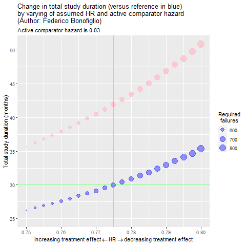
This animated dot-plot shows the dependency between study duration and treatment effect. The chart also shows how these two variables change when the study assumption varies. In this way, this entry works well as a conceptual chart as it is very good at representing uncertainty to not statisticians.
The panel spoke about how the plot efficiently communicates a general picture and the difficulty of using gifs for conveying specific numbers. One of the ways to overcome this challenge would have been to create an RShiny App where a button play/pause or a slider controls the animation and, therefore, the data displayed.
Regarding the aesthetics of the chart, the panel mentioned that increasing the contrast between the background and the dots would drag the viewer’s attention even more to the central topic of the plot. One way to do so would have been by swapping the grid color - having the background in white and grey lines.
Example 2. Animated dotplot - Update to RShiny App
One of the panelists, Rhys Warham, remade the graph to include the ability to stopping the animation. By adding this option, the project becomes a more exploratory tool.
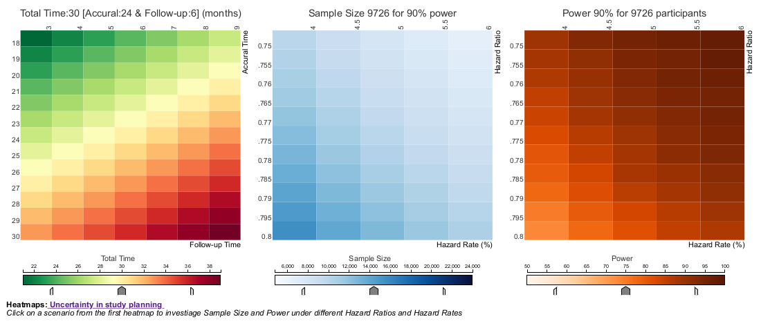
Example 3. Linked heatmaps
Heatmaps are graphs that represent the strength of a relationship between two categories of data through shades of color. In this case, the visualization has three heatmaps:
- One represents accural time vs. follow-up time. The color of the cells shows the sum of these two variables, which is the total time of a study.
- The second matrix maps Hazard ratio vs. Hazard rate, and the color represents the Sample Size.
- Finally, the third matrix maps also Hazard ratio vs. Hazard rate and colors the cells by Power.
The interactivity of the project brings real value to the graphs. The user can hover over the cells to get specific information -very useful when using color to map variables- and can click on them to see how the other charts are updated depending on the selection.
There’re also sliders in each of the plots to tighten the selectors and increase the contrast between the cells of each of the heatmaps.
The panel discussed the selection of color palettes for the charts, as they are easy to read and understand. They were questions about the divergent color palette of the first matrix: green and red tend to indicate good and bad values.
Regarding the interactivity, two ways to improve the app would have been to add the variable names to the tooltips instead of mentioning “row” and “column”, and also highlighting the selected cell after clicking.
Code
Example 1. Animated dotplot
Please see the Rmd file, the R file, and the bib file.
Example 2. Animated dotplot - Update to RShiny App
The following code needs this data file
library(shiny)
library(ggplot2)
library(plotly)

ref_dat <- dur_dat %>% dplyr::filter(baseline_haz == 0.05) %>%
  rename(ref_HR = HR)

makeplot <- function(df = dur_dat, basehaz){

  dur_dat2 <- dur_dat %>% dplyr::filter(baseline_haz == basehaz)

  plot<- ggplot(dur_dat2, aes(HR, optim_dur, size = required_events)) +
    geom_point(show.legend = FALSE, alpha = 0.9, colour = "pink") +
    geom_point(data = ref_dat, aes(ref_HR, optim_dur),
               alpha = 0.4, colour = "blue", fill = "white") +
    guides(size = guide_legend("Required\n failures")) +
    ylab("Total study duration (months)") +
    xlab("HR") +
    geom_vline(xintercept = 0.775, colour = "green") +
    geom_hline(yintercept = 30, colour = "green") +
    scale_y_continuous(limits = c(25, 55), breaks = seq(25, 55, by = 5)) +
    theme_light() +
    theme(panel.grid.minor = element_blank(),
          panel.border = element_blank())

  return(plot)

}

P1 <- makeplot(basehaz = 0.03)
P2 <- makeplot(basehaz = 0.035)
P3 <- makeplot(basehaz = 0.04)
P4 <- makeplot(basehaz = 0.045)
P5 <- makeplot(basehaz = 0.05)
P6 <- makeplot(basehaz = 0.055)
P7 <- makeplot(basehaz = 0.06)
P8 <- makeplot(basehaz = 0.065)
P9 <- makeplot(basehaz = 0.07)


ui <- fluidPage(titlePanel(h4("Change in total study duration (versus reference in blue) by varying of assumed HR and active comparator hazard")),
                titlePanel(h4("Primary Author: Federico Bonofiglio")),
                titlePanel(h5("Modified by: Rhys Warham")),
                titlePanel(h5("The size of the data points represents the number of required failures")),
                selectInput("basehaz", label = h5("Active Comparator Hazard"),
            choices = list("0.030", "0.035", "0.040", "0.045",
                           "0.050 (Reference Hazard)", "0.055", "0.060",
                           "0.065", "0.070")),
            plotlyOutput("barplot"))

server <- function(input, output){

  barplottest <- reactive({
    if ( "0.030" %in% input$basehaz) return(P1)
    if ( "0.035" %in% input$basehaz) return(P2)
    if( "0.040" %in% input$basehaz) return(P3)
    if ( "0.045" %in% input$basehaz) return(P4)
    if ( "0.050 (Reference Hazard)" %in% input$basehaz) return(P5)
    if( "0.055" %in% input$basehaz) return(P6)
    if ( "0.060" %in% input$basehaz) return(P7)
    if ( "0.065" %in% input$basehaz) return(P8)
    if( "0.070" %in% input$basehaz) return(P9)
  })

  output$barplot <- renderPlotly({
    dataplots = barplottest()
    print(dataplots)
  })

}

shinyApp(ui = ui, server = server)
Example 3. Linked heatmaps
Please see instructions and the GitHub repository.