Alzheimer data example
The data is a ADaM data set following the CDISC standard. We will focus on the ADSL (subject level) data.
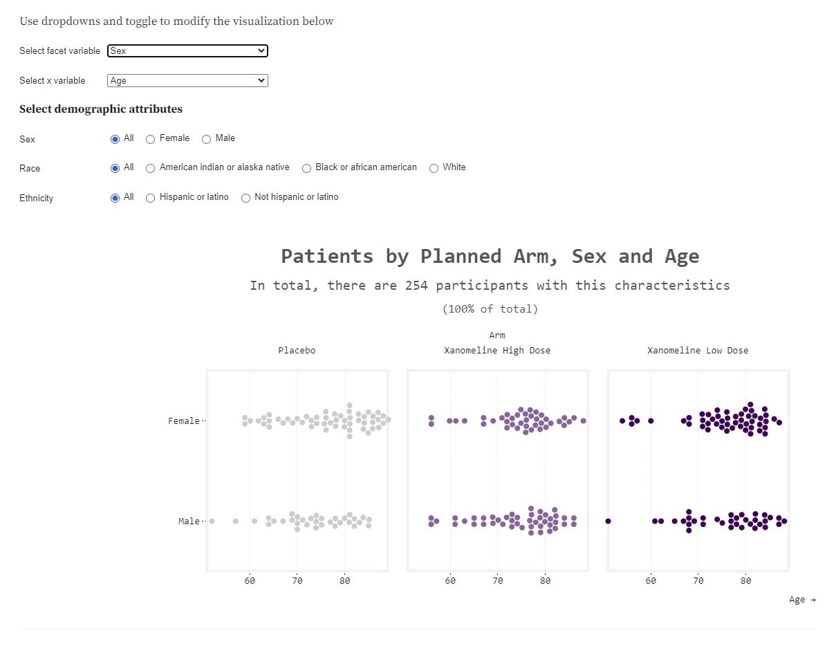
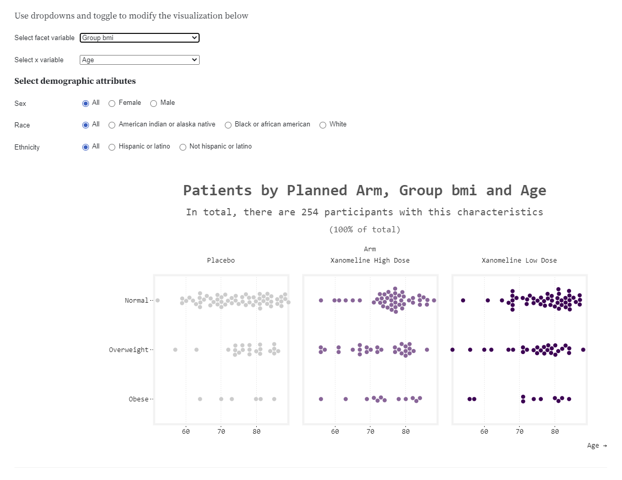
Example 1. Beeswarm (Observable)

high resolution image
high resolution image
high resolution image
The app can be found here.
The beeswarm visualisation plots individual data in a similar way to a scatterplot. However, unlike a scatterplot, the beeswarm ensures that there are no overlapping datapoints. This means that it is clearer to see how many patients have data of the same value. The visualisation provides dropdown options for selecting the values used on the x-axis and y-axis, allowing the viewer to explore different combinations of variables with ease. There are also options for filtering on the provided demographic attributes.
The panel liked the interactivity of the plot, including that the axes and title all updated when new variables were selected. The overall presentation was clean and the decision to split the plots by treatment allocation allowed for easy comparison between groups- although this may have been simpler for the viewer if the plots had been stacked (rather than side by side). The panel also discussed broader applications of this sort of visualisation and how this would perform with a larger group of patients.
Example 2. Scatter Plots and Densities
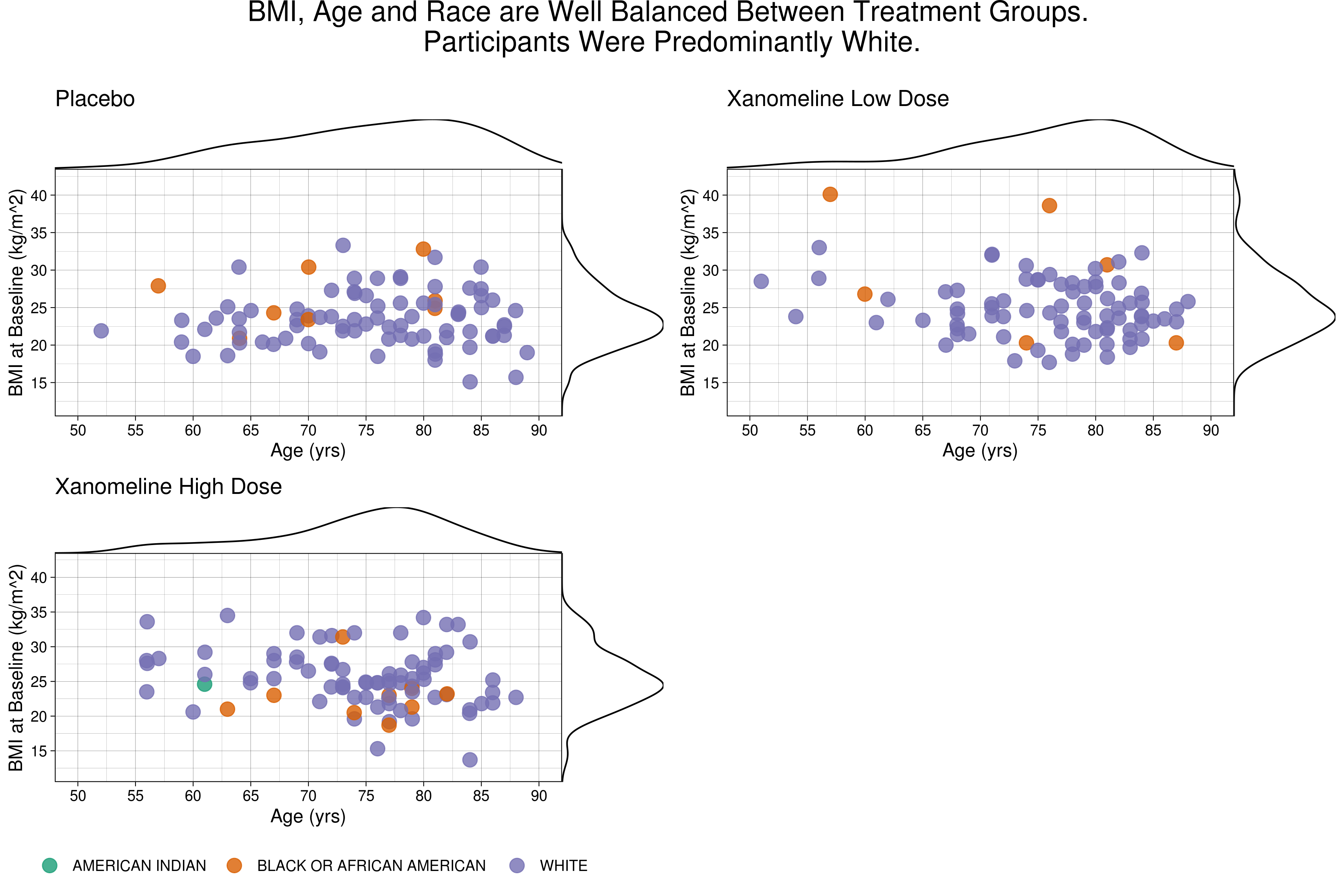
This entry combined scatterplots and density graphs into a single visualisation. The main part of each plot displays a scatter plot of age vs BMI, with the densities of each of these variables shown on the top and right sides respectively. The points of the scatterplot were different colours, based on the race of the patient.
The panel highlighted that this visualisation made it easy to spot any outliers in the data. It also demonstrated a clean way of presenting three variables simultaneously. Comparisons between treatment arms may be simpler if all plots were in a single row or column. The opacity of the datapoints was such that any overlapped plotting of datapoints could be observed. However, the panel discussed that care should be taken when doing this- as although the original colours chosen may be colour-blind friendly, the altered opacity may make the differentiation between colours more difficult. Suggestions were also made to include the densities separately for each race and to display reference lines or annotations for the mean or median. These changes would have to balance the trade-off between including the additional information and the clarity of the current layout- so may depend on the target audience and purpose of the visualisation.
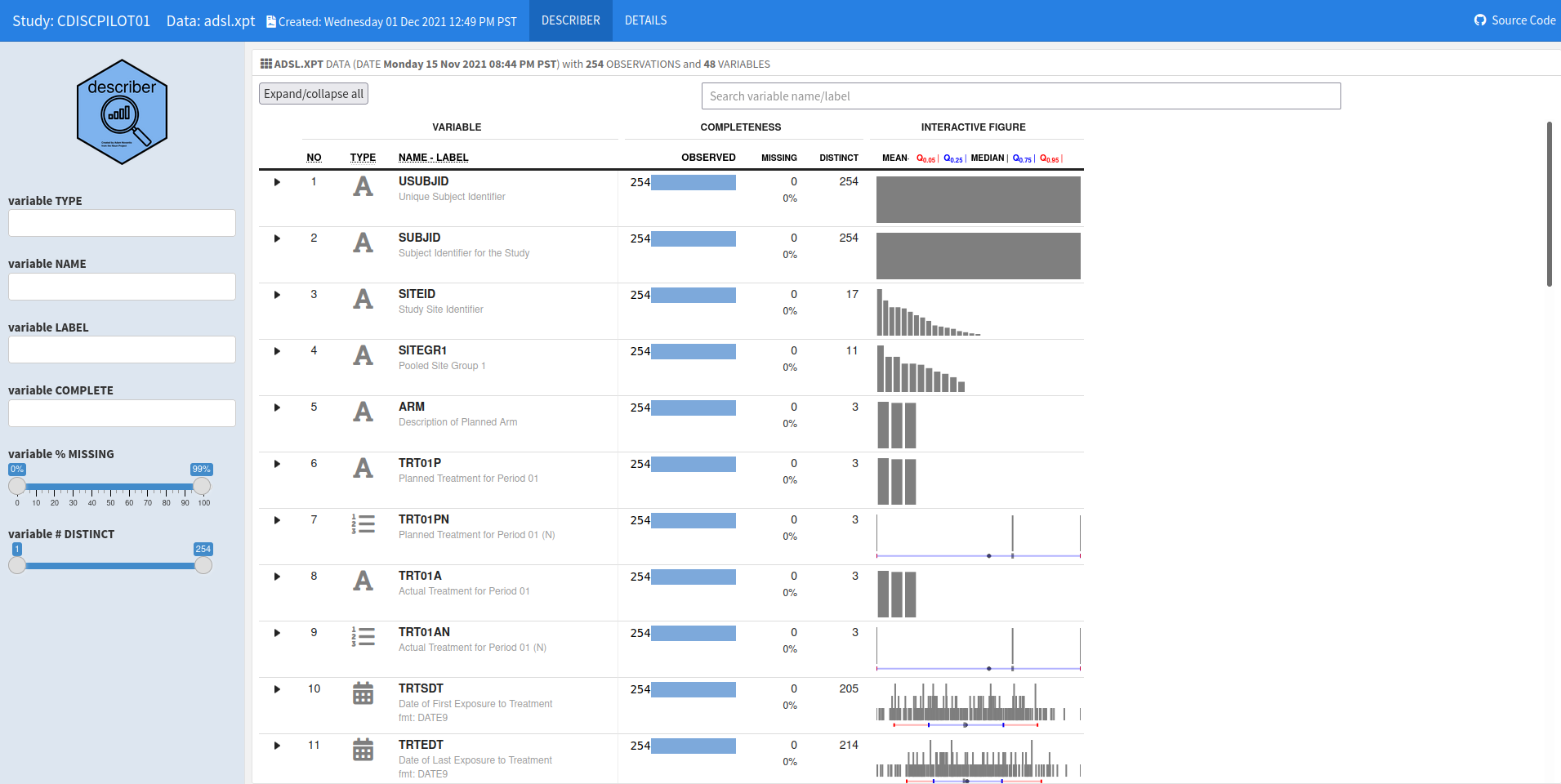
Example 3. Interactive Table / Describer package
The app can be found herehere.
The interactive describer visualisation allows the user to explore every variable included in the dataset. The details tab provides an overview of the summaries that are produced and a guide to how to navigate the data/interpret the visualisations, which summarise the data based on the type of variable (i.e. categorical or continuous).
The panel liked that the display was generalisable and could be ran on different datasets, although this does mean that that summaries of some variables are automatically included but may not be useful, such as plots of the USUBJID variable. It was discussed that the audience of the visualisation is important. In this case, the tool would be extremely useful for statisticians or programmers who want to investigate their data in depth, or to conduct data checks on interim data cuts. To improve the visualisation further, the panel recommended including treatment arm within the summaries of other variables.
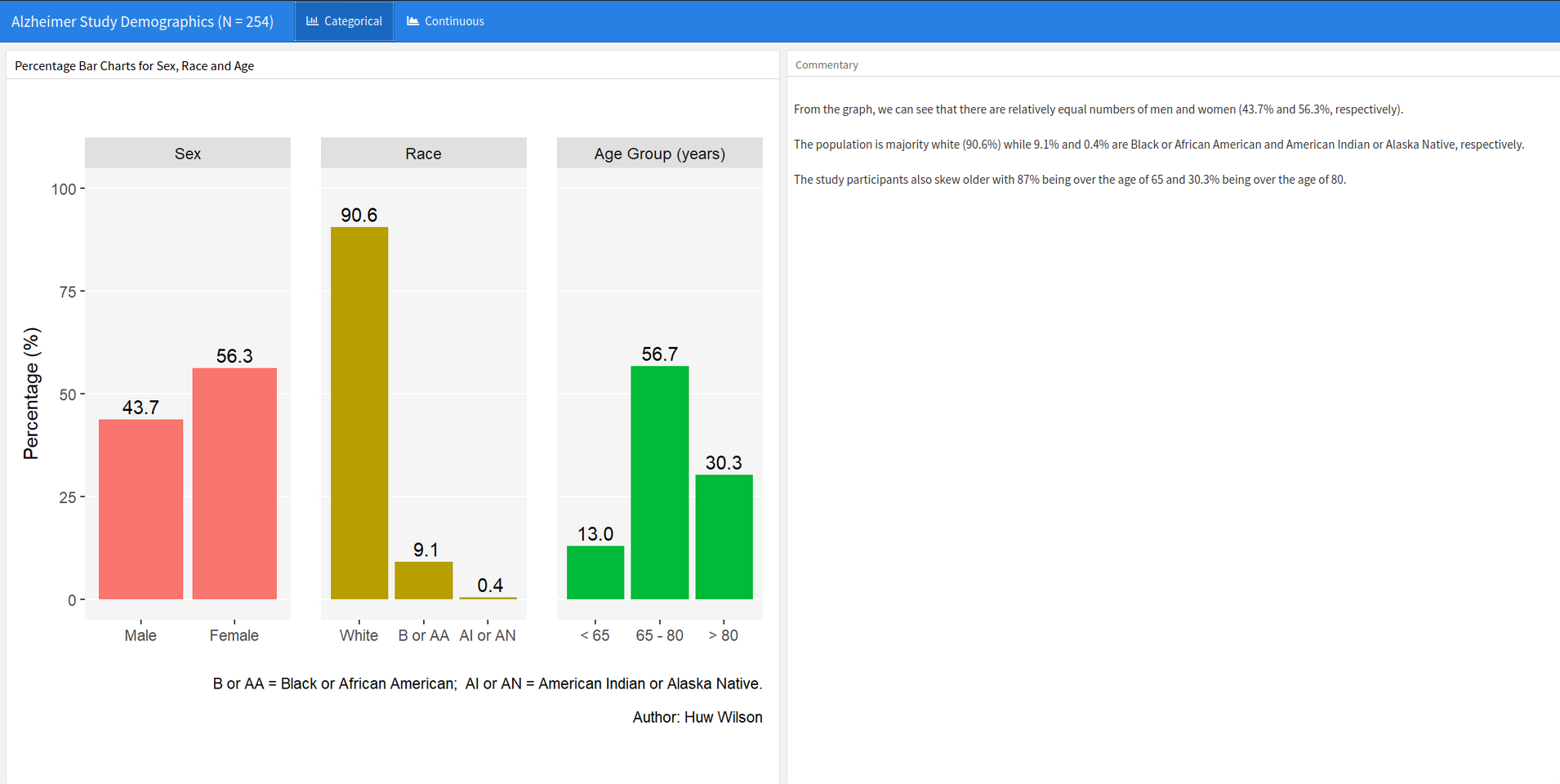
Example 4. Html Summaries
The html file can be found here.
This submission included bar charts for the categorical data and density plots for the continuous variables in the data. There is also a commentary pane alongside the graphs to aid interpretation.
Numbers are presented on the visualisation in a clear way for both chart types without adding too much clutter. The panel discussed the possibility of adding further measures of spread to the density plots (rather than just mean), but agreed that there is a balance between adding additional information and not becoming too cluttered. Separate colours were used for each visualisation but did not add any additional information. It was suggested that colours could instead be used to indicate treatment arms. The axes on the bar chart could be flipped, which would allow for inclusion of labelling in the bars. This alteration would also make it easier to align the comments in the right pane with the visualisations themselves, which would further aid interpretation.
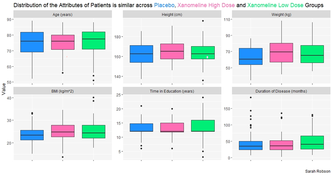
Example 5. Boxplots
This visualisation presented the data using a panel of box plots, with a separate panel for each variable. Data was also split by treatment arm with a different box for each group.
The panel praised the clean presentation of the plot, with the need for a key eliminated by using colours within the plot title itself. The graphs presented the data in a way which made it easy for the viewer to interpret and compare across treatment arms. However, the panel did highlight that it may be beneficial to rearrange the ordering of the boxes, as placebo, low dose, high dose would be a more natural ordering of treatment arms. The y-axis scales for each panel varied based on the data values for each variable, which helped to ensure plots were clear to read and not misleading.
Code
Example 1. Beeswarm (Observable)
See the following URL: https://observablehq.com/@irenedelatorre/beeswarm-in-plot-for-demographic-data
Example 2. Scatter Plots and Densities
library(haven)
library(dplyr)
library(tidyr)
library(ggplot2)
library(grid)
library(gridExtra)
library(readxl)
library(cowplot)

# Placebo

bl0 <- read_excel("/shared/175/arenv/arwork/gsk1278863/mid209676/present_2020_01/code/baseline/baseline.xlsx") %>%
  filter(TRT01PN == 0)

base0 <- ggplot(bl0) +
  geom_jitter(aes(x=AGE, y=as.numeric(BMIBL), color=factor(RACE)),  size=4, width=0.03, height=0, alpha=0.8) +
  scale_x_continuous(limits=c(50, 90), breaks=c(50, 55, 60, 65, 70, 75, 80, 85, 90)) +
  scale_y_continuous(limits=c(12, 42), breaks=c(15, 20, 25, 30, 35, 40, 45)) +
  scale_color_manual("Race", values=c("#d95f02", "#7570b3")) +
  ylab("BMI at Baseline (kg/m^2)") +
  xlab("Age (yrs)") +
  ggtitle("Placebo") +
  theme_minimal() +
  theme_linedraw() +
  theme(text = element_text(size=12)) +
  theme(legend.position = "none")

xdens0 <- axis_canvas(base0, axis="x") +
  geom_density(data=bl0, aes(AGE))

ydens0 <- axis_canvas(base0, axis="y", coord_flip = TRUE) +
  geom_density(data=bl0, aes(as.numeric(BMIBL))) +
                 coord_flip()

p10 <- insert_xaxis_grob(base0, xdens0, position="top")
p20 <- insert_yaxis_grob(p10, ydens0, position="right")

#############################################################################
# Low Dose

bl_lo <- read_excel("/shared/175/arenv/arwork/gsk1278863/mid209676/present_2020_01/code/baseline/baseline.xlsx") %>%
  filter(TRT01PN == 54)

base_lo <- ggplot(bl_lo) +
  geom_jitter(aes(x=AGE, y=as.numeric(BMIBL), color=factor(RACE)),  size=4, width=0.03, height=0, alpha=0.8) +
  scale_x_continuous(limits=c(50, 90), breaks=c(50, 55, 60, 65, 70, 75, 80, 85, 90)) +
  scale_y_continuous(limits=c(12, 42), breaks=c(15, 20, 25, 30, 35, 40, 45)) +
  scale_color_manual("Race", values=c("#d95f02", "#7570b3")) +
  ylab("BMI at Baseline (kg/m^2)") +
  xlab("Age (yrs)") +
  ggtitle("Xanomeline Low Dose") +
  theme_minimal() +
  theme_linedraw() +
  theme(text = element_text(size=12)) +
  theme(legend.position = "none")

xdens_lo <- axis_canvas(base_lo, axis="x") +
  geom_density(data=bl_lo, aes(AGE))

ydens_lo <- axis_canvas(base_lo, axis="y", coord_flip = TRUE) +
  geom_density(data=bl_lo, aes(as.numeric(BMIBL))) +
  coord_flip()

p1_lo <- insert_xaxis_grob(base_lo, xdens_lo, position="top")
p2_lo <- insert_yaxis_grob(p1_lo, ydens_lo, position="right")
#############################################################################
# High Dose

bl_hi <- read_excel("/shared/175/arenv/arwork/gsk1278863/mid209676/present_2020_01/code/baseline/baseline.xlsx") %>%
  filter(TRT01PN == 81)

base_hi <- ggplot(bl_hi) +
  geom_jitter(aes(x=AGE, y=as.numeric(BMIBL), color=factor(RACE)),  size=4, width=0.03, height=0, alpha=0.8) +
  scale_x_continuous(limits=c(50, 90), breaks=c(50, 55, 60, 65, 70, 75, 80, 85, 90)) +
  scale_y_continuous(limits=c(12, 42), breaks=c(15, 20, 25, 30, 35, 40, 45)) +
  scale_color_manual("Race", labels=c("AMERICAN INDIAN", "BLACK OR AFRICAN AMERICAN","WHITE"),values=c("#1b9e77", "#d95f02", "#7570b3")) +
  ylab("BMI at Baseline (kg/m^2)") +
  xlab("Age (yrs)") +
  ggtitle("Xanomeline High Dose") +
  theme_minimal() +
  theme_linedraw() +
  theme(text = element_text(size=12)) +
  theme(legend.position = "bottom") +
  theme(legend.title=element_blank())

xdens_hi <- axis_canvas(base_hi, axis="x") +
  geom_density(data=bl_hi, aes(AGE))

ydens_hi <- axis_canvas(base_hi, axis="y", coord_flip = TRUE) +
  geom_density(data=bl_hi, aes(as.numeric(BMIBL))) +
  coord_flip()

p1_hi <- insert_xaxis_grob(base_hi, xdens_hi, position="top")
p2_hi <- insert_yaxis_grob(p1_hi, ydens_hi, position="right")


#############################################################################

p <- grid.arrange(arrangeGrob(p20, ncol=1, nrow=1),
                  arrangeGrob(p2_lo, ncol=1, nrow=1),
                  arrangeGrob(p2_hi, ncol=1, nrow=1),
                  heights = c(1,1.1))

title <- ggdraw() + draw_label("BMI, Age and Race are Well Balanced Between Treatment Groups. \nParticipants Were Predominantly White.\n", size = 18)

p2 <- plot_grid(title, p, ncol=1, rel_heights = c(1, 10))

ggsave("/shared/175/arenv/arwork/gsk1278863/mid209676/present_2020_01/code/baseline/baseline_SM.png", p2, width=12, height=8, dpi=300)
Example 3. Interactive Table / Describer package
The rmd file can be found here.
Example 4. Html Summaries
The Rmd file can be found here
Example 5. Boxplots
No code has been submitted.