Quality of Life in a Cancer Trial
EORTC QLQ-C30 is quality of life (QoL) questionnaire designed for use in cancer patients Each item is rated on a 4-point response scale ranging from 1 (“Not at all”) to 4 (“Very much”) or a 7-point scale ranging from 1 (“Very poor”) to 7 (“Excellent”).
Higher scores represent better outcomes for the global health scale (QL) and the functional scales (PF, RF, EF, CF, SF), whereas higher scores represent higher severe symptoms for the symptom scales/items (FA, NV, PA, DY, SL, AP, CO, DI, FI). The overall QLQ-C30 score is calculated using scoring rules to a range of 0-100.
The challenge comprises a simulated study with two arms (Experimental Treatment vs. Standard of Care), with 100 participants each arm. Participants are followed for 48 weeks, and PRO scores are collected at baseline and every 3 weeks.
The challenge is to visualize any treatment benefit using absolute values or change from baseline. A threshold of ± 10 or ± 5 points for the change from baseline could be used for assessing meaningful worsening or improvement.
A recording of the session can be found here.
Example 1. Individual Patient Trajectories
_visualisation_newer%20-%20Samiar%20Ashtiany.png)
This figure of change from baseline in QLQ-C30 over time is showing patient-level data as individual lines. Although this is technically a spaghetti plot, a lot of over-plotting occurs due to the discrete nature of the score values. Where this occurs, the opacity of the lines depends on the number of lines that are superimposed, so the figure gives an good general impression of the overall trend. In the left panel (control group), there seem to be more darker lines in the lower half of the plot, showing a worsening of QoL, while the opposite is true in the right panel (experimental group). The figure also includes a superimposed line plot of mean over time (+/- standard error), which shows a similar trend of improvement in global health status in the experimental group and a worsening in the control group.
The use of faint grey gridlines is quite effective. The possibility of using a greyscale for the patient-level data was discussed, because the colour isn’t coding any information and this would make the line plot of mean over time stand out, but it was agreed this would make the patient-level data difficult to distinguish against the gridlines. Some design improvements were suggested, making some of the labels a little larger, and there is also some scope for decluttering the graph, e.g. removing the Y-axis label from the right panel.
Example 2. Animated Radial Plot
This is an animated radial plot showing absolute values for each of the domains, with better scores represented towards the outside and worse score on the inside. At each point in time, the scores for the different domains are joined by a thick line, with previous results retained as fainter lines. As the animation runs, the trends in each of the domains over time can be viewed as shifts in the overall shape, and it is possible to control the animation and jump to a specific timepoint.
Animated plots have the advantage that time in the study is represented as time in the animation, which is highly intuitive. Absolute quality of life score is represented by the lightness or darkness of the background colour, so the legend labels of “Improvement” and “Worsening” are a little misleading. It might have been better for the background colour-coding to be stepwise rather than continuous, as it is quite difficult to read off the values, especially where the shading is darker. Because the treatment groups are colour-coded, a possible design option might be to include both treatment groups on the same axes, although this may cause problems with over-plotting. Overall, the graph is highly effective and aesthetically pleasing.
Example 3.
_visualisation_newer%20-%20Samiar%20Ashtiany.png)
Visualizations (the app) can be found here.
Static
image 1
Static
image 2
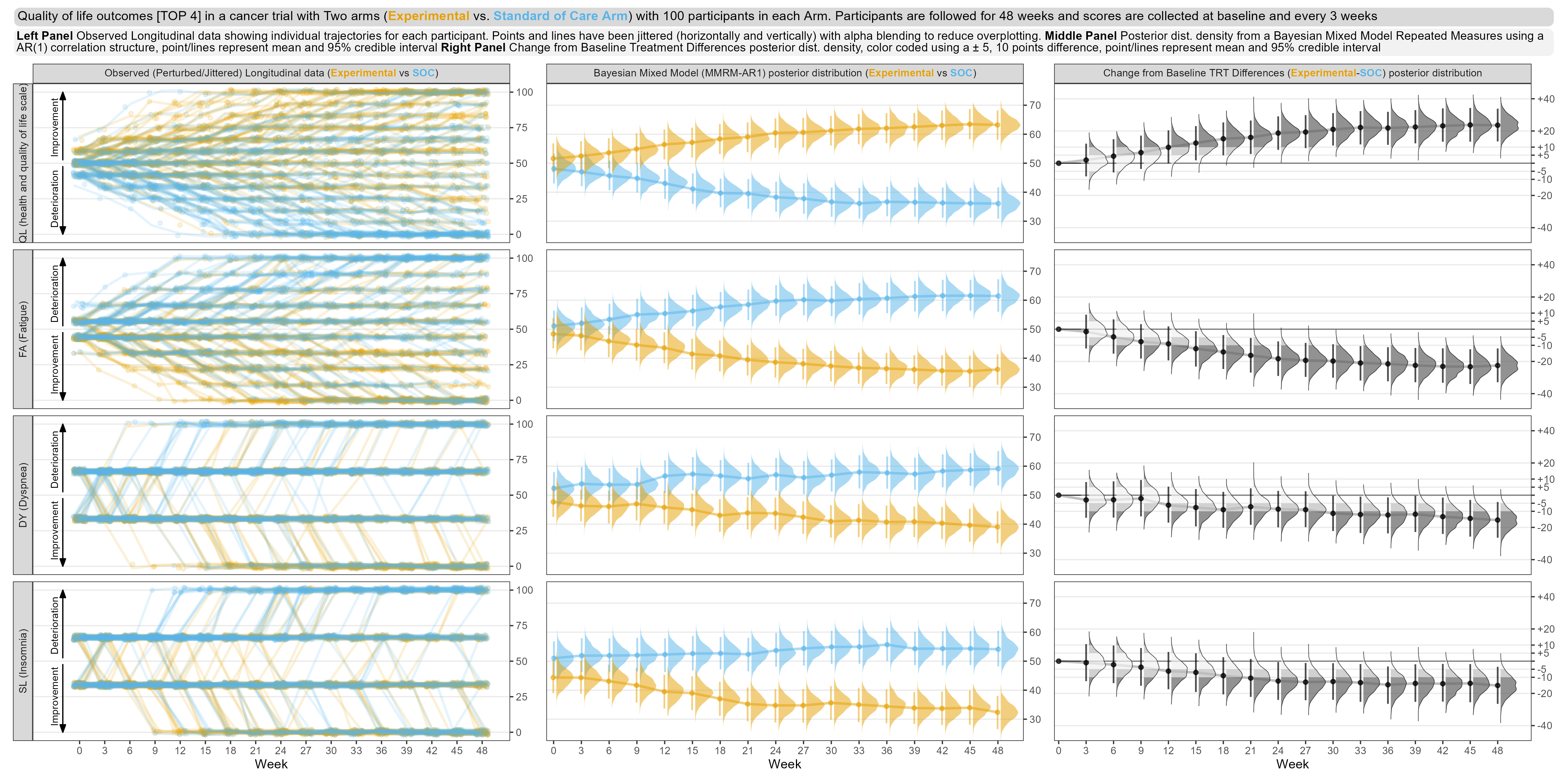
First tab: This tab focuses on only the top four domains, in terms of treatment effect. The left panel is showing patient-level data, similarly to the first entry, although data have been jittered to avoid over-plotting. The middle panel shows point estimates, credible intervals and posterior distributions for each treatment and timepoint from from a Bayesian MMRM model. Posterior distributions for the treatment differences are shown in the right panel, with cutpoints added to the density plots to indicate clinically-meaningful threshold values.The graph includes a lot of information but is highly effective in showing trends in the data.
Second tab: this shows the treatment differences for all domains, including point estimates, credible intervals and Bayesian posterior distributions. The domains are sorted in terms of treatment effect, so it is very clear which domains are driving the overall treatment effect. Shading has been used to represent different parts of the posterior distribution curve with respect to the threshold values.
Further tabs give the user a more focused view of what we saw in the first tab, i.e. patient-level data, results of the MMRM and treatment differences, for a single domain, e.g. quality of life, functional scales, symptoms and financial difficulties.
The consistent colour-coding across all panels is helpful, and the colours are similar with respect to their intensity. For the second tab, representing time on the vertical axis is unsual and possibly counter intuitive, but an alternative design may have difficult to implement. Also in the second tab, annotations hadn’t been added to show which direction represents a benefit for each of the scales (which was present on the first tab and was very helpful). But overall this package of graphs provides a rich source of information and clearly shows the important features of the data.
Code
Example 1. Individual Patient Trajectories
library(tidyverse)
library(lubridate)
library(dplyr)
library(ggplot2)
library(readxl)
library(cowplot)
library(gridExtra)
library(patchwork)
library(reshape2)
library(grid)

X <- read.csv(url("https://raw.githubusercontent.com/VIS-SIG/Wonderful-Wednesdays/master/data/2022/2022-09-14/ww%20eortc%20qlq-c30.csv"))
X[X==0] <- NA;
X1 <- X[1:(nrow(X)/2), ]; # standard
Xe <- X[(nrow(X)/2+1):nrow(X),]; # experimental

X1 <-  X1 %>%
  group_by(USUBJID) %>%
  mutate(QL_diff = QL - QL[1], PF_diff = PF - PF[1], RF_diff = RF - RF[1], EF_diff = EF - EF[1])
X1_a <- X1 #save for second plot

Xe <-  Xe %>%
  group_by(USUBJID) %>%
  mutate(QL_diff = QL - QL[1], PF_diff = PF - PF[1], RF_diff = RF - RF[1], EF_diff = EF - EF[1])
Xe_a <- Xe #save for second plot

#need to replace NA's with 0's again when finding the mean
X1$QL_diff[is.na(X1$QL_diff)] <- 0 #We will only use QL in the plot below, but can use any sub-scale.
X1$PF_diff[is.na(X1$PF_diff)] <- 0
X1$RF_diff[is.na(X1$RF_diff)] <- 0
X1$EF_diff[is.na(X1$EF_diff)] <- 0
Xe$QL_diff[is.na(Xe$QL_diff)] <- 0
Xe$PF_diff[is.na(Xe$PF_diff)] <- 0
Xe$RF_diff[is.na(Xe$RF_diff)] <- 0
Xe$EF_diff[is.na(Xe$EF_diff)] <- 0

A <- aggregate(X1[, 20:23], list(X1$AVISITN), mean)
colnames(A) <- c("AVISITN", "QL_mean", "PF_mean", "RF_mean", "EF_mean")
B <- aggregate(X1[, 20:23], list(X1$AVISITN), sd)
B <- B[, 2:ncol(B)]/sqrt(100)
colnames(B) <- c("QL_se", "PF_se", "RF_se", "EF_se")
A <- data.frame(A, B)

Ae <- aggregate(Xe[, 20:23], list(Xe$AVISITN), mean)
colnames(Ae) <- c("AVISITN", "QL_mean", "PF_mean", "RF_mean", "EF_mean")
Be <- aggregate(Xe[, 20:23], list(Xe$AVISITN), sd)
Be <- Be[, 2:ncol(Be)]/sqrt(100)
colnames(Be) <- c("QL_se", "PF_se", "RF_se", "EF_se")
Ae <- data.frame(Ae, Be)

library(plyr) #call this library here, not before.

A = A[c(1,2,3,4,5,6,7,8,10,11,12,13,14,15,16,17,9),]
A[nrow(A)+nrow(X1)-nrow(A),] <- NA;
A1 <- cbind(X1_a, A);

Ae = Ae[c(1,2,3,4,5,6,7,8,10,11,12,13,14,15,16,17,9),]
Ae[nrow(Ae)+nrow(Xe)-nrow(Ae),] <- NA;
A1e <- cbind(Xe_a, Ae);

X1count <- X1[complete.cases(X1$QL),] #To count dropout rate/N (number) per visit
Xecount <- Xe[complete.cases(Xe$QL),]
X1count <- count(X1count, "AVISITN")
Xecount <- count(Xecount, "AVISITN")

#Standard treatment plot
GG1<-ggplot(data=A1, aes(x=AVISITN...19, y=QL_diff, group=USUBJID, color="red")) +
  geom_line(size=1, alpha=0.15, color="tomato")+guides(color = "none")+
  xlab("Visit Number")+ylab("Change from Baseline")+
  scale_x_continuous(breaks=0:17)+
  scale_y_continuous(breaks=seq(-55, 55, by=10))+
  geom_hline(yintercept=c(-6,0,6), linetype='dotted', col = 'black')+
  geom_line(aes(x=AVISITN...24, y = QL_mean, colour = "Standard"),size=1) +
  geom_point(aes(x=AVISITN...24, y = QL_mean, colour = "Standard"),size=2)+
  geom_errorbar(aes(ymin=QL_mean-QL_se, ymax=QL_mean+QL_se, colour = "Standard"),width=25, position=position_dodge(0))+
  scale_colour_manual(values="violet")+
  annotate(geom = "text", x = 1:17, y = -68, label = X1count$freq, size = 3)+
  coord_cartesian(ylim = c(-55, 55), expand = FALSE, clip = "off")+theme_bw()

GG1 <- GG1+theme(axis.text=element_text(size=8), axis.title=element_text(size=10),panel.grid.minor.x = element_blank(),panel.grid.minor.y = element_blank())

#Experimental treatment plot
GG2<-ggplot(data=A1e, aes(x=AVISITN...19, y=QL_diff, group=USUBJID, color="red")) +
  geom_line(size=1, alpha=0.15, color="dodgerblue")+guides(color = "none")+
  xlab("Visit Number")+ylab("")+
  scale_x_continuous(breaks=0:17)+
  scale_y_continuous(breaks=seq(-55, 55, by=10))+
  geom_hline(yintercept=c(-6,0,6), linetype='dotted', col = 'black')+
  geom_line(aes(x=AVISITN...24, y = QL_mean, colour = "Experimental"),size=1) +
  geom_point(aes(x=AVISITN...24, y = QL_mean, colour = "Experimental"),size=2)+
  geom_errorbar(aes(ymin=QL_mean-QL_se, ymax=QL_mean+QL_se, colour = "Experimental"),width=25, position=position_dodge(0))+
  scale_colour_manual(values="aquamarine4")+
  annotate(geom = "text", x = 1:17, y = -68, label = Xecount$freq, size = 3)+
  coord_cartesian(ylim = c(-55, 55), expand = FALSE, clip = "off")+theme_bw()

GG2 <- GG2+theme(axis.text=element_text(size=8), axis.title=element_text(size=10),panel.grid.minor.x = element_blank(),panel.grid.minor.y = element_blank())

#Combining two plots
p1 <- plot_grid(GG1, GG2, labels=c("Standard", "Experimental"),hjust = -1.0, vjust = 0.5,label_size = 8)
title <- ggdraw() + draw_label("This looks nothing like real QLQ-C30 Global Heath Status data, real individual patient data has much more variability", size=15)
subtitle <- ggdraw() + draw_label("Higher Values & Positive Change from Baseline values for QLQ-C30 Global Heath Status indicate better Quality of Life", size=10)
footnote <- ggdraw() + draw_label("Individual patient data with arithmetic mean (+/- SE) overlaid. \n Horizontal Reference lines indicate the Minimal Important Change (MIC), at the group level, of -6 and 6 based on the 2012 Cocks publication.\n Line opacity is proportional to the number of patients, with more transparent lines indicating less patients. Total number of patients remaining per visit is given below the x-axis.", fontface='italic', size=10)

#plot results
plot_grid(title, subtitle, p1, footnote, ncol=1, rel_heights=c(0.1, 0.1, 1, 0.4, -0.1))

#By Samiar Ashtiany
Example 2.
No code has been sumbitted.
Example 3.
The code can be found here.