Continuous Glucose Monitoring (CGM) data
Diabetes affects over 463 million people worldwide. Diabetes is a vascular disease that can lead to amputations, blindness, kidney failure and death. Managing patients’ glucose levels is key to managing their disease.
The CGM data allows us to approximate glucose levels every 5 minutes continuously throughout the day. Glucose values with low variability and within clinically relevant ranges of 72 and 140 mg/dL are considered to indicate good glycemic control. More information can be found here.
Example 1. Bar plot
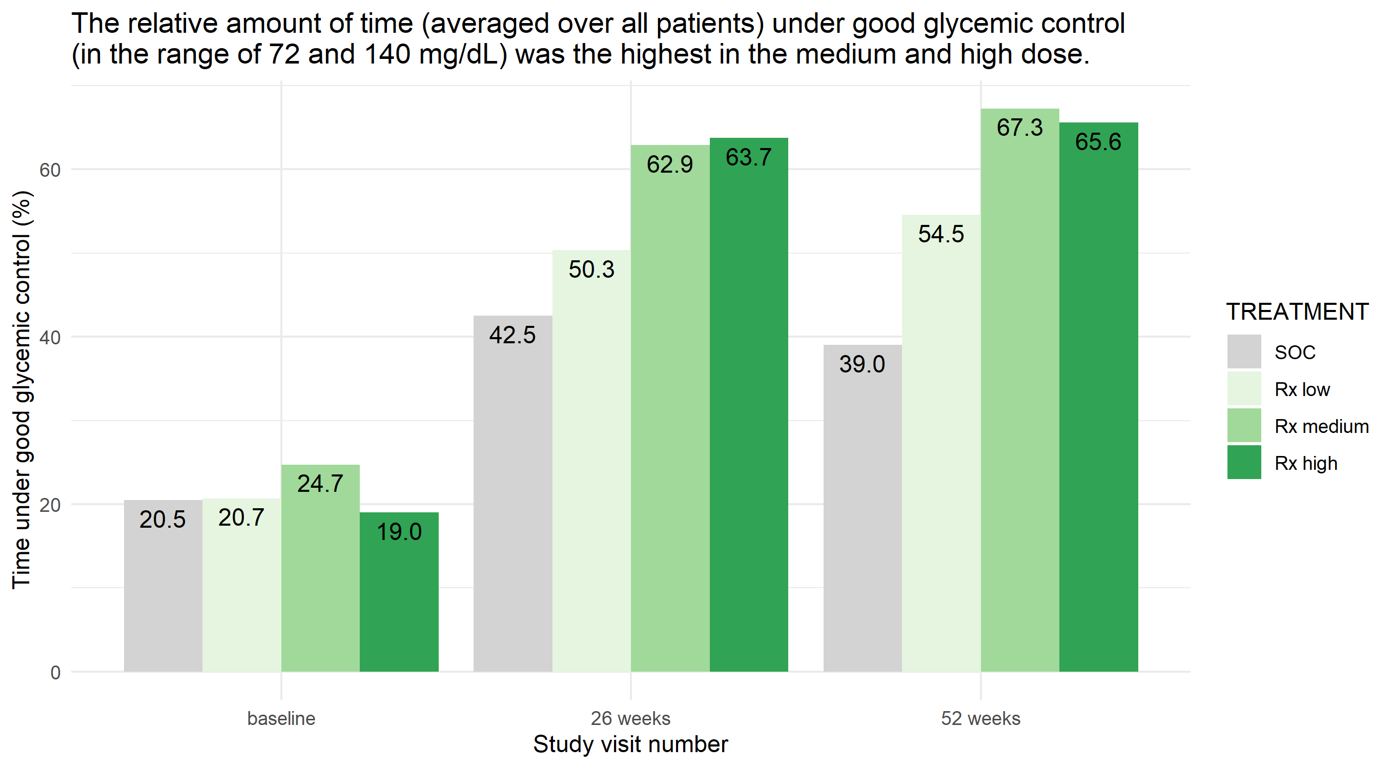
In this bar plot, the relatively complex data set is boiled down to a very simple visualization. The relative amount of time is plotted against time and treatment group.
The panel liked its simplicity and that clutter has been avoided. Furthermore, the coloring is chosen in a sensible way. Grey is used for SOC whereas different shades of green are used for the Rx treatments using increasing intensities with higher dose levels. The horizontal lines and the y-axis tick marks could have been removed to make it even less cluttered, because the percentage is shown in each bar.
Example 2. Dashboard Trelliscope
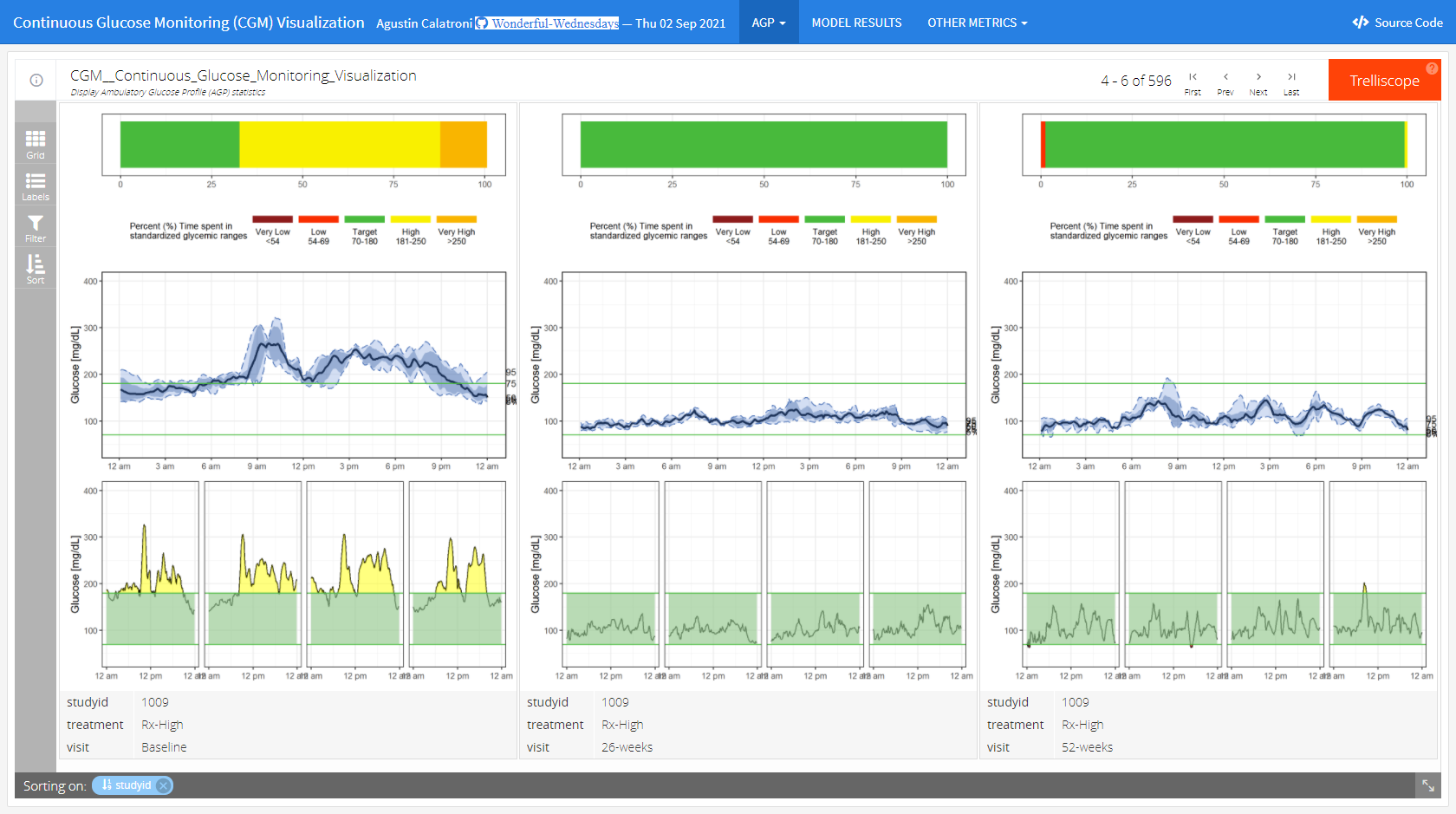
The app can be found here
This is a lot more than just a visualization. It is a very comprehensive tool to do an exhaustive exploratory analysis of the data.
In the first tab (“AGP”), we see individual patient data including individual profile plots over time. This is very helpful if you want to focus on specific patients. The level of information increases from top to bottom. In the first row, we see a summary over all data for this patient. The next row shows a summary over all days. And the last rows provides the user with individual patient profile plots.
In the second tab (“MODEL RESULTS”), we see a visualization of model results to detect clusters in the CGM values. The goal was to detect differences between clusters in regards to the time spent in the standardized glycemic ranges. The visualization helps the user to easily understand the results.
The last tab (“OTHER METRICS”) follows a similar idea as the second tab. The clustering can be done based on other variables in a flexible way. This makes this a very powerful tool with many options.
The whole tool comes with a lot of explanations and with clickable references.
The panel thinks that this is a great and very powerful app to do a thorough exploratory data analysis.
Example 3. Patient profiles with quantiles
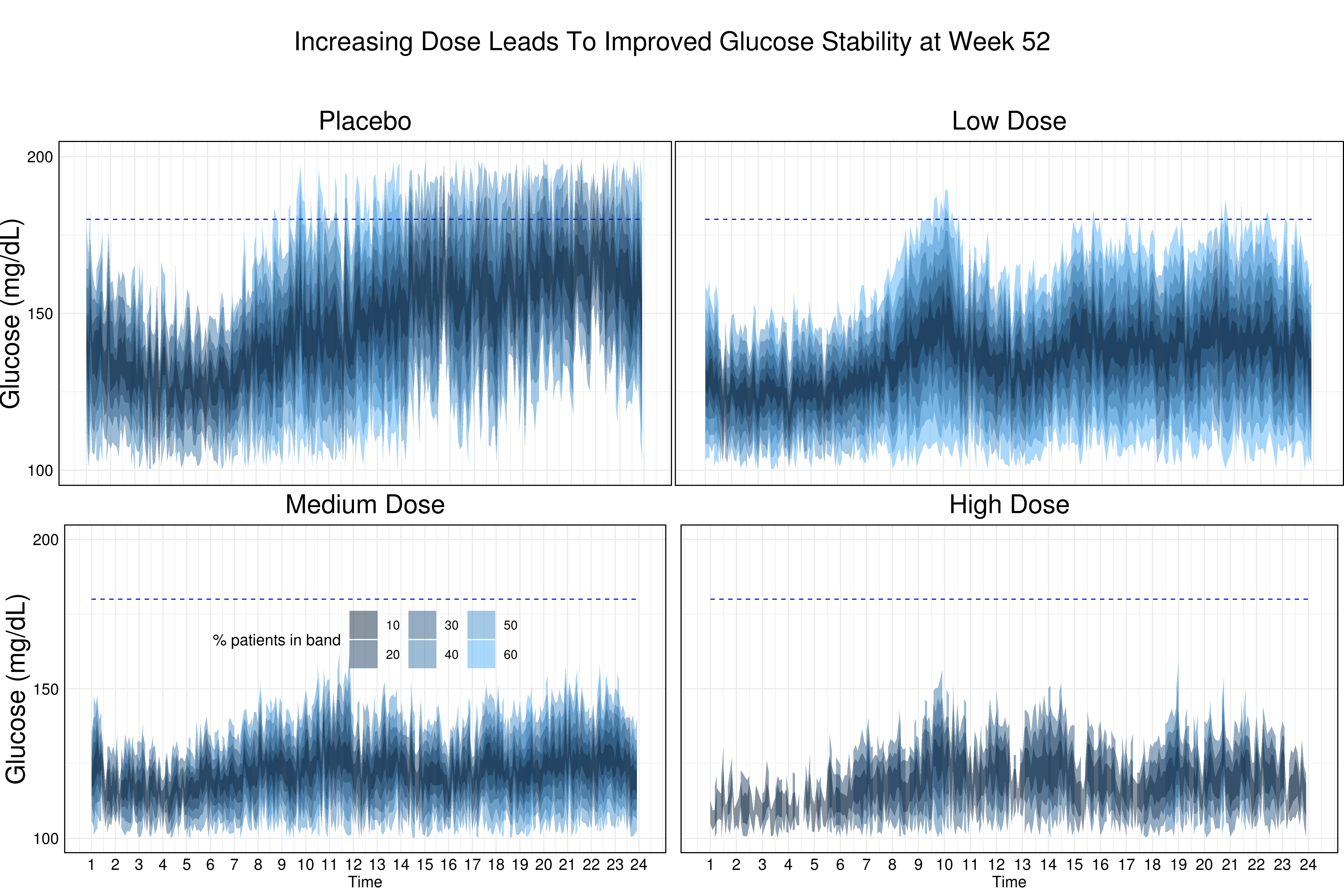
This visualization shows quantiles of profile plots at week 52 for the different treatment groups. The message becomes very obvious and it is also stated in the title: Increasing dose leads to improved glucose stability at week 52.
The quantiles are color-coded and the grid line helps to understand the results. It marks the upper limit of good glycemic control. Furthermore, the order of the treatment groups is sensibly chosen (going from top left to bottom right means going from SOC to the highest dose).
Example 4. Averaged patient profiles
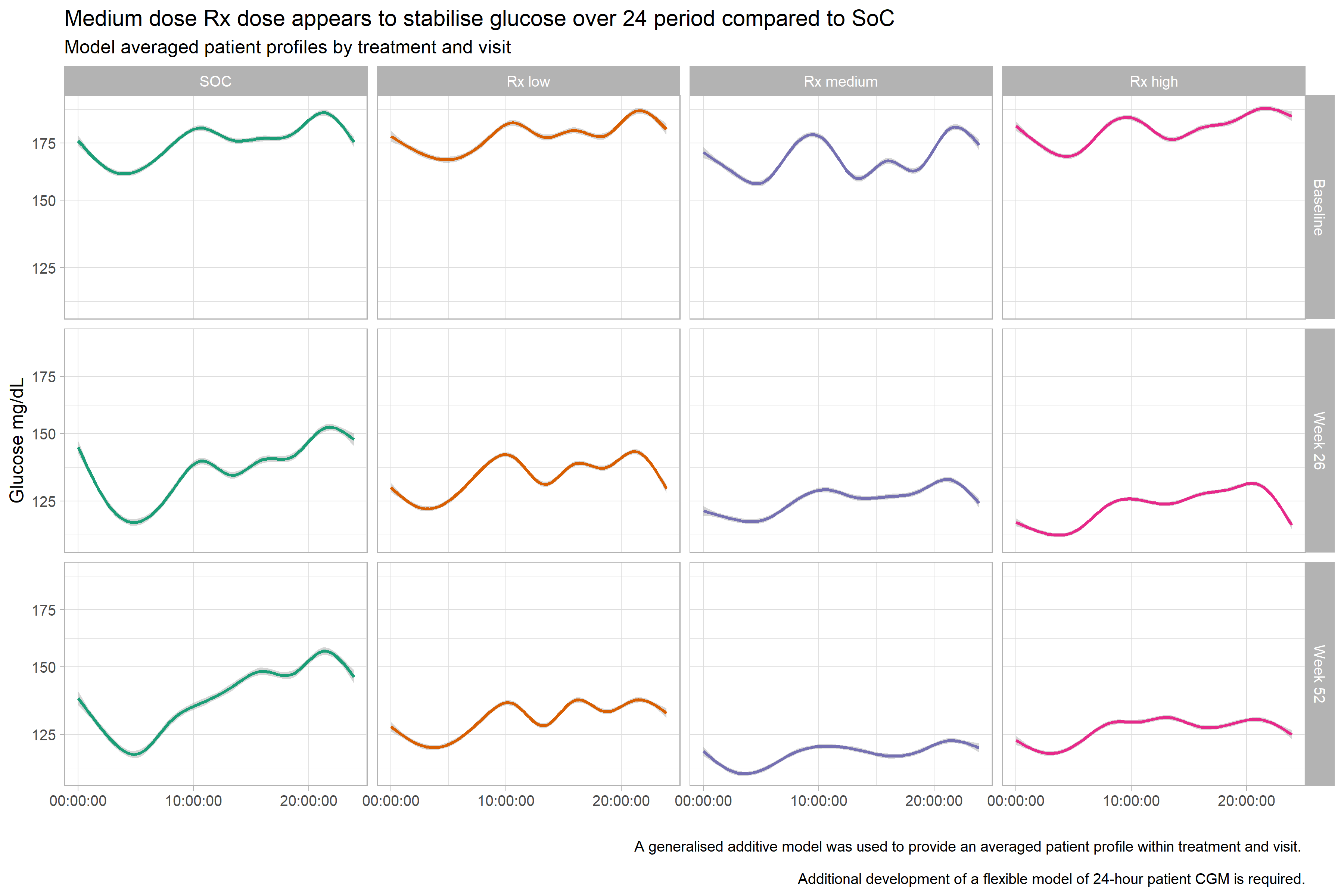
In this visualization, we see the averaged profile plots for the different treatment groups. It is a very clean visualization and the message becomes quite obvious.
The panel thought that the coloring could be improved (for example, by using the same color but with increasing intensity for the Rx arms with increasing dose levels). Furthermore, it might be better to re-organize the plots: The time points could be next to each other and the groups on top of each other.
A very good idea is the x-axis labeling. Even without a label it becomes clear right away that it is the time that is displayed because of the format that is being used.
Example 5. Profile plots with overlays
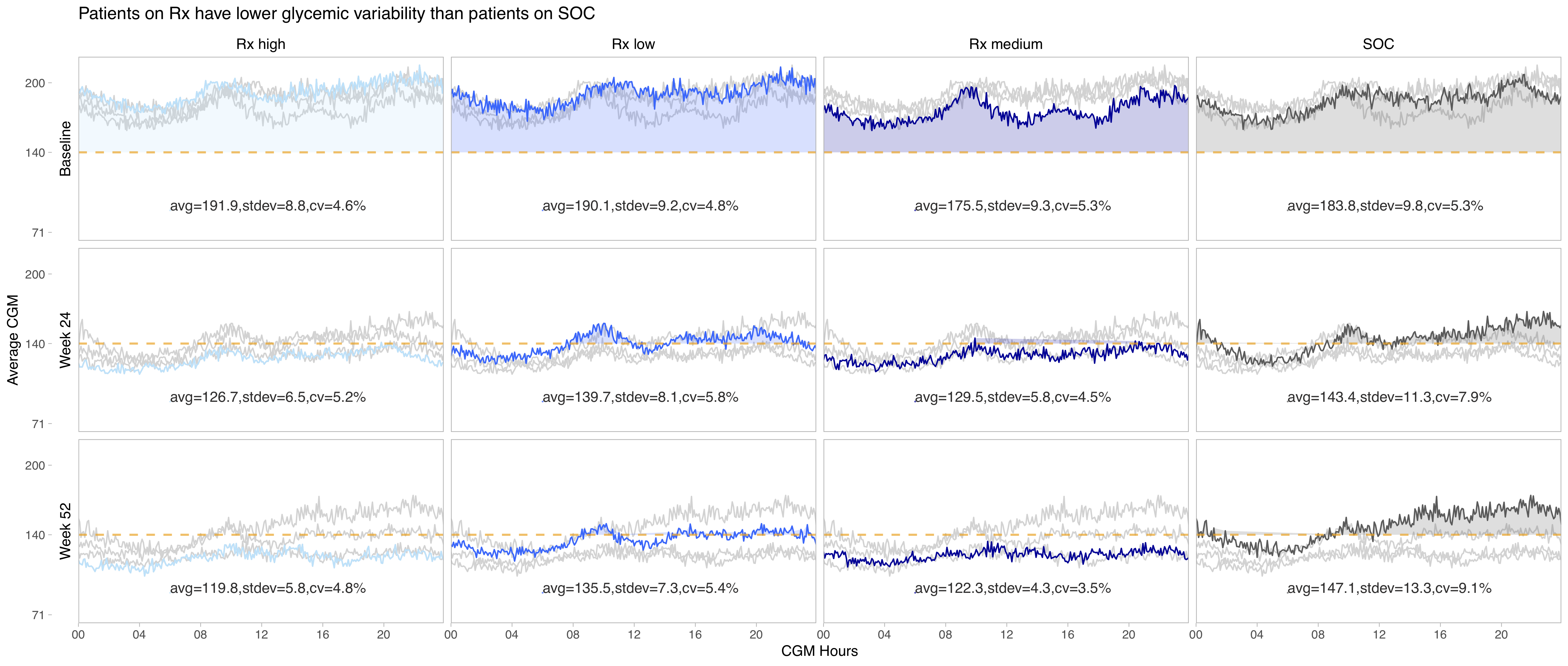
This visualization follows a similar idea as the one above. Furthermore, the same ordering of the plots is used and, therefore, the same comment about re-ordering them might apply. Another thing that could be improved is the order of the treatment arms (going from SOC to low - medium - high dose) and the coloring of the arms with increased intensity of the color for increased levels of dosing. (Grey is wisely chosen for SOC.)
The overlays make it easy to compare the different groups which is a very nice idea of visualizing this type of data.
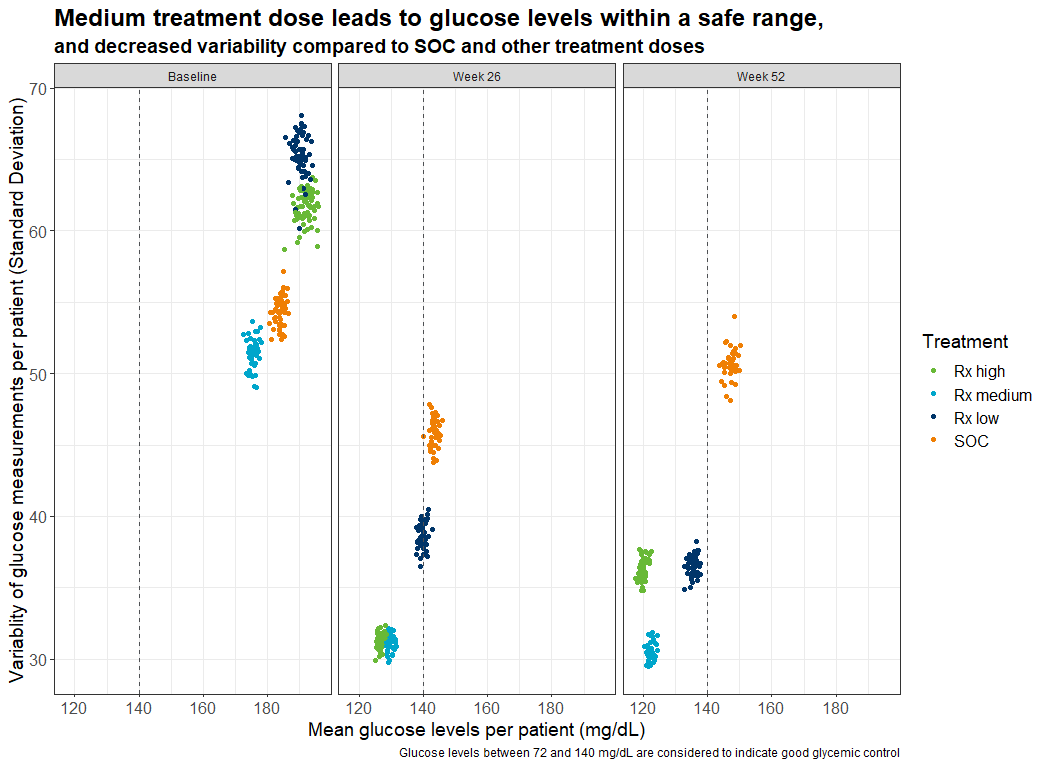
Example 6. Variability plot
In this plot, the variability (represented by the standard deviation) is plotted over time and by treatment group. This is a very good idea to present the stability of the values.
The title is very nicely done. The first line provides already a very clear message. The second line uses a smaller font size and provides additional information. This plot is very clear and easy to read. Only the coloring could be chosen in a different way as already discussed above.
Example 7. Colab notebook
Please find the notebook here.
Code
Example 1.
# Barplot by treatment and time:
# Frequency of values per patient within the range of 72 and 140 mg/dL:

# Read in data:
dat <- read.csv("simulated_data.csv", sep = ",", dec = ".")

# Create function to calculate the percentage per patient:
num.f <- function(x) length(which(x >= 72 & x <= 140)) / length(x)

# Calculate mean values:
res <- aggregate(dat$Simulated_CGMValue, list(dat$SUBJID, dat$TREATMENT, dat$VISITNUM), num.f)
res <- aggregate(res$x, list(res$Group.2, res$Group.3), mean)

# Prepare the results to be plotted:
names(res) <- c("TREATMENT", "VISITNUM", "Value")
res$VISITNUM <- factor(res$VISITNUM, levels = c(3, 17, 21), labels = c("baseline", "26 weeks", "52 weeks"))
res$TREATMENT <- factor(res$TREATMENT, ordered = T,
                        levels = c("SOC", "Rx low", "Rx medium", "Rx high"))
res$Value <- res$Value*100
res$val.t <- format(round(res$Value, 1), nsmall = 1)

# Create the plot:
library(ggplot2)
library(RColorBrewer)
ggplot(res, aes(y=Value, x=VISITNUM, fill=TREATMENT)) +
  geom_bar(position="dodge", stat="identity") +
  ylab("Time under good glycemic control (%)") + xlab ("Study visit number") +
  theme_minimal() + #scale_fill_brewer(palette="Set1")
  scale_fill_manual(breaks = c("SOC", "Rx low", "Rx medium", "Rx high"),
                    values = c("lightgrey", brewer.pal(n = 3, name = "Greens"))) +
  geom_text(aes(label=val.t), vjust = 1.5, size = 4, position = position_dodge(.9)) +
  ggtitle("The relative amount of time (averaged over all patients) under good glycemic control
(in the range of 72 and 140 mg/dL) was the highest in the medium and high dose.")
ggsave("barplot.png")
Example 2. Dashboard Trelliscope
The Rmd file can be found here and here.
The full code can be found here.
Example 3. Patient profiles with quantiles
####################################################################
# Program name: hgb_quantiles_f.R
# Purpose: To produce plot summarising spread of Hgb values at each
#         visit (for Wonderful Wednesdays July 2020)
# Written by: Steve Mallett
# Date: 12-Jun-2020
####################################################################

library(haven)
library(dplyr)
library(tidyr)
library(ggplot2)
library(grid)
library(gridExtra)

cgm0 <- read_sas("/shared/175/arenv/arwork/gsk1278863/mid209676/present_2020_01/code/CGM/cgm_data2.sas7bdat") %>%
  filter(trtcd == 0 & VISITNUM == 21)

quant <- cgm0 %>% group_by(CGMTIME) %>%
  do(quant = quantile(.$aval, probs = seq(0.2,0.8,.05)), probs = seq(0.2,0.8,.05)) %>%
  unnest(cols=c(quant, probs)) %>%
  mutate(delta = 2*round(abs(.5-probs)*100)) %>%
  group_by(CGMTIME, delta) %>%
  summarize(quantmin = min(quant), quantmax= max(quant)) %>%
  mutate(hour = (CGMTIME/3600)) %>%
  filter(delta != 0)

# Produce plot for Placebo

plot0 <- ggplot() +
  geom_ribbon(data = quant, aes(x = hour, ymin = quantmin, ymax = quantmax,
                                    group = reorder(delta, -delta), fill = as.numeric(delta)),
              alpha = .5) +
  geom_segment(aes(x=1, xend=24, y=180, yend=180), linetype = 2, color = "blue") +
 scale_x_continuous(" ",
                    breaks=c(1,2,3,4,5,6,7,8,9,10,11,12,13,14,15,16,17,18,19,20,21,22,23,24),
                    limits=c(1, 24)) +
 scale_y_continuous("Glucose (mg/dL)",
                   breaks=c(100, 150, 200),
                   limits=c(100, 200),
                   ) +
  scale_fill_continuous(guide = guide_legend(direction = "horizontal",
                                             title.position = "none")) +
  scale_color_identity(name = " ",
                       guide=legend,
                       labels = " ") +
  theme_minimal() +
  theme(legend.position="none",
        axis.text.x = element_blank(),
        axis.title.x = element_blank(),
        axis.text.y = element_text(size = 15, color = 'black'),
        axis.title.y = element_text(size = 25),

        axis.ticks.x=element_blank(),
        axis.text.y.left =  element_text(color = 'black'),
        plot.title = element_text(hjust = 0.5, size = 25),
        text = element_text(size = 15),

        axis.title = element_text(size = 25),
        panel.border = element_rect(colour = "black", fill=NA, size=1),
        plot.margin=unit(c(1,0,0,0),"cm")) +
  ggtitle(label = "Placebo")

#####################################
cgm1 <- read_sas("/shared/175/arenv/arwork/gsk1278863/mid209676/present_2020_01/code/CGM/cgm_data2.sas7bdat") %>%
  filter(trtcd==1 & VISITNUM == 21)

quant <- cgm1 %>% group_by(CGMTIME) %>%
  do(quant = quantile(.$aval, probs = seq(0.2,0.8,.05)), probs = seq(0.2,0.8,.05)) %>%
  unnest(cols=c(quant, probs)) %>%
  mutate(delta = 2*round(abs(.5-probs)*100)) %>%
  group_by(CGMTIME, delta) %>%
  summarize(quantmin = min(quant), quantmax= max(quant)) %>%
  mutate(hour = (CGMTIME/3600)) %>%
  filter(delta != 0)

plot1 <- ggplot() +
  geom_ribbon(data = quant, aes(x = hour, ymin = quantmin, ymax = quantmax,
                                 group = reorder(delta, -delta), fill = as.numeric(delta)),
              alpha = .5) +
  geom_segment(aes(x=1, xend=24, y=180, yend=180), linetype = 2, color = "blue") +
  scale_x_continuous(" ",
                     breaks=c(1,2,3,4,5,6,7,8,9,10,11,12,13,14,15,16,17,18,19,20,21,22,23,24),
                     limits=c(1, 24)) +
  scale_y_continuous("Glucose (mg/dL)",
                     breaks=c(100, 150, 200),
                     limits=c(100, 200),
  ) +
   scale_fill_continuous(guide = guide_legend(direction = "horizontal",
                                             title.position = "none")) +
  scale_color_identity(name = " ",
                       guide=legend,
                       labels = " ") +
  theme_minimal() +
  theme(legend.position="none",
        axis.title.y = element_blank(),
        axis.title.x=element_blank(),
        axis.text.x=element_blank(),
        axis.ticks.x=element_blank(),
        axis.text.y.left =  element_blank(),
        plot.title = element_text(hjust = 0.5, size = 25),
        text = element_text(size = 15),
        axis.text = element_text(size = 20),
        axis.title = element_text(size = 25),
        panel.border = element_rect(colour = "black", fill=NA, size=1),
        plot.margin=unit(c(1,0,0,0),"cm")) +
  ggtitle(label = "Low Dose")

##################################################################################################
cgm2 <- read_sas("/shared/175/arenv/arwork/gsk1278863/mid209676/present_2020_01/code/CGM/cgm_data2.sas7bdat") %>%
  filter(trtcd==2 & VISITNUM == 21)

quant <- cgm2 %>% group_by(CGMTIME) %>%
  do(quant = quantile(.$aval, probs = seq(0.2,0.8,.05)), probs = seq(0.2,0.8,.05)) %>%
  unnest(cols=c(quant, probs)) %>%
  mutate(delta = 2*round(abs(.5-probs)*100)) %>%
  group_by(CGMTIME, delta) %>%
  summarize(quantmin = min(quant), quantmax= max(quant)) %>%
  mutate(hour = (CGMTIME/3600)) %>%
  filter(delta != 0)

plot2 <- ggplot() +
  geom_ribbon(data = quant, aes(x = hour, ymin = quantmin, ymax = quantmax,
                                 group = reorder(delta, -delta), fill = as.numeric(delta)),
              alpha = .5) +
  geom_segment(aes(x=1, xend=24, y=180, yend=180), linetype = 2, color = "blue") +
  scale_x_continuous("Time",
                     breaks=c(1,2,3,4,5,6,7,8,9,10,11,12,13,14,15,16,17,18,19,20,21,22,23,24),
                     limits=c(1, 24)) +
  scale_y_continuous("Glucose (mg/dL)",
                     breaks=c(100, 150, 200),
                     limits=c(100, 200)) +
  scale_fill_continuous(guide = guide_legend(title = "% patients in band",
                                             direction = "horizontal",
                                             title.position = "left",
                                             element_text(size=15))) +
   theme_minimal() +
  theme(legend.position=c(0.5, 0.65),
        plot.title = element_text(hjust = 0.5, size = 25),
        text = element_text(size = 15),
        axis.text = element_text(size = 15, color = 'black'),
        axis.title.y = element_text(size = 25),
        axis.title.x = element_text(size = 15),
        legend.key.size = unit(1, "cm"),
        panel.border = element_rect(colour = "black", fill=NA, size=1)) +
  # guides(colour = guide_legend(override.aes = list(size=3))) +
  ggtitle(label = "Medium Dose")

############################################################################################################
cgm3 <- read_sas("/shared/175/arenv/arwork/gsk1278863/mid209676/present_2020_01/code/CGM/cgm_data2.sas7bdat") %>%
  filter(trtcd==3 & VISITNUM == 21)

quant <- cgm3 %>% group_by(CGMTIME) %>%
  do(quant = quantile(.$aval, probs = seq(0.2,0.8,.05)), probs = seq(0.2,0.8,.05)) %>%
  unnest(cols=c(quant, probs)) %>%
  mutate(delta = 2*round(abs(.5-probs)*100)) %>%
  group_by(CGMTIME, delta) %>%
  summarize(quantmin = min(quant), quantmax= max(quant)) %>%
  mutate(hour = (CGMTIME/3600)) %>%
  filter(delta != 0)

plot3 <- ggplot() +
  geom_ribbon(data = quant, aes(x = hour, ymin = quantmin, ymax = quantmax,
                                group = reorder(delta, -delta), fill = as.numeric(delta)),
              alpha = .5) +
  geom_segment(aes(x=1, xend=24, y=180, yend=180), linetype = 2, color = "blue") +
  scale_x_continuous("Time",
                     breaks=c(1,2,3,4,5,6,7,8,9,10,11,12,13,14,15,16,17,18,19,20,21,22,23,24),
                     limits=c(1, 24)) +
  scale_y_continuous(" ",
                     breaks=c(100, 150, 200),
                     limits=c(100, 200),
  ) +
  scale_fill_continuous(guide = guide_legend(direction = "horizontal",
                                             title.position = "none",
                                             element_text(size=6))) +

  theme_minimal() +
  theme(legend.position="none",
        plot.title = element_text(hjust = 0.5, size = 25),
        text = element_text(size = 15),
        axis.text.y = element_blank(),
        axis.text.x = element_text(size = 15, color = 'black'),
        axis.title.y = element_blank(),
        axis.title.x = element_text(size = 15),
        legend.text=element_text(size=6),
        legend.title=element_text(size=15),
        legend.key.size = unit(1, "cm"),
        panel.border = element_rect(colour = "black", fill=NA, size=1)) +
  guides(colour = guide_legend(override.aes = list(size=3))) +
  ggtitle(label = "High Dose")

#####################################################################################################

p <- grid.arrange(arrangeGrob(plot0, ncol=1, nrow=1),
                  arrangeGrob(plot1, ncol=1, nrow=1),
                  arrangeGrob(plot2, ncol=1, nrow=1),
                  arrangeGrob(plot3, ncol=1, nrow=1),
                  heights = c(1,1))

title <- ggdraw() + draw_label("Increasing Dose Leads To Improved Glucose Stability at Week 52", size = 25)

p2 <- plot_grid(title, p, ncol=1, rel_heights = c(1, 10))

ggsave("/shared/175/arenv/arwork/gsk1278863/mid209676/present_2020_01/code/CGM/cgm_plot_quantiles.png", p2, width=18, height=12, dpi=300)
Example 4. Averaged patient profiles
#-----------------------------------------------------------------------------
# Plot a model averaged patient profile
# Warning. The proposed model does not take in to account patients and shouldn't
# be believed, but is used for illustrative purposes.
#-----------------------------------------------------------------------------

library(tidyverse)
library(readr)


simulated_data <- read_csv("simulated_data.csv")

simulated_data %>% glimpse()

simulated_data %>%
  mutate(TREATMENT = factor(TREATMENT, levels=c("SOC", "Rx low", "Rx medium", "Rx high")),
         VISIT = case_when(
           VISITNUM == 3 ~ "Baseline",
           VISITNUM == 17 ~ "Week 26",
           VISITNUM == 21 ~ "Week 52")
  ) %>%
  ggplot(aes(x = CGMTIME, y = Original_CGMValue, colour = TREATMENT, group = TREATMENT)) +
  geom_smooth(se = TRUE) +
  scale_y_continuous(trans = "log") +
  facet_grid(VISIT ~ TREATMENT ) +
  theme_light(base_size = 12) +
  #theme_dark() +
  theme(legend.position = "none") +
  xlab("") +
  ylab("Glucose mg/dL") +
  labs(title = "Medium dose Rx dose appears to stabilise glucose over 24 period compared to SoC",
       subtitle = "Model averaged patient profiles by treatment and visit",
       caption = "A generalised additive model was used to provide an averaged patient profile within treatment and visit. \n
       Additional development of a flexible model of 24-hour patient CGM is required.") +
  scale_color_brewer(palette="Dark2")

ggsave("MAD-CGM.png", width = 12, height = 8)
Example 5. Profile plots with overlays
No code has been submitted.
Example 6. Variability plot
## Continuous glucose monitoring data challenge

## Load packages and colours ----
library(tidyverse)

Orange <- "#EF7F04"
Green <- "#68B937"
Blue <- "#00A6CB"
Grey <- "#4E5053"
Darkblue <- "#003569"
Yellow <- "#FFBB2D"

## Read in dataset ----

data <- read_csv('simulated_data.csv')

data$VISITNUM <- as.character(data$VISITNUM)
data$TREATMENT <- as.factor(data$TREATMENT)

## Set up data frame for changing visitnum to visit name

visits <- data.frame(VISITNUM = c('3', '17', '21'),
                     Visit = c('Baseline', 'Week 26', 'Week 52'))

## join it on

dataa <- data %>%
  full_join(visits)

levels(data$TREATMENT)

## reorder factor for treatment


dataa$Treatment <- factor(dataa$TREATMENT, levels = c("Rx high", "Rx medium", "Rx low", "SOC"))

## Add in mean and sd for each patient and visit combination ----

data1 <- dataa %>%
  group_by(SUBJID, Visit, Treatment) %>%
  summarise(mean_cgmsim = mean(Simulated_CGMValue), sd_cgmsim = sd(Simulated_CGMValue),
            mean_cgm = mean(Original_CGMValue), sd_cgm = sd(Simulated_CGMValue),
            med_cgm = median(Original_CGMValue), iqr_cgm = IQR(Original_CGMValue),
            med_cgmsim = median(Simulated_CGMValue), iqr_cgmsim = IQR(Simulated_CGMValue))


# plotdata <- ggplot(data= data1, aes(x=mean_cgmsim, y = sd_cgmsim, colour= TREATMENT, shape= Visit))
# plotdata <- ggplot(data= data1, aes(x=mean_cgm, y = sd_cgm, colour= TREATMENT, shape= VISITNUM))
plotdata <- ggplot(data= data1, aes(x=mean_cgmsim, y = sd_cgmsim, colour= Treatment))
# plotdata <- ggplot(data= data1, aes(x=med_cgmsim, y = iqr_cgmsim, colour= TREATMENT))


plotdata + geom_point() +
  ggtitle('Medium treatment dose leads to glucose levels within a safe range,') +
  xlab('Mean glucose levels per patient (mg/dL)') +
  ylab('Variablity of glucose measurements per patient (Standard Deviation)') +
  scale_colour_manual(values = c(Green, Blue, Darkblue, Orange)) +
  geom_vline(aes(xintercept=140), linetype=2, colour=Grey) +
  facet_wrap(vars(Visit),labeller = labeller(Visit = label_wrap_gen(55))) +
  labs(caption = "Glucose levels between 72 and 140 mg/dL are considered to indicate good glycemic control",
       subtitle = "and decreased variability compared to SOC and other treatment doses") +
  theme_bw() +
  theme(panel.background = element_blank(), axis.line = element_blank(),
        axis.text=element_text(size=12),
        axis.title=element_text(size=14),
        # legend.position="none",
        legend.title = element_text(size=14),
        legend.text= element_text(size=12),
        plot.title = element_text(size=18, face="bold"),
        plot.subtitle = element_text(size=14, face="bold"))
Example 5. Colab notebook
The code is included in the notebook which can be found here.