Clinical Global Impression Data Challenge
The clinical global impression – severity scale (CGI-S) is a 7-point scale that requires the clinician to rate the severity of the patient’s illness at the time of assessment, relative to the clinician’s past experience with patients who have the same diagnosis. The challenge was to provide data visualisations to show this data and also to provide comparisons between the different groups (e.g. based on response differences or odds ratios for the different response categories) using Clinical Global Impression Data.
A recording of the session can be found here.
Example 1. Barplot
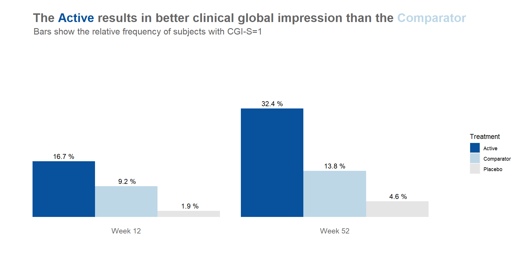
high resolution image
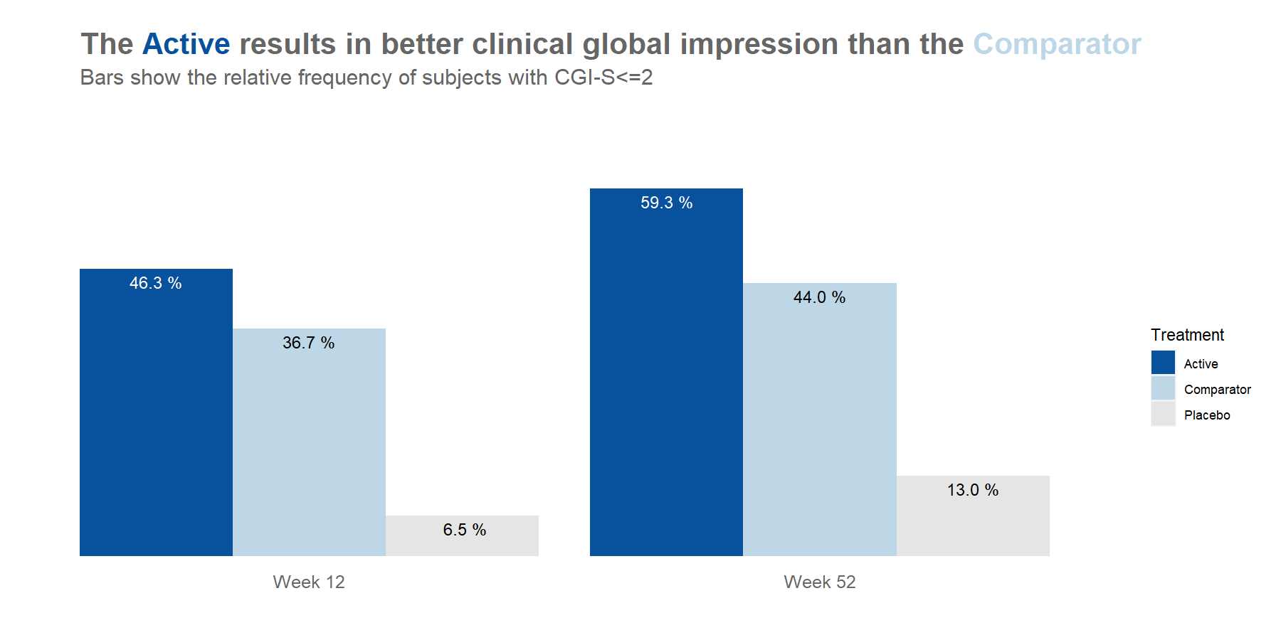
high resolution image
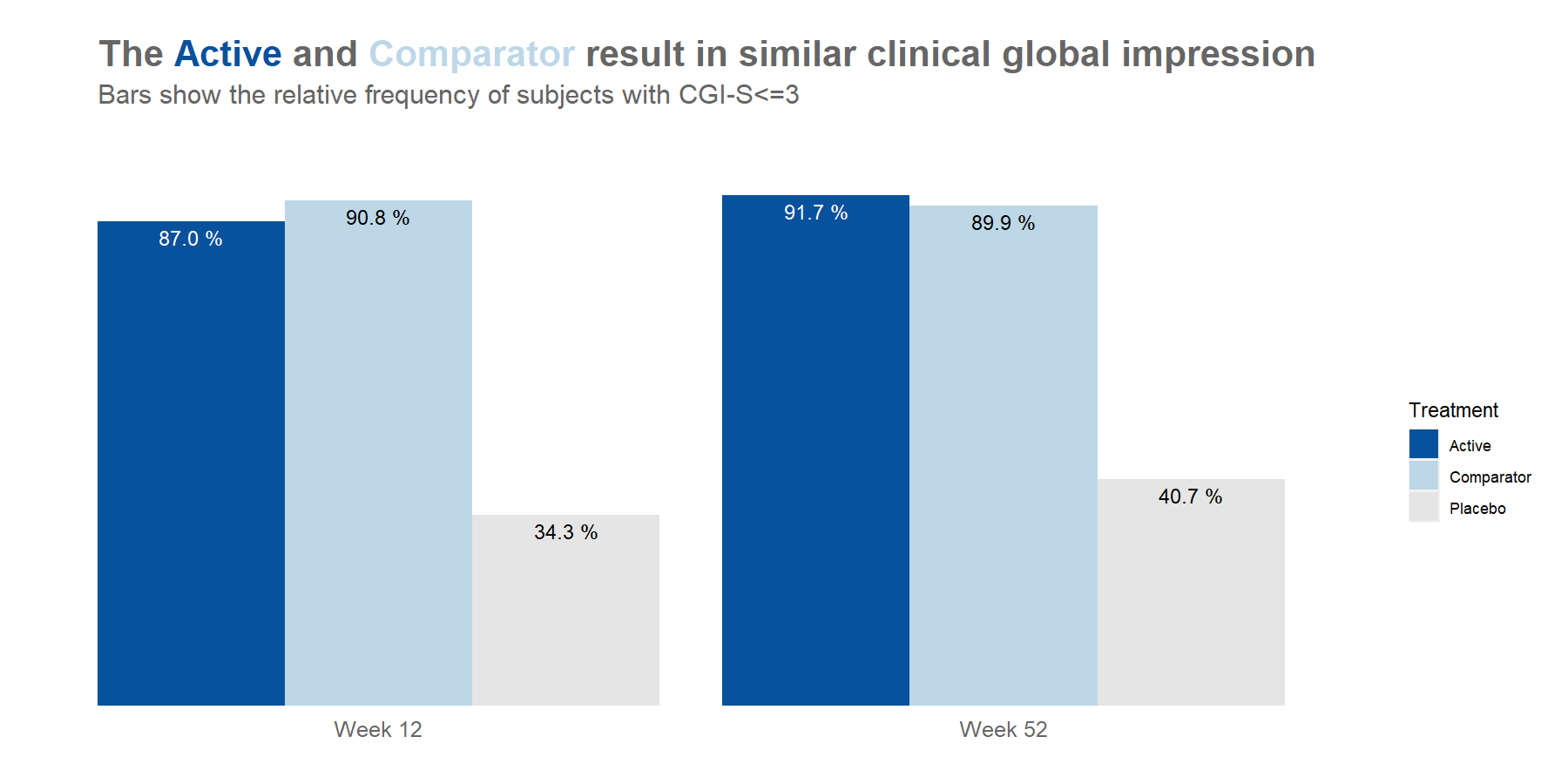
high resolution image
Example 2. Line graphs
Example 3. Cumulative distribution plot I
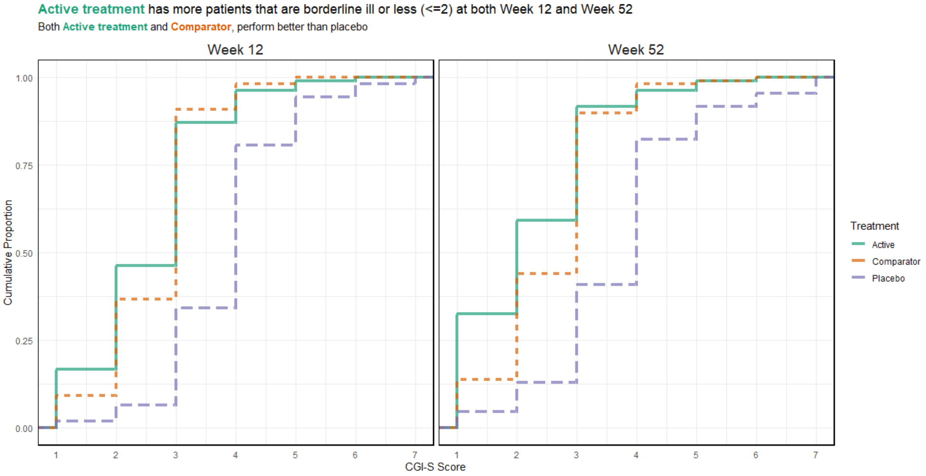
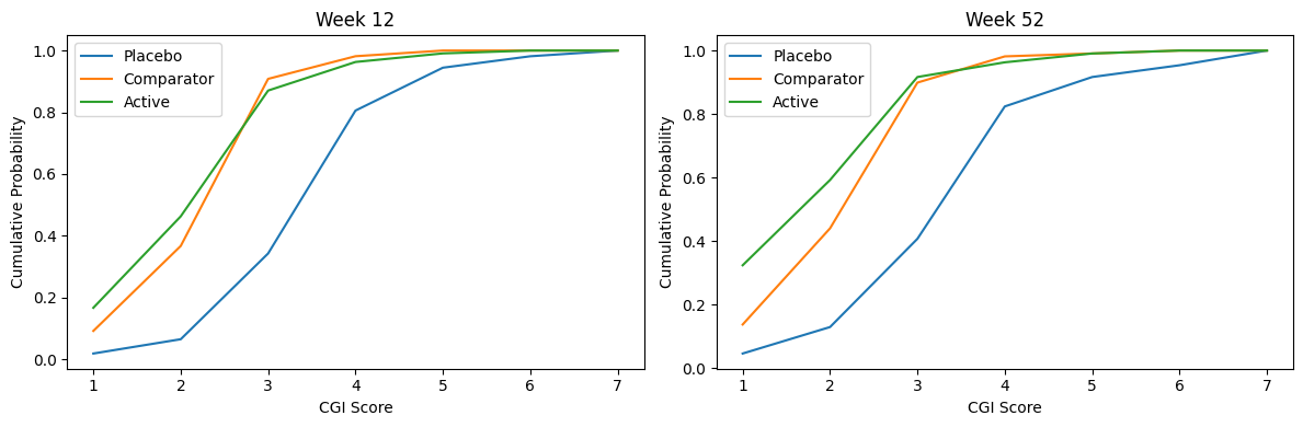
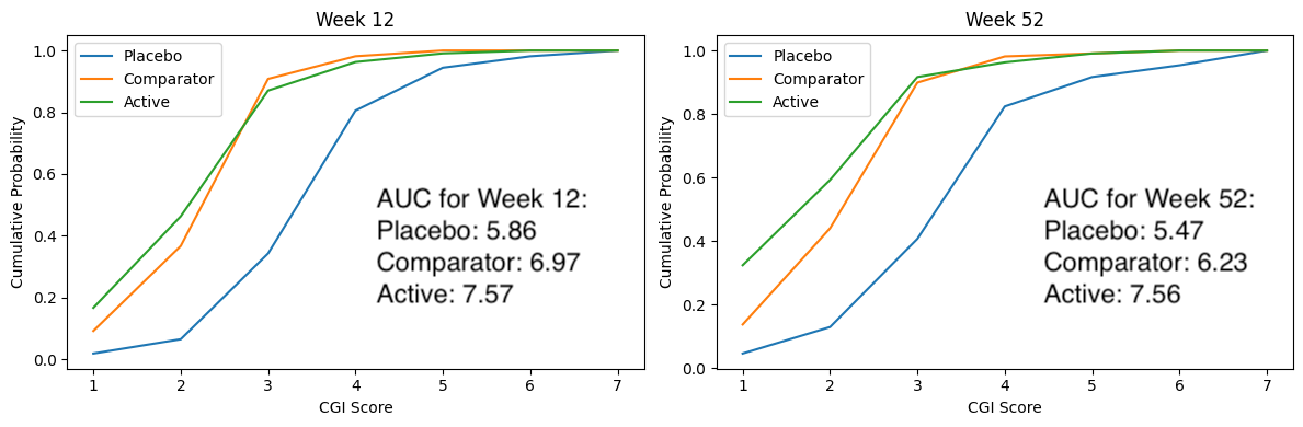
Example 4. Cumulative distribution plot II
high resolution
image
high resolution
image
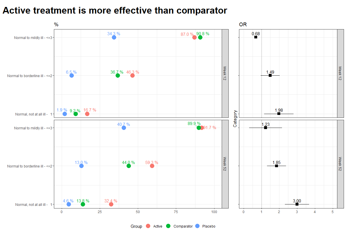
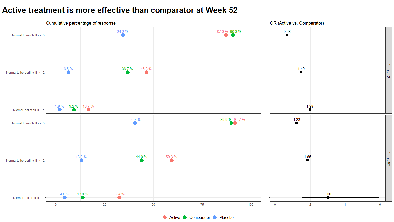
Example 5. Lollipop/forest plot
Code
Example 1. Barplot
plot.fun <- function(dat, name, v.just = 1.5, gci.s = "<=3", y.max = 100,
                     title.text = "The <span style = 'color: #08519C'>Active</span> and
         <span style = 'color: #BDD7E7'>Comparator</span> result in similar clinical global impression",
                     col.ann = c(rep(c("black", "black", "white"), 2)),
                     title.h.just = 0.6) {
  require(ggplot2)
  require(ggtext)
  ggplot(dat, aes(y=Value, x=VISITNUM, fill=Treatment)) +
    geom_bar(position="dodge", stat="identity") +
    ylab("") + xlab ("") +
    ylim(-12, y.max) +
    theme(panel.grid.major = element_blank(), panel.grid.minor = element_blank(),
          panel.background = element_blank(), axis.line = element_blank(),
          axis.ticks = element_blank(),# axis.text = element_text(size = 12),
          axis.text.x = element_blank(),
          axis.text.y = element_blank(),
          plot.subtitle = element_text(size = 15, color = "grey40", hjust = 0.14),
          plot.caption = element_text(color = "grey60", size = 12, hjust = 0.85),
          plot.title = element_markdown(color = "grey40", size = 20,
                                        face = "bold", hjust = title.h.just),
          plot.margin = margin(0.3, 0.2, -0.38, -0.2, "in")) +
    annotate("text", x=1, y=-4, label= "Week 12", size = 4.25, color = "grey40") +
    annotate("text", x=2, y=-4, label= "Week 52", size = 4.25, color = "grey40") +
    # annotate("text", x=3, y=-4, label= "Week 24", size = 4.25, color = "grey40") +
    # annotate("text", x=2.27, y=-12,
    #          label= "Good glycemic control is defined as Glucose values within a range of 72 and 140 mg/dL.",
    #          size = 3.5, color = "grey60") +
    scale_fill_manual(breaks = c("Active", "Comparator", "Placebo"),
                      values = c(brewer.pal(n = 5, name = "Blues")[c(5, 2)], "grey90")) +
    geom_text(aes(label=val.t), vjust = v.just, size = 4, position = position_dodge(.9),
              col = col.ann) +
    labs(title = title.text,
         subtitle = paste0("Bars show the relative frequency of subjects with CGI-S", gci.s))#,
  # caption = "Good glycemic control is defined as Glucose values within a range of 72 and 140 mg/dL.")
  ggsave(name, width = 12, height = 6, units = "in", dpi = 150)
}

dat <- read.csv("CGI_S_3_groups_csv.csv")
dat$X1 <- (dat$X1 + dat$X2 + dat$X3) / dat$Total.sample.size * 100
# dat$X1 <- (dat$X1) / dat$Total.sample.size * 100
dat <- dat[, 1:3]
names(dat) <- c("VISITNUM", "Treatment", "Value")
dat$val.t <- paste(format(round(dat$Value, 1), nsmall = 1), "%")
dat$VISITNUM <- as.factor(dat$VISITNUM)
plot.fun(dat, "barplot_3.png")

dat <- read.csv("CGI_S_3_groups_csv.csv")
dat$X1 <- (dat$X1 + dat$X2) / dat$Total.sample.size * 100
# dat$X1 <- (dat$X1) / dat$Total.sample.size * 100
dat <- dat[, 1:3]
names(dat) <- c("VISITNUM", "Treatment", "Value")
dat$val.t <- paste(format(round(dat$Value, 1), nsmall = 1), "%")
dat$VISITNUM <- as.factor(dat$VISITNUM)
plot.fun(dat, "barplot_2.png", gci.s = "<=2", y.max = 70,
         title.text = "The <span style = 'color: #08519C'>Active</span> results
         in better clinical global impression than the
         <span style = 'color: #BDD7E7'>Comparator</span>",
         title.h.just = 1.25)

dat <- read.csv("CGI_S_3_groups_csv.csv")
dat$X1 <- (dat$X1) / dat$Total.sample.size * 100
# dat$X1 <- (dat$X1) / dat$Total.sample.size * 100
dat <- dat[, 1:3]
names(dat) <- c("VISITNUM", "Treatment", "Value")
dat$val.t <- paste(format(round(dat$Value, 1), nsmall = 1), "%")
dat$VISITNUM <- as.factor(dat$VISITNUM)
plot.fun(dat, "barplot_1.png", v.just = -0.5, gci.s = "=1", y.max = 50,
         title.text = "The <span style = 'color: #08519C'>Active</span> results
         in better clinical global impression than the
         <span style = 'color: #BDD7E7'>Comparator</span>",
         col.ann = c(rep(c("black", "black", "black"), 2)),
         title.h.just = 1.25)
Example 2.
No code has been submitted.
Example 3.
No code has been submitted.
Example 4.
No code has been submitted.
Example 5.
First image:
library(RCurl)
library(dplyr)
library(tidyr)
library(ggplot2)
library(ggrepel)
library(cowplot)
x <-
  getURL(
    "https://raw.githubusercontent.com/VIS-SIG/Wonderful-Wednesdays/master/data/2023/2023-05-10/CGI_S_3_groups_csv.csv"
  )
y <- read.csv(text = x) %>%
  rename(Group = CGI)
y

l <- y %>%
  pivot_longer(cols = X1:X7,
               names_to = "Category",
               values_to = "n") %>%
  mutate(Category = as.numeric(gsub("X", "", Category))) %>%
  group_by(Week, Group) %>%
  arrange(Category) %>%
  mutate(
    CumN = cumsum(n),
    Week = paste("Week", Week),
    CumFreq = CumN / Total.sample.size,
    Freq = n / Total.sample.size,
    `Cumulative %` = round(CumFreq * 100, 1),
    `%` = round(Freq * 100, 1)
  ) %>%
  ungroup() %>%
  group_by(Week, Category) %>%
  arrange(Group, .by_group = T) %>%
  mutate(
    Odds = CumFreq / (1 - CumFreq),
    OR = ifelse(Group == "Active", round(Odds / Odds[2], 2), NA),
    seOR = ifelse(Group == "Active", sqrt(
      1 / CumN + 1 / (Total.sample.size - CumN) + 1 / CumN[2] + 1 / (Total.sample.size[2] -
                                                                       CumN[2])
    ), NA),
    ORlower95CI = ifelse(Group == "Active", round(OR - 1.96 * seOR, 2), NA),
    ORupper95CI = ifelse(Group == "Active", round(OR + 1.96 * seOR, 2), NA)
  )
l

k = 3
labs <- c("Normal, not at all ill -   1",
          "Normal to borderline ill - <=2",
          "Normal to mildly ill - <=3")

p1 <-
  ggplot(data = l[l$Category <= k,], aes(x = `Cumulative %`, y = Category, col =
                                           Group)) +
  geom_point(size = 5) +
  facet_grid(rows = vars(Week)) +
  labs(title = "Cumulative Percentage of response", y = "", x = "") +
  scale_y_continuous(breaks = 1:k, labels = labs) +
  scale_x_continuous(limits = c(0, 100)) +
  theme_bw() +
  theme(legend.position = "none") +
  labs(title = "%") +
  geom_text_repel(aes(label = paste(sprintf(
    "%.1f", `Cumulative %`
  ), "%")),
  nudge_y = 0.1)
p1

legend_b <- get_legend(p1 +
                         guides(color = guide_legend(nrow = 1)) +
                         theme(legend.position = "bottom"))


p2 <-
  ggplot(data = l[l$Category <= k &
                    !is.na(l$OR),], aes(x = OR, y = Category)) +
  geom_point(size = 3, pch = 15) +
  geom_linerange(aes(xmin = ORlower95CI, xmax = ORupper95CI)) +
  geom_vline(xintercept = 1, linetype = 3) +
  facet_grid(rows = vars(Week)) +
  scale_y_continuous(breaks = 1:k, labels = labs) +
  scale_x_continuous(limits = c(0, 5)) +
  theme_bw() +
  theme(legend.position = "none",
        axis.text.y = element_blank()) +
  labs(x = "", title = "OR") +
  geom_text_repel(aes(label = sprintf("%.2f", OR)),
                  nudge_y = 0.1)
p2

plot_row <- plot_grid(p1, p2, nrow = 1, rel_widths = c(2, 1))

title <- ggdraw() +
  draw_label(
    "Active treatment is more effective than comparator",
    fontface = 'bold',
    x = 0,
    hjust = 0,
    size = 24,
  ) +
  theme(plot.margin = margin(0, 0, 0, 7))

p <- plot_grid(title,
               plot_row,
               legend_b,
               ncol = 1,
               rel_heights = c(0.1, 1, 0.05))

p
library(RCurl)
library(dplyr)
library(tidyr)
library(ggplot2)
library(ggrepel)
library(cowplot)
library(ggtext)
x <-
  getURL(
    "https://raw.githubusercontent.com/VIS-SIG/Wonderful-Wednesdays/master/data/2023/2023-05-10/CGI_S_3_groups_csv.csv"
  )
y <- read.csv(text = x) %>%
  rename(Group = CGI)
y

l <- y %>%
  pivot_longer(cols = X1:X7,
               names_to = "Category",
               values_to = "n") %>%
  mutate(Category = as.numeric(gsub("X", "", Category))) %>%
  group_by(Week, Group) %>%
  arrange(Category) %>%
  mutate(
    CumN = cumsum(n),
    Week = paste("Week", Week),
    CumFreq = CumN / Total.sample.size,
    Freq = n / Total.sample.size,
    `Cumulative %` = round(CumFreq * 100, 1),
    `%` = round(Freq * 100, 1)
  ) %>%
  ungroup() %>%
  group_by(Week, Category) %>%
  arrange(Group, .by_group = T) %>%
  mutate(
    Odds = CumFreq / (1 - CumFreq),
    OR = ifelse(Group == "Active", round(Odds / Odds[2], 2), NA),
    selogOR = ifelse(Group == "Active", sqrt(
      1 / CumN + 1 / (Total.sample.size - CumN) + 1 / CumN[2] + 1 / (Total.sample.size[2] -
                                                                       CumN[2])
    ), NA),
    ORlower95CI = ifelse(Group == "Active", round(exp(log(OR) - 1.96 * selogOR), 2), NA),
    ORupper95CI = ifelse(Group == "Active", round(exp(log(OR) + 1.96 * selogOR), 2), NA)
  )
l

k = 3
labs <- c("Normal, not at all ill -   1",
          "Normal to borderline ill - <=2",
          "Normal to mildly ill - <=3")

p1 <-
  ggplot(data = l[l$Category <= k,], aes(x = `Cumulative %`, y = Category, col =
                                           Group)) +
  geom_point(size = 5) +
  facet_grid(rows = vars(Week)) +
  labs(title = "Cumulative percentage of response", y = "", x = "") +
  scale_y_continuous(breaks = 1:k, labels = labs) +
  scale_x_continuous(limits = c(0, 100)) +
  theme_bw() +
  theme(legend.position = "none",
        strip.text = element_blank()) +
  geom_text_repel(aes(label = paste(sprintf(
    "%.1f", `Cumulative %`
  ), "%")),
  nudge_y = 0.1)
p1

legend_b <- get_legend(p1 +
                         guides(color = guide_legend(nrow = 1)) +
                         theme(legend.position = "bottom",
                               legend.title = element_blank(),
                               legend.text = element_text(size = 12)))
p2 <-
  ggplot(data = l[l$Category <= k &
                    !is.na(l$OR),], aes(x = OR, y = Category)) +
  geom_point(size = 3, pch = 15) +
  geom_linerange(aes(xmin = ORlower95CI, xmax = ORupper95CI)) +
  geom_vline(xintercept = 1, linetype = 3) +
  facet_grid(rows = vars(Week)) +
  scale_y_continuous(breaks = 1:k, labels = labs) +
  scale_x_continuous(limits = c(0, 6)) +
  theme_bw() +
  theme(legend.position = "none",
        axis.text.y = element_blank()) +
  labs(x = "", y="", title = "OR (Active vs. Comparator)") +
  geom_text_repel(aes(label = sprintf("%.2f", OR)),
                  nudge_y = 0.1) +
  theme(strip.text = element_text(size=12))
p2

plot_row <- plot_grid(p1, p2, nrow = 1, rel_widths = c(2, 1))

title <- ggdraw() +
  draw_label(
    "Active treatment is more effective than comparator at Week 52",
    fontface = 'bold',
    x = 0,
    hjust = 0,
    size = 24,
  ) +
  theme(plot.margin = margin(0, 0, 0, 7))

p <- plot_grid(title,
               plot_row,
               legend_b,
               ncol = 1,
               rel_heights = c(0.1, 1, 0.05))
p