DLQI data set
In this month’s dataset, DLQI has been administered in a phase 3 clinical trial to patients with psoriasis. There are two imbalanced treatment groups, with 150 patients randomised to Placebo (Treatment A) and 450 to the active treatment (Treatment B). DLQI responses are recorded at Baseline and Week 16 (although some DLQI assessment is missing at Week 16), allowing the treatment effect in terms of Quality of Life to be assessed. The Psoriasis Area and Severity Index (PASI) is also recorded at baseline.
Example 1. Heatmaps
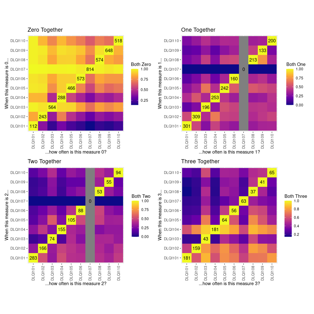
This example uses a heatmap to display how often each item is assigned a given level of response when each other item has been given that same level of response. The heatmap is coloured according to the proportion of times for which this same level of response is observed, which is always equal to 1 on the diagonal as can be easily seen.
It was immediately noted that this example is extremely colourful which makes it stand out nicely from the white background. However, it was felt that the colour spectrum could be flipped - usually on a white background darker colours represent something ‘more’ rather than something ‘less’. Given that DLQI items are scored on an ordinal scale, it was highlighted that it may better to look at the relationships between item responses in terms of being ‘at least’ or ‘at most’ a certain score, rather than ‘equal to’.
The main issue with this plot is that it is difficult to know what exactly the author is trying to tell us. We do not see any differentiation between treatments or time points and therefore we are unable to determine the effects which these had on DLQI scores.
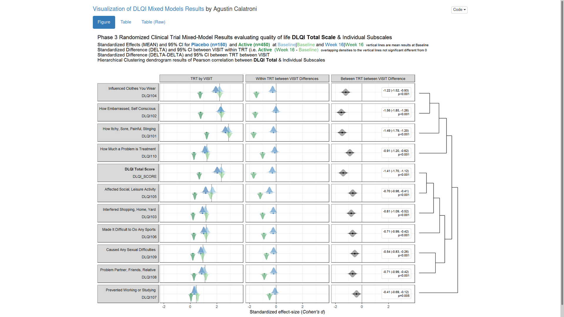
Example 2. Mixed models
The app can be found here.
In this next example, we have the results of mixed models visualised in an interactive html document. The figure is split into three columns, allowing us to see all of the effects we may be interested in: treatment by visit; within treatment, between visit differences; between treatment, between treatment differences.
One of the features that is really nice about this example is that, unlike many other examples, it considers an alternative way to sort the different items using a dendrogram. This allows us to quickly see two clear clusters in the items, although it was felt that total score should not have been included in this clustering. It is also great that the distributions are shown around the estimated effects, allowing us to quickly see the uncertainty in these estimates.
There were mixed feelings around the large amount of white space included in some of the columns. In some ways, this could be seen as unnecessary, but it was pointed out that the white space provides a nice level of consistency, allowing us to get an immediate impression of effect sizes on the upper plots which are quite a way from the labels on the horizontal axis. The vertical reference lines included are also really nice for getting a quick impression of effect sizes and how meaningful these are.
Similarly, there were mixed feelings around the level of complexity of this example, with the conclusion being that its appropriateness would largely depend on how technical the audience was. Whilst it may be slightly difficult for a non-technical audience to understand, it was felt that this example would be great for providing a large amount of information to technical audiences, particularly given that tables of values were provided in additional tabs alongside the figure. The group envisaged many applications where similar figures would be great to have, such as meta-analyses and subgroup analyses.
The final thing discussed at length for this example was the representation of the effect sizes. The group really liked that the colours used correspond to those provided in the above text, allowing us to determine treatment groups without the need for a legend. Similarly, it was great to see the different effect sizes consistently pointing either upwards or downwards for the different treatment groups, although it would be beneficial to have this also described in the text. This would allow the figure to be interpreted without having to be able to distinguish between the colours.
The panel highlighted a really nice tool which allows us to see how easily certain colours are distinguished by individuals with different kinds of colour-blindness. Whilst it was shown that the blue and green used here are not too difficult to distinguish for most individuals, the tool was used to identify colours which could be even easier to differentiate between.
Example 3. Change in mean scores
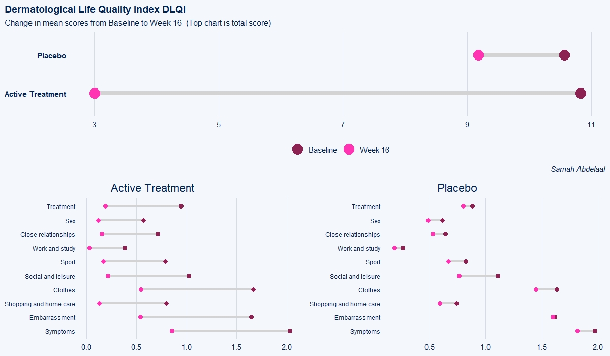
The dot plot displayed here is a great way to quickly see the effect of treatment on the different DLQI items. For each item and each group, we see mean scores for both Baseline and Week 16, which are coloured differently and consistently to allow patterns to be quickly and easily identified. Whilst it is not something commonly seen, the position of the legend in the middle of the page works really nicely and can be quickly referenced for each plot.
Overall, this is a very clean design and provides a clear message. However, there were some ways in which the panel felt that the layout of this example could be improved. Whilst it is easy to compare within treatment groups, it is not so easy to make comparisons between treatment groups here. The group proposed combining the two treatment groups in a vertical layout, possibly using different colours to differentiate between treatment groups and arrows to indicate the direction of the effect. This would also mean that labels of the different items would not need to be repeated as they currently are. This vertical structure could be accommodated by using less space for the first figure showing effect sizes on overall means. Having this so large is not necessarily a bad thing if it shows key information which needs to be emphasised, but we should be intentional about it when doing things such as this.
Unlike in the previous example, here the items are sorted in the order they appear on the questionnaire. Alternative ways to sort the items could be considered to highlight those which are most interesting, such as sorting by baseline means or by effect size. There are also a few tweaks to the horizontal axes which the group felt should be made. Firstly, it would be better to start from zero on the first dot plot, otherwise the effect size appears to be exaggerated. Further, the horizontal axes and spacing between labels should be made consistent for the two treatment groups, allowing for direct comparison between the two figures.
Example 4. Histograms
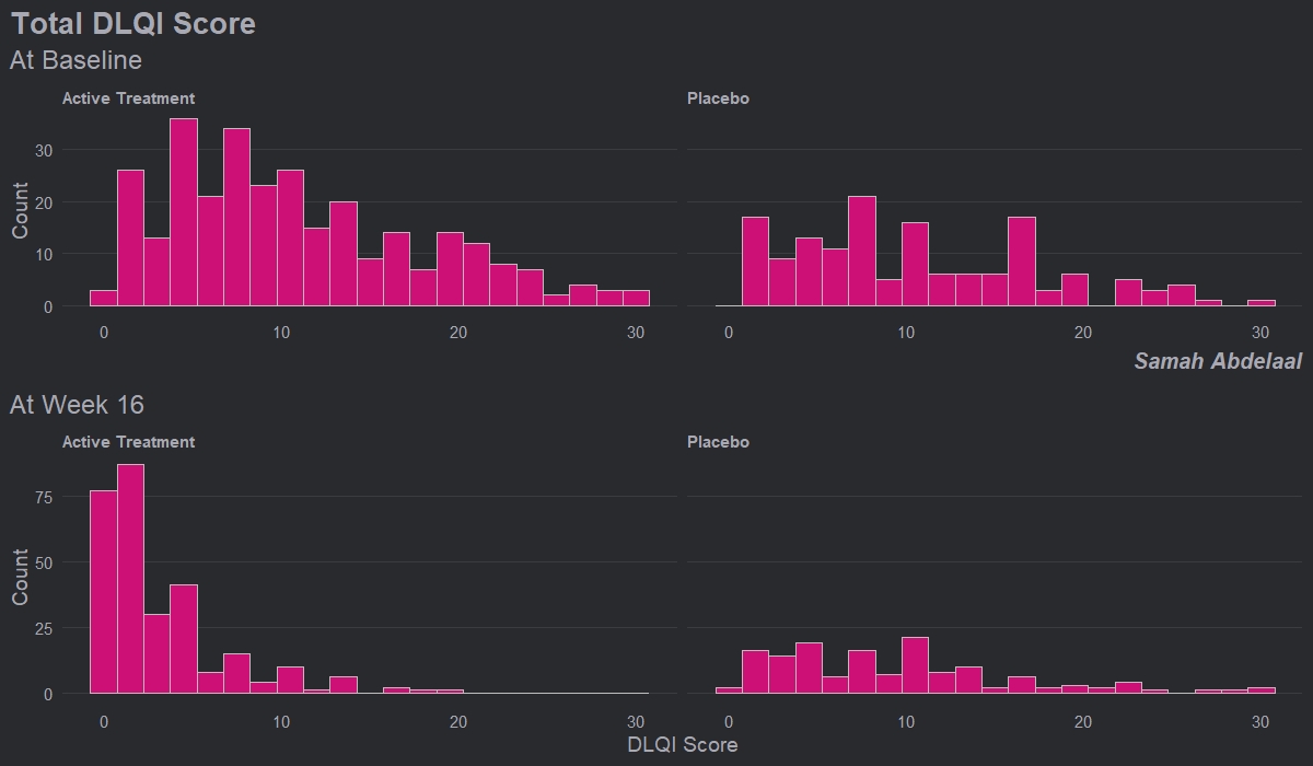
This example shows four histograms which nicely display the distributions of responses for the different treatment groups and the different time points. Overall it is a very clean design with minimal clutter, no unnecessary tick-marks and the gridlines very much in the background. Again, this example makes it easy to get an impression of the treatment effect, with a clear ‘shift’ between time points for the active treatment.
Whilst the current layout with the columns corresponding to treatment and rows corresponding to time allows us to easily see this shift, it goes against our intuition which is to think of changes in time happening along the horizontal axis. Switching the rows and columns may be more in line with what we naturally expect to see.
There are a couple of issues with this example that the group felt could be easily addressed. Firstly, given that DLQI scores can only be equal to natural numbers, a bin width of one would be more suitable. Otherwise, as is the case with the current bin width, some bars correspond to only one DLQI score whereas others correspond to more than one. This results in the misleading ‘up and down’ nature of the histograms. Further, there should be more consistency between the y-axes on the top and bottom panels. The change in axes in the current example gives an impression of ‘squashing’ for placebo when actually there was not a great deal of change.
Overall, the group felt that this example only needed some easily implemented changes to become a really nice visualisation, and thought this was a great opportunity to highlight how some of these changes may look, as displayed in the next example.
Example 5. Histograms updated
Here we see a really effective visualisation which has been produced with only minimal additional work to the previous example. Firstly, we see that a more appropriate and telling title has been used and a footnote has been added to aid in interpretation for those individuals who are unfamiliar with the DLQI. We also see that the layout has been changed with changes in time occurring horizontally as we expect to see.
Different colours have also been used to allow the two treatment groups to be easily distinguished, and the titles have been coloured accordingly. Consistent spacing has been used on the vertical axes to allow for easy comparisons, and these axes now represent percentages rather than counts to allow for more meaningful comparison between the imbalanced treatment groups. There was some discussion amongst the group regarding the fact that lower panel is shorter, but there were no strong feelings about this given that the spacing on the vertical axes is consistent.
Probably the biggest improvement here, though, is that a bin width of one has now been used. This simple change allows the histograms to be interpreted in a much more meaningful way for a score that can only take values in the natural numbers.
Example 6. Lineplots
These slope graphs provide a clear and meaningful picture of patient level changes in DLQI scores for the different items and treatment groups. Here, the circles are proportional to the percentage of patients with a given response to that item at that visit, and the strips represents the ‘flow’ of patients across response levels between the visits. The decision to make the circles proportional to percentages rather than counts is the correct one here and allows for meaningful comparison between the imbalanced treatment groups.
This is a really nice example of a plot type which we don’t often see and tells a good story. The consistent improvement for the active treatment is clear to see and we see that there is not too much happening in terms of a response for placebo. Whilst we do not get the same level of understanding of marginal distributions that we might with a histrogram, we do still get some notion and this is balanced by the additional level of patient understanding which we have.
The group liked how the flow of patients could easily be seen by the intensity of lines, but felt that either a greater level of ‘minimum’ intensity or a different colour to blue could be used to still allow even a single patient’s movement to be seen, which is currently slightly difficult. However, it was acknowledged that not being able to see a lot within certain items for placebo is in itself meaningful.
The consistent use of colour between plots and titles allows us to easily distinguish between treatment groups, although it was felt that a more telling title may have been used. It is great that item descriptions rather than just numbers are provided, and the panel really liked that we see the effects when certain items are combined together into different domains. Grouping of the ten DLQI items into these six domains is something which is commonly done in clinical practice but is not something which was considered by many of the other examples. It was acknowledged that the inclusion of these additional plots for the six domains justifies keeping the items ordered as they appear on the questionnaire, so we can clearly see which items correspond to which domains. However, there was still some discussion as to whether an alternative ordering of both individual items and domains could be considered.
This example has a long, vertical layout. This would be great for something like a poster, but is maybe less convenient for viewing on screen. There was a feeling that when being presented as a poster, a lighter background may be more suitable.
Code
Example 1. Heatmaps
library(GGally)
library(dplyr)
library(tidyr)
library(patchwork)

qol <- read.csv("Data/2021-01-13-QualityOfLife.csv")

head(qol)
glimpse(qol)

qol2 <- qol %>%
    mutate_if(function(x){length(unique(x)) < 6}, factor)

ggpairs(qol2[qol2$VISIT == "Week 16", c(2, 3, 15)],
    mapping = aes(colour = TRT))
ggpairs(qol[qol$VISIT == "Week 16", 5:14])
ggpairs(qol2[qol2$VISIT == "Week 16", 5:14])
ggpairs(qol[qol$VISIT == "Week 16", 5:14],
    mapping = aes(colour = qol[qol$VISIT == "Week 16",]$TRT))
ggpairs(qol2[qol2$VISIT == "Week 16", 5:14],
    mapping = aes(colour = qol2[qol2$VISIT == "Week 16",]$TRT))


#### Goal 1: Multidimensional nature of DLQI ####
# As integers, they're all highly correlated
# As categorical variables, need an intelligent way to summarise
# Something like PCA or NMF, but for categories?
# Collection of stacked bar plots?
# Percent agreement between categories?
# Compound Poisson model for discrete categories?
#### Goal 2: Show the effect of treatment, incorporate multidimensionality ####


# Attempt 1: Conditional Distributions

dlq <- select(qol, starts_with("DLQI")) %>%
    select(-DLQI_SCORE)
heatmaps <- lapply(0:3, function(w){
    m1 <- sapply(1:10, function(x){
        f1 <- filter(dlq, dlq[, x] == w)
        if(nrow(f1) > 0) {
            return(apply(f1, 2, function(y) mean(y == w, na.rm = TRUE)))
        } else {
            return(rep(NA, 10))
        }
    })
    colnames(m1) <- rownames(m1)
    m1 <- m1 %>% as.data.frame() %>%
        tibble::rownames_to_column(var = "from") %>%
        pivot_longer(-from, names_to = "to", values_to = "both_0")
    return(m1)
})


numwords <- c("Zero", "One", "Two", "Three")
wrap_plots(lapply(1:4, function(i) {
    zeros <- apply(dlq, 2, function(x) sum(x == i - 1, na.rm = TRUE))
    ggplot(heatmaps[[i]]) +
        aes(x = to, y = from, fill = both_0) +
        geom_tile() +
        labs(x = paste0("...how often is this measure ", i - 1, "?"),
            y = paste0("When this measure is ", i - 1, "..."),
            title = paste0(numwords[i], " Together"),
            fill = paste0("Both ", numwords[i])) +
        scale_fill_viridis_c(option = "C") +
        annotate("text", x = 1:10, y = 1:10, label = zeros) +
        theme(aspect.ratio = 1,
            axis.text.x = element_text(angle = 90, vjust = 0.5))
}))
Example 2. Mixed models
The R Markdown file can be found here.
Example 3. Change in mean scores
# Load data
dql <- read.csv("ww2020_dlqi.csv")
attach(dql)
View(dql)

# Load library
library(tidyverse)
library(ggplot2)
library(ggthemes)
library(ggcharts)
library(ggalt)

# Seperate treatment arms
new_A <-
  dql %>%
  filter(TRT=="A")
new_B <-
  dql %>%
  filter(TRT=="B")

## Treatment A : Placebo

dtA <- new_A %>%
  # Remove missing data
  filter(!is.na(new_A)) %>%
  # Select relevant variables
  select(
    DLQI101, DLQI102, DLQI103, DLQI104, DLQI105,
    DLQI106, DLQI107, DLQI108, DLQI109, DLQI110,
    VISIT
    ) %>%
  # Summarize mean score for each question grouped by visit
  # while also renaming variables to indicate the meaning of each score
  group_by(VISIT) %>%
  summarise(
    Symptoms = mean(DLQI101, na.rm = T),
    Embarrassment = mean(DLQI102, na.rm = T),
   `Shopping and home care` = mean(DLQI103, na.rm = T),
    Clothes = mean(DLQI104, na.rm = T),
   `Social and leisure` = mean(DLQI105, na.rm = T),
    Sport = mean(DLQI106, na.rm = T),
    `Work and study` = mean(DLQI107, na.rm = T),
    `Close relationships` = mean(DLQI108, na.rm = T),
    Sex = mean(DLQI109, na.rm = T),
    Treatment = mean(DLQI110, na.rm = T)
   )

# Tidying data
dtA <-
  dtA %>%
  pivot_longer(
    !VISIT,
    names_to = "Domain",
    values_to = "Mean_Score"
    )

# Seperating the visit variable into baseline and week 16
dtA <-
  dtA %>%
  pivot_wider(
    names_from = VISIT,
    values_from = Mean_Score
    )

# Ensuring the domain levels are ordered the same
dtA <-
  dtA %>%
  mutate(
    Domain = factor(Domain,
                    levels = c("Symptoms", "Embarrassment",
                               "Shopping and home care",
                               "Clothes", "Social and leisure",
                               "Sport", "Work and study",
                               "Close relationships",
                               "Sex", "Treatment"))
    )

# Constructing a dumbbell plot using ggalt package with a ggchart theme

(a <-
  ggplot()+
  geom_dumbbell(
    data = dtA,
    aes(
      y = Domain,
      x = Baseline,
      xend = `Week 16`
      ),
    size = 1.5,
    color = "lightgray",
    size_x = 3,
    colour_x = "violetred4",
    size_xend = 3,
    colour_xend = "maroon1"
    )
  + theme_ggcharts(grid = "Y")
  + labs(
    title = "Placebo"
    )
  + theme(
    plot.title = element_text(hjust = 0.5),
    axis.title.y = element_blank(),
    axis.title.x = element_blank(),
    axis.text.y = element_text(size = 9)
    ))

## Treatment B : Active Treatment

dtB <- new_B %>%
  # Remove missing data
  filter(!is.na(new_B)) %>%
  # Select relevant variables
  select(
    DLQI101, DLQI102, DLQI103, DLQI104, DLQI105,
    DLQI106, DLQI107, DLQI108, DLQI109, DLQI110,
    VISIT
    ) %>%
  # Summarize mean score for each question grouped by visit
  # while also renaming variables to indicate the meaning of each score
  group_by(VISIT) %>%
  summarise(
    Symptoms = mean(DLQI101, na.rm = T),
    Embarrassment = mean(DLQI102, na.rm = T),
    `Shopping and home care` = mean(DLQI103, na.rm = T),
    Clothes = mean(DLQI104, na.rm = T),
    `Social and leisure` = mean(DLQI105, na.rm = T),
    Sport = mean(DLQI106, na.rm = T),
    `Work and study` = mean(DLQI107, na.rm = T),
    `Close relationships` = mean(DLQI108, na.rm = T),
    Sex = mean(DLQI109, na.rm = T),
    Treatment = mean(DLQI110, na.rm = T)
    )

# Tidying data
dtB <-
  dtB %>%
  pivot_longer(
    !VISIT,
    names_to = "Domain",
    values_to = "Mean_Score"
    )

# Seperating the visit variable into baseline and week 16
dtB <-
  dtB %>%
  pivot_wider(
    names_from = VISIT,
    values_from = Mean_Score
    )

# Ensuring the domain levels are ordered the same
dtB <-
  dtB %>%
  mutate(
    Domain = factor(Domain,
                    levels = c("Symptoms", "Embarrassment",
                               "Shopping and home care",
                               "Clothes", "Social and leisure",
                               "Sport", "Work and study",
                               "Close relationships",
                               "Sex", "Treatment"))
    )

# Constructing a dumbbell plot using ggalt package with a ggchart theme

(b <-
  ggplot()+
  geom_dumbbell(
    data = dtB,
    aes(
      y = Domain,
      x = Baseline,
      xend = `Week 16`
      ),
    size = 1.5,
    color = "lightgray",
    size_x = 3,
    colour_x = "violetred4",
    size_xend = 3,
    colour_xend = "maroon1")
  + theme_ggcharts(grid = "Y")
  + labs(
    title = "Active Treatment"
    ) + theme(
    plot.title = element_text(hjust = 0.5),
    axis.title.y = element_blank(),
    axis.title.x = element_blank(),
    axis.text.y = element_text(size = 9)
        ))

## Mean total score for both treatment arms

totaldt <-
  dql %>%
  # Remove missing data
  filter(!is.na(dql)) %>%
  # select and summarizing relevant variables
  select(DLQI_SCORE, TRT, VISIT) %>%
  group_by(TRT, VISIT) %>%
  summarise(
    qtotal = mean(DLQI_SCORE, na.rm = T)
    )

# Tidying data
totaldt <-
  totaldt %>%
  pivot_wider(
    names_from = VISIT,
    values_from = qtotal
    )

totaldt$TRT[totaldt$TRT=="A"] <- "Placebo"
totaldt$TRT[totaldt$TRT=="B"] <- "Active Treatment"

# Constructing a dumbbell plot using ggcharts

(c <-
  dumbbell_chart(
    data = totaldt,
    x = TRT,
    y1 = Baseline,
    y2 = `Week 16`,
    line_color = "lightgray",
    line_size = 3,
    point_color = c("violetred4", "maroon1"),
    point_size = 7
  ) + labs(
    x = NULL,
    y = NULL,
    title = "Dermatological Life Quality Index DLQI",
    subtitle = "Change in mean scores from Baseline to Week 16  (Top chart is total score)",
    caption = "Samah Abdelaal"
    ) + theme(
    axis.text.y = element_text(face = "bold"),
    plot.title = element_text(size = 14,
                              face = "bold"),
    plot.subtitle = element_text(size = 12),
    plot.caption = element_text(size = 11,
                                face = "italic"),
    legend.position = "bottom"
    ))

# Compine all three plots
library(gridExtra)

grid.arrange(c, arrangeGrob(b, a, ncol = 2), nrow = 2)
Example 4. Histrograms
# Load data
dql <- read.csv("ww2020_dlqi.csv")
attach(dql)
View(dql)
summary(dql)

# Load Library
library(tidyverse)
library(ggplot2)
library(ggthemes)
library(ggcharts)

# Select relevant variables
dql_renamed <-
  dql %>%
  select(
    TRT, VISIT, DLQI_SCORE
    )

# Rename treatment levels
dql_renamed$TRT[dql_renamed$TRT=="A"] <- "Placebo"
dql_renamed$TRT[dql_renamed$TRT=="B"] <- "Active Treatment"

# Seperate visits

# Baseline visit
totalbaseline <-
  dql_renamed %>%
  filter(VISIT=="Baseline")

# Construct a histogram for each treatment arm at baseline visit
(d <-
  ggplot(
    data = totalbaseline,
    aes(
      x = DLQI_SCORE
      ))
  + geom_histogram(
    binwidth = 1.5,
    color = "grey",
    fill = "deeppink3"
    ) +
  facet_grid(~ TRT)
  + theme_ng(grid = "X")
  + labs(
    x = "DLQI Score",
    y = "Count",
    title = "Total DLQI Score",
    subtitle = "At Baseline",
    caption = "Samah Abdelaal")
  + theme(
    axis.title.x = element_blank(),
    plot.title = element_text(size = 20,
                              face = "bold"),
    plot.subtitle = element_text(size = 18),
    plot.caption = element_text(size = 15,
                                face = "bold.italic")
    ))


# Week 16 visit
totalweek16 <-
  dql_renamed %>%
  filter(VISIT=="Week 16")

(e <-
  ggplot(
    data = totalweek16,
    aes(
      x = DLQI_SCORE
      )
    )
  + geom_histogram(
    binwidth = 1.5,
    color = "grey",
    fill = "deeppink3"
    ) +
  facet_grid(~ TRT)
  + theme_ng(grid = "X")
  + labs(
    x = "DLQI Score",
    y = "Count",
    subtitle = "At Week 16"
    ) +
  theme(
    plot.subtitle = element_text(size = 18)
    ))

# Compine plots
library(gridExtra)

gridExtra::grid.arrange(d, e, nrow = 2)
Example 5. Histrograms updated
# Load data
dql <- read.csv("O:\\1_Global_Biostatistics\\Biostatistics Innovation Center\\BIC Project - Subgroup Analyses\\Screening\\R-Package\\Supports\\WW\\ww2020_dlqi.csv")
attach(dql)
View(dql)
summary(dql)

# Load Library
library(tidyverse)
library(ggplot2)
library(ggthemes)
library(ggcharts)

# Select relevant variables
dql_renamed <-
  dql %>%
  select(
    TRT, VISIT, DLQI_SCORE
    )

# Rename treatment levels
dql_renamed$TRT[dql_renamed$TRT=="A"] <- "Placebo"
dql_renamed$TRT[dql_renamed$TRT=="B"] <- "Active Treatment"

# Seperate treatments

# Active
totalB <-
  dql_renamed %>%
  filter(TRT=="Active Treatment")

# Construct a histogram for each treatment arm at baseline visit
(d <-
  ggplot(
    data = totalB,
    aes(
      x = DLQI_SCORE
      ))
  + geom_histogram(
    binwidth = 1,
    color = "grey",
    fill = "deeppink3"
    ) +
  facet_grid(~ VISIT)
  + theme_ng(grid = "X")
  + labs(
    x = "Total DLQI Score",
    y = "Patients",
    title = "Improved Quality of life after 16 weeks of treatment",
    subtitle = "Active Treatment")
  + theme(
    axis.title.x = element_blank(),
    axis.text.x = element_blank(),
    plot.title = element_text(size = 17,
                              face = "bold"),
    plot.subtitle = element_text(size = 15, color = "deeppink3")
    ))


# Week 16 visit
totalA <-
  dql_renamed %>%
  filter(TRT=="Placebo")

(e <-
  ggplot(
    data = totalA,
    aes(
      x = DLQI_SCORE
      )
    )
  + geom_histogram(
    binwidth = 1,
    color = "grey",
    fill = "green4"
    ) +
  facet_grid(~ VISIT)
  + theme_ng(grid = "X")
  + labs(
    x = "Total DLQI Score",
    y = "Patients",
    subtitle = "Placebo",
    caption = "Lower score equals better quality of life"
    ) +
  theme(
    strip.text.x = element_blank(),
    plot.subtitle = element_text(size = 15, color = "green4"),
    plot.caption = element_text(size = 12,
                                face = "italic")
    ))

# Compine plots
library(gridExtra)

gridExtra::grid.arrange(d, e, nrow = 2, heights = c(1.5,1))
Example 6. Lineplots
library(tidyverse)
library(data.table)
library(grid)
library(cowplot)
library(RCurl)


x <- getURL("https://raw.githubusercontent.com/VIS-SIG/Wonderful-Wednesdays/master/data/2021/2021-01-13/ww2020_dlqi.csv")

d <- read.csv(text = x)
d1a <- d %>%
  gather(key = PARAMCD,
         value = AVAL, DLQI101:DLQI_SCORE, factor_key=TRUE) %>%
  filter(!PARAMCD %in% c("DLQIMCID", "DLQIRESP")) %>%
  mutate(VISIT = ifelse(VISIT=="Baseline", "Wk 0", "Wk 16"),
         VISITN = if_else(VISIT=="Wk 0", 0, 1))
d1a

d1b <- d1a %>%
  group_by(TRT, PARAMCD, VISITN, VISIT, AVAL) %>%
  summarise(n = n())%>%
  mutate(freq = n / sum(n))
d1b

d1a$TRT <- relevel(as.factor(d1a$TRT), "B")
d1b$TRT <- relevel(as.factor(d1b$TRT), "B")


tit_col = "grey50"
cap_col = "grey50"

ggplotib <- function(paramcd = NULL,
                     title = NULL,
                     caption = NULL,
                     breaks = 0:3,
                     transparency = 0.01){
  d1a_2 <- d1a %>%
    filter(PARAMCD %in% paramcd) %>%
    group_by(TRT, USUBJID, VISITN, VISIT) %>%
    summarise(AVAL_SUB = sum(AVAL))

  d1b_2 <- d1a_2 %>%
    group_by(TRT, VISITN, VISIT, AVAL_SUB) %>%
    summarise(n = n())%>%
    mutate(freq = n / sum(n))
  p1 <- ggplot() +
    geom_line(data = d1a_2, aes(x = VISITN, y = AVAL_SUB, group = USUBJID, col=TRT),
              alpha = transparency, size = 2) +
    geom_point(data = d1b_2, aes(x = VISITN, y = AVAL_SUB, size = freq, col=TRT)) +
    facet_grid(cols = vars(TRT)) +
    scale_x_continuous(breaks = c(0, 1), labels = c("Wk 0", "Wk 16"), limits = c(-0.1,1.1)) +
    scale_y_continuous(breaks = breaks) +
    theme_minimal() +
    labs(x = "", y = "", title = title, subtitle = caption) +
    theme(panel.grid = element_blank(),
          title = element_text(size = 12, colour = tit_col),
          plot.subtitle = element_text(size = 10, colour = cap_col, hjust = 0),
          axis.text.x = element_text(size = 12, colour = "grey50"),
          plot.background = element_rect(fill="black"),
          strip.text = element_blank()) +
    guides(color = F, size = F)
  p1
}


# Unidimensional ----------------------------------------------------------
p1 <- ggplotib(paramcd = "DLQI101",
              title="Item 1",
              caption="Itchy, sore, painful, or stinging skin") +
  theme(axis.text.y = element_text(colour = "grey50"))
p1
p2 <- ggplotib(paramcd = "DLQI102",
              title="Item 2",
              caption="Embarassment") +
  theme(axis.text.y = element_text(colour = "grey50"))
p2
p3 <- ggplotib(paramcd = "DLQI103",
              title="Item 3",
              caption="Interference with shopping / home / gardening") +
  theme(axis.text.y = element_text(colour = "grey50"))
p3
p4 <- ggplotib(paramcd = "DLQI104",
              title = "Item 4",
              caption = "Influence on clothing") +
  theme(axis.text.y = element_text(colour = "grey50"))
p4
p5 <- ggplotib(paramcd = "DLQI105",
              title = "Item 5",
              caption = "Social or leisure activities affected") +
  theme(axis.text.y = element_text(colour = "grey50"))
p5
p6 <- ggplotib(paramcd = "DLQI106",
              title = "Item 6",
              caption = "Difficult to do any sport?") +
  theme(axis.text.y = element_text(colour = "grey50"))
p6
p7 <- ggplotib(paramcd = "DLQI107",
              title = "Item 7",
              caption = "Prevented you from working / studying?") +
  theme(axis.text.y = element_text(colour = "grey50"))
p7
p8 <- ggplotib(paramcd = "DLQI108",
               title = "Item 8",
               caption = "Problems with partner / close friends / relatives") +
  theme(axis.text.y = element_text(colour = "grey50"))
p8
p9 <- ggplotib(paramcd = "DLQI109",
               title = "Item 9",
               caption = "Sexual difficulties") +
  theme(axis.text.y = element_text(colour = "grey50"))
p9
p10 <- ggplotib(paramcd = "DLQI110",
                title = "Item 10",
                caption = "Problem from treatment") +
  theme(axis.text.y = element_text(colour = "grey50"))
p10

pt <- ggplotib(paramcd = "DLQI_SCORE",
               breaks = 0:30,
               transparency = 0.02,
               title = "DLQI",
               caption = "Total Score") +
  theme(axis.text.y = element_text(colour = "grey50"))
pt

# t_b
tfs <- 24
x <- 0.05
t1 <- textGrob(expression(bold("Active treatment") * phantom(bold(" vs. Placebo"))),
               x = x, y = 0.7, gp = gpar(col = "#F8766D", fontsize = tfs), just = "left")
t2 <- textGrob(expression(phantom(bold("Active treatment vs.")) * bold(" Placebo")),
               x = x, y = 0.7, gp = gpar(col = "#00BFC4", fontsize = tfs), just = "left")
t3 <- textGrob(expression(phantom(bold("Active treatment ")) * bold("vs.") * phantom(bold(" Placebo"))),
               x = x, y = 0.7, gp = gpar(col = "grey", fontsize = tfs), just = "left")
t4 <- textGrob(expression("Strips describe the flow of the patients from different categories between visits"),
               x = x, y = 0.4, gp = gpar(col = "grey", fontsize = 10), just = "left")
t5 <- textGrob(expression("Circles are proportional to the percentage of patients at every visit"),
               x = x, y = 0.25, gp = gpar(col = "grey", fontsize = 10), just = "left")

tb <- ggplot(data = d) +
  theme(panel.grid = element_blank(),
        plot.background = element_rect(fill="black"))  +
  coord_cartesian(clip = "off") +
  annotation_custom(grobTree(t1, t2, t3, t4, t5)) +
  theme(legend.position = 'none')
tb

b <- plot_grid(tb, p1, p2, p3, p4, p5, p6, p7, p8, p9, p10,
             nrow = 11, rel_heights = c(0.5, rep(1, 10)))
ggsave(plot=b, filename="b.png", path=("~") , width = 6, height = 32, device = "png")

# Multidimensional --------------------------------------------------------
p12 <- ggplotib(paramcd = c("DLQI101", "DLQI102"),
                breaks = 0:6,
                transparency = 0.015,
                title="Item 1 + Item 2",
                caption="Symptoms and feelings") +
  theme(axis.text.y = element_text(colour = "grey50"))
p12

p34 <- ggplotib(paramcd = c("DLQI103", "DLQI104"),
                breaks = 0:6,
                transparency = 0.015,
                title="Item 3 + Item 4",
                caption="Daily activities") +
  theme(axis.text.y = element_text(colour = "grey50"))
p34

p56 <- ggplotib(paramcd = c("DLQI105", "DLQI106"),
                breaks = 0:6,
                transparency = 0.015,
                title="Item 5 + Item 6",
                caption="Leisures") +
  theme(axis.text.y = element_text(colour = "grey50"))
p56

p89 <- ggplotib(paramcd = c("DLQI108", "DLQI109"),
                breaks = 0:6,
                transparency = 0.015,
                title="Item 8 + Item 9",
                caption="Interpersonal relationships") +
  theme(axis.text.y = element_text(colour = "grey50"))
p89

tfs <- 42
x <- 0.0175
t1 <- textGrob(expression(bold("Active treatment") * phantom(bold(" vs. Placebo"))),
               x = x, y = 0.7, gp = gpar(col = "#F8766D", fontsize = tfs), just = "left")
t2 <- textGrob(expression(phantom(bold("Active treatment vs.")) * bold(" Placebo")),
               x = x, y = 0.7, gp = gpar(col = "#00BFC4", fontsize = tfs), just = "left")
t3 <- textGrob(expression(phantom(bold("Active treatment ")) * bold("vs.") * phantom(bold(" Placebo"))),
               x = x, y = 0.7, gp = gpar(col = "grey", fontsize = tfs), just = "left")
t4 <- textGrob(expression("Strips describe the flow of the patients from different categories between visits"),
               x = x, y = 0.4, gp = gpar(col = "grey", fontsize = 10), just = "left")
t5 <- textGrob(expression("Circles are proportional to the percentage of patients at every visit"),
               x = x, y = 0.25, gp = gpar(col = "grey", fontsize = 10), just = "left")

t <- ggplot(data = d) +
  theme(panel.grid = element_blank(),
        plot.background = element_rect(fill="black"))  +
  coord_cartesian(clip = "off") +
  annotation_custom(grobTree(t1, t2, t3, t4, t5)) +
  theme(legend.position = 'none')
t

t2 <- ggplot(data = d) +
  theme(panel.grid = element_blank(),
        plot.background = element_rect(fill="black"))  +
  theme(legend.position = 'none')
t2
col1 <- plot_grid(p1, p2, p3, p4, p5, p6, p7, p8, p9, p10,
               nrow = 10, rel_heights = c(rep(1, 10)))
col2 <- plot_grid(p12, p34, p56, p7, p89, p10,
                nrow = 6, rel_heights = c(2, 2, 2, 1, 2, 1))
col3 <- plot_grid(pt, t2,
                nrow = 2, rel_heights = c(4, 6))
cols <- plot_grid(col1, col2, col3, ncol = 3, rel_widths = c(3, 3, 3))
o <- plot_grid(t, cols, nrow = 2, rel_heights = c(0.5, 10))
ggsave(plot = o, filename="o.png", path=("~") , width = 18, height = 32, device = "png")