Mediator effect example data set
The purpose of this exercise is to develop data visualization techniques to illustrate that one variable is a mediator for a treatment effect and that this mediator effect is stronger than in other variables. A more detailed description and link to the data can be found here.
Example 1. Mediation on treatment effect
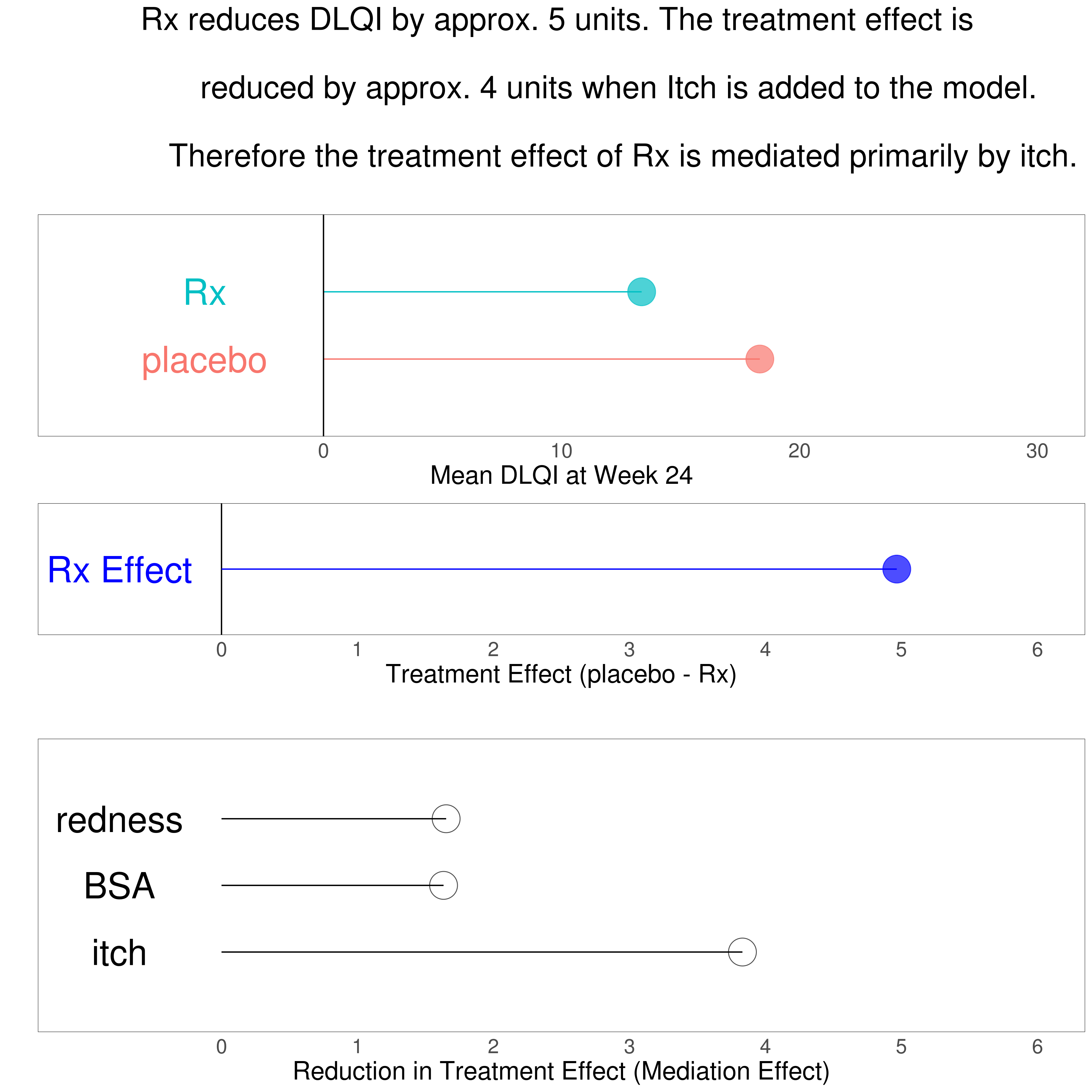
This graphic addresses the question of which variable is mediating the treatment effect the most by plotting the reduction in treatment effect after accounting for the variable. One shortcoming of lollipop charts is that they do not allow for a visulization of uncertainty. link to code
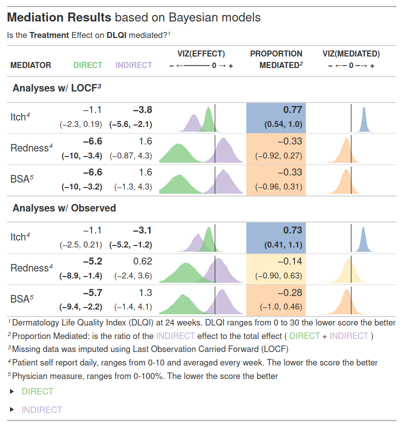
Example 2. Bayesian model
The html file can be found here.
This is a well done “grapple” - a graphic embeded in a table. This table summarizes all essential information in the data to address the mediaton effect of all three variables being considered. The posterior distrubtions are relevant and to the point. It is well annotated, uses color and bold face judiciously to highlight key findings and is organized to let the reader draw the correct conclusion without having to spell it out in the title. This graphic is ready for a journal. The question is: What type of journal? If it is a medical journal then the author might want to exclude the sensitivity analysis results (LOCF or completers) and just pick the appropriate method for handling missing data since this is not of interest to a medical audience. On the other hand if this is for a statistics journal this is quite appropriate. The author is not only showing the key results but the robustness of the results. (And part of the exercise was to account for missingness, so we cannot really blame the author for including this.)
Example 3. Barplot
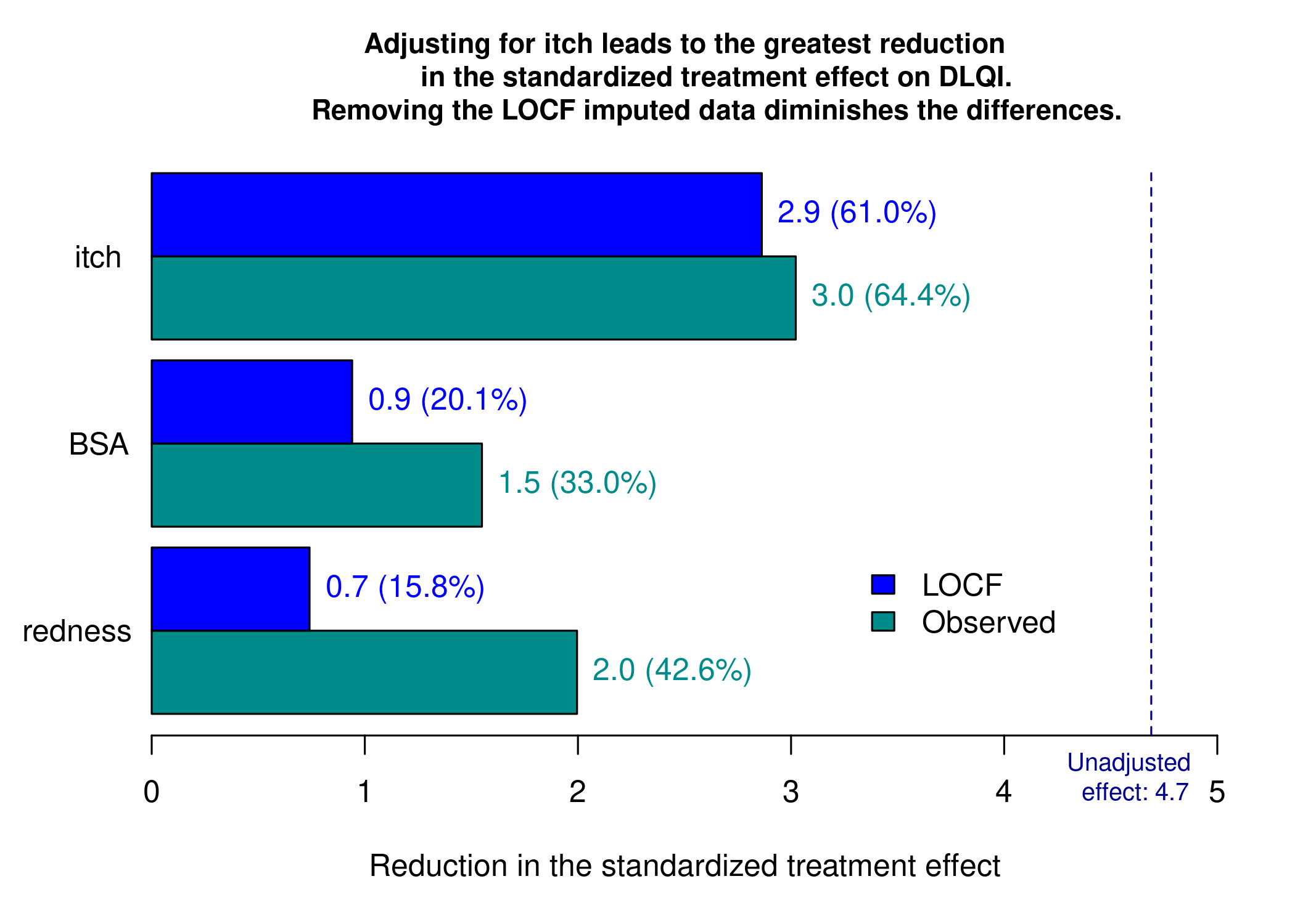
This graphic is similar to the first one except it uses a barchart instead of a lollipop chart and it includes a completers analysis. The title explains the results and the reference line for the marginal treatment effect provides a good reference for the reader.
Example 4. Parallel coords
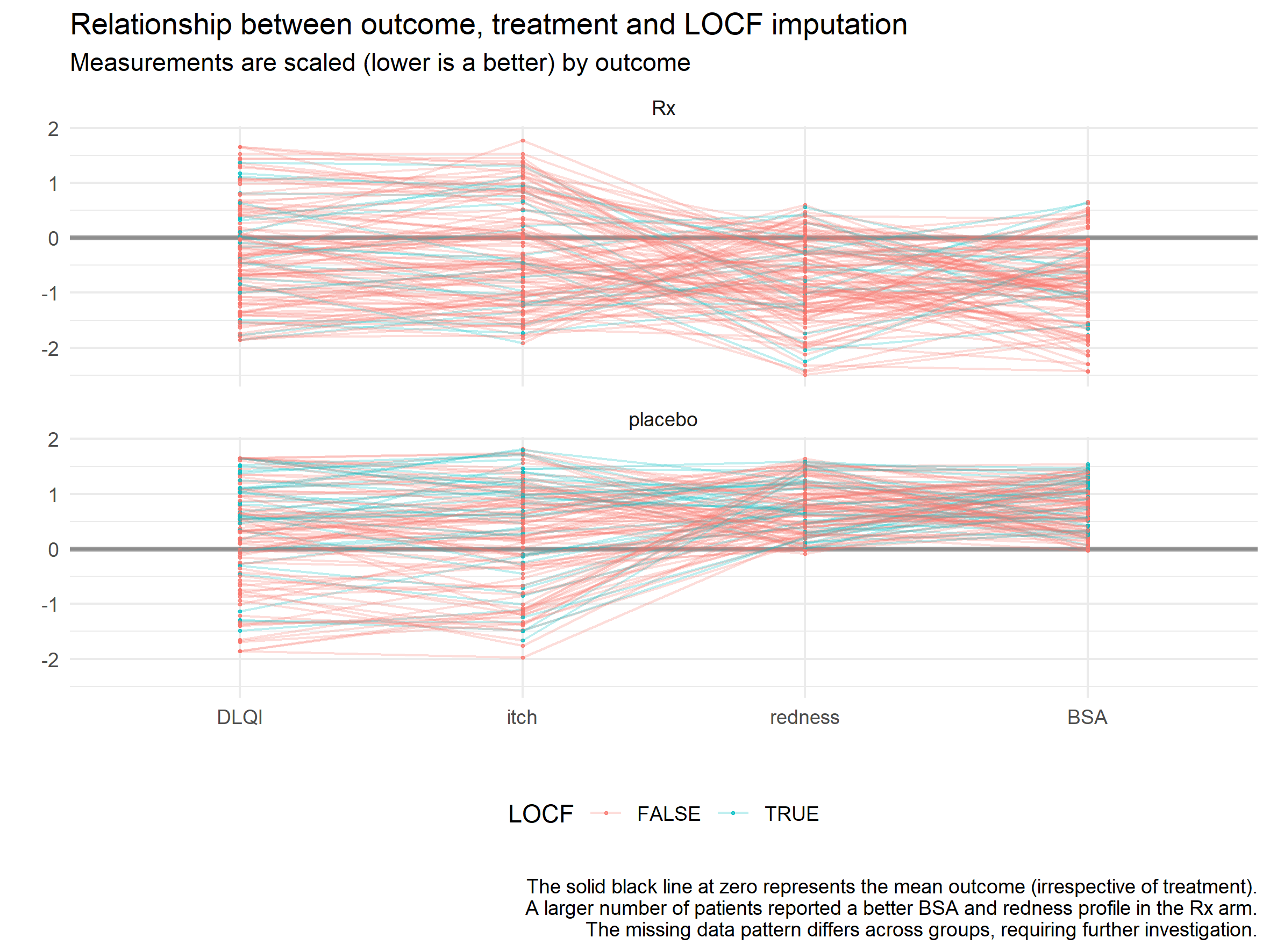
The parallel coordinate plot is a classic way to analyze multi-variate data. The correlation between itch and DLQI is apparent by the fact that there are so many horizontal parallel lines connecting the two axes. This is a plot where two key parameters have to be fine tuned to bring out any patterns: the order of the axes and the scaling. By separating Rx and placebo into two different panels and scaling them separately we lose the treatment effect on DLQI. They look quite similar in fact, but that is because they were scaled independently. The author chose to color by LOCF, but this revealed no clear pattern. It would be interesting to combine the two treatment groups and color by treatment to see if that creates a distinct grouping for Rx vs placebo.
The advantage of this graphic over the barchart and lollipop chart is that we can see the individual variation. But this can be a downside because it can lead to overplotting. Making this interactive where the user could select a set of lines and move the axes could make this plot very powerful.
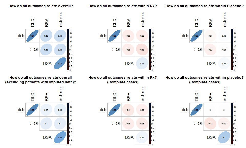
Example 5. Correlation plot
This is a succinct summary of the correlations between all of the variables, whether they are based on all data including LOCF imputed or just completers. The use of color in addition to shave of the ellipses is a nice application of redundancy. You do not need to read a legend to realize that blue encodes a positive correlation and red encodes a negative correlation and the level of transparency encodes the magnitude of the correlation.
Example 6. Scatter matrices
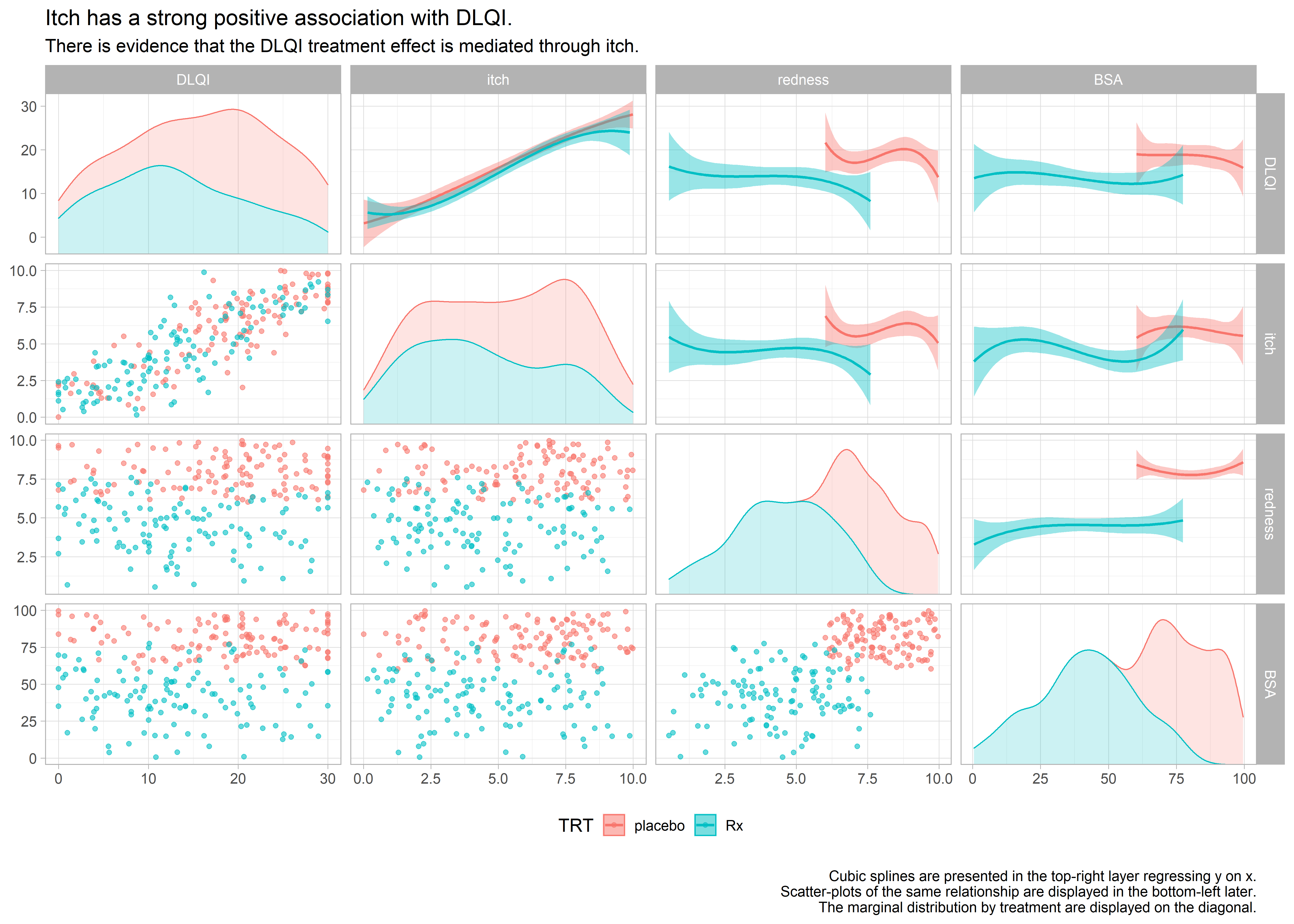
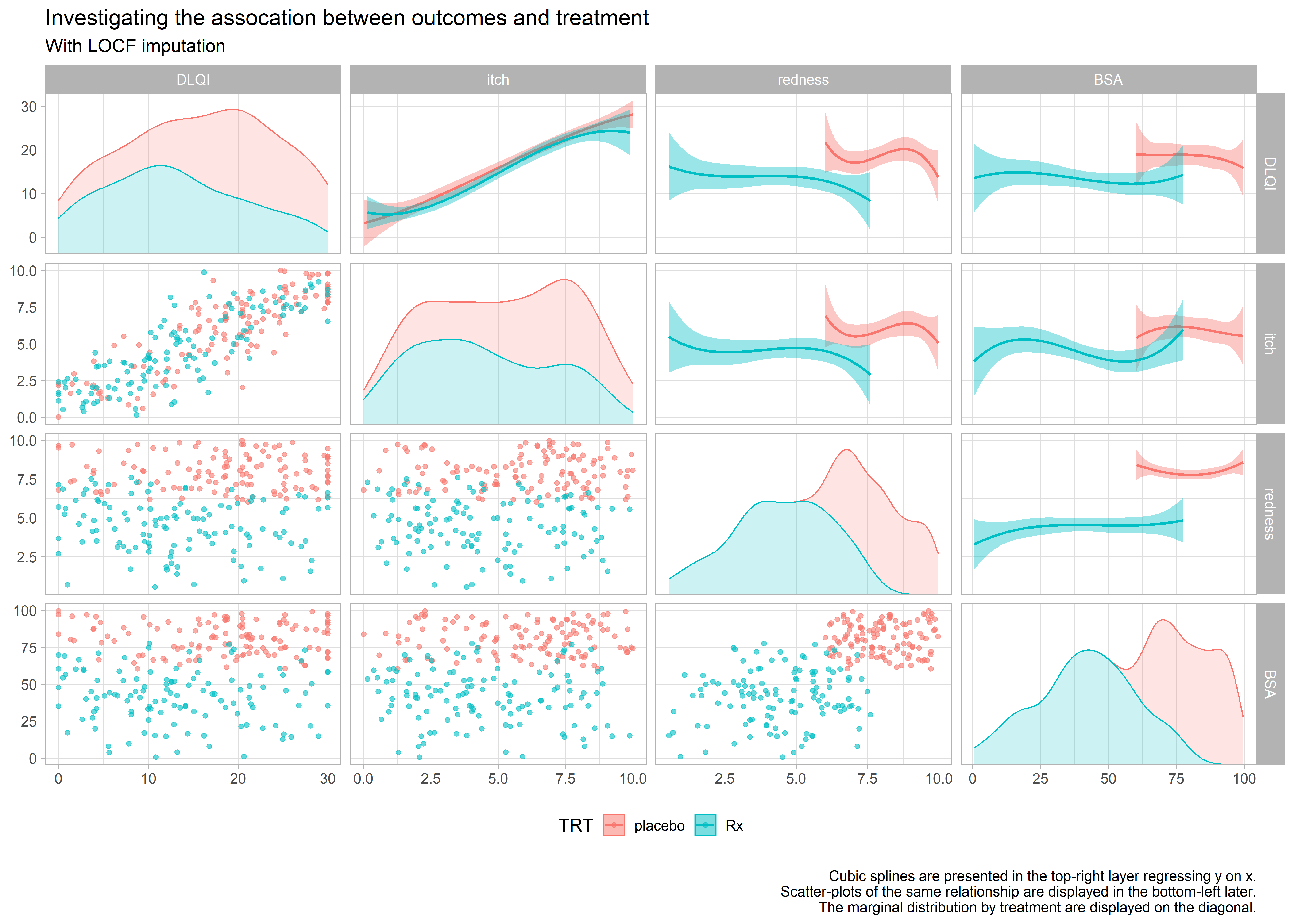
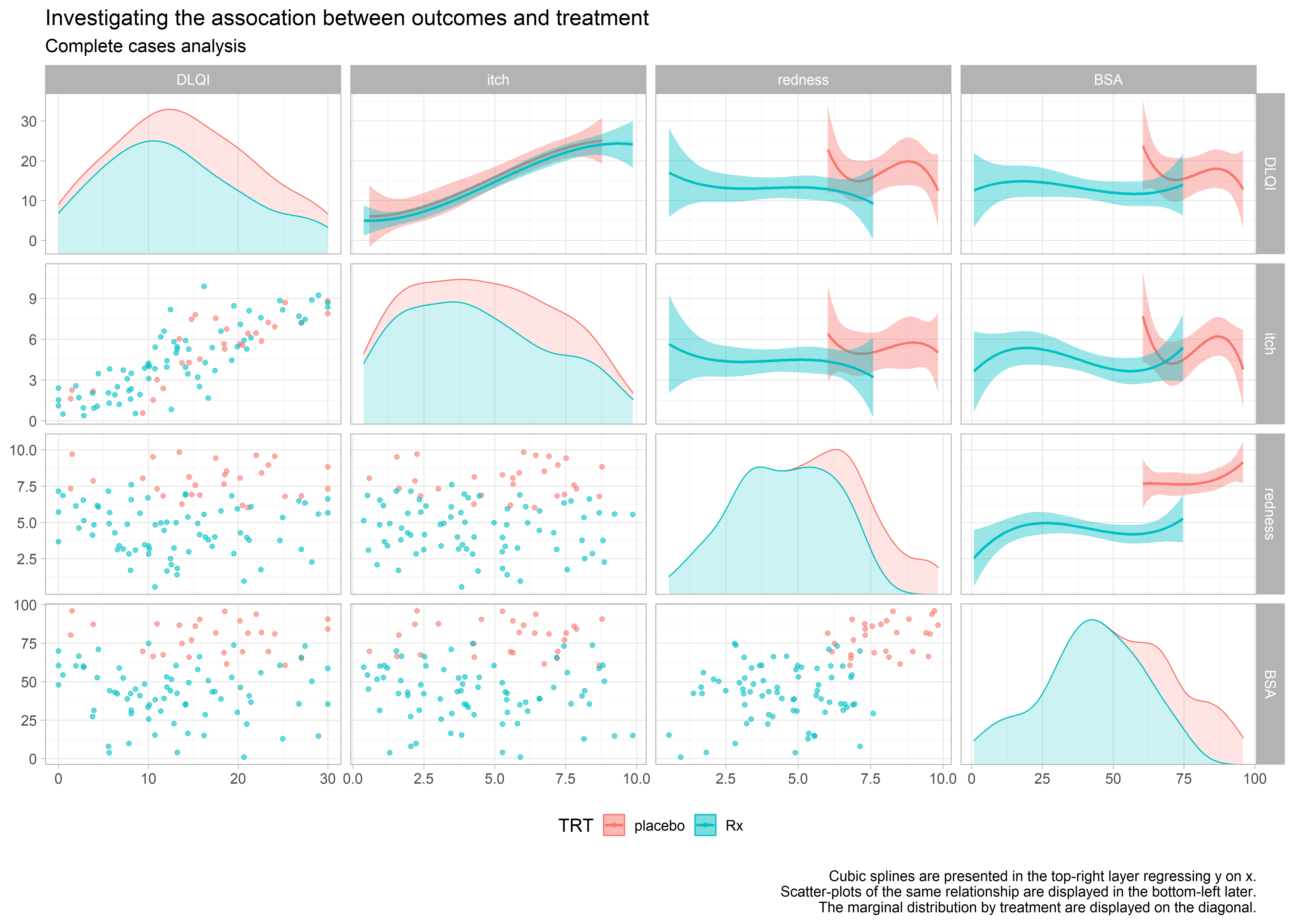
high-resolution image high-resolution image high-resolution image
These 3 graphics provide an exhaustive amount of information. The 3 graphics address the different ways of treating the missing data. Each graph is a matrix where the upper triangle models the data by treatment and covariate, the lower triangle shows the individual data and the diagonal shows the marginal distributions. The title clearly leads the reader to the conclusion the DLQI is highly correlated with itch and when the reader looks at the panel with two splines, one for each treatment, of DLQI against itch the reader can see that the treatment effect on DLQI is neglible once itch is included in the model.
Code
Example 1. Mediation on treatment effect
library(tidyverse)
library(dplyr)
library(tidyr)
library(mediation)
library(grid)
library(gridExtra)
library(haven)
library(ggplot2)
library(cowplot)

data <- read_csv("/shared/175/arenv/arwork/gsk1278863/mid209676/present_2020_01/code/mediation/TRT.csv")

# Summarise data
sum <- data %>%
  group_by(TRT) %>%
  summarise(avg=mean(DLQI))
sort <- c(1,2)
sum <- cbind(sum, sort)

# Plot Mean DLQI
plot01 <- ggplot(data=sum) +
  geom_text(aes(x=-5, y=sort, label=TRT, color=TRT), size=10) +
  geom_segment(aes(x=0, xend=avg, y=sort, yend=sort, color=TRT)) +
  geom_vline(aes(xintercept=0)) +
  geom_point(aes(x=avg, y=sort, color=TRT), alpha=0.7, size=10) +
  scale_x_continuous("Mean DLQI at Week 24",
                     labels=c(" ", "0", "10", "20", "30"),
                     breaks=c(-10, 0, 10, 20, 30),
                     limits=c(-10, 30)) +
  scale_y_continuous(" ",
                     labels=c(" ", " ", " "),
                     breaks=c(1,2,3),
                     limits=c(0, 3)) +
  labs(title="Rx reduces DLQI by approx. 5 units. The treatment effect is \n
              reduced by approx. 4 units when Itch is added to the model. \n
              Therefore the treatment effect of Rx is mediated primarily by itch.\n") +
  theme_minimal() +
  theme(legend.position="none",
        text = element_text(size = 20),
        axis.ticks.x = element_blank(),

        axis.text.y =  element_blank(),
        axis.ticks.y = element_blank(),
        axis.title.x = element_text(size = 20),
        plot.title = element_text(hjust = 0.5, size = 25),
        panel.border = element_rect(colour = "black", fill=NA, size=0.25),
        panel.grid = element_blank())

# Mediation analysis (itch)
model.I <- lm(itch ~ TRT, data)
model.Yi <- lm(DLQI ~ TRT + itch, data)
med.itch <- mediate(model.I, model.Yi, treat='TRT', mediator='itch',
                   boot=TRUE, sims=500)
itch <- (med.itch$d0)*(-1)

# Mediation analysis (BSA)
model.B <- lm(BSA ~ TRT, data)
model.Yb <- lm(DLQI ~ TRT + BSA, data)
med.BSA <- mediate(model.B, model.Yb, treat='TRT', mediator='BSA',
                    boot=TRUE, sims=500)
BSA <- (med.BSA$d0)

# Mediation analysis (redness)
model.R <- lm(redness ~ TRT, data)
model.Yr <- lm(DLQI ~ TRT + redness, data)
med.redness <- mediate(model.R, model.Yr, treat='TRT', mediator='redness',
                   boot=TRUE, sims=500)
redness <- (med.redness$d0)

# Combine ACME values
sort <- c(1, 2, 3)
V1 <- " "
A <- data.frame(cbind(itch, BSA, redness))
A2 <- gather(A, var, val)
A3 <- cbind(A2, sort, V1)

# Overall treatment effect
var = "Effect"
sort = 1
coeff <- data.frame(cbind(summary(model.0 <- lm(DLQI ~ TRT, data))$coefficients[2,1]*(-1), var)) %>%
  mutate(val=as.numeric(V1))
coeff2 <- cbind (coeff, sort)

# Plot treatment effect
plot02 <- ggplot() +
  geom_vline(aes(xintercept=0)) +
  geom_text(data=coeff2, aes(x=-0.75, y=sort), label="Rx Effect", color="blue", size=10) +
  geom_segment(data=coeff2, aes(x=0, xend=val, y=sort, yend=sort), color="blue") +
  geom_point(data=coeff2, aes(x=val, y=sort), color="Blue", alpha=0.7, size=10) +
  scale_x_continuous("Treatment Effect (placebo - Rx)",
                     labels=c(" ", "0", "1", "2", "3", "4", "5", "6"),
                     breaks=c(-1, 0, 1, 2, 3, 4, 5, 6),
                     limits=c(-1, 6)) +
  scale_y_continuous(" ",
                     labels=c(" "),
                     breaks=c(1),
                     limits=c(1)) +
  theme_minimal() +
  theme(text = element_text(size = 20),
        axis.ticks.x = element_blank(),
        axis.text.y =  element_blank(),
        axis.ticks.y = element_blank(),
        axis.title.x = element_text(size = 20),
        plot.title = element_text(hjust = 0.5, size = 25),
        panel.border = element_rect(colour = "black", fill=NA, size=0.25),
        panel.grid = element_blank(),
        plot.caption=element_text(hjust = 0))

# Plot mediation effect
plot03 <- ggplot() +
  geom_text(data=A3, aes(x=-0.75, y=sort, label=var), color="black", size=10) +
  geom_segment(data=A3, aes(x=0, xend=val, y=sort, yend=sort)) +
  geom_point(data=A3, aes(x=val, y=sort), color="black", alpha=0.7, size=10, shape=1) +
  scale_x_continuous("Reduction in Treatment Effect (Mediation Effect)",
                     labels=c(" ", "0", "1", "2", "3", "4", "5", "6"),
                     breaks=c(-1, 0, 1, 2, 3, 4, 5, 6),
                     limits=c(-1, 6)) +
  scale_y_continuous(" ",
                     labels=c(" ", " ", " "),
                     breaks=c(1, 2, 3),
                     limits=c(0, 4)) +
  theme_minimal() +
  theme(text = element_text(size = 20),
        axis.ticks.x = element_blank(),
        axis.text.y =  element_blank(),
        axis.ticks.y = element_blank(),
        axis.title.x = element_text(size = 20),
        plot.title = element_text(hjust = 0.5, size = 25),
        panel.border = element_rect(colour = "black", fill=NA, size=0.25),
        panel.grid = element_blank(),
        plot.caption=element_text(hjust = 0)) +
  ggtitle(label = " ")

p <- plot_grid(plot01, plot02, plot03, align = "v", nrow = 3, rel_heights = c(1.5, 0.6, 1.2))

ggsave("/shared/175/arenv/arwork/gsk1278863/mid209676/present_2020_01/code/mediation/DLQI_mediation_mallett.png", p, width=12, height=12, dpi=300)Example 2. Bayesian model
The code can be found here.
Note that this is an R markdown file and you might need a proper editor to open it.
A txt file with the code can be found here.
Example 3. Barplot
# Baplots to show the reduction in treatment effect on DLQI.
# ==========================================================

# Read in the data set:
dat <- read.csv("mediation_data.csv")


fit <- lm(DLQI ~ TRT, data = dat)
t.val.pure <- coef(summary(fit))[2, 3]

t.val.vec <- numeric(3)
j <- 1
for (i in c(2, 4, 6)) {
  fit <- lm(dat$DLQI ~ dat[, i] + dat$TRT)
  t.val.vec[j] <- coef(summary(fit))[3, 3]
  j <- j + 1
}

# Redo without imputed data:
t.val.vec.re <- numeric(3)
j <- 1
for (i in c(2, 4, 6)) {
  dat.re <- dat[which(dat[, i+1] == F), ]
  fit <- lm(dat.re$DLQI ~ dat.re[, i] + dat.re$TRT)
  t.val.vec.re[j] <- coef(summary(fit))[3, 3]
  j <- j + 1
}

# Combine both vectors:
t.vals <- c(t.val.vec.re[3], t.val.vec[3],
            t.val.vec.re[2], t.val.vec[2],
            t.val.vec.re[1], t.val.vec[1])

# Calculate difference:
t.vals - t.val.pure

# Calculate the difference:
t.val.diff <- t.vals - t.val.pure
t.val.mat <- matrix(t.val.diff, ncol = 3)
fit <- lm(DLQI ~ TRT, dat)
t.val.mat.pr <- t.val.mat/abs(coef(summary(fit))[2, 3]) * 100

png("barplot.png", width = 7, height = 5, res = 300, units = "in")
par(xpd = T, cex.main = 0.9)
barplot(t.val.diff, horiz = T, col = c("darkcyan", "blue"), xlim = c(0, 5),
        space = rep(c(0.25, 0), 3),
        main = "Adjusting for itch leads to the greatest reduction
        in the absolute standardized treatment effect on DLQI (unadjusted effect: 4.7).
        Removing the LOCF imputed data diminishes the differences.",
        xlab = "Reduction in the absolute standardized treatment effect")
y.coord <- c(1.25, 3.5, 5.75)
text(-0.25, y.coord[3], "itch")
text(-0.25, y.coord[2], "BSA")
text(-0.35, y.coord[1], "redness")
for (i in 1:nrow(t.val.mat)) {
  for (j in 1:ncol(t.val.mat)) {
    t.val <- paste0(format(round(t.val.mat[i, j], 1), nsmall = 1), " (",
                    format(round(t.val.mat.pr[i, j], 1), nsmall = 1), "%)")
    text(t.val.mat[i, j] + .45, y.coord[j] + i - 1.5, t.val,
         col = c("darkcyan", "blue")[i])
  }
}
legend("topright", legend = c("LOCF", "Observed"), fill = c("blue", "darkcyan"), bty = "n")
dev.off()Example 4. Parallel coords
## function to scale data
scale_this <- function(x) {
  (x - mean(x, na.rm = TRUE)) / sd(x, na.rm = TRUE)
}


library(tidyverse)

## read in data
final_in <- read_csv("mediation_data.csv")

## check data
final_in %>% glimpse()

## scale data and put in long format
data <-
  final_in %>%
  select(!c("itch_LOCF", "BSA_LOCF", "redness_LOCF", "DLQI_LOCF")) %>%
  mutate(id = row_number(),
         itch = scale_this(itch),
         BSA = scale_this(BSA),
         redness = scale_this(redness),
         DLQI = scale_this(DLQI)) %>%
  pivot_longer(!c(TRT, id), names_to = "var", values_to = "val")

### add an indicator for LOCF variables
missing <-
  final_in %>%
  select(c("TRT", "itch_LOCF", "BSA_LOCF", "redness_LOCF", "DLQI_LOCF")) %>%
  mutate(id = row_number()) %>%
  pivot_longer(!c(TRT, id), names_to = "var", values_to = "LOCF") %>%
  mutate(var = str_remove(var, "_LOCF"))

## join to main data set
data <-
  data %>%
  left_join(missing)

## check data set
data %>% glimpse()

## check LOCF vals
table(data$LOCF)


## plot data
data %>%
  mutate(
    name = fct_relevel(var,
                       "DLQI", "itch", "redness",
                       "BSA"),
    TRT = fct_relevel(TRT, "Rx", "placebo")
  ) %>%
  ggplot(aes(
    x = name,
    y = val,
    group = id,
    colour = LOCF
  )) +
  geom_hline(yintercept = 0, colour = "black", alpha = 0.4, size = 1.1) +
  geom_point(alpha = 0.7, size = 0.5) +
  geom_line(alpha = 0.25, size = 0.5) +
  labs(title = "Relationship between outcome, treatment and LOCF imputation",
       subtitle = "Measurements are scaled (lower is a better) by outcome",
       caption = "\n The solid black line at zero represents the mean outcome (irrespective of treatment).\nA larger number of patients reported a better BSA and redness profile in the Rx arm.\nThe missing data pattern differs across groups, requiring further investigation.") +
  xlab("") +
  ylab("") +
  facet_wrap( ~ TRT, ncol = 1) +
  theme_minimal() +
  theme(legend.position = "bottom")


## Save plot
page_width <- 200
page_height <- 150
d_dpi <- 300
ggsave(file = paste0("parallel_coords.png"),
       width = page_width, height = page_height,
units = "mm", dpi = d_dpi)Example 5. Correlation plot
#########################################
##  Warning this code requires a re-factor
## and put repeated steps in to a function
#########################################

library(corrplot)
library(tidyverse)

## read in data
final_in <- read_csv("mediation_data.csv")

#plot on one page
par(mfrow = c(2, 3))
par(cex = 0.75)

##-----------------------------------------------------
## Overall correlations
title <- "How do all outcomes relate overall?"

corrs <- final_in %>%
  dplyr::select("itch", "BSA", "redness", "DLQI") %>%
  filter(complete.cases(.)) %>%
  dplyr::mutate_all(as.numeric)

M <- cor(corrs)
col <-
  colorRampPalette(c("#BB4444", "#EE9988", "#FFFFFF", "#77AADD", "#4477AA"))
corrplot(
  M,
  method = "ellipse",
  col = col(200), tl.cex = 1/par("cex"),
  type = "upper",
  order = "hclust",
  number.cex = .7,
  title = title,
  addCoef.col = "black",
  # Add coefficient of correlation
  tl.col = "black",
  tl.srt = 90,
  # Text label color and rotation
  # hide correlation coefficient on the principal diagonal
  diag = FALSE,
  mar = c(0, 0, 3, 0)
)


##-----------------------------------------------------
### - By Rx arm
title <- "How do all outcomes relate within Rx?"

corrs <- final_in %>%
  filter(TRT == "Rx") %>%
  dplyr::select("itch", "BSA", "redness", "DLQI") %>%
  dplyr::mutate_all(as.numeric)
M <- cor(corrs)
col <-
  colorRampPalette(c("#BB4444", "#EE9988", "#FFFFFF", "#77AADD", "#4477AA"))

corrplot(
  M,
  method = "ellipse",
  col = col(200), tl.cex = 1/par("cex"),
  type = "upper",
  order = "hclust",
  number.cex = .7,
  title = title,
  addCoef.col = "black",
  # Add coefficient of correlation
  tl.col = "black",
  tl.srt = 90,
  diag = FALSE,
  mar = c(0, 0, 3, 0)
)


##-----------------------------------------------------
## By Placebo
corrs <- final_in %>%
  filter(TRT == "placebo") %>%
  dplyr::select("itch", "BSA", "redness", "DLQI") %>%
  dplyr::mutate_all(as.numeric)
M <- cor(corrs)
col <-
  colorRampPalette(c("#BB4444", "#EE9988", "#FFFFFF", "#77AADD", "#4477AA"))

title <- "How do all outcomes relate within Placebo?"
corrplot(
  M,
  method = "ellipse",
  col = col(200), tl.cex = 1/par("cex"),
  type = "upper",
  order = "hclust",
  number.cex = .7,
  title = title,
  addCoef.col = "black",
  # Add coefficient of correlation
  tl.col = "black",
  tl.srt = 90,
  # Text label color and rotation
  # hide correlation coefficient on the principal diagonal
  diag = FALSE,
  mar = c(0, 0, 3, 0)
)


##-----------------------------------------------------
## Overall and complete cases

corrs <- final_in %>%
  filter(itch_LOCF == FALSE &
           BSA_LOCF == FALSE & redness_LOCF == FALSE & DLQI_LOCF == FALSE) %>%
  filter(complete.cases(.)) %>%
  dplyr::select("itch", "BSA", "redness", "DLQI") %>%
  dplyr::mutate_all(as.numeric)

M <- cor(corrs)

col <-
  colorRampPalette(c("#BB4444", "#EE9988", "#FFFFFF", "#77AADD", "#4477AA"))


title <-
  "How do all outcomes relate overall\n(excluding patients with imputed data)?"
corrplot(
  M,
  method = "ellipse",
  col = col(200), tl.cex = 1/par("cex"),
  type = "upper",
  order = "hclust",
  number.cex = .7,
  title = title,
  addCoef.col = "black",
  # Add coefficient of correlation
  tl.col = "black",
  tl.srt = 90,
  # Text label color and rotation
  # hide correlation coefficient on the principal diagonal
  diag = FALSE,
  mar = c(0, 0, 3, 0)
)


##-----------------------------------------------------
### By Rx and complete cases
corrs <- final_in %>%
  filter(TRT == "Rx") %>%
  filter(itch_LOCF == FALSE &
           BSA_LOCF == FALSE & redness_LOCF == FALSE & DLQI_LOCF == FALSE) %>%
  filter(complete.cases(.)) %>%
  dplyr::select("itch", "BSA", "redness", "DLQI") %>%
  dplyr::mutate_all(as.numeric)
M <- cor(corrs)
col <-
  colorRampPalette(c("#BB4444", "#EE9988", "#FFFFFF", "#77AADD", "#4477AA"))

title <- "How do all outcomes relate within Rx?\n(Complete cases)"
corrplot(
  M,
  method = "ellipse",
  col = col(200), tl.cex = 1/par("cex"),
  type = "upper",
  order = "hclust",
  number.cex = .7,
  title = title,
  addCoef.col = "black",
  # Add coefficient of correlation
  tl.col = "black",
  tl.srt = 90,
  # Text label color and rotation
  # hide correlation coefficient on the principal diagonal
  diag = FALSE,
  mar = c(0, 0, 3, 0)
)


##-----------------------------------------------------
### Placebo and complete cases

corrs <- final_in %>%
  filter(TRT == "placebo") %>%
  filter(itch_LOCF == FALSE &
           BSA_LOCF == FALSE & redness_LOCF == FALSE & DLQI_LOCF == FALSE) %>%
  filter(complete.cases(.)) %>%
  dplyr::select("itch", "BSA", "redness", "DLQI") %>%
  dplyr::mutate_all(as.numeric)
M <- cor(corrs)
col <-
  colorRampPalette(c("#BB4444", "#EE9988", "#FFFFFF", "#77AADD", "#4477AA"))

title <-
  "How do all outcomes relate within placebo?\n(Complete cases)"
corrplot(
  M,
  method = "ellipse",
  col = col(200), tl.cex = 1/par("cex"),
  type = "upper",
  order = "hclust",
  number.cex = .7,
  title = title,
  addCoef.col = "black",
  # Add coefficient of correlation
  tl.col = "black",
  tl.srt = 90,
  # Text label color and rotation
  # hide correlation coefficient on the principal diagonal
  diag = FALSE,
  mar = c(0, 0, 3, 0)
)Example 6. Correlation matrices
a) Overview
library(tidyverse)
library(ggforce)

## Save plot
page_width <- 350
page_height <- 250
d_dpi <- 400

## read in data
final_in <- read_csv("mediation_data.csv")


## Plot overall
ggplot(final_in, aes(x = .panel_x, y = .panel_y, colour = TRT, fill = TRT)) +
  geom_autopoint(alpha = 0.6) +
  geom_autodensity(alpha = 0.2) +
  geom_smooth(method = lm, formula = y ~ splines::bs(x, 3)) +
  facet_matrix(vars(DLQI, itch, redness, BSA), layer.diag = 2, layer.upper = 3,
               grid.y.diag = FALSE) +
  labs(title = "Itch has a strong positive association with DLQI.",
       subtitle = "There is evidence that the DLQI treatment effect is mediated through itch.",
       caption = "\n Cubic splines are presented in the top-right layer regressing y on x.\nScatter-plots of the same relationship are displayed in the bottom-left later.\nThe marginal distribution by treatment are displayed on the diagonal.") +
  theme_light(base_size = 14) +
  theme(legend.position = "bottom")

## save plot
ggsave(file = paste0("scatter-matrix-final.png"),
       width = page_width, height = page_height,
       units = "mm", dpi = d_dpi)
b) LOCF and CC:
library(tidyverse)
library(ggforce)

## Save plot
page_width <- 350
page_height <- 250
d_dpi <- 400

## read in data
final_in <- read_csv("mediation_data.csv")


## Plot overall
ggplot(final_in, aes(x = .panel_x, y = .panel_y, colour = TRT, fill = TRT)) +
  geom_autopoint(alpha = 0.6) +
  geom_autodensity(alpha = 0.2) +
  geom_smooth(method = lm, formula = y ~ splines::bs(x, 3)) +
  facet_matrix(vars(DLQI, itch, redness, BSA), layer.diag = 2, layer.upper = 3,
               grid.y.diag = FALSE) +
  labs(title = "Investigating the assocation between outcomes and treatment",
       subtitle = "With LOCF imputation",
       caption = "\n Cubic splines are presented in the top-right layer regressing y on x.\nScatter-plots of the same relationship are displayed in the bottom-left later.\nThe marginal distribution by treatment are displayed on the diagonal.") +
  theme_light(base_size = 14) +
  theme(legend.position = "bottom")

## save plot
ggsave(file = paste0("scatter-matrix-locf.png"),
       width = page_width, height = page_height,
       units = "mm", dpi = d_dpi)


## Plot complete cases
final_in %>%
  filter(itch_LOCF == FALSE & BSA_LOCF == FALSE & redness_LOCF == FALSE & DLQI_LOCF == FALSE) %>%
  ggplot(aes(x = .panel_x, y = .panel_y, colour = TRT, fill = TRT)) +
  geom_autopoint(alpha = 0.6) +
  geom_autodensity(alpha = 0.2) +
  geom_smooth(method = lm, formula = y ~ splines::bs(x, 3)) +
  facet_matrix(vars(DLQI, itch, redness, BSA), layer.diag = 2, layer.upper = 3,
               grid.y.diag = FALSE) +
  labs(title = "Investigating the assocation between outcomes and treatment",
       subtitle = "Complete cases analysis",
       caption = "\n Cubic splines are presented in the top-right layer regressing y on x.\nScatter-plots of the same relationship are displayed in the bottom-left later.\nThe marginal distribution by treatment are displayed on the diagonal.") +
  theme_light(base_size = 14) +
  theme(legend.position = "bottom")

## save plot
ggsave(file = paste0("scatter-matrix-cc.png"),
       width = page_width, height = page_height,
       units = "mm", dpi = d_dpi)