Example meta-analysis dataset
The meta-analysis data set introduced some of the challenges faced when working with pooled or integrated clinical trial data. This is often referred to as meta-analysis.
Meta-analyses concerning integrated data throw up a number of challenges typically as the data sets are “found” i.e. not designed by the team performing the analysis or designed for the question of interest. This is often the typical task of a data science project.
Key issues where data visualisation can help are around the investigation of whether studies can or should be combined due to study heterogeneity among individual trials. This throws up questions such as:
- what graphical tools can be used to assess heterogeneity, describing the fixed and random-effects?
- what variables are potentially prognostic or predictive of outcome, etc?
- where can graphical methods provide some general recommendations?
Lets go through the submissions and how they tackled some of these questions.
Example 1. Forest plot
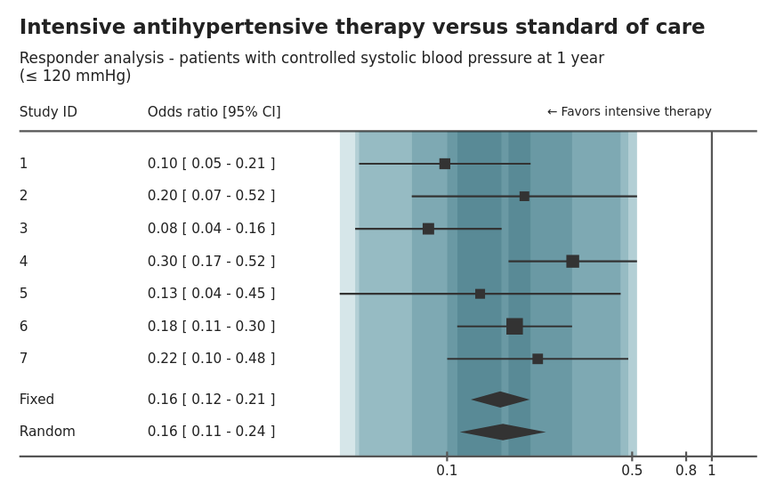
This is an example of a forest plot displaying the within study results based on two outcomes comparing treatment effect on patient blood pressure response at 1-year using odds ratio and relative risk measures. The treatment effect is displayed as a table and visualisation by study as well as the overall fixed effect size. The size of the study is also encoded in the size of the “point estimate”. The agreement or overlap between each study is also highlighted through bands.
There are nice interactive options that allow the switching between odds ratio and relative risk. This can help with comparisons or essentially a sensitivity analysis, comparing different assumptions. Another option is to be able to resize the plot, which is a great feature if the plot has to be presented at different forums or media (i.e. report or powerpoint).
The banding to display the overlap or agreement between studies is an interesting idea, but is not intuitive. Often banding is used to encode uncertainty.
Another potential addition to this plot would be annotation to indicate the overall random or fixed effect, to help draw comparisons across study with the full model.
The shiny app can be found here.
Example 2. Explorer app
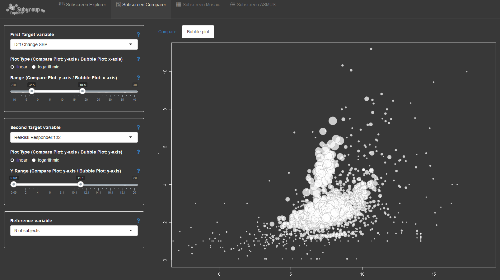
The second submission is an example of the open source subscreen shiny app applied to the problem of exploring integrated data. The application provides a number of options to explore the relationship between explanatory and dependent variables. With wide data, the combinations between variables can become overwhelming. This is where such an application helps with systematically exploring the data to look for potential issues or trends that require further investigation.
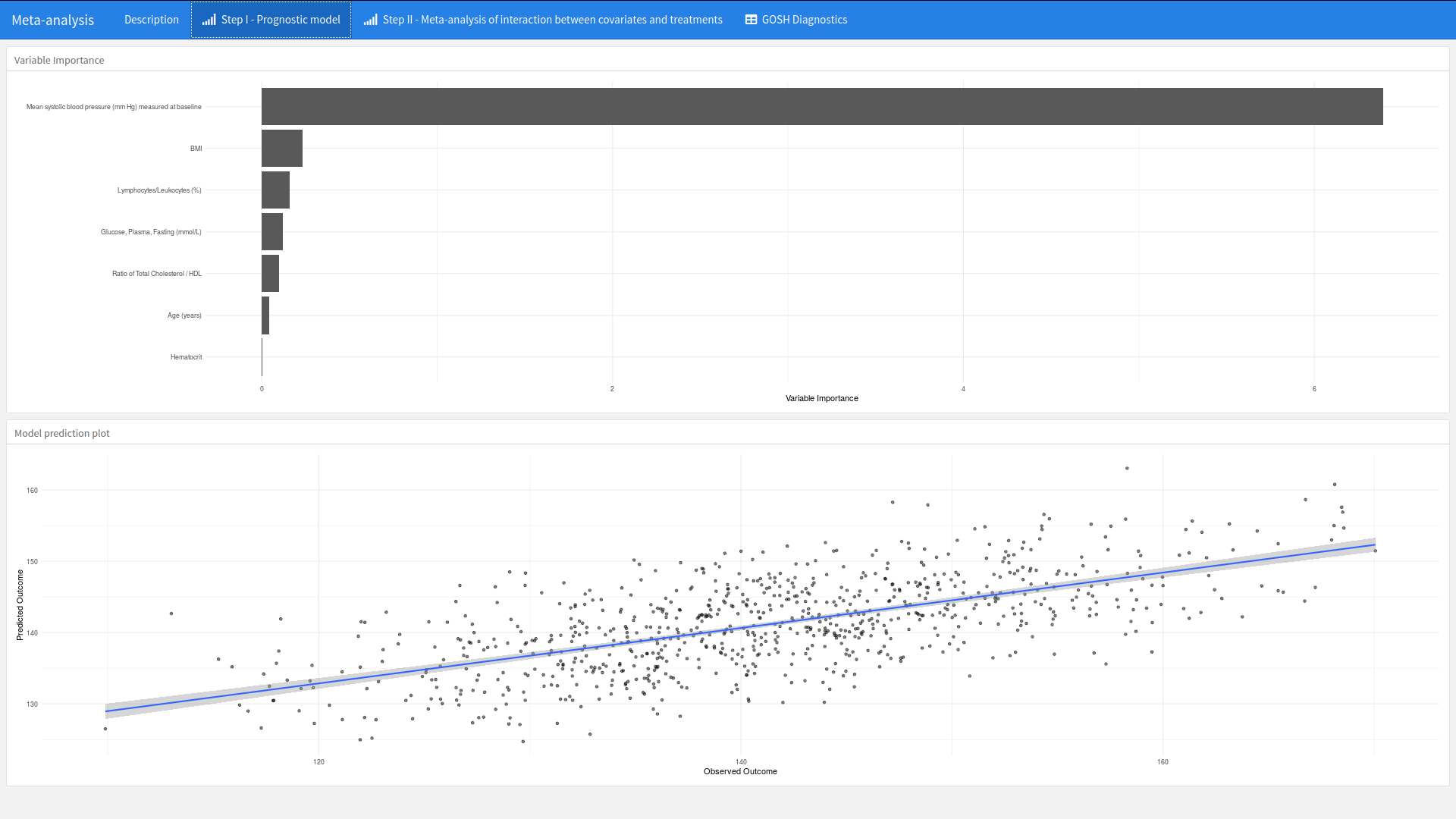
Example 3. Prognostic model workflow shiny app
high-resolution image
The app can be found here.
This submission was a carefully thought through example of how visualisations can be embedded into the workflow of the development of a model. The app is developed to support a 2-stage meta-analysis approach to detect baseline variables that are predictive of mean systolic blood pressure (mm Hg) measured at 1-year. A number of visualisations are provided to support each phase of the workflow.
What is nice about this app is that plots such as a ranking of variable importance is placed alongside other supporting visualisations that provide supporting context. In this case a scatter plot of the observed and predictive outcome. This provides an instant overview of the model.
The second step provides both the forest plot of within study estimates with a GOSH plot to explore the heterogeneity of each study and the impact of including or not including a study within the model. Again, both plots side by side provide context that support the workflow.
Please click on the link to explore for yourself.
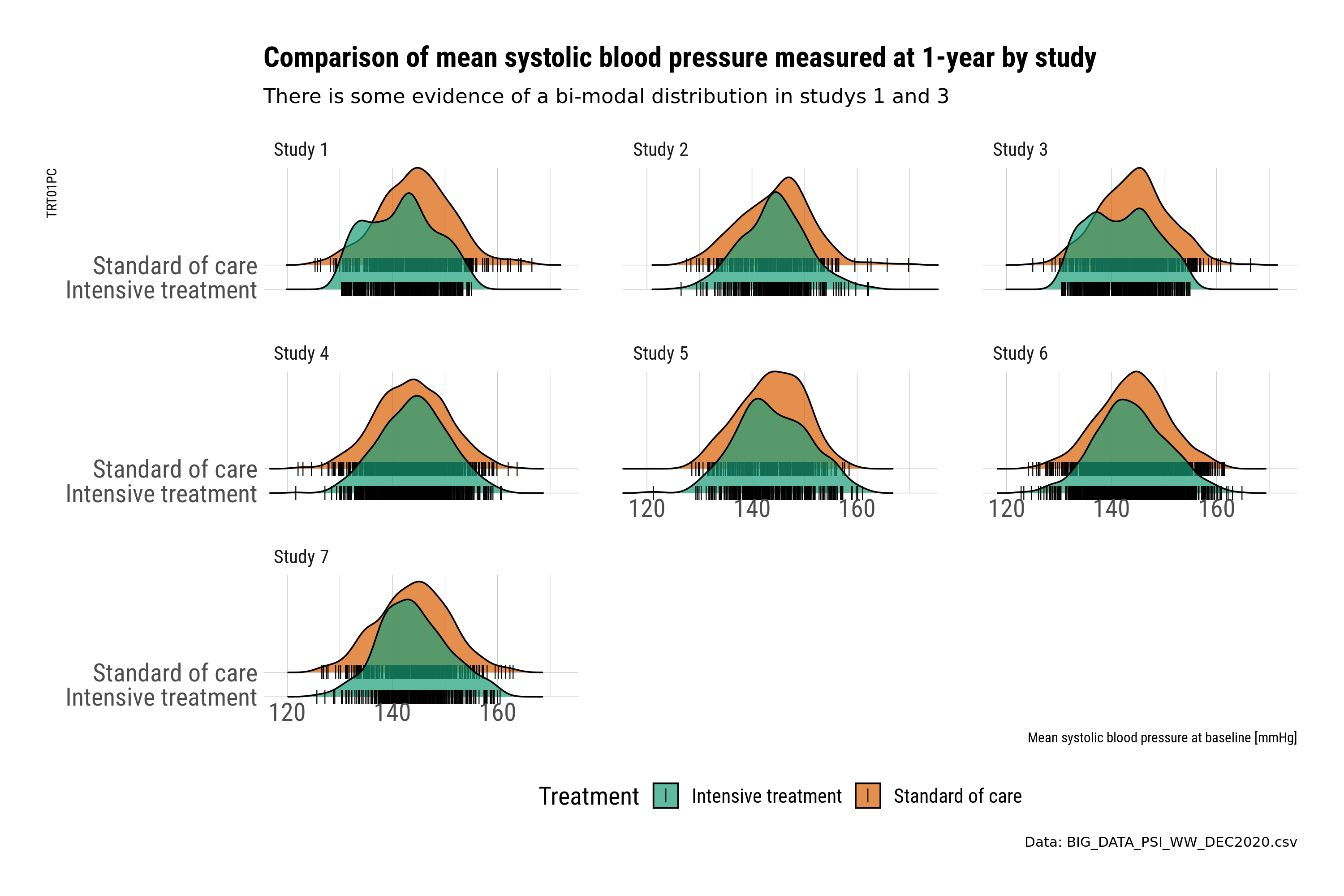
Example 4. Comparison of blood pressure by study
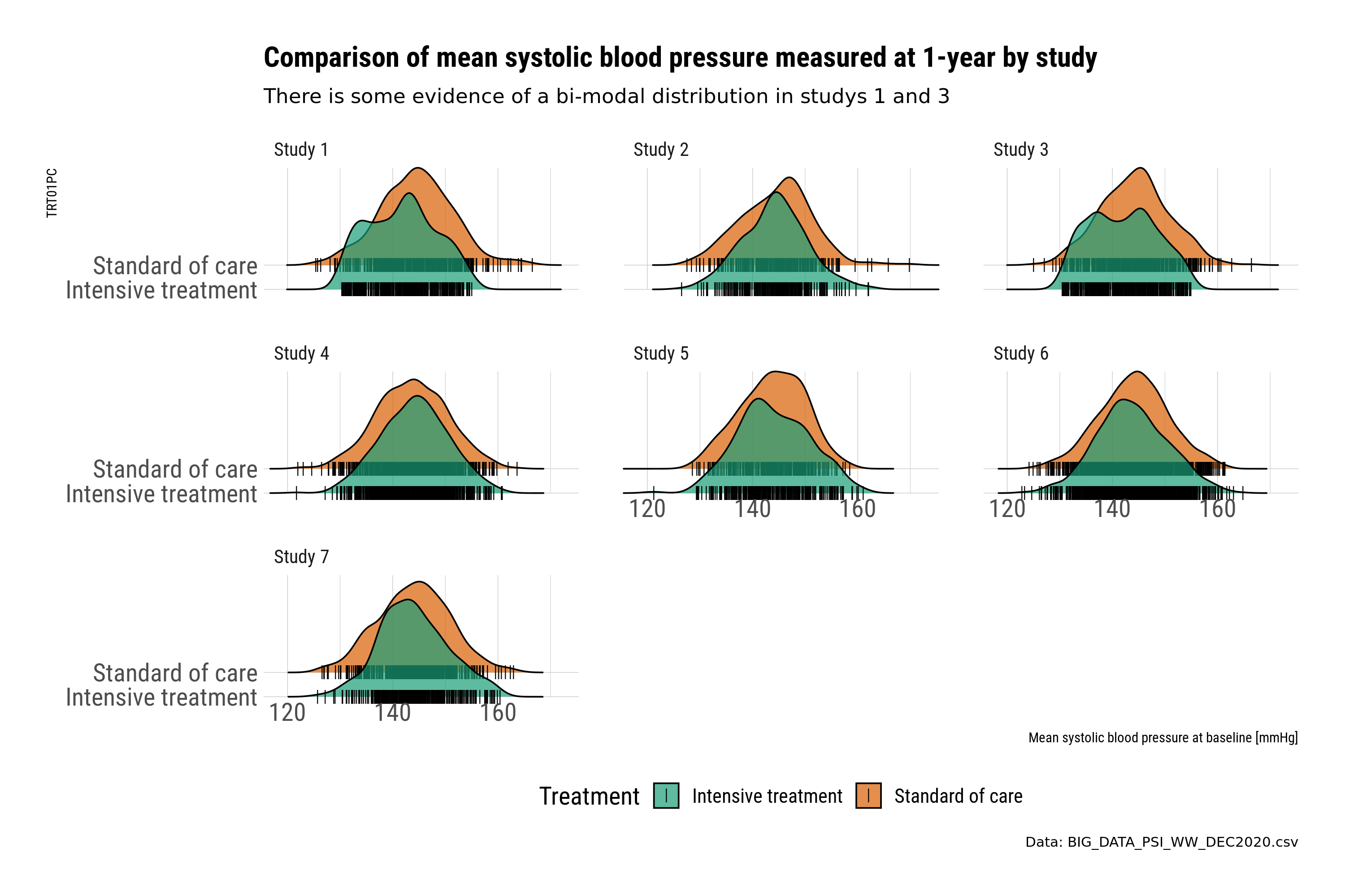
This submission is a selection of plots that uses small multiples to explore the within study relationship between key variables related to baseline and outcome. In this case the relationship between blood pressure measured at baseline and 1-year. Small multiples provide an instant overview and a visual check for potential differences.
The first set of plots use ridge plots to explore the distribution by treatment. This is an example of the outcome variable (BP at 1-year). Ridge plots provide a visual check and comparison. However, the comparison is by treatment, where plotting the treatment difference could be more informative. The ridge plots also create a slight “3d” effect, where the upper placed treatment is “higher” in value compared to the lower; this could be potentially misleading when comparing across treatments.
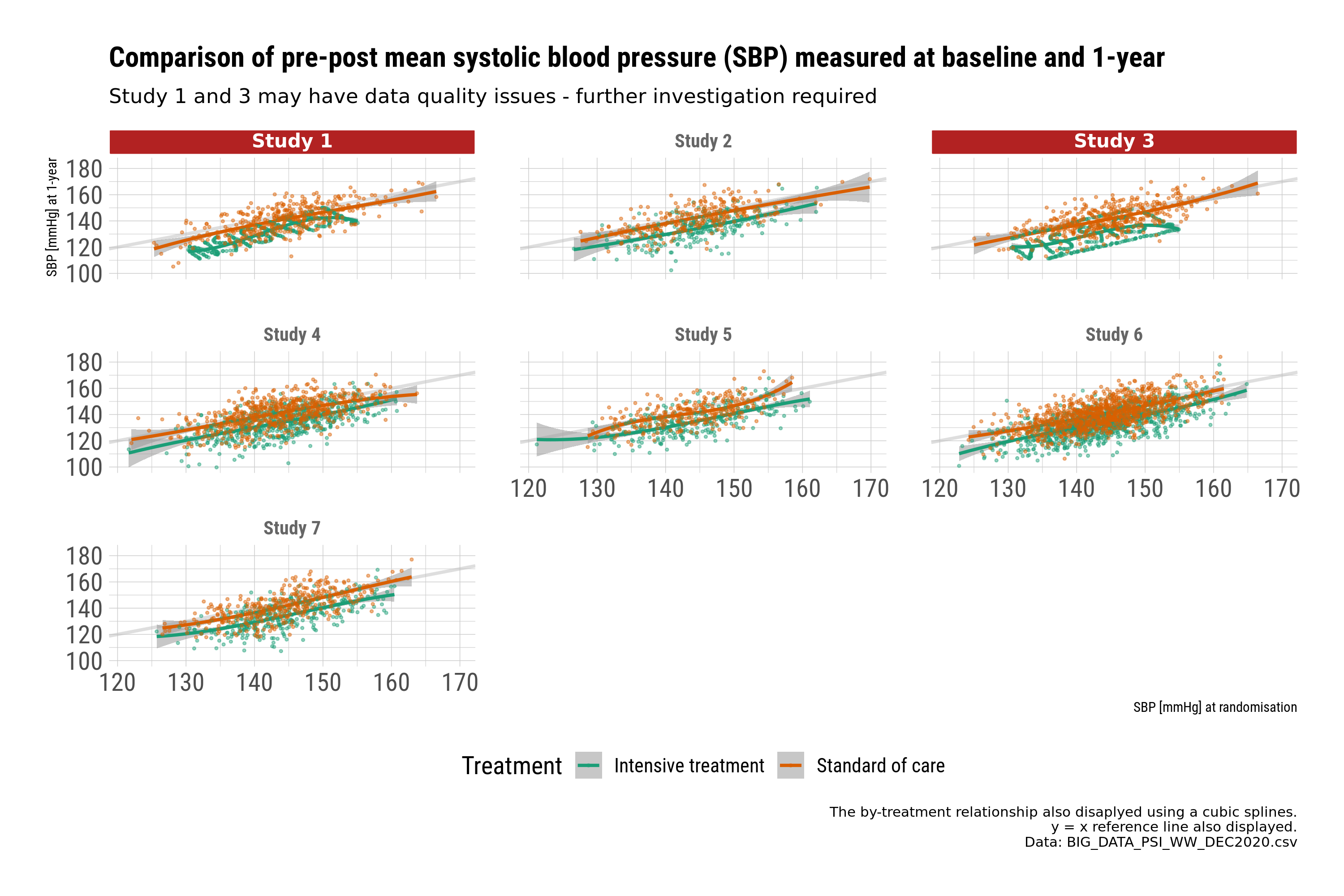
The second set of plots use scatter plots to explore the relationship between baseline and 1-year by treatment. The plots are designed to provide a message. In this case, further checking of the data is required for studies 1 and 3.
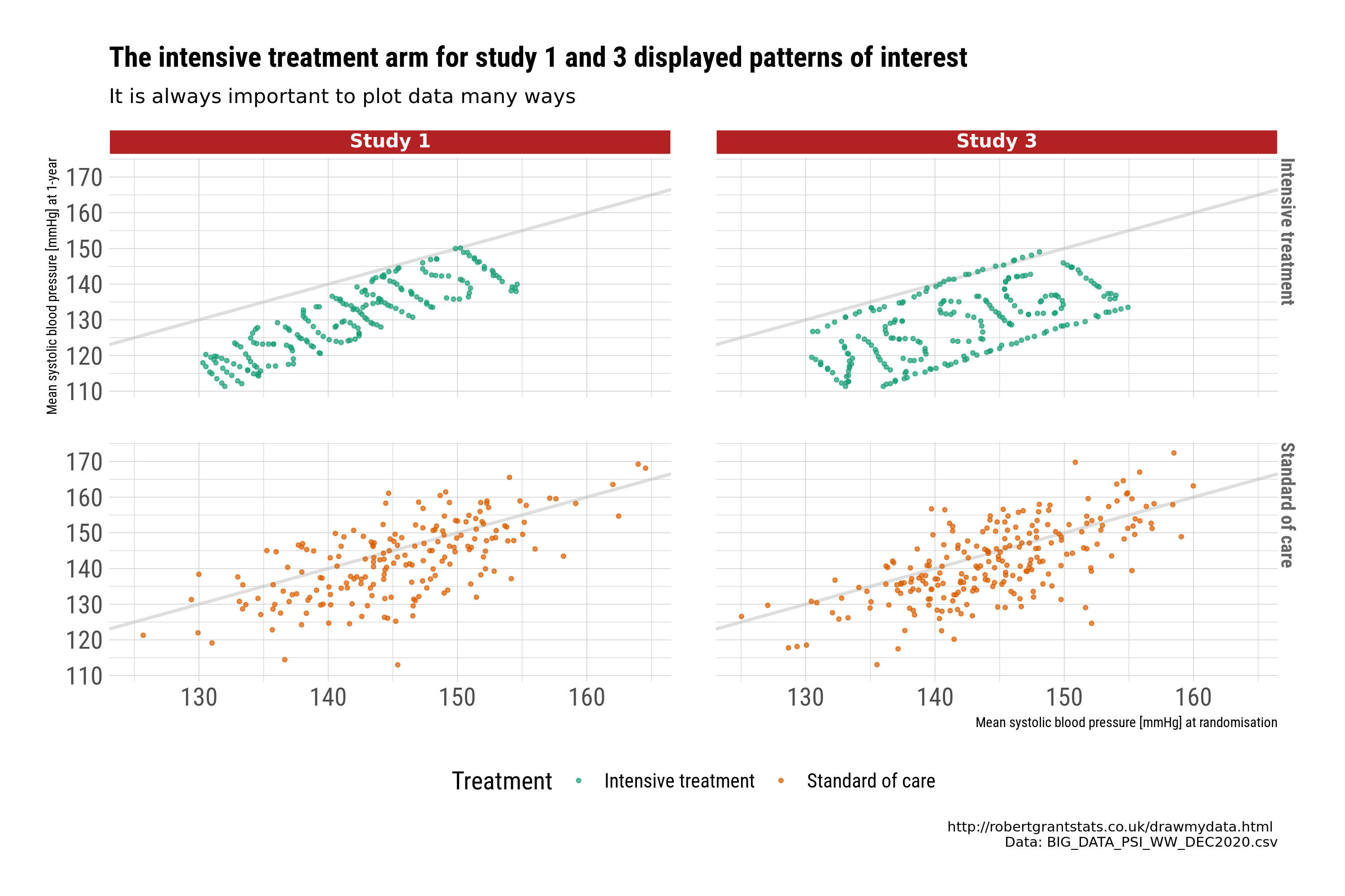
Closer examination identifies systematic patterns in the data that may indicate we would want to exclude those studies from a “full model”, or at least query the issue further. This is a good example of why visualisations are important to identify issues with the data, and to identify “insights”.
high-resolution image high-resolution image high-resolution image high-resolution image
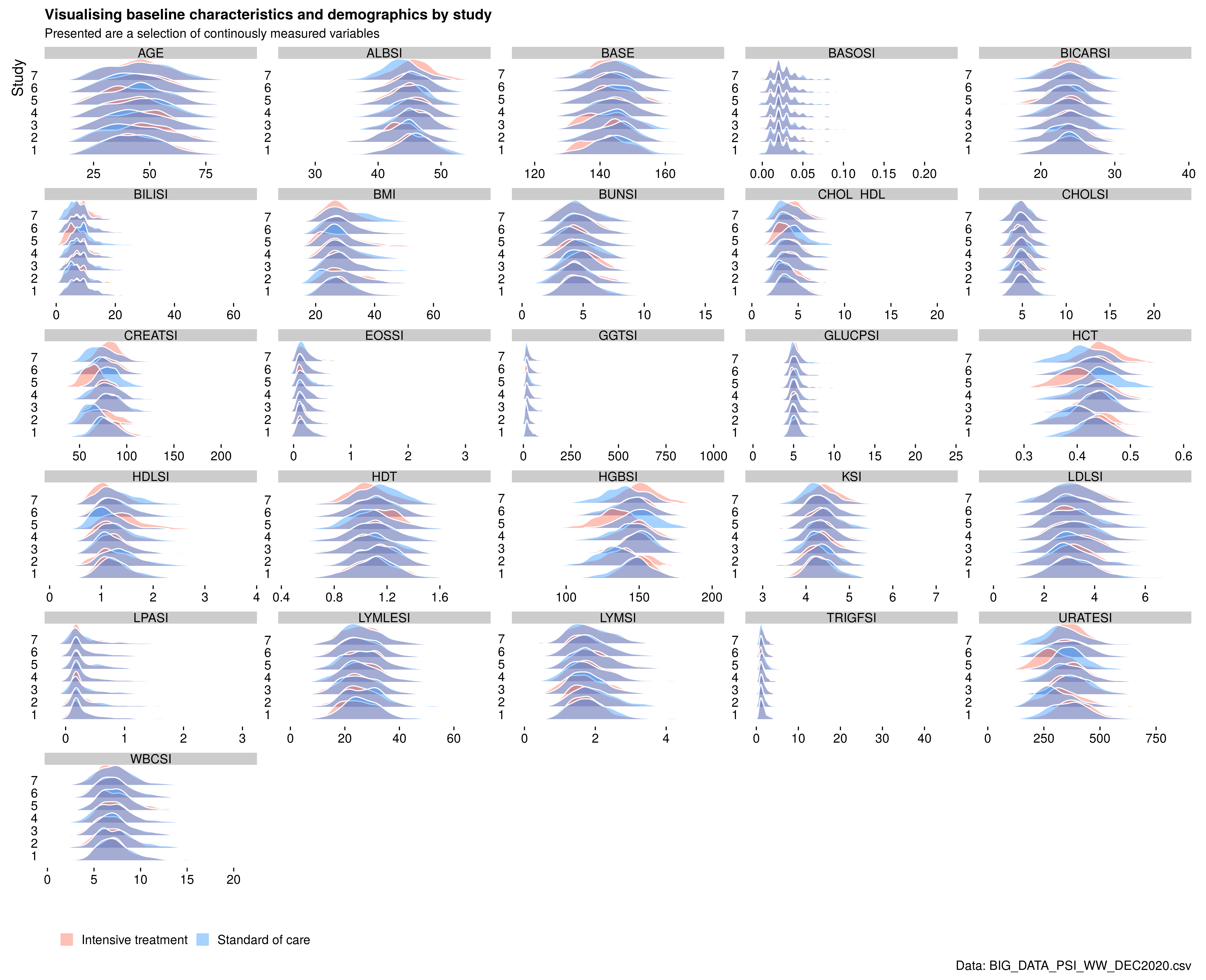
Example 5. Baseline characteristics
The final submission explored the use of ridge plots again to replace the typical “table one” with a visual representation. As a quick overview, this provides an instant overview of the distribution of many continuous variables. However, the treatment comparisons between ridges also suffer from this “3d” effect. Another potential problem is how to scale the distributions so that comparisons with skewed distributions with data points with extreme values can be displayed.
Code
Example 1. Forest plot
The following code only shows the app code. The complete code can be found here (zip folder).
library(shiny)
library(shinythemes)
library(r2d3)
library(shinyhelper)

ui <- fluidPage(
  theme = shinytheme('united'),
  title = 'Visualizing Heterogeneity in Meta-Analyses',

  tags$style('
    body {
      margin: auto 30px;
    }
    footer {
      padding: 5px;
      text-align: right;
    }
    .shinyhelper-container i {
      font-size: 20px;
    }
    #control-panel {
      display: flex;
      align-items: center;
    }
    #forest-container {
      display: flex;
      flex-direction: column;
      align-items: center;
    }
  '),

  div(class = 'page-header',
      h1('Visualizing Heterogeneity in Meta-Analyses'),
      h3('Forest Plot with Heterogeneity Bands')),

  wellPanel(style = 'margin: 20px auto;',
            fluidRow(id = 'control-panel',
                     column(2,
                            radioButtons('summary_measure',
                                         label = 'Summary measure:',
                                         choices = list('Odds ratio' = 'or',
                                                        'Risk ratio' = 'rr'))),
                     column(5,
                            sliderInput('d3_width',
                                        'Plot width:',
                                        value = 850,
                                        min = 750,
                                        max = 1300,
                                        step = 10,
                                        post = ' px')),
                     column(5,
                            sliderInput('d3_height',
                                        'Plot height:',
                                        value = 500,
                                        min = 350,
                                        step = 10,
                                        max = 800,
                                        post = ' px')))),

  helper(content = 'interpretation',
         colour = 'teal',
         buttonLabel = 'OK',
         div(id ='forest-container',
             style = 'min-height: 350px;',
             d3Output('d3Forest'))),

  hr(),
  tags$footer('Built by',
              a(' Waseem Medhat',
                href = 'https://linkedin.com/in/waseem-medhat'),
              ' for ',
              a('Wonderful Wednesdays',
                href = 'https://psiweb.org/sigs-special-interest-groups/visualisation/welcome-to-wonderful-wednesdays')))

server <- function(input, output) {
  observe_helpers()

  observe({
    metadata <- readRDS(
      sprintf('data/metadata_%s.rds', input$summary_measure)
    )

    removeUI('#d3Forest', immediate = TRUE)

    insertUI(
      selector = '#forest-container',
      where = 'beforeEnd',
      ui = d3Output('d3Forest', height = input$d3_height, width = input$d3_width)
    )

    output$d3Forest <- renderD3({
      r2d3(metadata, script = 'src/forestWithBands.js')
    })
  })

}

shinyApp(ui = ui, server = server)
Example 2. Explorer app
# EC subscreen presentation

rm(list=ls())
setwd("o:/1_Global_Biostatistics/Biostatistics Innovation Center/BIC Project - Subgroup Analyses/Screening/_archive/WW/")

suppressPackageStartupMessages(library(dplyr))
library(survival)
library(subscreen)

A=read.csv(file="BIG_DATA_PSI_WW_DEC2020.csv", sep=",", dec=".", na.strings = "", header=TRUE)

A$CHG <- as.numeric(A$CHG)
A$PCHG <- as.numeric(A$PCHG)
A$AVALCAT1N <- as.numeric(A$AVALCAT1N)
A$AVALCAT2N <- as.numeric(A$AVALCAT2N)

A %>% group_by(Base_SBP) %>% count()

#dychotomisation/categorisation of continuous variables

A$HEIGHT <- as.numeric(A$HEIGHT)
hei.median <- median(A$HEIGHT, na.rm=TRUE)
A$Height_gr[A$HEIGHT <  171] <- "A) < 171 cm (median)"
A$Height_gr[A$HEIGHT >= 171] <- "B) >=171 cm"
A$Height_gr[is.na(A$HEIGHT)] <- "C) missing"

A$WEIGHT <- as.numeric(A$WEIGHT)
wei.median <- median(A$WEIGHT, na.rm=TRUE)
A$Weight_gr[A$WEIGHT <  60] <- "A) < 60 kg"
A$Weight_gr[A$WEIGHT >= 60] <- "B) 60-90 cm"
A$Weight_gr[A$WEIGHT >  90] <- "C) > 90 cm"
A$Weight_gr[is.na(A$WEIGHT)] <- "D) missing"

A$BMI <- as.numeric(A$BMI)
bmi.median <- median(A$BMI, na.rm=TRUE)
A$BMI_gr[A$BMI <  18.5] <- "A) < 18.5 (WHO)"
A$BMI_gr[A$BMI >= 18.5] <- "B) 18.5-24.9 (WHO)"
A$BMI_gr[A$BMI >=  25]  <- "C) 25-29.9 (WHO)"
A$BMI_gr[A$BMI >=  30]  <- "D) >=30 (WHO)"
A$BMI_gr[is.na(A$BMI)]  <- "E) missing"

A$Age_gr[A$AGE <  30] <- "A) < 30 years"
A$Age_gr[A$AGE >= 30] <- "B) 30-59 cm"
A$Age_gr[A$AGE >= 60] <- "C) 60-75 cm"
A$Age_gr[A$AGE >  75] <- "D) > 75 cm"

A$CHD10R1[A$CHD10R1=="High (>20%)"] <- "Mx High (>20%)"

A$ALBSI <- as.numeric(A$ALBSI)
median(A$ALBSI, na.rm=TRUE)
A$ALB_med[A$ALBSI <  45] <- "A) <  45 (median)"
A$ALB_med[A$ALBSI >= 45] <- "B) >= 45 (median)"
A$ALB_med[is.na(A$ALBSI)]  <- "C) missing"

A$BASOSI <- as.numeric(A$BASOSI)
median(A$BASOSI, na.rm=TRUE)
A$BASO_med[A$BASOSI <  0.02] <- "A) <  0.02 (median)"
A$BASO_med[A$BASOSI >= 0.02] <- "B) >= 0.02 (median)"
A$BASO_med[is.na(A$BASOSI)]  <- "C) missing"

A$BICARSI <- as.numeric(A$BICARSI)
median(A$BICARSI, na.rm=TRUE)
A$BICAR_med[A$BICARSI <  24] <- "A) <  24 (median)"
A$BICAR_med[A$BICARSI >= 24] <- "B) >= 24 (median)"
A$BICAR_med[is.na(A$BICARSI)]  <- "C) missing"

A$BILISI <- as.numeric(A$BILISI)
median(A$BILISI, na.rm=TRUE)
A$BILI_med[A$BILISI <  7] <- "A) <  7 (median)"
A$BILI_med[A$BILISI >= 7] <- "B) >= 7 (median)"
A$BILI_med[is.na(A$BILISI)]  <- "C) missing"

A$BUNSI <- as.numeric(A$BUNSI)
median(A$BUNSI, na.rm=TRUE)
A$BUN_med[A$BUNSI <  4.64] <- "A) <  4.64 (median)"
A$BUN_med[A$BUNSI >= 4.64] <- "B) >= 4.64 (median)"
A$BUN_med[is.na(A$BUNSI)]  <- "C) missing"

A$CASI <- as.numeric(A$CASI)
median(A$CASI, na.rm=TRUE)
A$CA_med[A$CASI <  2.38] <- "A) <  2.38 (median)"
A$CA_med[A$CASI >= 2.38] <- "B) >= 2.38 (median)"
A$CA_med[is.na(A$CASI)]  <- "C) missing"

A$CHOL_HDL <- as.numeric(A$CHOL_HDL)
median(A$CHOL_HDL, na.rm=TRUE)
A$CHOL_HDL_med[A$CHOL_HDL <  4] <- "A) <  4 (median)"
A$CHOL_HDL_med[A$CHOL_HDL >= 4] <- "B) >= 4 (median)"
A$CHOL_HDL_med[is.na(A$CHOL_HDL)]  <- "C) missing"

A$CHOLSI <- as.numeric(A$CHOLSI)
median(A$CHOLSI, na.rm=TRUE)
A$CHOL_med[A$CHOLSI <  4.95] <- "A) <  4.95 (median)"
A$CHOL_med[A$CHOLSI >= 4.95] <- "B) >= 4.95 (median)"
A$CHOL_med[is.na(A$CHOLSI)]  <- "C) missing"

A$CREATSI <- as.numeric(A$CREATSI)
median(A$CREATSI, na.rm=TRUE)
A$CREAT_med[A$CREATSI <  77] <- "A) <  77 (median)"
A$CREAT_med[A$CREATSI >= 77] <- "B) >= 77 (median)"
A$CREAT_med[is.na(A$CREATSI)]  <- "C) missing"

A$EOSLESI <- as.numeric(A$EOSLESI)
median(A$EOSLESI, na.rm=TRUE)
A$EOSLE_med[A$EOSLESI <  2] <- "A) <  2 (median)"
A$EOSLE_med[A$EOSLESI >= 2] <- "B) >= 2 (median)"
A$EOSLE_med[is.na(A$EOSLESI)]  <- "C) missing"

A$EOSSI <- as.numeric(A$EOSSI)
median(A$EOSSI, na.rm=TRUE)
A$EOS_med[A$EOSSI <  0.16] <- "A) <  0.16 (median)"
A$EOS_med[A$EOSSI >= 0.16] <- "B) >= 0.16 (median)"
A$EOS_med[is.na(A$EOSSI)]  <- "C) missing"

A$GGTSI <- as.numeric(A$GGTSI)
median(A$GGTSI, na.rm=TRUE)
A$GGT_med[A$GGTSI <  25] <- "A) <  25 (median)"
A$GGT_med[A$GGTSI >= 25] <- "B) >= 25 (median)"
A$GGT_med[is.na(A$GGTSI)]  <- "C) missing"

A$GLUCPSI <- as.numeric(A$GLUCPSI)
median(A$GLUCPSI, na.rm=TRUE)
A$GLUCP_med[A$GLUCPSI <  5.2] <- "A) <  5.2 (median)"
A$GLUCP_med[A$GLUCPSI >= 5.2] <- "B) >= 5.2 (median)"
A$GLUCP_med[is.na(A$GLUCPSI)]  <- "C) missing"

A$HCT <- as.numeric(A$HCT)
median(A$HCT, na.rm=TRUE)
A$HCT_med[A$HCT <  0.43] <- "A) <  0.43 (median)"
A$HCT_med[A$HCT >= 0.43] <- "B) >= 0.43 (median)"
A$HCT_med[is.na(A$HCT)]  <- "C) missing"

A$HDLSI <- as.numeric(A$HDLSI)
median(A$HDLSI, na.rm=TRUE)
A$HDL_med[A$HDLSI <  1.22] <- "A) <  1.22 (median)"
A$HDL_med[A$HDLSI >= 1.22] <- "B) >= 1.22 (median)"
A$HDL_med[is.na(A$HDLSI)]  <- "C) missing"

A$HDT <- as.numeric(A$HDT)
median(A$HDT, na.rm=TRUE)
A$HDT_med[A$HDT <  1.1] <- "A) <  1.1 (median)"
A$HDT_med[A$HDT >= 1.1] <- "B) >= 1.1 (median)"
A$HDT_med[is.na(A$HDT)]  <- "C) missing"

A$HGBSI <- as.numeric(A$HGBSI)
median(A$HGBSI, na.rm=TRUE)
A$HGB_med[A$HGBSI <  146] <- "A) <  146 (median)"
A$HGB_med[A$HGBSI >= 146] <- "B) >= 146 (median)"
A$HGB_med[is.na(A$HGBSI)]  <- "C) missing"

A$KSI <- as.numeric(A$KSI)
median(A$KSI, na.rm=TRUE)
A$K_med[A$KSI <  4.3] <- "A) <  4.3 (median)"
A$K_med[A$KSI >= 4.3] <- "B) >= 4.3 (median)"
A$K_med[is.na(A$KSI)]  <- "C) missing"

A$LDLSI <- as.numeric(A$LDLSI)
median(A$LDLSI, na.rm=TRUE)
A$LDL_med[A$LDLSI <  3.11] <- "A) <  3.11 (median)"
A$LDL_med[A$LDLSI >= 3.11] <- "B) >= 3.11 (median)"
A$LDL_med[is.na(A$LDLSI)]  <- "C) missing"

A$LPASI <- as.numeric(A$LPASI)
median(A$LPASI, na.rm=TRUE)
A$LPA_med[A$LPASI <  0.21] <- "A) <  0.21 (median)"
A$LPA_med[A$LPASI >= 0.21] <- "B) >= 0.21 (median)"
A$LPA_med[is.na(A$LPASI)]  <- "C) missing"

A$LYMLESI <- as.numeric(A$LYMLESI)
median(A$LYMLESI, na.rm=TRUE)
A$LYMLE_med[A$LYMLESI <  26] <- "A) <  26 (median)"
A$LYMLE_med[A$LYMLESI >= 26] <- "B) >= 26 (median)"
A$LYMLE_med[is.na(A$LYMLESI)]  <- "C) missing"

A$LYMSI <- as.numeric(A$LYMSI)
median(A$LYMSI, na.rm=TRUE)
A$LYM_med[A$LYMSI <  1.76] <- "A) <  1.76 (median)"
A$LYM_med[A$LYMSI >= 1.76] <- "B) >= 1.76 (median)"
A$LYM_med[is.na(A$LYMSI)]  <- "C) missing"

A$MONOLSI <- as.numeric(A$MONOLSI)
median(A$MONOLSI, na.rm=TRUE)
A$MONOL_med[A$MONOLSI <  6] <- "A) <  6 (median)"
A$MONOL_med[A$MONOLSI >= 6] <- "B) >= 6 (median)"
A$MONOL_med[is.na(A$MONOLSI)]  <- "C) missing"

A$TRIGFSI <- as.numeric(A$TRIGFSI)
median(A$TRIGFSI, na.rm=TRUE)
A$TRIGF_med[A$TRIGFSI <  1.41] <- "A) <  1.41 (median)"
A$TRIGF_med[A$TRIGFSI >= 1.41] <- "B) >= 1.41 (median)"
A$TRIGF_med[is.na(A$TRIGFSI)]  <- "C) missing"

A$URATESI <- as.numeric(A$URATESI)
median(A$URATESI, na.rm=TRUE)
A$URATE_med[A$URATESI <  357] <- "A) <  357 (median)"
A$URATE_med[A$URATESI >= 357] <- "B) >= 357 (median)"
A$URATE_med[is.na(A$URATESI)]  <- "C) missing"

A$WBCSI <- as.numeric(A$WBCSI)
median(A$WBCSI, na.rm=TRUE)
A$WBC_med[A$WBCSI <  7.1] <- "A) <  7.1 (median)"
A$WBC_med[A$WBCSI >= 7.1] <- "B) >= 7.1 (median)"
A$WBC_med[is.na(A$WBCSI)]  <- "C) missing"

A$BASE <- as.numeric(A$BASE)
median(A$BASE, na.rm=TRUE)
A$Base_SBP[A$BASE <  132] <- "A) < 132 mmHg"
A$Base_SBP[A$BASE >= 132] <- "B) 132-145 mmHg"
A$Base_SBP[A$BASE >= 145] <- "C) >= 145 mmHg"
A$Base_SBP[is.na(A$BASE)]  <- "D) missing"


#names(A)[names(A) == "AGEGR1"]   <- ""


factors=c("STUDYID", "SEX", "RACE", "ETHNIC", "Height_gr", "Weight_gr", "BMI_gr", "Age_gr",
          "Base_SBP", "CHD10R1", "ALB_med", "BASO_med", "BICAR_med", "BILI_med", "BUN_med", "CA_med",
          "CHOL_HDL_med", "CHOL_med", "CREAT_med", "EOSLE_med", "EOS_med", "GGT_med", "GLUCP_med", "HCT_med",
          "HDL_med", "HDT_med", "HGB_med", "K_med", "LDL_med", "LPA_med", "LYMLE_med", "LYM_med",
          "MONOL_med", "TRIGF_med", "URATE_med", "WBC_med")

### analysis function "auwe" to be filled in with the statistical evaluation
auwe<- function(D){

  Mean.Change.SBP.SoC <- round(mean(D$CHG[D$TRT01PN == 0], na.rm=TRUE),2)
  Mean.Change.SBP.Int <- round(mean(D$CHG[D$TRT01PN == 1], na.rm=TRUE),2)
  Diff.Change.SBP     <- Mean.Change.SBP.SoC - Mean.Change.SBP.Int

  Mean.PctChange.SBP.SoC <- round(mean(D$PCHG[D$TRT01PN == 0], na.rm=TRUE),2)
  Mean.PctChange.SBP.Int <- round(mean(D$PCHG[D$TRT01PN == 1], na.rm=TRUE),2)
  Diff.PctChange.SBP     <-  Mean.PctChange.SBP.Int - Mean.PctChange.SBP.SoC

  N.SoC  <- sum(D$TRT01PN==0)
  N.Int  <- sum(D$TRT01PN==1)

  Responder.120.SoC    <- sum(D$AVALCAT1N[D$TRT01PN == 0] == 1, na.rm=TRUE)
  Responder.120.Int    <- sum(D$AVALCAT1N[D$TRT01PN == 1] == 1, na.rm=TRUE)

  Prop.Responder.120.SoC <- round(Responder.120.SoC/sum(!is.na(D$AVALCAT1N[D$TRT01PN == 0]), na.rm=TRUE)*100,2)
  Prop.Responder.120.Int <- round(Responder.120.Int/sum(!is.na(D$AVALCAT1N[D$TRT01PN == 1]), na.rm=TRUE)*100,2)

  Diff.Responder.120     <- Prop.Responder.120.Int - Prop.Responder.120.SoC
  OR.Responder.120       <- limit(round((Responder.120.Int * (N.SoC-Responder.120.SoC))/(Responder.120.SoC * (N.Int-Responder.120.Int)),3), high=100)
  RelRisk.Responder.120  <- limit(round((Responder.120.Int * N.SoC)/(Responder.120.SoC * N.Int),3), high=100)

  Responder.132.SoC    <- sum(D$AVALCAT2N[D$TRT01PN == 0] == 0, na.rm=TRUE)
  Responder.132.Int    <- sum(D$AVALCAT2N[D$TRT01PN == 1] == 0, na.rm=TRUE)

  Prop.Responder.132.SoC <- round(Responder.132.SoC/sum(!is.na(D$AVALCAT2N[D$TRT01PN == 0]), na.rm=TRUE)*100,2)
  Prop.Responder.132.Int <- round(Responder.132.Int/sum(!is.na(D$AVALCAT2N[D$TRT01PN == 1]), na.rm=TRUE)*100,2)

  Diff.Responder.132     <- Prop.Responder.132.Int - Prop.Responder.132.SoC
  OR.Responder.132       <- limit(round((Responder.132.Int * (N.SoC-Responder.132.SoC))/(Responder.132.SoC * (N.Int-Responder.132.Int)),3))
  RelRisk.Responder.132  <- limit(round((Responder.132.Int * N.SoC)/(Responder.132.SoC * N.Int),3))


  return(data.frame(Diff.Change.SBP, Mean.Change.SBP.SoC, Mean.Change.SBP.Int,
                    Diff.PctChange.SBP, Mean.PctChange.SBP.SoC, Mean.PctChange.SBP.Int,
                    Diff.Responder.120, OR.Responder.120, RelRisk.Responder.120, Prop.Responder.120.SoC, Prop.Responder.120.Int,
                    Diff.Responder.132, OR.Responder.132, RelRisk.Responder.132, Prop.Responder.132.SoC, Prop.Responder.132.Int,
                    N.SoC, N.Int
                    ))

}

#limit function / truncation of large or small estimates
limit <- function(x, low=0.05, high=20){
  if (!is.na(x)) y=min(high, max(low,x)) else y=NA
  return (y)
}

results <- subscreencalc(data=A,
                    eval_function=auwe,
                    endpoints=c("CHG", "PCHG", "AVALCAT1N", "AVALCAT2N"),
                    treat="TRT01PN",
                    subjectid="USUBJD",
                    factors=factors,
                    min_comb=1,
                    max_comb=2,
                    nkernel=16,
                    par_functions = "limit",
                    factorial = TRUE,
                    use_complement =FALSE,
                    verbose=T)


#setwd("O:/1_Global_Biostatistics/Biostatistics Innovation Center/BIC Project - Subgroup Analyses/Screening/16244")
#save(results, file = "o:/1_Global_Biostatistics/Biostatistics Innovation Center/BIC Project - Subgroup Analyses/Screening/_archive/WW/sgs3.RData")
# rm("results")
# load("o:/1_Global_Biostatistics/Biostatistics Innovation Center/BIC Project - Subgroup Analyses/Screening/_archive/WW/sgs3.RData")

subscreenshow(results, port=14444)
Example 3. Meta-analysis shiny app
Example 4. Comparison of blood pressure by study
library(readr)
library(tidyverse)
library(Hmisc)
library(hrbrthemes)
library(ggtext)
library(rlang)


# Functions originally from Cedric Scherer
# https://cedricscherer.netlify.app/2019/08/05/a-ggplot2-tutorial-for-beautiful-plotting-in-r/
element_textbox_highlight <- function(..., hi.labels = NULL, hi.fill = NULL,
                                      hi.col = NULL, hi.box.col = NULL, hi.family = NULL) {
  structure(
    c(element_textbox(...),
      list(hi.labels = hi.labels, hi.fill = hi.fill, hi.col = hi.col, hi.box.col = hi.box.col, hi.family = hi.family)
    ),
    class = c("element_textbox_highlight", "element_textbox", "element_text", "element")
  )
}

element_grob.element_textbox_highlight <- function(element, label = "", ...) {
  if (label %in% element$hi.labels) {
    element$fill <- element$hi.fill %||% element$fill
    element$colour <- element$hi.col %||% element$colour
    element$box.colour <- element$hi.box.col %||% element$box.colour
    element$family <- element$hi.family %||% element$family
  }
  NextMethod()
}


## Read data and manipulate
data <- read_csv("BIG_DATA_PSI_WW_DEC2020.csv") %>%
  mutate(
    TRT01PC = if_else(TRT01P == "INT", "Intensive treatment", "Standard of care"),
    STUDYIDC = paste0("Study ", STUDYID)
  )

# Check color palettes
# RColorBrewer::display.brewer.all()


#-------------------------------------------------------
# Small multiples of BASE by Study


plot1a <-
  ggplot(data, aes(x = BASE, y = TRT01PC, fill = TRT01PC)) +
  geom_density_ridges(scale = 4,
                      jittered_points = TRUE,
                      position = position_points_jitter(width = 0.05, height = 0),
                      point_shape = '|', point_size = 3, point_alpha = 1, alpha = 0.7) +
  scale_y_discrete(expand = c(0, 0)) +
  scale_x_continuous(expand = c(0, 0)) +
  scale_fill_brewer(palette = "Dark2") +
  coord_cartesian(clip = "off") +
  theme_ipsum_rc(base_size = 16) +
  labs(x = "DBP [mmHg] at 1-year") +
  facet_wrap(~STUDYIDC) +
  labs(
    x = "Mean systolic blood pressure at baseline [mmHg]",
    fill = "Treatment",
    title = "Comparison of mean systolic blood pressure measured at 1-year by study",
    subtitle = "There is some evidence of a bi-modal distribution in studys 1 and 3",
    caption = "Data: BIG_DATA_PSI_WW_DEC2020.csv"
  ) +
  theme(legend.position = "bottom")


ggsave("eda-plot1a.png", plot1a, height = 8, width = 12, dpi = 250)


#-------------------------------------------------------
# Small multiples of AVAL by Study


plot1b <-
  ggplot(data, aes(x = AVAL, y = TRT01PC, fill = TRT01PC)) +
  geom_density_ridges(scale = 4,
                      jittered_points = TRUE,
                      position = position_points_jitter(width = 0.05, height = 0),
                      point_shape = '|', point_size = 3, point_alpha = 1, alpha = 0.7) +
  scale_y_discrete(expand = c(0, 0)) +
  scale_x_continuous(expand = c(0, 0)) +
  scale_fill_brewer(palette = "Dark2") +
  coord_cartesian(clip = "off") +
  theme_ipsum_rc(base_size = 16) +
  labs(x = "DBP [mmHg] at 1-year") +
  facet_wrap(~STUDYIDC) +
  labs(
    x = "Mean systolic blood pressure at 1-year [mmHg]",
    fill = "Treatment",
    title = "Comparison of mean systolic blood pressure measured at 1-year by study",
    subtitle = "There is some evidence of a bi-modal distribution in studys 1 and 3",
    caption = "Data: BIG_DATA_PSI_WW_DEC2020.csv"
  ) +
  theme(legend.position = "bottom")


ggsave("eda-plot1b.png", plot1a, height = 8, width = 12, dpi = 250)


#-------------------------------------------------------
# Small multiples of AVAL vs BASE by Study

plot2a <-
  data %>% ggplot(aes(
    x = BASE,
    y = AVAL,
    group = TRT01PC,
    color = TRT01PC
  )) +
  geom_abline(
    intercept = 0,
    slope = 1,
    color = "grey",
    size = 1,
    alpha = 0.5
  ) +
  geom_smooth(
    method = "lm",
    formula = y ~ splines::bs(x, 3),
    se = TRUE,
    alpha = 0.55
  ) +
  geom_point(alpha = 0.45, size = 0.6) +
  facet_wrap( ~ STUDYIDC, ncol = 3) +
  scale_color_brewer(palette = "Dark2") +
  scale_x_continuous(breaks = scales::pretty_breaks(n = 5)) +
  scale_y_continuous(breaks = scales::pretty_breaks(n = 5)) +
  labs(
    x = "SBP [mmHg] at randomisation",
    y = "SBP [mmHg] at 1-year",
    color = "Treatment",
    title = "Comparison of pre-post mean systolic blood pressure (SBP) measured at baseline and 1-year",
    subtitle = "Study 1 and 3 may have data quality issues - further investigation required",
    caption = "The by-treatment relationship also disaplyed using a cubic splines.\ny = x reference line also displayed.\nData: BIG_DATA_PSI_WW_DEC2020.csv"
  )  +
  theme_ipsum_rc(base_size = 16) +
  theme(
    strip.text = element_textbox_highlight(
      size = 12,
      face = "bold",
      fill = "white",
      box.color = "white",
      color = "gray40",
      halign = .5,
      linetype = 1,
      r = unit(0, "pt"),
      width = unit(1, "npc"),
      padding = margin(2, 0, 1, 0),
      margin = margin(0, 1, 3, 1),
      hi.labels = c("Study 1", "Study 3"),
      hi.family = "Bangers",
      hi.fill = "firebrick",
      hi.box.col = "firebrick",
      hi.col = "white"
    ),
    legend.position = "bottom"
  )


ggsave("eda-plot2a.png", plot2a, height = 8, width = 12, dpi = 250)


#---------------------------------------
# Plot study1 and 3 only

plot2b <-
  data %>%
  filter(STUDYID == c(1, 3)) %>%
  ggplot(aes(
    x = BASE,
    y = AVAL,
    group = TRT01PC,
    color = TRT01PC
  )) +
  geom_abline(
    intercept = 0,
    slope = 1,
    color = "grey",
    size = 1,
    alpha = 0.5
  ) +
  geom_point(alpha = 0.7, size = 1) +
  facet_grid(TRT01PC  ~ STUDYIDC) +
  scale_color_brewer(palette = "Dark2") +
  scale_x_continuous(breaks = scales::pretty_breaks(n = 5)) +
  scale_y_continuous(breaks = scales::pretty_breaks(n = 5)) +
  labs(
    x = "Mean systolic blood pressure [mmHg] at randomisation",
    y = "Mean systolic blood pressure [mmHg] at 1-year",
    color = "Treatment",
    title = "The intensive treatment arm for study 1 and 3 displayed patterns of interest",
    subtitle = "It is always important to plot data many ways",
    caption = "http://robertgrantstats.co.uk/drawmydata.html \nData: BIG_DATA_PSI_WW_DEC2020.csv"
  )  +
  theme_ipsum_rc(base_size = 16) +
  theme(
    strip.text = element_textbox_highlight(
      size = 12,
      face = "bold",
      fill = "white",
      box.color = "white",
      color = "gray40",
      halign = .5,
      linetype = 1,
      r = unit(0, "pt"),
      width = unit(1, "npc"),
      padding = margin(2, 0, 1, 0),
      margin = margin(0, 1, 3, 1),
      hi.labels = c("Study 1", "Study 3"),
      hi.family = "Bangers",
      hi.fill = "firebrick",
      hi.box.col = "firebrick",
      hi.col = "white"
    ),
    legend.position = "bottom"
  )


ggsave("eda-plot2b.png", plot2b, height = 8, width = 12, dpi = 250)
Example 5. Correlation plot
library(tidyverse)
library(ggridges)
library(readr)
library(ggtext)
library(rlang)

## Read data and manipulate
data <- read_csv("BIG_DATA_PSI_WW_DEC2020.csv") %>%
  mutate(
    TRT01PC = if_else(TRT01P == "INT", "Intensive treatment", "Standard of care"),
    STUDYIDC = paste0("Study ", STUDYID)
  )


plot_data <-
  data %>%
  pivot_longer(
    cols = c(
      AGE,
      ALBSI,
      BASOSI,
      BASE,
      BICARSI,
      BILISI,
      BMI,
      BUNSI,
      CHOL_HDL,
      CHOLSI,
      CREATSI,
      EOSSI,
      GGTSI,
      GLUCPSI,
      HCT,
      HDLSI,
      HDT,
      HGBSI,
      KSI,
      LDLSI,
      LPASI,
      LYMLESI,
      LYMSI,
      TRIGFSI,
      URATESI,
      WBCSI
    ),
    names_to = "var",
    values_to = "val"
  )


ridge_plot <-
  plot_data %>%
  ggplot(aes(
    x = val,
    y = factor(STUDYID),
    fill = paste(STUDYIDC, TRT01PC)
  )) +
  geom_density_ridges(alpha = .4,
                      rel_min_height = .01,
                      color = "white") +
  scale_fill_cyclical(
    values = c("tomato", "dodgerblue"),
    name = "",
    labels = c(`Study 1 Intensive treatment` = "Intensive treatment",
               `Study 1 Standard of care` = "Standard of care"),
    guide = "legend"
  ) +
  theme_ridges(grid = FALSE) +
  facet_wrap( ~ var, scales = "free", ncol = 5) +
  labs(
    x = "",
    y = "Study",
    fill = "Treatment",
    title = "Visualising baseline characteristics and demographics by study",
    subtitle = "Presented are a selection of continously measured variables",
    caption = "Data: BIG_DATA_PSI_WW_DEC2020.csv"
  ) +
  theme(legend.position = "bottom")

ggsave(
  "ridge_plot.png",
  ridge_plot,
  height = 12,
  width = 16,
  dpi = 330
)