Glycemic Control
The background
Type 2 diabetes (T2D) is a growing health challenge in China, where many patients struggle to manage their blood sugar and weight effectively. This study looked at the long-term health and cost benefits of achieving three treatment goals: blood sugar control, weight loss, and avoiding low blood sugar episodes. Using a UK Prospective Diabetes Study Outcomes Model Version 2 (UKPDS OM2) based on patient data from a clinical trial recruiting predominantly Chinese adults with T2D, researchers found that patients who met these goals for several years had fewer diabetes-related complications, lived longer, and had better quality of life. They also saved money on healthcare costs—up to ¥53,234 per person over 30 years. The longer patients maintained these goals, the greater the benefits. These findings support the importance of achieving and maintaining treatment targets to improve health outcomes and reduce costs for people with T2D in China.
The publication is available via Taylor and Francis.
The challenge
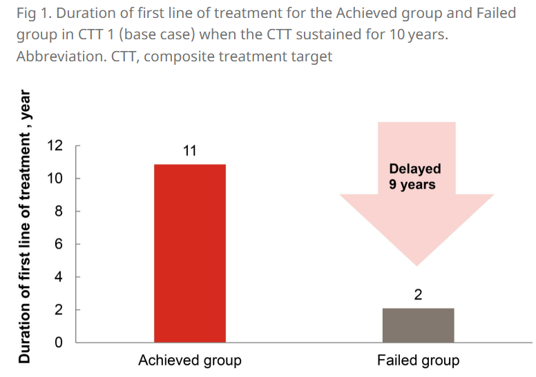
The challenge is to identify alternative design choices for the plot below to convey the main conclusion from the study results. Or to create a new plot.
Visualisations
Example 1: First Draft
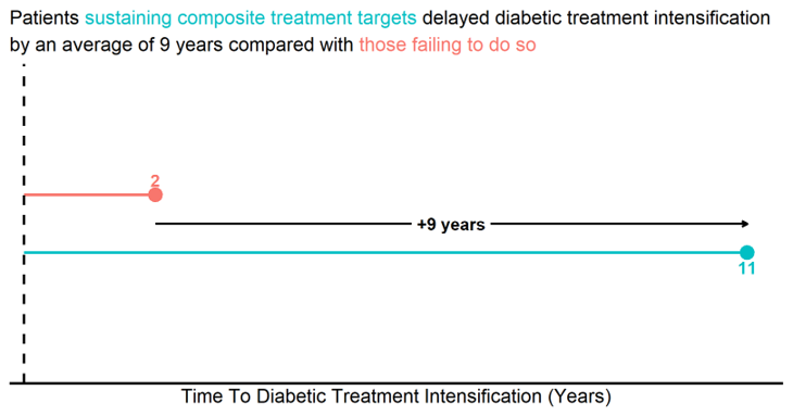
Example 2: Polished Lollipop Plot
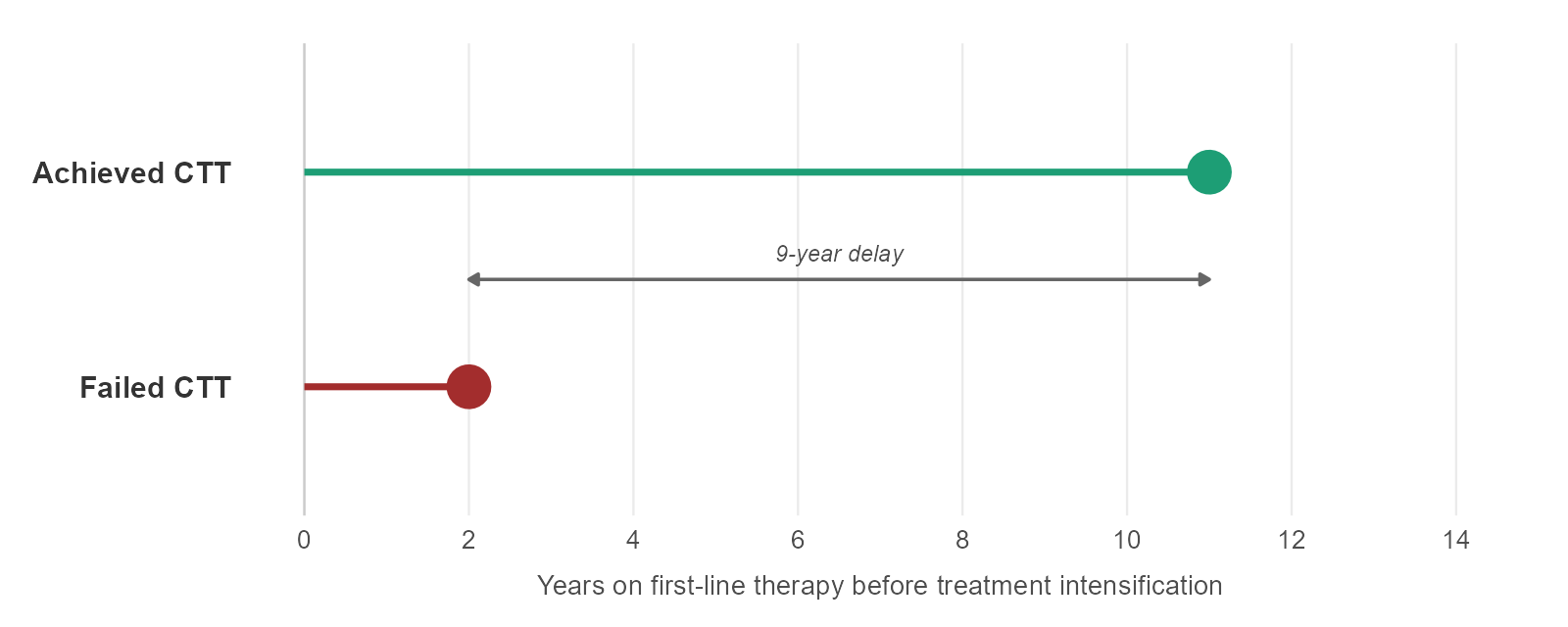
Example 3: Treatment Timeline
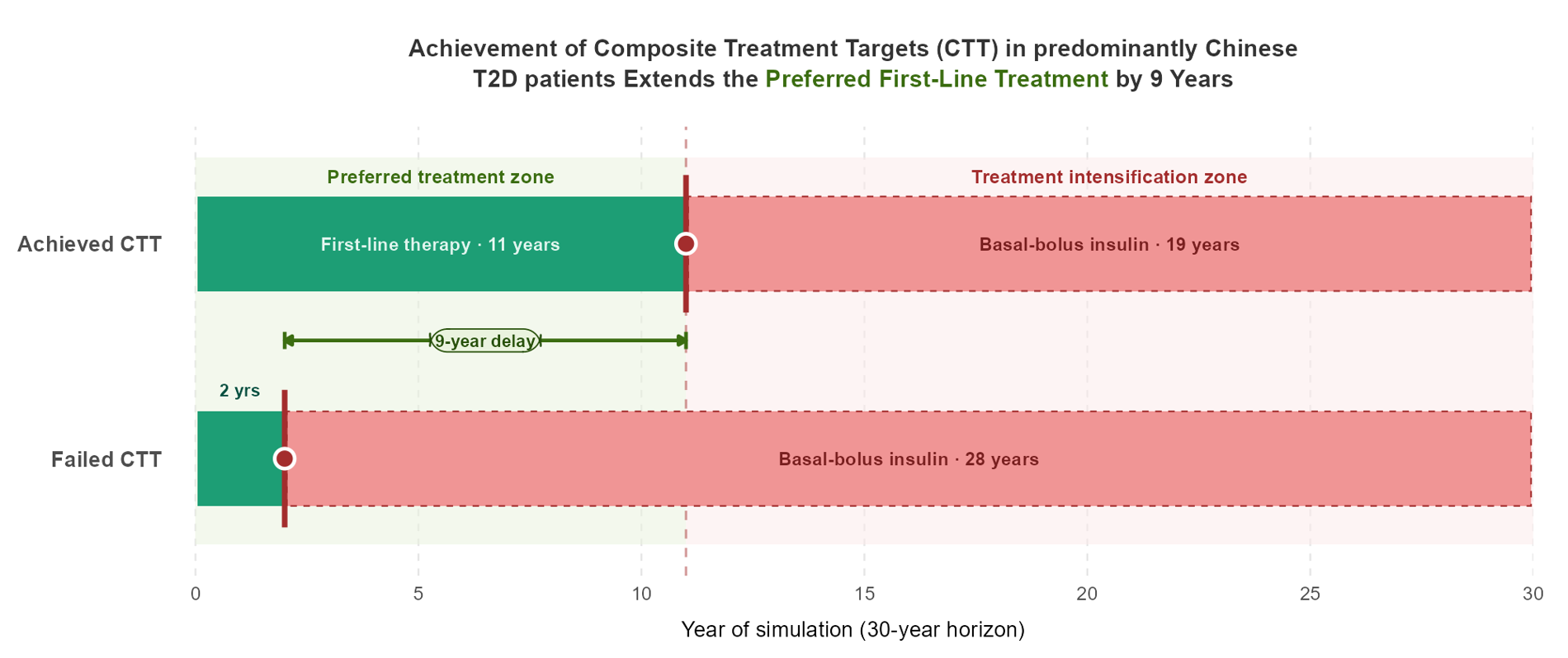
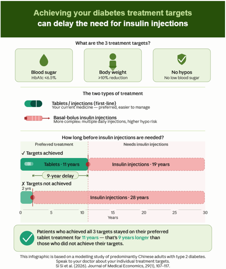
Example 4: Infographic
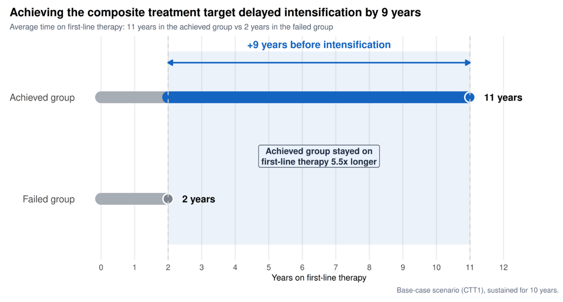
Example 5: Timeline Difference
Code
Code for Example 1
library(ggplot2)
library(ggtext)
library(scales)

# ggplot2 default colours
default_cols <- hue_pal()(2)

# Fix y-axis range (preserved)
y_limits <- c(0, 1)
y_range  <- diff(y_limits)

# Position lollipops at ~40% and ~60% of y-range
y_short <- y_limits[1] + 0.60 * y_range
y_long  <- y_limits[1] + 0.40 * y_range

df <- data.frame(
  group = factor(c("Failing", "Sustaining"),
                 levels = c("Failing", "Sustaining")),
  y     = c(y_short, y_long),
  time  = c(2, 11)
)

# Arrow position
arrow_y <- mean(df$y)

p <- ggplot(df, aes(x = time, y = y, colour = group)) +

  # Lollipop stems
  geom_segment(
    aes(x = 0, xend = time, yend = y),
    linewidth = 2
  ) +

  # Lollipop heads
  geom_point(size = 10) +

  # Vertical reference line at time = 0
  geom_vline(
    xintercept = 0,
    linetype = "dashed",
    linewidth = 2
  ) +

  # Arrow between lollipops
  annotate(
    "segment",
    x = 2, xend = 11,
    y = arrow_y, yend = arrow_y,
    linewidth = 2,
    arrow = arrow(length = unit(0.35, "cm"))
  ) +

  # Arrow label
  annotate(
    "label",
    x = 6.5,
    y = arrow_y,
    label = "+9 years",
    size = 10,
    fontface = "bold",
    fill = "white",
    linewidth = 0
  ) +

  # Numeric labels at lollipop ends
  annotate(
    "text",
    x = 2,
    y = y_short + 0.05,
    label = "2",
    colour = default_cols[1],
    size = 10,
    fontface = "bold"
  ) +
  annotate(
    "text",
    x = 11,
    y = y_long - 0.05,
    label = "11",
    colour = default_cols[2],
    size = 10,
    fontface = "bold"
  ) +

  # Scales
  scale_y_continuous(breaks = NULL, limits = y_limits) +
  scale_colour_manual(values = default_cols) +
  scale_x_continuous(expand = expansion(mult = c(0.02, 0.05))) +

  # Labels
  labs(
    x = "Time To Diabetic Treatment Intensification (Years)",
    y = NULL,
    title = paste0(
      "Patients <span style='color:", default_cols[2], "'>",
      "sustaining composite treatment targets",
      "</span> delayed diabetic treatment intensification <br> by an average of ",
      "9 years compared with ",
      "<span style='color:", default_cols[1], "'>",
      "those failing to do so",
      "</span>"
    )
  ) +

  # Theme
  theme_minimal(base_size = 32) +
  theme(
    axis.line.x  = element_line(colour = "black", linewidth = 2),
    axis.text.x  = element_blank(),
    axis.ticks.x = element_blank(),
    panel.grid   = element_blank(),
    plot.title   = element_markdown(size = 32, lineheight = 1.4),
    legend.position = "none"
  )

print(p)
Code for Example 2
library(tidyverse)

# ── Data ──────────────────────────────────────────────────────────────────────
lollipop <- tribble(
  ~group,       ~years_first_line,
  "Achieved CTT",   11,
  "Failed CTT",      2
) |>
  mutate(group = factor(group, levels = c("Failed CTT", "Achieved CTT")))

# ── Colours ───────────────────────────────────────────────────────────────────
col_achieved <- "#1D9E75"   # teal
col_failed   <- "#A32D2D"   # red

# ── Plot ──────────────────────────────────────────────────────────────────────
p <- ggplot(lollipop, aes(x = years_first_line, y = group, colour = group)) +

  # Reference line at x = 0
  geom_vline(xintercept = 0, colour = "grey80", linewidth = 0.4) +

  # Lollipop stems
  geom_segment(
    aes(x = 0, xend = years_first_line, yend = group),
    linewidth = 1.2
  ) +

  # Lollipop heads
  geom_point(size = 7) +

  # Value labels inside the heads
  # geom_text(
  #   aes(label = paste0(years_first_line, " yrs")),
  #   colour = "white", size = 2.8, fontface = "bold"
  # ) +

  # 9-year delay annotation
  annotate(
    "segment",
    x = 2, xend = 11, y = 1.5, yend = 1.5,
    colour = "grey40", linewidth = 0.6,
    arrow = arrow(ends = "both", length = unit(4, "pt"), type = "closed")
  ) +
  annotate(
    "text",
    x = 6.5, y = 1.62,
    label = "9-year delay",
    size = 3, colour = "grey30", fontface = "italic"
  ) +

  # ── Scales ──────────────────────────────────────────────────────────────────
  scale_colour_manual(
    values = c("Achieved CTT" = col_achieved, "Failed CTT" = col_failed),
    guide  = "none"
  ) +
  scale_x_continuous(
    name   = "Years on first-line therapy before treatment intensification",
    limits = c(0, 14),
    breaks = seq(0, 14, 2)
  ) +
  scale_y_discrete(name = NULL) +

  # labs(
  #   caption = "Intensification triggered at HbA1c ≥6.5% (CTT 1 base case).\nAchieved group: HbA1c ≤6.5%, weight reduction ≥10%, no hypoglycaemia.\nFirst-line therapy preferred: lower complication risk, no hypoglycaemia, no weight gain."
  # ) +

  # ── Theme ───────────────────────────────────────────────────────────────────
  theme_minimal(base_size = 12) +
  theme(
    panel.background   = element_rect(fill = "white", colour = NA),
    plot.background    = element_rect(fill = "white", colour = NA),
    panel.grid.major.y = element_blank(),
    panel.grid.minor   = element_blank(),
    panel.grid.major.x = element_line(colour = "grey92", linewidth = 0.4),
    axis.text.y        = element_text(size = 11, face = "bold", colour = "grey20"),
    axis.title.x       = element_text(size = 10, colour = "grey30",
                                      margin = margin(t = 8)),
    plot.caption       = element_text(size = 8, colour = "grey50",
                                      lineheight = 1.4, margin = margin(t = 10)),
    plot.margin        = margin(16, 20, 10, 12)
  )

# ── Save ──────────────────────────────────────────────────────────────────────
ggsave(
  "lollipop.png",
  plot   = p,
  width  = 8,
  height = 3.2,
  dpi    = 200,
  bg     = "white"
)

message("Saved to treatment_timeline.png")
Code for Example 3
library(tidyverse)
library(ggplot2)
library(ggtext)

# ── Data ──────────────────────────────────────────────────────────────────────
# Each row is one segment of a patient group's treatment timeline
segments <- tribble(
  ~group,      ~treatment,          ~xmin, ~xmax,
  "Achieved",  "First-line",            0,    11,
  "Achieved",  "Basal-bolus insulin",  11,    30,
  "Failed",    "First-line",            0,     2,
  "Failed",    "Basal-bolus insulin",   2,    30
)

# Labels centred on each segment
seg_labels <- segments |>
  mutate(
    xmid  = (xmin + xmax) / 2,
    label = case_when(
      treatment == "First-line" & group == "Achieved" ~ "First-line therapy · 11 years",
      treatment == "First-line" & group == "Failed"   ~ "2 yrs",
      treatment == "Basal-bolus insulin" & group == "Achieved" ~ "Basal-bolus insulin · 19 years",
      treatment == "Basal-bolus insulin" & group == "Failed"   ~ "Basal-bolus insulin · 28 years"
    ),
    # suppress label when bar is too narrow to fit
    show_label = !(treatment == "First-line" & group == "Failed")
  )

# Intensification markers (vertical lines + points)
markers <- tribble(
  ~group,      ~x,
  "Achieved",  11,
  "Failed",     2
)

# 9-year delay annotation (drawn between yr 2 and yr 11)
delay_y <- 1.55   # sits between the two rows

# Zone shading rectangles (drawn behind everything)
zones <- tribble(
  ~xmin, ~xmax, ~fill_col, ~zone_label,       ~sublabel,
  0,    11,  "#EAF3DE", "Preferred treatment zone",
  "Better glycaemic control · lower complication risk",
  11,    30,  "#FCEBEB", "Treatment intensification zone",
  "Increased hypoglycaemia · weight gain · higher costs"
)

# ── Colours ───────────────────────────────────────────────────────────────────
col_first   <- "#1D9E75"   # teal-400 — first-line bars
col_bolus   <- "#F09595"   # red-200  — basal-bolus bars
col_bolus_b <- "#A32D2D"   # red-700  — border + markers
col_delay   <- "#3B6D11"   # green-600 — delay annotation

# ── Plot ──────────────────────────────────────────────────────────────────────
p <- ggplot() +

  # 1. Background zone shading
  geom_rect(
    data = zones,
    aes(xmin = xmin, xmax = xmax, fill = zone_label),
    ymin = 0.6, ymax = 2.4, alpha = 0.55, inherit.aes = FALSE
  ) +

  # 2. Zone header text (top of chart)
  geom_text(
    data = zones,
    aes(x = (xmin + xmax) / 2, label = zone_label),
    y = 2.28,
    color = ifelse(zones$fill_col == "#EAF3DE", "#3B6D11", "#A32D2D"),
    fontface = "bold", size = 3.1, vjust = 0
  ) +
  geom_text(
    data = zones,
    aes(x = (xmin + xmax) / 2, label = sublabel),
    y = 2.15,
    color = ifelse(zones$fill_col == "#EAF3DE", "#3B6D11", "#A32D2D"),
    size = 2.6, vjust = 0
  ) +

  # 3. Dashed vertical divider at year 11
  geom_vline(xintercept = 11, linetype = "dashed",
             color = col_bolus_b, linewidth = 0.5, alpha = 0.5) +

  # 4. Treatment bars
  geom_rect(
    data = segments,
    aes(
      xmin = xmin + 0.05, xmax = xmax - 0.05,
      ymin = as.integer(factor(group, levels = c("Failed", "Achieved"))) - 0.22,
      ymax = as.integer(factor(group, levels = c("Failed", "Achieved"))) + 0.22,
      fill = treatment
    ),
    color = NA
  ) +
  scale_fill_manual(
    values = c(
      "First-line"                     = col_first,
      "Basal-bolus insulin"            = col_bolus,
      "Preferred treatment zone"       = "#EAF3DE",
      "Treatment intensification zone" = "#FCEBEB"
    ),
    breaks = c("First-line", "Basal-bolus insulin"),
    name   = NULL
  ) +

  # dashed border on basal-bolus bars only
  geom_rect(
    data = filter(segments, treatment == "Basal-bolus insulin"),
    aes(
      xmin = xmin + 0.05, xmax = xmax - 0.05,
      ymin = as.integer(factor(group, levels = c("Failed", "Achieved"))) - 0.22,
      ymax = as.integer(factor(group, levels = c("Failed", "Achieved"))) + 0.22
    ),
    fill = NA, color = col_bolus_b, linewidth = 0.35, linetype = "dashed"
  ) +

  # 5. Bar labels
  geom_text(
    data = filter(seg_labels, show_label),
    aes(
      x     = xmid,
      y     = as.integer(factor(group, levels = c("Failed", "Achieved"))),
      label = label,
      color = treatment
    ),
    size = 3, fontface = "bold"
  ) +
  # "2 yrs" label above the narrow Failed first-line bar
  annotate("text", x = 1, y = 1.32, label = "2 yrs",
           size = 2.8, fontface = "bold", color = "#085041") +

  scale_color_manual(
    values = c("First-line" = "#E1F5EE", "Basal-bolus insulin" = "#791F1F"),
    guide  = "none"
  ) +

  # 6. Intensification markers (point + vertical line)
  geom_segment(
    data = markers,
    aes(
      x    = x, xend = x,
      y    = as.integer(factor(group, levels = c("Failed", "Achieved"))) - 0.32,
      yend = as.integer(factor(group, levels = c("Failed", "Achieved"))) + 0.32
    ),
    color = col_bolus_b, linewidth = 1.2
  ) +
  geom_point(
    data = markers,
    aes(
      x = x,
      y = as.integer(factor(group, levels = c("Failed", "Achieved")))
    ),
    shape = 21, fill = col_bolus_b, color = "white",
    size = 3.5, stroke = 1.2
  ) +

  # 7. 9-year delay annotation
  annotate("segment",
           x = 2, xend = 11, y = delay_y, yend = delay_y,
           color = col_delay, linewidth = 0.8,
           arrow = arrow(ends = "both", length = unit(4, "pt"),
                         type = "closed")) +
  annotate("segment",
           x = 2,  xend = 2,
           y = delay_y - 0.04, yend = delay_y + 0.04,
           color = col_delay, linewidth = 0.8) +
  annotate("segment",
           x = 11, xend = 11,
           y = delay_y - 0.04, yend = delay_y + 0.04,
           color = col_delay, linewidth = 0.8) +
  annotate("label",
           x = 6.5, y = delay_y,
           label = "9-year delay",
           size = 2.8, fontface = "bold",
           color = "#27500A", fill = "#EAF3DE",
           linewidth = 0.3, label.r = unit(8, "pt")) +

  # 8. Axes + scales
  scale_x_continuous(
    breaks = seq(0, 30, 5),
    limits = c(-0.5, 30),
    expand = c(0, 0)
  ) +
  scale_y_continuous(
    breaks = 1:2,
    labels = c("Failed CTT", "Achieved CTT"),
    limits = c(0.55, 2.45)
  ) +

  labs(
    title   = "Achievement of Composite Treatment Targets (CTT) in predominantly Chinese<br>T2D patients Extends the <span style='color:#3B6D11'>Preferred First-Line Treatment</span> by 9 Years",
    x       = "Year of simulation (30-year horizon)",
    y       = NULL
  ) +
  # 9. Legend
  guides(
    fill = guide_legend(
      override.aes = list(color = c(NA, col_bolus_b),
                          linetype = c("solid", "dashed")),
      keywidth = unit(1.2, "cm"), keyheight = unit(0.4, "cm")
    )
  ) +

  # 10. Theme
  theme_minimal(base_size = 11) +
  theme(
    panel.background   = element_rect(fill = "white", color = NA),
    plot.background    = element_rect(fill = "white", color = NA),
    panel.grid.major.y = element_blank(),
    panel.grid.minor   = element_blank(),
    panel.grid.major.x = element_line(color = "grey90", linewidth = 0.4,
                                      linetype = "dashed"),
    axis.text.y        = element_text(size = 10, face = "bold",
                                      color = "grey30", hjust = 1),
    axis.title.x       = element_text(size = 10, margin = margin(t = 8)),
    legend.position    = "none",
    legend.text        = element_text(size = 9),
    plot.title         = element_markdown(size = 11, face = "bold", colour = "grey20",
                                          lineheight = 1.3, margin = margin(b = 10),
                                          hjust = 0.5, box.colour = "black",
                                          padding = margin(6, 8, 6, 8),
                                          r = unit(0, "pt")),
    plot.caption       = element_text(size = 7.5, color = "grey50",
                                      margin = margin(t = 6)),
    plot.margin        = margin(12, 16, 8, 8)
  )

# ── Save ──────────────────────────────────────────────────────────────────────
ggsave(
  "treatment_timeline.png",
  plot   = p,
  width  = 10,
  height = 4.2,
  dpi    = 200,
  bg     = "white"
)

message("Saved to treatment_timeline.png")