Exercise in Pregnancy
The background
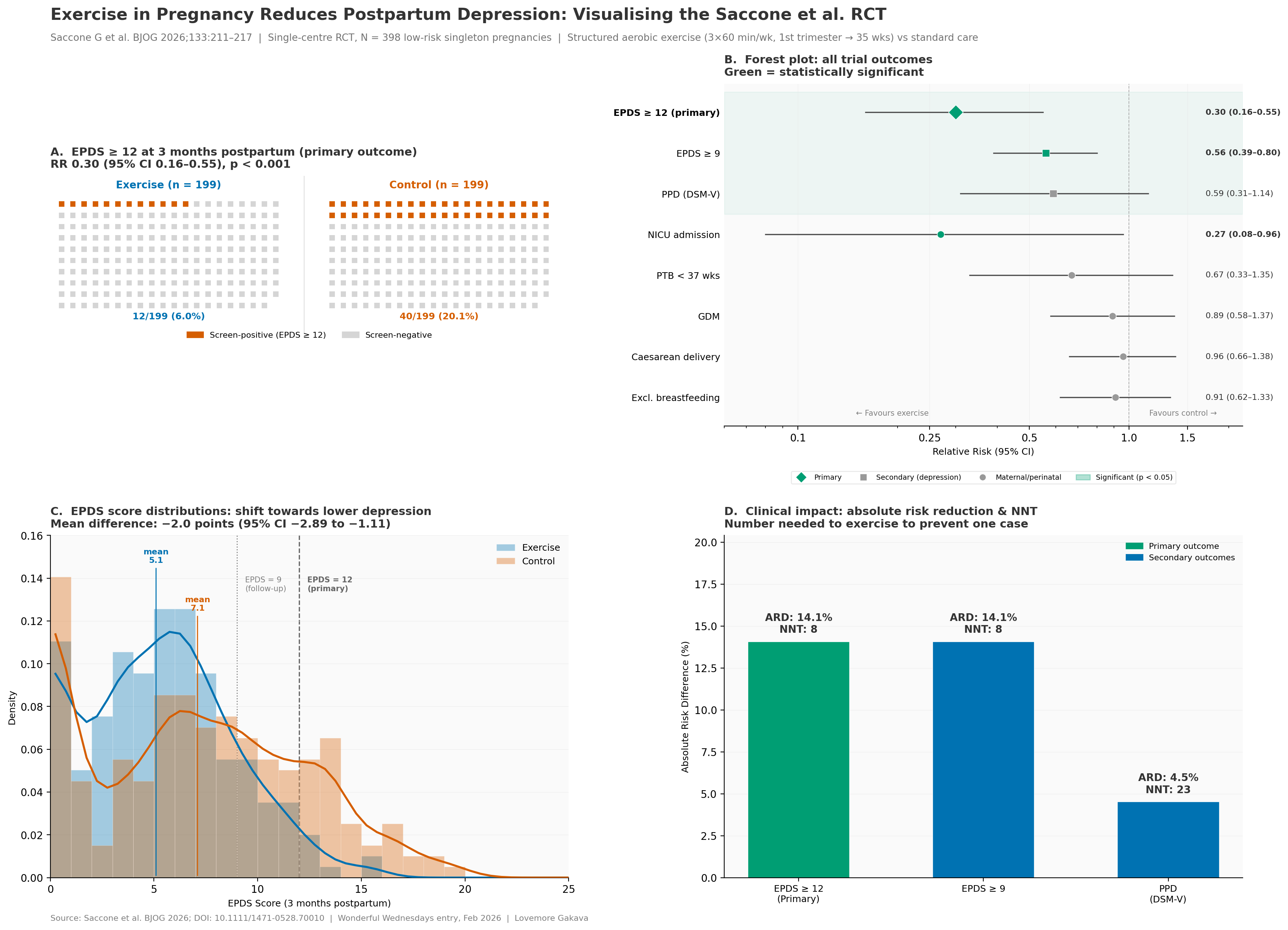
There is a recent publication: Exercise in Pregnancy and Risk of Postpartum Depression: A Randomised Controlled Trial
The publication is available via Wiley.
The challenge
In the publication the results are presented in a table and described verbally. Create an effective visualisation to convey the positive outcome of the trial.
You may imagine being at a conference presenting the data or even presenting it in an online post or article.
A description of the challenge can also be found here.
A recording of the session can be found here.
Visualisation
Visualising the Saccone et al. RCT
Code
"""
Wonderful Wednesdays Entry: Exercise in Pregnancy & Postpartum Depression
Rendered with matplotlib (mirrors the R ggplot2 version)

Source: Saccone G et al. BJOG 2026;133:211-217
"""

import numpy as np
import matplotlib.pyplot as plt
import matplotlib.gridspec as gridspec
import matplotlib.patches as mpatches
from matplotlib import rcParams
from scipy.ndimage import gaussian_filter1d

# --- Configuration ---
rcParams['font.family'] = 'sans-serif'
rcParams['font.sans-serif'] = ['DejaVu Sans', 'Arial', 'Helvetica']
rcParams['font.size'] = 10

COL_EX = '#0072B2'
COL_CT = '#D55E00'
COL_BEN = '#009E73'
COL_NEU = '#999999'
COL_TXT = '#333333'
COL_BG = '#FAFAFA'
COL_GRID = '#E8E8E8'

fig = plt.figure(figsize=(18, 13), facecolor='white')
gs = gridspec.GridSpec(2, 2, hspace=0.32, wspace=0.30,
                       left=0.06, right=0.96, top=0.89, bottom=0.06)

# =============================================================================
# PANEL A: Icon array — primary outcome
# =============================================================================
ax_a = fig.add_subplot(gs[0, 0])
ax_a.set_facecolor(COL_BG)

def draw_icon_grid(ax, n_events, n_total, x_offset, ncols=20, color_event=COL_CT):
    nrows = int(np.ceil(n_total / ncols))
    xs, ys, colors = [], [], []
    for i in range(n_total):
        c = i % ncols
        row = nrows - 1 - (i // ncols)
        xs.append(c + x_offset)
        ys.append(row)
        colors.append(color_event if i < n_events else '#D5D5D5')
    ax.scatter(xs, ys, c=colors, s=28, marker='s', edgecolors='none', zorder=3)
    return nrows

nrows_ex = draw_icon_grid(ax_a, 12, 199, x_offset=0)
draw_icon_grid(ax_a, 40, 199, x_offset=24)

ax_a.text(9.5, nrows_ex + 0.4, 'Exercise (n = 199)', ha='center',
          fontsize=10, fontweight='bold', color=COL_EX)
ax_a.text(33.5, nrows_ex + 0.4, 'Control (n = 199)', ha='center',
          fontsize=10, fontweight='bold', color=COL_CT)
ax_a.text(9.5, -1.2, '12/199 (6.0%)', ha='center', fontsize=9,
          fontweight='bold', color=COL_EX)
ax_a.text(33.5, -1.2, '40/199 (20.1%)', ha='center', fontsize=9,
          fontweight='bold', color=COL_CT)

ax_a.axvline(x=21.5, color='#808080', linewidth=0.5, linestyle='-', alpha=0.4)
ax_a.set_xlim(-1, 45)
ax_a.set_ylim(-2.5, nrows_ex + 1.5)
ax_a.set_aspect('equal')
ax_a.axis('off')

ax_a.set_title('A.  EPDS \u2265 12 at 3 months postpartum (primary outcome)\n'
               'RR 0.30 (95% CI 0.16\u20130.55), p < 0.001',
               fontsize=11, fontweight='bold', color=COL_TXT, loc='left', pad=8)

leg_event = mpatches.Patch(color=COL_CT, label='Screen-positive (EPDS \u2265 12)')
leg_no = mpatches.Patch(color='#D5D5D5', label='Screen-negative')
ax_a.legend(handles=[leg_event, leg_no], loc='lower center', ncol=2,
            fontsize=8, frameon=False, bbox_to_anchor=(0.5, -0.08))


# =============================================================================
# PANEL B: Forest plot — y-tick labels (tight) + legend
# =============================================================================
ax_b = fig.add_subplot(gs[0, 1])
ax_b.set_facecolor(COL_BG)

outcomes = [
    ('EPDS \u2265 12 (primary)',  0.30, 0.16, 0.55, True,  True),
    ('EPDS \u2265 9',             0.56, 0.39, 0.80, True,  False),
    ('PPD (DSM-V)',           0.59, 0.31, 1.14, False, False),
    ('NICU admission',        0.27, 0.08, 0.96, True,  False),
    ('PTB < 37 wks',         0.67, 0.33, 1.35, False, False),
    ('GDM',                   0.89, 0.58, 1.37, False, False),
    ('Caesarean delivery',    0.96, 0.66, 1.38, False, False),
    ('Excl. breastfeeding',   0.91, 0.62, 1.33, False, False),
]

n_out = len(outcomes)

# Category shading (depression outcomes = top 3)
ax_b.axhspan(n_out - 2.5, n_out + 0.5, color=COL_BEN, alpha=0.05, zorder=0)

# Reference line at RR=1
ax_b.axvline(x=1, color='#808080', linewidth=0.7, linestyle='--', zorder=1)

y_positions = []
for i, (label, rr, lo, hi, sig, prim) in enumerate(outcomes):
    y = n_out - i
    y_positions.append(y)
    col = COL_BEN if sig else COL_NEU
    marker = 'D' if prim else ('s' if i < 3 else 'o')
    ms = 10 if prim else 7

    ax_b.plot([lo, hi], [y, y], color='#4D4D4D', linewidth=1.2, zorder=2)
    ax_b.plot(rr, y, marker=marker, color=col, markersize=ms, zorder=3,
              markeredgecolor='white', markeredgewidth=0.5)

    # RR label positioned to right of the plot data area
    rr_text = f'{rr:.2f} ({lo:.2f}\u2013{hi:.2f})'
    ax_b.text(1.7, y, rr_text, va='center', ha='left', fontsize=8,
              fontweight='bold' if sig else 'normal', color=COL_TXT)

# Y-axis: outcome names as tick labels (tight against plot edge)
ax_b.set_yticks(y_positions)
ax_b.set_yticklabels([o[0] for o in outcomes], fontsize=9)
for tl in ax_b.get_yticklabels():
    if 'primary' in tl.get_text():
        tl.set_fontweight('bold')

ax_b.set_xscale('log')
ax_b.set_xlim(0.06, 2.2)
ax_b.set_ylim(0.3, n_out + 0.7)
ax_b.set_xticks([0.1, 0.25, 0.5, 1.0, 1.5])
ax_b.set_xticklabels(['0.1', '0.25', '0.5', '1.0', '1.5'])
ax_b.set_xlabel('Relative Risk (95% CI)', fontsize=9)
ax_b.spines['top'].set_visible(False)
ax_b.spines['right'].set_visible(False)
ax_b.spines['left'].set_visible(False)
ax_b.tick_params(axis='y', length=0, pad=4)
ax_b.grid(axis='x', color=COL_GRID, linewidth=0.3, zorder=0)

# Direction annotations
# Direction annotations - position below last outcome row
ax_b.text(0.15, 0.55, '\u2190 Favours exercise', fontsize=7.5, color='#808080')
ax_b.text(1.15, 0.55, 'Favours control \u2192', fontsize=7.5, color='#808080')

# Legend - well below the plot
leg_dia = plt.Line2D([0], [0], marker='D', color='w', markerfacecolor=COL_BEN,
                     markersize=8, label='Primary')
leg_sq = plt.Line2D([0], [0], marker='s', color='w', markerfacecolor=COL_NEU,
                    markersize=7, label='Secondary (depression)')
leg_ci = plt.Line2D([0], [0], marker='o', color='w', markerfacecolor=COL_NEU,
                    markersize=7, label='Maternal/perinatal')
leg_sig = mpatches.Patch(color=COL_BEN, alpha=0.3, label='Significant (p < 0.05)')
ax_b.legend(handles=[leg_dia, leg_sq, leg_ci, leg_sig], loc='lower center',
            fontsize=7, frameon=True, framealpha=0.9, edgecolor=COL_GRID, ncol=4,
            bbox_to_anchor=(0.5, -0.18))

ax_b.set_title('B.  Forest plot: all trial outcomes\n'
               'Green = statistically significant',
               fontsize=11, fontweight='bold', color=COL_TXT, loc='left', pad=8)


# =============================================================================
# PANEL C: EPDS score distribution (simulated from mean +/- SD)
# =============================================================================
ax_c = fig.add_subplot(gs[1, 0])
ax_c.set_facecolor(COL_BG)

np.random.seed(2026)
sim_ex = np.clip(np.random.normal(5.1, 3.7, 199), 0, 30)
sim_ct = np.clip(np.random.normal(7.1, 5.2, 199), 0, 30)

# Set axis limits FIRST so annotations use correct coordinates
YMAX = 0.16
ax_c.set_ylim(0, YMAX)
ax_c.set_xlim(0, 25)

# Histograms
hist_bins = np.arange(0, 26, 1)
ax_c.hist(sim_ex, bins=hist_bins, density=True, alpha=0.35, color=COL_EX,
          edgecolor='white', linewidth=0.3, label='Exercise', zorder=2)
ax_c.hist(sim_ct, bins=hist_bins, density=True, alpha=0.35, color=COL_CT,
          edgecolor='white', linewidth=0.3, label='Control', zorder=2)

# Smoothed density curves
for data, col in [(sim_ex, COL_EX), (sim_ct, COL_CT)]:
    counts, edges = np.histogram(data, bins=np.arange(0, 26, 0.5), density=True)
    centres = (edges[:-1] + edges[1:]) / 2
    smooth = gaussian_filter1d(counts, sigma=2)
    ax_c.plot(centres, smooth, color=col, linewidth=2, zorder=3)

# Threshold lines
ax_c.axvline(x=9, color='#808080', linestyle=':', linewidth=1, zorder=1)
ax_c.axvline(x=12, color='#666666', linestyle='--', linewidth=1.2, zorder=1)

# Threshold annotations (explicit y positions)
ax_c.text(9.4, YMAX * 0.88, 'EPDS = 9\n(follow-up)',
          fontsize=7.5, color='#808080', va='top')
ax_c.text(12.4, YMAX * 0.88, 'EPDS = 12\n(primary)',
          fontsize=7.5, color='#666666', fontweight='bold', va='top')

# Mean markers
ax_c.annotate('mean\n5.1', xy=(5.1, 0), xytext=(5.1, YMAX * 0.92),
              fontsize=8, fontweight='bold', color=COL_EX, ha='center',
              arrowprops=dict(arrowstyle='-', color=COL_EX, lw=1))
ax_c.annotate('mean\n7.1', xy=(7.1, 0), xytext=(7.1, YMAX * 0.78),
              fontsize=8, fontweight='bold', color=COL_CT, ha='center',
              arrowprops=dict(arrowstyle='-', color=COL_CT, lw=1))

ax_c.set_xlabel('EPDS Score (3 months postpartum)', fontsize=9)
ax_c.set_ylabel('Density', fontsize=9)
ax_c.legend(fontsize=9, frameon=False, loc='upper right')
ax_c.spines['top'].set_visible(False)
ax_c.spines['right'].set_visible(False)
ax_c.grid(axis='y', color=COL_GRID, linewidth=0.3)

ax_c.set_title('C.  EPDS score distributions: shift towards lower depression\n'
               'Mean difference: \u22122.0 points (95% CI \u22122.89 to \u22121.11)',
               fontsize=11, fontweight='bold', color=COL_TXT, loc='left', pad=8)


# =============================================================================
# PANEL D: Absolute risk differences + NNT
# =============================================================================
ax_d = fig.add_subplot(gs[1, 1])
ax_d.set_facecolor(COL_BG)

ard_outcomes = [
    ('EPDS \u2265 12\n(Primary)', 12/199, 40/199, True),
    ('EPDS \u2265 9',             35/199, 63/199, False),
    ('PPD\n(DSM-V)',          13/199, 22/199, False),
]

x_pos = np.arange(len(ard_outcomes))
ards, nnts, colors = [], [], []

for label, p_ex, p_ct, is_primary in ard_outcomes:
    ard = (p_ct - p_ex) * 100
    nnt = int(np.ceil(1 / (p_ct - p_ex)))
    ards.append(ard)
    nnts.append(nnt)
    colors.append(COL_BEN if is_primary else COL_EX)

bars = ax_d.bar(x_pos, ards, width=0.55, color=colors, edgecolor='white',
                linewidth=0.5, zorder=2)

for bar, ard, nnt in zip(bars, ards, nnts):
    ax_d.text(bar.get_x() + bar.get_width()/2, bar.get_height() + 0.4,
              f'ARD: {ard:.1f}%\nNNT: {nnt}',
              ha='center', va='bottom', fontsize=10, fontweight='bold', color=COL_TXT)

ax_d.set_xticks(x_pos)
ax_d.set_xticklabels([o[0] for o in ard_outcomes], fontsize=9)
ax_d.set_ylabel('Absolute Risk Difference (%)', fontsize=9)
ax_d.set_ylim(0, max(ards) * 1.45)
ax_d.spines['top'].set_visible(False)
ax_d.spines['right'].set_visible(False)
ax_d.grid(axis='y', color=COL_GRID, linewidth=0.3)

ax_d.set_title('D.  Clinical impact: absolute risk reduction & NNT\n'
               'Number needed to exercise to prevent one case',
               fontsize=11, fontweight='bold', color=COL_TXT, loc='left', pad=8)

leg_pri = mpatches.Patch(color=COL_BEN, label='Primary outcome')
leg_sec = mpatches.Patch(color=COL_EX, label='Secondary outcomes')
ax_d.legend(handles=[leg_pri, leg_sec], loc='upper right', fontsize=8, frameon=False)


# =============================================================================
# OVERALL TITLE & CAPTION
# =============================================================================
fig.suptitle(
    'Exercise in Pregnancy Reduces Postpartum Depression: Visualising the Saccone et al. RCT',
    fontsize=16, fontweight='bold', color=COL_TXT, x=0.06, ha='left', y=0.97
)

fig.text(0.06, 0.935,
         'Saccone G et al. BJOG 2026;133:211\u2013217  |  '
         'Single-centre RCT, N = 398 low-risk singleton pregnancies  |  '
         'Structured aerobic exercise (3\u00D760 min/wk, 1st trimester \u2192 35 wks) vs standard care',
         fontsize=9.5, color='#737373', ha='left')

fig.text(0.06, 0.015,
         'Source: Saccone et al. BJOG 2026; DOI: 10.1111/1471-0528.70010  |  '
         'Wonderful Wednesdays entry, Feb 2026  |  Lovemore Gakava',
         fontsize=8, color='#808080', ha='left')

plt.savefig('/home/claude/ww_submission/saccone_exercise_ppd.png',
            dpi=200, bbox_inches='tight', facecolor='white')
plt.close()
print("Saved: saccone_exercise_ppd.png")