Wonderful-Wednesdays
Repository to hold the data and materials for the Wonderful Wednesday webinar series https://www.psiweb.org/sigs-special-interest-groups/visualisation/welcome-to-wonderful-wednesdays
Overview
Analyze each visualization and create improved versions.
Required R packages:
```r
install.packages(c("ggplot2", "gridExtra", "scales"))
```
Challenge 1: Drug Efficacy Comparison
```r
library(ggplot2)
library(gridExtra)
library(scales)
efficacy_data <- data.frame(
drug = c("Drug A", "Drug B", "Placebo"),
efficacy = c(84, 82, 80)
)
p1 <- ggplot(efficacy_data, aes(x = drug, y = efficacy, fill = drug)) +
geom_bar(stat = "identity") +
coord_cartesian(ylim = c(75, 85)) +
labs(title = "Drug Efficacy Comparison",
subtitle = "Phase III Clinical Trial Results",
y = "Efficacy Rate (%)") +
theme_minimal() +
theme(legend.position = "none",
plot.title = element_text(face = "bold", size = 14))
```
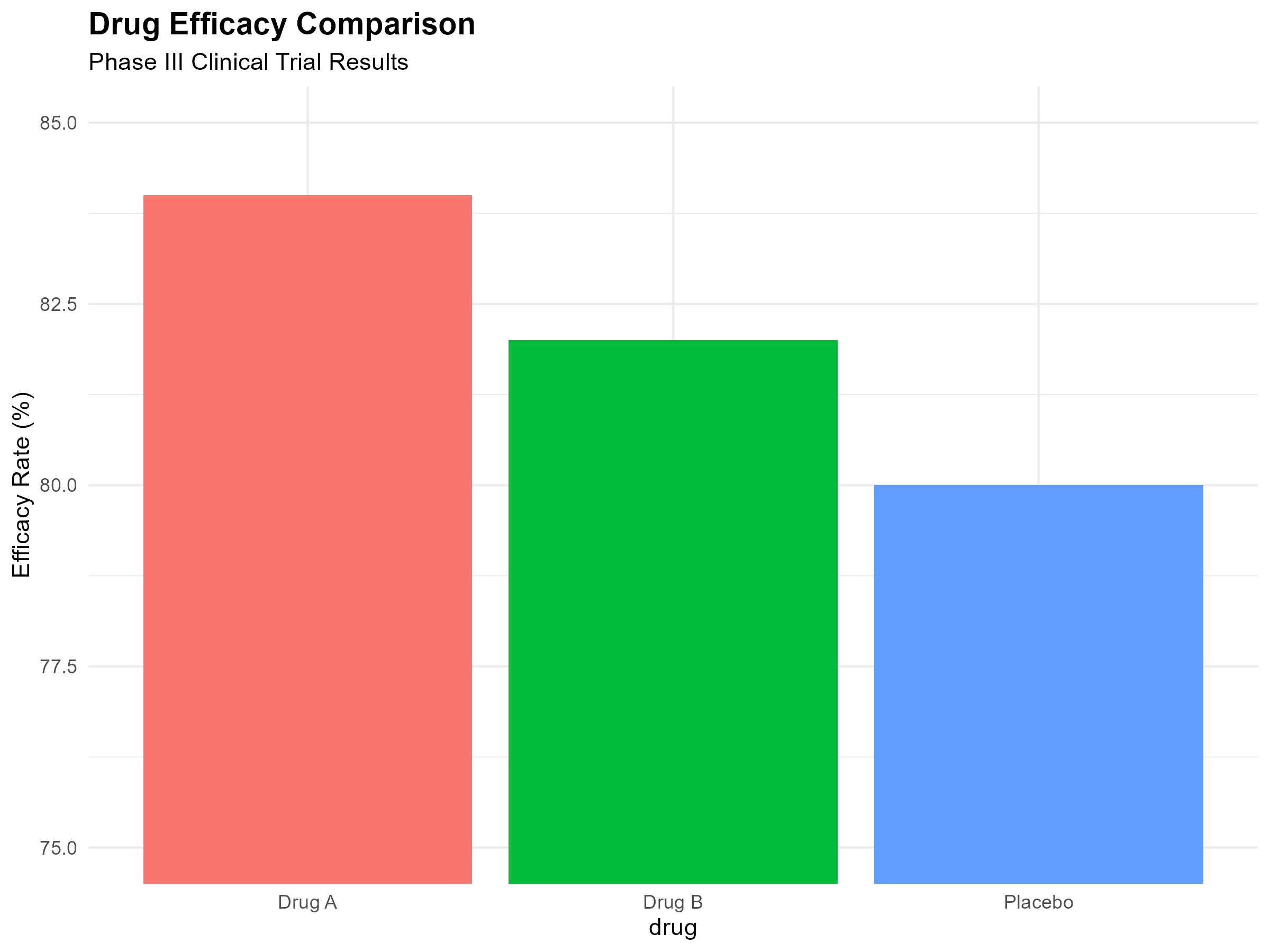
The data can be found here.
Challenge 2: Adverse Events Distribution
```r
adverse_events <- data.frame(
event = c("Headache", "Nausea", "Dizziness", "Fatigue",
"Insomnia", "Rash", "Other"),
percentage = c(15, 12, 10, 8, 7, 5, 43)
)
pie_colors <- c("#FF6B6B", "#4ECDC4", "#45B7D1", "#F9CA24",
"#6C5CE7", "#A29BFE", "#95A5A6")
p2 <- ggplot(adverse_events, aes(x = "", y = percentage, fill = event)) +
geom_bar(stat = "identity", width = 1) +
coord_polar("y", start = 0) +
scale_fill_manual(values = pie_colors) +
labs(title = "Adverse Events Distribution",
subtitle = "Safety Profile Analysis") +
theme_void() +
theme(plot.title = element_text(face = "bold", size = 14, hjust = 0.5),
plot.subtitle = element_text(hjust = 0.5),
legend.position = "right")
```
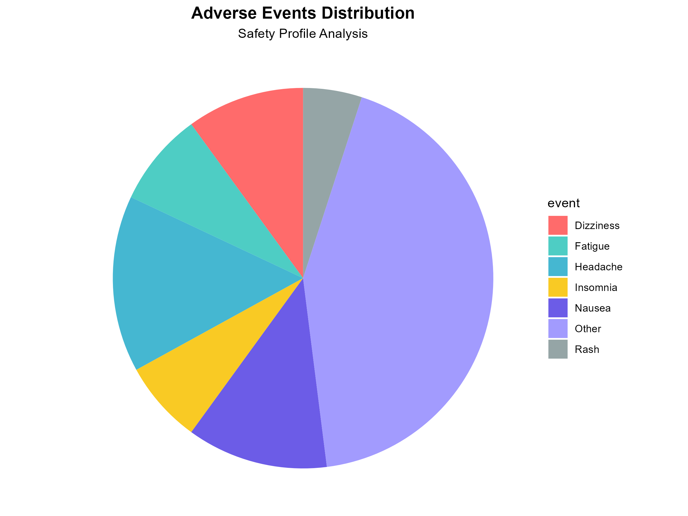
The data can be found here.
Challenge 3: Sales vs Costs Analysis
```r
sales_data <- data.frame(
month = factor(c("Jan", "Feb", "Mar", "Apr"),
levels = c("Jan", "Feb", "Mar", "Apr")),
sales = c(100, 110, 105, 115),
costs = c(2.0, 2.1, 2.2, 2.3)
)
p3 <- ggplot(sales_data, aes(x = month)) +
geom_bar(aes(y = sales, fill = "Sales"), stat = "identity", alpha = 0.7) +
geom_line(aes(y = costs * 50, group = 1, color = "Costs"), size = 2) +
geom_point(aes(y = costs * 50, color = "Costs"), size = 4) +
scale_y_continuous(
name = "Sales ($M)",
sec.axis = sec_axis(~./50, name = "Costs ($M)")
) +
scale_fill_manual(values = c("Sales" = "#82ca9d")) +
scale_color_manual(values = c("Costs" = "#ff7300")) +
labs(title = "Sales vs Costs Correlation",
subtitle = "Quarterly Performance Review",
x = "Month") +
theme_minimal() +
theme(
plot.title = element_text(face = "bold", size = 14),
legend.title = element_blank(),
axis.title.y.left = element_text(color = "#82ca9d"),
axis.title.y.right = element_text(color = "#ff7300")
)
```
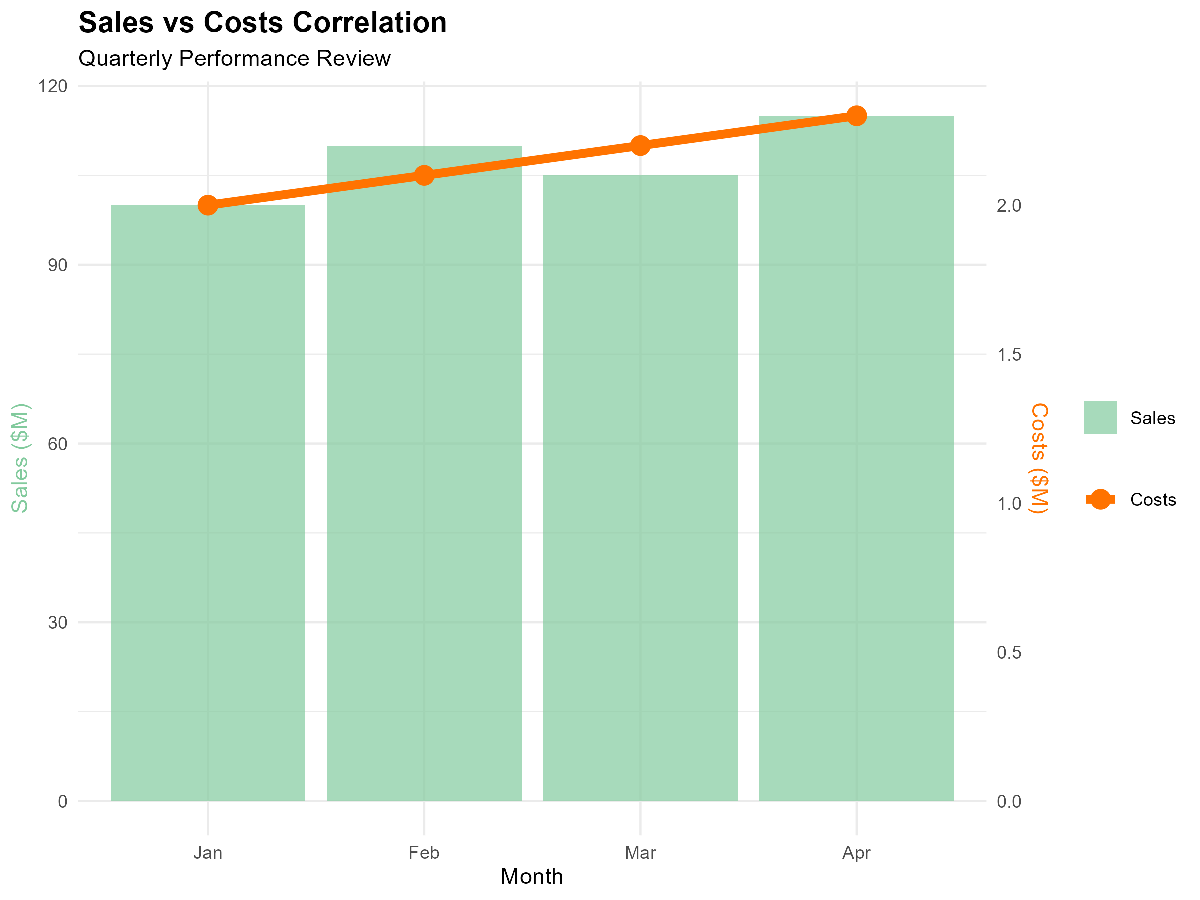
The data can be found here.
Challenge 4: Treatment Response Over Time
```r
trial_data <- data.frame(
week = 1:12,
response = c(40, 45, 44, 52, 50, 48, 55, 68, 65, 66, 69, 71),
se = c(3, 3, 2.5, 3, 2.8, 3.2, 2.9, 2.7, 2.8, 2.6, 2.5, 2.4)
)
p4 <- ggplot(trial_data |> dplyr::filter(week %in%c(2, 4, 8, 12)), aes(x = week, y = response)) +
geom_line(color = "blue", size = 1.5) +
geom_point(color = "blue", size = 3) +
scale_x_continuous(breaks = c(2, 4, 8, 12)) +
labs(title = "Treatment Response Over Time",
subtitle = "Selected measurement timepoints",
x = "Week", y = "Response Rate (%)") +
theme_minimal() +
theme(plot.title = element_text(face = "bold", size = 14))
```
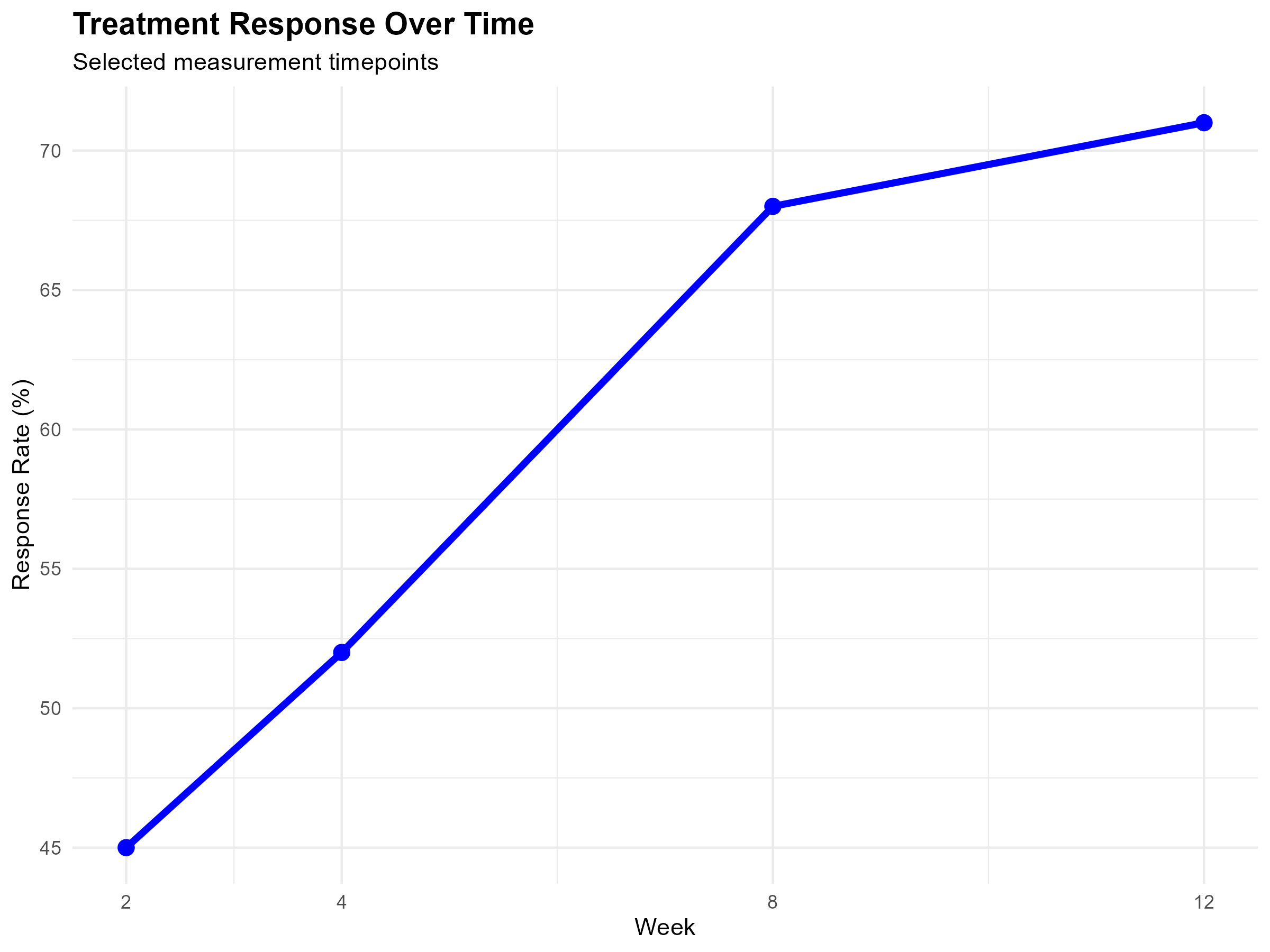
The data can be found here.
Challenge 5: Adverse Event Severity
```r
safety_data <- data.frame(
category = factor(c("Severe", "Moderate", "Mild"),
levels = c("Severe", "Moderate", "Mild")),
count = c(3, 15, 45)
)
p5 <- ggplot(safety_data, aes(x = category, y = count, fill = category)) +
geom_bar(stat = "identity") +
scale_fill_manual(values = c("Severe" = "#90EE90",
"Moderate" = "#FFB6C1",
"Mild" = "#8B0000")) +
labs(title = "Adverse Event Severity Distribution",
subtitle = "Safety monitoring report",
x = "Severity",
y = "Number of Events") +
theme_minimal() +
theme(legend.position = "none",
plot.title = element_text(face = "bold", size = 14))
```
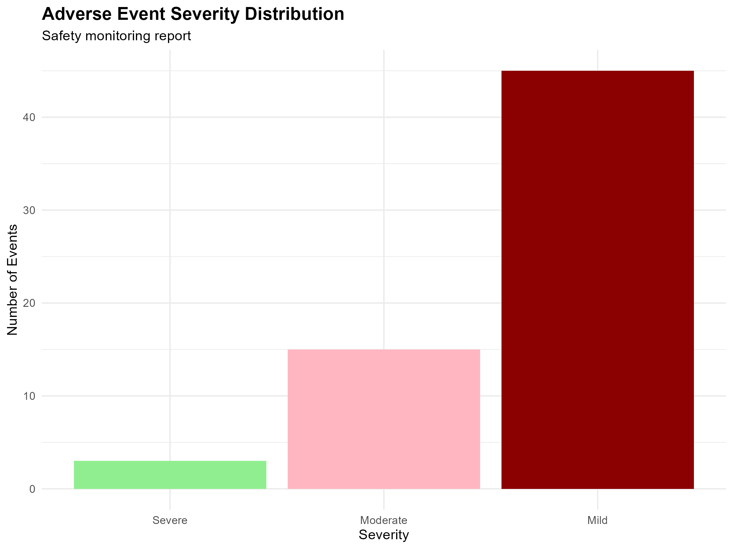
The data can be found here.
Your Task
Analyze each visualization and create improved versions that follow best practices for data presentation.
Submit your improved charts along with a brief explanation of what you changed and why.