Wonderful-Wednesdays
Repository to hold the data and materials for the Wonderful Wednesday webinar series https://www.psiweb.org/sigs-special-interest-groups/visualisation/welcome-to-wonderful-wednesdays
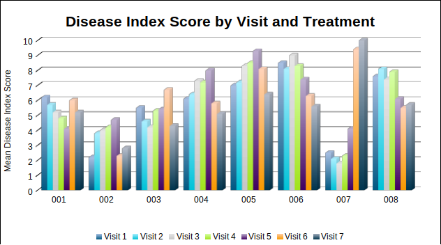
Improving a Bad Chart
Background
- A randomized study comparing 8 treatments/interventions
- Subjects were followed up at 7 study visits, with the intervention given between visits 5-6
- Endpoint: Disease Index Score
- Dataset contains mean scores by treatment and visit
- A data visualisation is provided, along with the source data
Data set
The dataset contains mean Disease Index Score at each Visit, by Treatment. It is provided as csv and xlsx file.
The bad chart
The Challenge
- Can you produce an improved version of the supplied visualisation?
- Identify any pattern or interesting finding in the results
- Produce a visualisation that clearly shows any trends
- Focus on attention to detail and quality